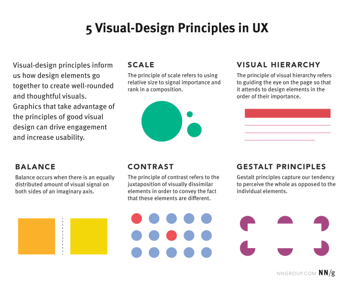
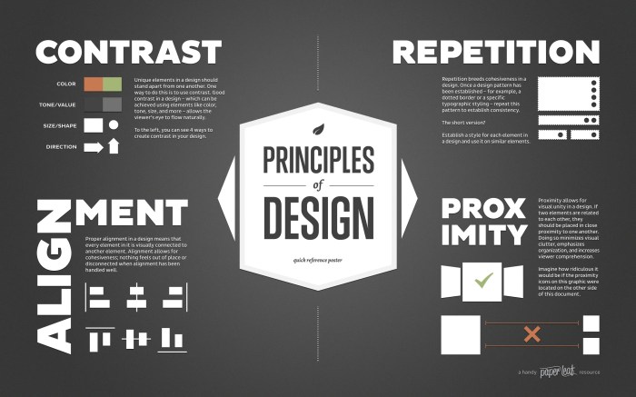
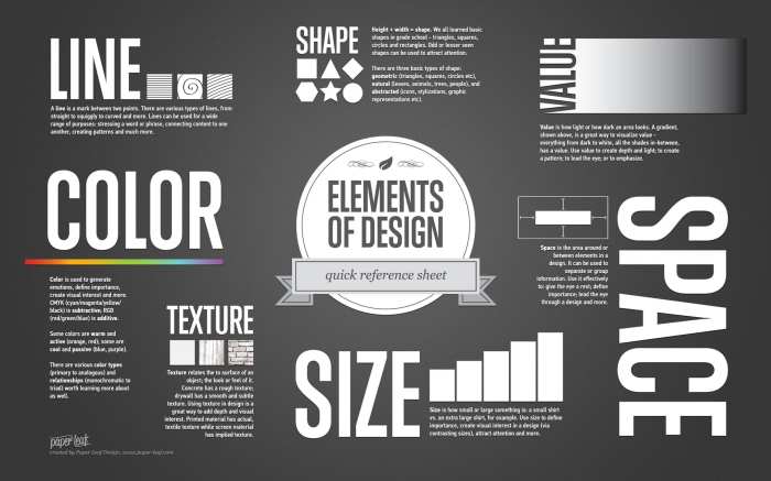
Effective image composition is the cornerstone of compelling visual design. It’s the art of arranging elements within a frame to create visual harmony, guide the viewer’s eye, and effectively communicate a message. This exploration delves into five key principles – the rule of thirds, leading lines, negative space, and more – providing practical strategies to elevate your design work. We’ll examine how these principles apply across various design disciplines, from web design and photography to graphic design, offering both theoretical understanding and practical application examples.
Understanding these principles isn’t just about aesthetics; it’s about enhancing the impact and effectiveness of your visual communication. By mastering these techniques, you’ll be able to create designs that are not only visually appealing but also powerfully communicative.
Understanding the Rule of Thirds and its Applications

The rule of thirds is a fundamental principle in image composition, offering a simple yet powerful method for creating visually appealing and balanced designs. It suggests dividing your image into nine equal parts using two equally-spaced horizontal lines and two equally-spaced vertical lines, and then placing key elements along these lines or at their intersections. This technique avoids the often-static and uninteresting effect of centering, leading to more dynamic and engaging compositions.
Rule of Thirds Layouts
The rule of thirds significantly impacts visual balance by drawing the viewer’s eye strategically across the image. This is achieved by subtly shifting the focus from the center, creating a more natural and pleasing arrangement. Below are three examples demonstrating different applications of the rule of thirds.
| Layout 1 | Layout 2 | Layout 3 |
|---|---|---|
| Imagine a landscape photograph. The horizon line sits along the top horizontal third, emphasizing the vastness of the sky. A prominent tree, the main subject, is positioned at the intersection of the left vertical third and the bottom horizontal third. This creates a balanced composition, drawing the eye across the sky and down to the tree. | Consider a portrait photograph. The subject’s eyes are positioned along the top horizontal third, while their shoulders are aligned with the bottom horizontal third. This positioning guides the viewer’s gaze naturally through the image, emphasizing the subject’s expression and posture. | Visualize a product shot. The product is placed at the intersection of the right vertical and middle horizontal thirds. A complementary background element, such as a subtle texture, is positioned along the left vertical third. This arrangement highlights the product while maintaining a visually interesting and balanced overall composition. |
Rule of Thirds vs. Centered Composition
Images composed using the rule of thirds often feel more dynamic and engaging compared to those with centered subjects. For example, a centered portrait can appear static and somewhat lifeless, while the same portrait composed using the rule of thirds, with the eyes positioned along a horizontal third, will feel more natural and visually appealing. Similarly, a landscape photo with the horizon perfectly centered might appear bland, whereas positioning the horizon along a horizontal third creates a more compelling and balanced visual experience, drawing the eye across the scene.
Applying the Rule of Thirds in Different Design Contexts
The rule of thirds is a versatile principle applicable across various design disciplines. In web design, it guides the placement of key elements like headlines, calls to action, and images, improving user engagement and navigation. In photography, it helps create visually stunning compositions, directing the viewer’s attention to the subject matter. Graphic designers use it to balance layouts, creating aesthetically pleasing posters, brochures, and other marketing materials. The principle’s adaptability ensures its consistent relevance across diverse creative fields.
Mastering Leading Lines and Visual Flow

Effective image composition relies heavily on guiding the viewer’s eye through the scene. Leading lines are a powerful tool for achieving this, creating a sense of depth, movement, and visual interest within your photograph or design. They act as invisible pathways, subtly directing the viewer’s gaze to the main subject or focal point. Understanding how to utilize leading lines is key to crafting compelling and dynamic visuals.
Imagine a winding road disappearing into a distant mountain range. The road itself acts as a leading line, drawing your eye from the foreground, across the middle ground, and finally to the majestic peak in the background. This creates a sense of journey and depth, making the image more engaging than a simple, static shot. This is the essence of leading lines – using existing lines or implied lines within the scene to guide the viewer’s eye.
Types of Leading Lines and Their Effectiveness
Leading lines come in various forms, each offering unique visual effects. The choice of line type depends largely on the desired mood and the overall composition.
The different types of leading lines and their impact on visual storytelling are crucial aspects of composition. Utilizing these effectively can significantly enhance the impact and narrative of your image.
- Converging Lines: These lines, such as roads or railway tracks, appear to meet at a vanishing point, creating a strong sense of depth and perspective. They draw the viewer’s eye directly towards the convergence point, often emphasizing the subject located there. For example, imagine two roads merging in the distance; the viewer’s eye is naturally drawn to the point where they meet.
- Curved Lines: These lines, like a river or a winding path, create a more gentle and flowing visual experience. They guide the eye in a less direct manner, often suggesting movement and grace. A photograph of a river meandering through a landscape uses curved lines to lead the viewer’s eye along its path.
- Diagonal Lines: Diagonal lines add dynamism and energy to a composition. They are less predictable than horizontal or vertical lines, creating a sense of movement and excitement. A diagonal road cutting across a field creates a dynamic feel, contrasting with the horizontal expanse of the field.
- Zigzag Lines: These lines create a sense of movement and energy, leading the eye in a more erratic but engaging path. A series of fences or buildings arranged in a zigzag pattern can create a visually stimulating image.
Designing with Leading Lines and Other Compositional Elements
Let’s design a composition incorporating leading lines and the rule of thirds.
This example demonstrates a practical application of combining leading lines with other established compositional techniques to create a visually compelling image. The step-by-step approach highlights the thought process behind effective image composition.
- Subject Selection: We’ll choose a lone tree standing on a hill overlooking a valley. The tree will be our main subject.
- Leading Lines Identification: The gently sloping hillside leading towards the tree acts as a natural curved leading line. Additionally, a small winding path also ascends the hill, providing another leading line converging towards the tree.
- Rule of Thirds Application: We’ll place the tree at one of the intersection points of the rule of thirds grid, creating visual balance and emphasis.
- Negative Space Utilization: The vast expanse of the valley provides ample negative space, allowing the tree and leading lines to stand out prominently. This enhances the impact of the main subject.
- Final Composition: The final image shows the tree prominently positioned at a rule of thirds intersection, with the curved hillside and winding path drawing the viewer’s eye directly to it. The vast negative space of the valley adds to the sense of scale and emphasizes the tree’s isolation.
The effective use of leading lines enhances visual flow and guides the viewer’s eye effortlessly through the image.
Combining leading lines with other compositional elements like the rule of thirds creates a powerful and harmonious composition.
Utilizing Negative Space and Visual Hierarchy

Effective image composition relies heavily on understanding and utilizing negative space, also known as white space. It’s the area around and between the subjects of an image, and far from being empty, it plays a crucial role in guiding the viewer’s eye, creating visual hierarchy, and enhancing the overall impact of the design. Mastering negative space allows designers to control the visual flow and emphasize key elements, resulting in more impactful and memorable designs.
Negative space isn’t just about blankness; it’s a powerful design tool that contributes significantly to a composition’s effectiveness. By strategically placing elements within a field of negative space, designers can create a sense of balance, calmness, or drama, depending on the intended effect. Understanding how to use negative space effectively is a key skill for any designer.
Examples of Effective Negative Space in Design
The strategic use of negative space significantly impacts a design’s visual appeal and message conveyance. Below are examples demonstrating how negative space enhances various designs, categorized for clarity.
| Design Type | Image Description | Negative Space Role | Impact |
|---|---|---|---|
| Logo Design | A simple, minimalist logo featuring a single, bold letter “A” in a sans-serif typeface, centered on a large, white background. The letter is clean and unadorned, with significant negative space surrounding it. | Emphasizes the letterform, creating a clean, memorable, and impactful brand identity. | Creates a feeling of sophistication and clarity. The negative space allows the logo to breathe and stand out. |
| Photography | A photograph of a lone tree standing on a vast, open field under a dramatic sunset sky. The tree is positioned off-center, with ample negative space surrounding it, particularly on the sides and above. | Highlights the tree as the main subject, emphasizing its isolation and the grandeur of the landscape. | Evokes a feeling of solitude, vastness, and peacefulness. The negative space creates a sense of scale and emphasizes the drama of the sky. |
| Web Design | A website landing page with a large, high-quality image occupying the upper half, while the lower half contains only a concise headline, a call to action button, and minimal text. Plenty of white space is used between these elements. | Improves readability, guides the user’s eye to the key information, and reduces visual clutter. | Creates a clean, modern, and user-friendly experience. The negative space prevents the page from feeling overwhelming. |
| Poster Design | A poster advertising a minimalist art exhibition. The poster features a single, striking image of an abstract painting, positioned slightly off-center, with significant white space surrounding it. The title of the exhibition is placed subtly in the bottom corner. | Draws attention to the artwork, enhancing its impact and sophistication. | Creates a sense of elegance and intrigue. The negative space allows the artwork to speak for itself. |
Using Negative Space to Create Visual Hierarchy
Negative space is a powerful tool for establishing visual hierarchy, guiding the viewer’s eye to the most important elements within a composition. By strategically placing elements within a field of negative space, designers can create a clear path for the viewer’s gaze, ensuring that the key message is easily understood.
For example, consider a website homepage. A large, high-quality hero image might occupy the top third of the page, immediately capturing attention. Below, a concise headline and a call-to-action button are placed with generous space around them. This deliberate use of negative space ensures that the viewer’s eye naturally flows from the hero image to the headline and then to the call-to-action, creating a clear visual path that guides the user towards the desired interaction. The ample white space prevents the page from feeling cluttered or overwhelming.
A Composition Utilizing Negative Space
Imagine a photograph depicting a single, brightly colored hot air balloon floating against a vast, clear blue sky. The balloon is positioned slightly off-center, leaving significant negative space around it, particularly towards the bottom and to the sides. This arrangement creates a sense of freedom, lightness, and vastness. The vibrant color of the balloon contrasts sharply with the calm blue sky, drawing the viewer’s eye immediately to the balloon. The negative space emphasizes the balloon’s isolation and its journey through the expansive sky, conveying a feeling of adventure and aspiration. The lack of other visual elements further enhances the feeling of serenity and limitless possibility.
Conclusion

By applying the rule of thirds, harnessing the power of leading lines, and thoughtfully employing negative space, designers can create visually stunning and impactful compositions. This exploration has highlighted the importance of understanding these fundamental principles to enhance visual communication across diverse design platforms. Remember, the goal is not simply to follow rules, but to use them as a foundation for creative expression and impactful design.