Unlock the vibrant potential of triadic color schemes! This guide delves into the art of balancing three harmonious colors to create visually stunning designs. We’ll explore the principles of triadic harmony, demonstrate practical techniques for selecting and balancing colors, and offer insightful tips to avoid common pitfalls. Prepare to elevate your design projects with captivating palettes.
From understanding the foundational principles of color theory to applying these concepts in real-world design scenarios, we’ll equip you with the knowledge and skills necessary to confidently utilize triadic color schemes. Whether you’re a seasoned designer or just beginning your creative journey, this guide provides a comprehensive approach to mastering this powerful design tool.
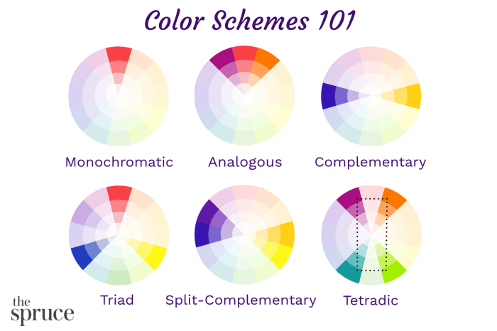
Understanding Triadic Color Harmony

Triadic color schemes, a cornerstone of color theory, utilize three colors equidistant on the color wheel. This arrangement inherently creates a vibrant and visually stimulating palette, offering a balance between harmony and contrast. Understanding how these colors interact is key to leveraging their potential in design.
Triadic harmonies are characterized by their inherent visual energy. The spacing between the colors ensures sufficient contrast to prevent monotony, while the relationship between them provides a sense of unity and cohesion. This makes them incredibly versatile, suitable for a wide array of design projects, from bold and playful aesthetics to sophisticated and elegant ones. The key lies in understanding how to balance the intensity and saturation of each color to achieve the desired effect.
Examples of Triadic Color Palettes
The effectiveness of triadic color schemes is evident across various design disciplines. Successful application requires careful consideration of color saturation and value, ensuring a balanced and harmonious outcome. Here are some examples demonstrating the versatility of triadic harmonies:
| Color 1 | Color 2 | Color 3 | Example Image Description |
|---|---|---|---|
| Yellow | Blue | Red | A vibrant painting depicting a sun-drenched landscape with a clear blue sky and a red barn prominently featured in the foreground. The yellow of the sun is warm and bright, contrasting with the cool blue of the sky and the bold red of the barn, creating a dynamic and balanced composition. The varying shades and tints within each color family further enhance the depth and richness of the scene. |
| Orange | Green | Purple | A fashion illustration showcasing a dress with an orange bodice, a green skirt, and purple accents. The orange is a warm, saturated hue, the green a cool, slightly muted tone, and the purple a rich, deep shade. This combination provides a sophisticated yet energetic feel, suitable for a modern, fashion-forward design. The varying textures and patterns within each color block further contribute to the overall visual appeal. |
| Teal | Yellow-Orange | Violet | A website design featuring a teal background, yellow-orange buttons, and violet text highlights. The teal provides a calming and sophisticated base, the yellow-orange adds a pop of energy and draws attention to interactive elements, while the violet accents provide subtle visual interest and enhance readability. The overall effect is modern, clean, and user-friendly. The careful selection of shades ensures visual clarity and prevents overwhelming the user. |
| Lime Green | Red-Violet | Golden Yellow | An abstract artwork utilizing lime green, red-violet, and golden yellow in a geometric pattern. The bright, almost neon lime green creates a sense of energy, the red-violet provides a counterpoint of depth and sophistication, while the golden yellow acts as a unifying element, bringing warmth and richness to the overall composition. The interplay between these colors creates a striking visual impact. The use of varying textures and patterns further enhances the dynamism of the piece. |
Advantages and Challenges of Triadic Color Schemes
Triadic color schemes offer several compelling advantages, but also present potential challenges that designers need to address.
Advantages include the inherent visual interest and energy they provide. The balanced contrast between the three colors prevents monotony, while their harmonious relationship ensures visual cohesion. They are incredibly versatile, adaptable to a wide range of design styles and purposes.
Challenges may arise from the potential for visual overstimulation if the colors are too saturated or the values too similar. Careful consideration of color saturation and value is crucial to achieving balance and harmony. Another challenge is finding the right balance between the three colors; one color might dominate the others if not carefully managed. This requires a keen eye for detail and a strong understanding of color theory.
Selecting and Balancing Triadic Colors
Choosing and harmoniously balancing triadic colors is crucial for creating visually appealing designs. A successful triadic palette relies on understanding not just the base colors, but also how their shades, tints, and saturation interact to create a balanced and dynamic composition. This section explores practical methods for selecting and balancing triadic color schemes, providing concrete examples and guidance.
Let’s begin by exploring three different triadic color palettes created using a standard 12-part color wheel. We will specify the precise HEX color codes for each color, offering a tangible starting point for your own design explorations. Remember, the color wheel is a tool; your artistic intuition will guide the final adjustments.
Three Triadic Color Palettes
Below are three examples of triadic color palettes. Each palette uses three colors equidistant on the color wheel, demonstrating the versatility of triadic harmonies. The specific shades and tints selected influence the overall mood and feel of the palette.
| Palette | Color 1 | Color 2 | Color 3 |
|---|---|---|---|
| Palette 1 (Vibrant) | #FF5733 (Red-Orange) | #007bff (Blue) | #34eb34 (Green) |
| Palette 2 (Muted) | #B35900 (Dark Orange) | #4682B4 (Steel Blue) | #808000 (Olive Green) |
| Palette 3 (Pastel) | #FFB3BA (Light Pink) | #B0C4DE (Light Blue) | #90EE90 (Light Green) |
These palettes showcase the variety achievable with a triadic structure. Palette 1 offers a high-energy feel due to the vibrant saturation of its colors. Palette 2 presents a more subdued, sophisticated look with its muted tones. Palette 3 utilizes pastel shades, creating a soft and gentle atmosphere.
Visual Effects of Shades and Tints
Exploring the variations within a single triadic base offers a deeper understanding of color harmony. By adjusting the shades (darker versions) and tints (lighter versions) of the base colors, we can fine-tune the overall aesthetic.
- Using darker shades creates a more dramatic and sophisticated effect, lending itself to elegant or mysterious designs. Imagine a website using dark shades of the triadic colors from Palette 1: a deep burgundy, a navy blue, and a forest green. This would convey a sense of luxury and authority.
- Conversely, using lighter tints results in a brighter, more airy feel, perfect for designs that need to project calmness or playfulness. A website using the tints of Palette 2, for example, would feel more approachable and inviting.
- Mixing shades and tints within the same triadic scheme adds complexity and depth. A design might use a deep shade of one color as an accent against lighter tints of the other two, creating visual interest and hierarchy.
Achieving Visual Balance with Saturation and Value
Visual balance in a triadic scheme is achieved by carefully manipulating the saturation (intensity) and value (lightness or darkness) of the colors. A poorly balanced palette might appear jarring or unbalanced, while a well-balanced one feels harmonious and pleasing to the eye.
Consider these strategies:
- Dominant Color: One color often acts as the dominant color, taking up the largest visual area. This dominant color should generally have a slightly lower saturation than the other two, preventing it from overwhelming the design.
- Accent Colors: The remaining two colors serve as accents, used in smaller areas or for highlighting specific elements. These can have higher saturation to draw attention, creating a pleasing contrast against the dominant color.
- Value Contrast: Using a mix of light and dark values within the triadic scheme adds depth and visual interest. Avoid using only light or only dark values as this can lead to a flat and uninteresting design.
Applying Triadic Color Schemes in Design Projects

Now that we understand the theory behind triadic color harmony and how to select and balance these palettes, let’s explore how to effectively apply them in real-world design projects. Successfully integrating a triadic scheme requires careful consideration of color placement and visual hierarchy to create a balanced and engaging design.
Website Layout Example using a Triadic Color Scheme
Let’s imagine we’re designing a website for a fictional organic coffee company, “Bean There, Brewed That.” We’ll use a triadic color scheme based on teal (#008080), burnt orange (#CC5500), and golden yellow (#FFD700). The following table Artikels the color usage for different website elements:
| Element | Color | Rationale |
|---|---|---|
| Background | Light Cream (#FAEBD7) | Provides a neutral, calming base that complements the brighter triadic colors. |
| Main Navigation | Teal (#008080) | Creates a clear visual anchor and reinforces the brand’s connection to nature (teal evokes water and freshness). |
| Headings (H1, H2) | Burnt Orange (#CC5500) | Adds warmth and visual emphasis, drawing attention to important information. The contrast with the background and navigation is strong yet harmonious. |
| Body Text | Dark Brown (#654321) | Provides readability against the cream background, maintaining a sophisticated and earthy feel consistent with the brand. |
| Call to Action Buttons | Golden Yellow (#FFD700) | Provides a strong visual contrast, encouraging user interaction. The bright yellow immediately stands out. |
| Images (Coffee beans, cups) | Varying shades of brown, with occasional highlights of orange and yellow. | Maintains color harmony while showcasing product imagery effectively. |
This layout utilizes the triadic colors strategically to create a visually appealing and consistent brand identity. The cream background ensures readability, while the bolder colors are used sparingly for emphasis.
Creating Visual Hierarchy with Triadic Colors
Effective use of color is crucial for establishing visual hierarchy and guiding the viewer’s eye. In our “Bean There, Brewed That” example, we achieve this through the following:
The strategic placement of colors helps to direct the user’s attention. The primary focus is given to elements using the burnt orange, the secondary focus to those in teal, and the tertiary focus (calls to action) to those in golden yellow.
- Dominant Color (Burnt Orange): Used for main headings and important sections to immediately draw attention.
- Secondary Color (Teal): Used for navigation and less critical but still important elements, providing a clear visual pathway.
- Accent Color (Golden Yellow): Used sparingly for calls to action, ensuring these elements stand out from the rest of the content.
Avoiding Color Clashes and Ensuring Visual Harmony
While triadic color schemes offer a balanced palette, careful consideration is needed to prevent clashes and maintain visual harmony.
Several techniques can help ensure that the chosen colors work together effectively.
- Varying Saturation and Brightness: Don’t use the full intensity of all three colors equally. Adjusting the saturation and brightness of each color can create a more sophisticated and harmonious effect. For example, using a muted version of the burnt orange for larger areas and a brighter version for smaller details.
- Strategic Color Placement: Consider the proximity of colors. Placing high-saturation colors next to each other might create jarring contrasts. Using lighter shades or neutrals as buffers can soften the effect.
- Consider Color Temperature: The combination of warm (orange) and cool (teal) colors can create a dynamic and engaging effect. However, ensure there is a sufficient balance to prevent visual imbalance.
- Testing and Iteration: Always test your design on different devices and screen sizes. Color perception can vary, so review and adjust as needed.
Conclusive Thoughts

By understanding the principles of triadic color harmony and applying the practical tips Artikeld in this guide, you can confidently create balanced and visually appealing designs. Remember, the key to success lies in careful color selection, thoughtful balance adjustments, and a keen eye for visual hierarchy. Experiment, iterate, and enjoy the process of crafting stunning visuals with triadic color schemes.