Effective typography is the cornerstone of compelling design. Understanding font hierarchy—the visual arrangement of text based on importance—is crucial for creating clear, engaging, and aesthetically pleasing layouts. This guide explores seven practical techniques to master font hierarchy, transforming your designs from cluttered to captivating. We’ll delve into choosing the right typefaces, utilizing size and weight variations, and employing strategic spacing to guide the reader’s eye effortlessly.
From website design to print advertisements, mastering font hierarchy elevates the user experience and reinforces your message. This guide provides a practical, step-by-step approach, complemented by illustrative examples, to help you confidently apply these principles to your own projects.
Understanding Font Hierarchy Principles

Effective visual hierarchy, achieved through skillful font selection and application, is crucial for guiding the reader’s eye and conveying information clearly and efficiently. A well-designed hierarchy ensures that the most important elements stand out, while less crucial details remain supportive and easily digestible. Poor font hierarchy, conversely, can lead to confusion and a frustrating user experience, hindering the communication of the intended message.
Font hierarchy dictates the visual prominence of text elements based on their importance within the design. This is achieved by manipulating various typographic properties such as font size, weight, style (e.g., italic, bold), family, and spacing. By strategically varying these attributes, designers create a visual flow that leads the viewer through the content in a logical and engaging manner.
Successful and Unsuccessful Font Hierarchy Examples
A website with a clear hierarchy might use a large, bold sans-serif font for the main heading, a slightly smaller sans-serif font for subheadings, and a legible serif font for body text. This creates a visual progression that is easy to follow. Conversely, a poorly designed website might use multiple fonts of similar size and weight, resulting in a chaotic and visually unappealing layout where the reader struggles to determine the relative importance of different text elements. A poster advertising a concert, for instance, might successfully use a large, decorative font for the band’s name, a smaller, more readable sans-serif font for the date and venue, and a very small, condensed font for supporting information like ticket prices. An unsuccessful example might cram all this information together in similar font sizes and styles, making the poster hard to read and understand. Similarly, a book might effectively use a large, clear serif font for chapter titles, a slightly smaller serif font for section headings, and a smaller, easily readable serif font for the main body text, ensuring a comfortable reading experience. An unsuccessful book design might use inconsistent fonts or sizes, creating a visually jarring and distracting layout.
Webpage Layout Demonstrating Effective Font Hierarchy
The following HTML code demonstrates a responsive two-column webpage layout using a table for structure, showcasing effective font hierarchy. This example utilizes a clear visual distinction between headings and body text to ensure readability and accessibility.
Main Heading |
 |
|---|---|
Subheading 1This is the body text for subheading 1. It uses a smaller, more readable font size and style than the main heading. The consistent font family provides a unified look. |
Subheading 2This is the body text for subheading 2. Again, it's consistent with the body text style and font size. The image on the right complements the text. |
The `placeholder.jpg` image would ideally be a relevant image related to the main heading, perhaps an abstract graphic or a photograph enhancing the page’s visual appeal and thematic coherence. The alt text “Illustrative image showcasing the main topic” provides context for screen readers and users with images disabled. The table structure ensures responsiveness, adapting to different screen sizes.
Methods for Establishing Visual Weight Using Font Families and Sizes
Establishing visual weight involves creating a clear hierarchy using font choices. Here are three distinct methods:
1. Size Variation: Using significantly different font sizes is the most straightforward method. Larger fonts immediately draw the eye, indicating greater importance. For example, a main heading might be 36px, subheadings 24px, and body text 16px. This creates a clear visual distinction.
2. Weight Contrast: Combining light and bold weights of the same font family can create visual hierarchy. Bold weights appear heavier and command more attention. A main heading in bold, followed by subheadings in regular weight, and body text in light weight, will establish a clear progression.
3. Font Family Contrast: Pairing distinct font families, such as a bold sans-serif for headings and a more delicate serif for body text, creates visual distinction. The contrasting styles further emphasize the hierarchy, guiding the reader’s focus. This method relies on inherent visual weight differences between serif and sans-serif fonts.
Selecting and Combining Typefaces

Choosing the right typefaces and combining them effectively is crucial for establishing a clear visual hierarchy. The successful interplay of different fonts guides the reader’s eye, emphasizing key information and creating a visually pleasing and easily navigable design. Understanding the characteristics of various font classifications and how they interact is paramount to achieving this.
Serif, sans-serif, and script fonts each possess distinct visual qualities that lend themselves to specific hierarchical roles. Careful consideration of these characteristics ensures that your design communicates its message clearly and effectively.
Serif, Sans-serif, and Script Font Comparisons and Uses
Serif fonts, characterized by small decorative strokes at the ends of their letterforms (like Times New Roman or Garamond), often convey a sense of tradition and formality. They are generally considered highly readable for body text due to their guiding strokes. Sans-serif fonts (like Arial or Helvetica), lacking these strokes, appear cleaner and more modern, often suitable for headings and titles where impact is desired. Script fonts (like Edwardian Script ITC or Pacifico), mimicking handwriting, add a touch of elegance or personality, best used sparingly for accents or very specific headings, given their lower readability for large amounts of text.
In a hierarchical structure, serif fonts might be used for body text, sans-serif for headings, and a script font for a logo or a single, impactful subheading. This creates a clear visual distinction between levels of importance.
Font Pairing for Effective Hierarchy
Font pairing involves selecting two or more typefaces that work harmoniously or contrast effectively to create visual interest and hierarchy. Harmonious pairings utilize fonts with similar characteristics, creating a cohesive and unified look. Contrasting pairings, on the other hand, use fonts with distinct features to highlight differences in importance. The key is balance; too much contrast can be jarring, while too much similarity can lead to monotony.
For example, pairing a classic serif like Garamond with a clean sans-serif like Open Sans creates a harmonious yet distinct hierarchy. Garamond’s readability makes it ideal for body text, while Open Sans’s clean lines are perfect for headings. A contrasting pairing could be a bold display font like Impact with a delicate script font like Great Vibes; Impact for a main title, and Great Vibes for a subtle sub-title. The key is to ensure sufficient visual distinction between the fonts to guide the eye through the information.
Font Pairings Based on Visual Weight and Purpose
The following table illustrates effective font pairings categorized by visual weight and intended purpose within a design hierarchy.
| Visual Weight | Purpose | Font Pairing 1 (Example) | Font Pairing 2 (Example) |
|---|---|---|---|
| Heavy | Main Heading | Bebas Neue | Impact |
| Medium | Subheading | Lato | Open Sans SemiBold |
| Light | Body Text | Lora | Playfair Display |
| Accent | Call to Action | Raleway | Montserrat |
Impact of X-Height and Font Weight on Visual Hierarchy
X-height refers to the height of the lowercase ‘x’ in a typeface. Fonts with a larger x-height generally appear more open and readable, making them suitable for body text. Conversely, fonts with a smaller x-height might be better suited for headings, as they can appear more compact and impactful. Font weight (e.g., light, regular, bold) significantly impacts visual hierarchy. Bolder weights draw more attention, making them ideal for headings and titles. Lighter weights are better for body text or less important elements to avoid overwhelming the reader.
For instance, using a bold sans-serif font for a heading and a lighter serif font for body text creates a strong visual distinction. This contrast in weight guides the reader’s eye to the most important information first, establishing a clear hierarchy and improving overall readability.
Applying Hierarchy Techniques
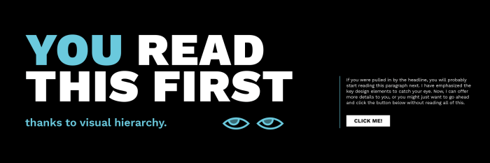
Effective visual hierarchy guides the viewer’s eye through your design, ensuring key information is noticed first. This is achieved primarily through manipulating font size, weight, style, and spacing. Mastering these techniques is crucial for creating clear and impactful designs. Let’s explore practical methods to achieve this.
By strategically employing different font sizes, weights, and styles, along with thoughtful spacing, we can create a visual flow that directs the reader’s attention to the most important elements. This not only improves readability but also enhances the overall aesthetic appeal of the design.
Seven Techniques for Creating Visual Hierarchy
The following techniques demonstrate how to use typography to establish a clear visual hierarchy. Each technique utilizes a combination of font size, weight, style, and spacing to achieve a specific effect.
- Size Variation: Imagine a movie poster. The title is in a massive, bold font (72pt), the actors’ names are smaller (36pt), and the release date is the smallest (18pt). This clear size difference immediately establishes importance.
- Weight Contrast: Consider a website header. The main heading uses a heavy bold weight (e.g., Black or Bold), while subheadings are in a lighter weight (e.g., Regular or Medium). This creates a visual distinction without relying solely on size.
- Style Differentiation: A book cover might use a serif typeface (like Times New Roman) for the title, conveying tradition and authority, while using a sans-serif typeface (like Arial) for the author’s name, creating a subtle contrast.
- Spacing and Leading: A newsletter utilizes generous leading (line spacing) between paragraphs, improving readability. The headline has significant top and bottom margins, visually separating it from the body text. This whitespace enhances the hierarchy.
- Color Contrast: A brochure might use a dark blue for headings and a lighter blue for body text, enhancing readability and emphasizing the headings. This works in conjunction with other techniques.
- Case Change: A simple yet effective technique. Using all caps for headlines immediately draws attention, while sentence case for body text maintains readability. This is particularly useful for short headlines.
- Font Family Variation: A magazine article might use a strong, modern sans-serif font for the title, and a more readable serif font for the body text. This creates visual distinction and provides a contrast in style.
Step-by-Step Font Selection for a Print Advertisement
Let’s Artikel a process for selecting and applying fonts hierarchically in a print advertisement for a new coffee blend called “Midnight Bloom.”
- Define the Hierarchy: Identify the key elements: Headline (“Midnight Bloom: Experience the Dark Roast”), Subheading (“A rich, velvety blend for late nights”), Body text (description of the coffee).
- Select Headings Font: Choose a bold, elegant serif font like Didot for the headline to convey luxury and sophistication. Consider a size of 48pt.
- Select Subheading Font: Opt for a slightly lighter weight of the same serif font (or a complementary sans-serif like Garamond) for the subheading (24pt).
- Select Body Text Font: Select a highly legible serif or sans-serif font for the body text (e.g., Georgia or Lato) in 12pt.
- Apply Spacing: Use generous leading (around 140% of the font size) for the body text and significant margins around the headline and subheading.
- Review and Adjust: Ensure the hierarchy is clear and visually appealing. Adjust sizes, weights, and spacing as needed for optimal impact.
Whitespace and Leading for Enhanced Impact
Whitespace and leading are not just about spacing; they are integral components of visual hierarchy. They provide visual breathing room, preventing the design from feeling cluttered and improving readability. Proper use of whitespace and leading emphasizes the importance of each element.
Imagine a poster with a large headline crammed next to a dense paragraph of text. The result is visually overwhelming. In contrast, a poster with the headline given ample space above and below, and the body text using generous leading, will feel much more balanced and easy to read. The increased whitespace draws the eye to the headline first, establishing a clear visual hierarchy.
Closing Summary

By skillfully employing font size, weight, style, and spacing, you can create a visual hierarchy that seamlessly guides the reader through your design. Remember, the key lies in thoughtful selection and strategic application of typefaces, ensuring your message is not only clear but also visually appealing and memorable. Experiment with the techniques Artikeld above, and refine your approach to craft designs that resonate with your audience.