Creating captivating YouTube thumbnails is crucial for attracting viewers and boosting click-through rates. A well-designed thumbnail acts as a visual advertisement, instantly conveying the video’s content and enticing potential audiences to click and watch. This guide delves into the art and science of crafting effective YouTube thumbnails, exploring design principles, visual strategies, and optimization techniques to help you maximize your video’s reach and engagement.
We’ll examine various design styles, from text-heavy to minimalist, and discuss the psychological impact of color palettes and imagery on viewer perception. Learning to leverage visual hierarchy, maintain visual consistency across your channel, and optimize text overlays will empower you to create thumbnails that not only look professional but also effectively communicate your video’s value proposition.
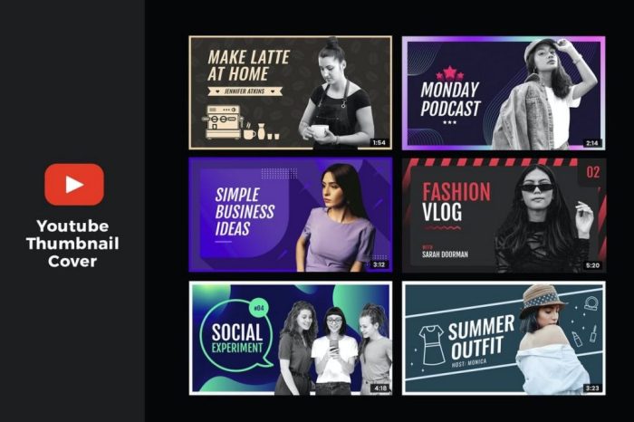
Thumbnail Design Principles for YouTube
Creating compelling YouTube thumbnails is crucial for attracting viewers and boosting click-through rates. A well-designed thumbnail acts as the visual hook, instantly communicating the video’s content and enticing potential viewers to click. Understanding key design principles is essential for maximizing your video’s visibility.
Color Palette and Emotional Impact on YouTube Thumbnails
The choice of color palette significantly influences the emotional response evoked by a YouTube thumbnail. Different colors trigger different associations and feelings, directly impacting viewer engagement. Below, three distinct color palettes are analyzed, considering their emotional impact and target audience.
| Color Palette | Emotional Response | Target Audience |
|---|---|---|
| Vibrant Blues and Greens (e.g., a nature documentary) | Calmness, tranquility, trust, reliability. Evokes feelings of peace and serenity. | Viewers seeking relaxation, educational content, or nature-related videos. |
| Warm Oranges and Yellows (e.g., a cooking tutorial) | Happiness, energy, warmth, appetite. Creates a cheerful and inviting atmosphere. | Viewers interested in food, lifestyle, or positive and upbeat content. |
| Dark Blues and Purples (e.g., a cinematic trailer) | Mystery, intrigue, sophistication, drama. Creates a sense of anticipation and excitement. | Viewers who appreciate dramatic or suspenseful content, cinematic productions, or gaming trailers. |
Thumbnail Styles and Their Effectiveness
Various thumbnail styles cater to different video types and target audiences. Selecting the appropriate style is critical for effective communication and engagement. The following are five distinct styles, along with their strengths and weaknesses.
Choosing the right thumbnail style depends heavily on the video content and target audience. A text-heavy thumbnail might work well for educational videos, while an image-focused one is more suitable for vlogs or travel content. Minimalist thumbnails can be effective for creating a sense of sophistication, but may not be as attention-grabbing as more visually busy thumbnails.
- Text-Heavy: This style uses large, bold text to convey the video’s core message. Strengths: Clear and concise message, easily understandable. Weaknesses: Can appear cluttered or less visually appealing, may not attract viewers seeking visual stimulation. Example: A thumbnail with the title “How to Learn Python in 30 Days” prominently displayed.
- Image-Focused: This style relies on a striking image to capture attention, with minimal text. Strengths: Visually appealing, attention-grabbing. Weaknesses: The message might be less clear if the image isn’t self-. Example: A thumbnail showing a breathtaking landscape for a travel vlog.
- Minimalist: This style uses a simple, clean design with limited elements. Strengths: Elegant and sophisticated, creates a sense of calm. Weaknesses: May not be attention-grabbing enough for highly competitive niches. Example: A thumbnail with a single, high-quality image and a small, subtle title.
- Infographic Style: This style utilizes visual elements such as charts, graphs, or icons to convey information concisely. Strengths: Easily digestible information, visually engaging. Weaknesses: May be less effective for topics that aren’t easily represented visually. Example: A thumbnail with a bar chart showing the results of a survey.
- Person-Focused: This style prominently features a person, often the creator, making a direct connection with the viewer. Strengths: Builds trust and connection with the audience. Weaknesses: May not be suitable for all video types. Example: A thumbnail with a headshot of the YouTuber making a playful expression.
Faces versus Objects in YouTube Thumbnails
The decision to use faces or objects in YouTube thumbnails significantly impacts click-through rates. Faces, due to their inherent human connection, tend to draw more attention. Objects, on the other hand, can be highly effective depending on the video’s content.
Studies have shown that thumbnails featuring faces generally achieve higher click-through rates due to the innate human tendency to engage with other people. However, a captivating object relevant to the video content can also be very effective. The choice should always align with the video’s subject matter and target audience.
Faces: Leverage the power of human connection. A friendly, relatable face can increase trustworthiness and encourage clicks. Example: A thumbnail showing the YouTuber smiling directly at the camera for a personal vlog. Objects: Use striking visuals that represent the video’s core message. Example: A thumbnail showcasing a vibrant, colorful dish for a cooking tutorial. The psychological impact stems from our inherent attention to faces (a survival mechanism) and the ability of objects to visually represent a concept or idea, creating curiosity and anticipation.
Crafting Compelling Visuals for YouTube Thumbnails

Effective thumbnails are crucial for attracting viewers on YouTube. They are the first impression, often determining whether a user clicks to watch your video. A well-designed thumbnail should accurately represent the video’s content while simultaneously capturing the viewer’s attention. This involves a careful consideration of visual elements, audience targeting, and maintaining visual consistency across your channel.
Creating visually appealing thumbnails involves understanding your target audience and choosing the right visual approach to resonate with them. Let’s explore this further through examples.
Thumbnail Designs for a Cooking Channel
We’ll design three thumbnails for a hypothetical cooking channel video showcasing a delicious chocolate lava cake recipe. Each thumbnail will utilize a different visual approach to demonstrate the versatility of thumbnail design.
- Thumbnail 1: Close-up of the Food. Target Audience: Foodies and dessert lovers. Rationale: A close-up shot of a perfectly gooey chocolate lava cake, with warm lighting and a slight steam effect, directly appeals to the viewer’s sense of taste and desire. The image is mouthwatering and emphasizes the deliciousness of the final product. The background is blurred, focusing attention entirely on the cake.
- Thumbnail 2: Action Shot. Target Audience: People interested in the cooking process. Rationale: This thumbnail shows the chef’s hands expertly pouring the batter into the ramekins, showcasing the active preparation stage. This approach appeals to those interested in the “how-to” aspect of the recipe. The image is dynamic and suggests a satisfying process. The kitchen setting is visible but subtly blurred, keeping the focus on the action.
- Thumbnail 3: Stylized Graphic. Target Audience: A broader audience, possibly those attracted to aesthetically pleasing designs. Rationale: This thumbnail features a stylized graphic representation of the chocolate lava cake, perhaps using bold colors and minimalist design. This is a more abstract approach, emphasizing the overall brand aesthetic rather than the food itself. The graphic style could be consistent with the channel’s overall branding, increasing recognition and memorability.
Visual Hierarchy in YouTube Thumbnails
Effective visual hierarchy guides the viewer’s eye to the most important elements of the thumbnail. This is achieved through the strategic use of size, color, and placement. Ineffective use can lead to confusion and a lack of clarity.
Visual hierarchy is crucial in thumbnail design as it dictates where the viewer’s eye will first land. A well-designed thumbnail uses visual cues to create a clear path, guiding the viewer towards the key information. Poor visual hierarchy, on the other hand, creates visual clutter, confusing the viewer and making it difficult to understand the video’s content.
- Effective Use: A large, high-contrast image of the food, placed centrally, immediately grabs attention. Bright, bold text overlaying the image clearly communicates the video title. The use of a consistent font and color palette creates a unified and professional look.
- Ineffective Use: A cluttered thumbnail with multiple images, text in various sizes and colors, and a busy background overwhelms the viewer and obscures the key message. The lack of a clear focal point makes it difficult to understand what the video is about.
Creating Visual Consistency Across a Series of YouTube Thumbnails
Maintaining visual consistency across your YouTube thumbnails is essential for building brand recognition and creating a cohesive channel identity. This can be achieved through the consistent use of color palettes, fonts, graphic elements, and overall design style.
Let’s consider a hypothetical cooking channel themed around rustic Italian cuisine. Each thumbnail would feature: a consistent warm color palette (reds, oranges, browns), a handwritten-style font for the title, a subtle background texture reminiscent of aged parchment, and a prominent image of the featured dish. These consistent elements create a recognizable brand identity, allowing viewers to instantly identify your channel amidst the countless others on YouTube. This consistency reinforces the channel’s theme and enhances viewer engagement.
Optimizing YouTube Thumbnails for Engagement

Creating compelling YouTube thumbnails is crucial for attracting viewers. A well-designed thumbnail not only grabs attention but also accurately reflects the video’s content, increasing click-through rates and ultimately, viewership. This section will explore several key strategies for optimizing thumbnails to maximize engagement.
Effective Use of Text Overlays in YouTube Thumbnails
The strategic use of text overlays significantly enhances thumbnail clarity and impact. By carefully selecting fonts, placement, and ensuring readability, creators can convey essential information quickly and effectively. Below are five examples analyzing these elements.
| Example | Font | Placement | Readability |
|---|---|---|---|
| A thumbnail for a cooking tutorial showing a finished dish with the words “Easy Pasta Recipe!” overlaid | A clean sans-serif font like Arial or Helvetica, bold and slightly larger than the rest of the text. | Centered at the bottom, slightly above the bottom edge of the image. | Excellent. The font is clear, the placement is unobtrusive yet prominent, and the text is easily read. |
| A gaming thumbnail showcasing a character with the text “NEW UPDATE!” in a vibrant color. | A bold, condensed sans-serif font, possibly Impact or similar. | Positioned diagonally across the image, following the character’s movement. | Good. The bold font and vibrant color ensure visibility, even against the background. The diagonal placement adds dynamism. |
| A motivational video thumbnail with a person smiling and the words “Unlock Your Potential!” | A slightly more elegant serif font, perhaps Garamond or Times New Roman, but still readable. | Placed subtly in the lower third, allowing the image to take center stage. | Good. The font is sophisticated yet legible, and the placement maintains a balance between text and visual. |
| A news commentary thumbnail with a headline overlaid, such as “Election Results SHOCK!” | A bold sans-serif font like Roboto, in all capitals. | Centered, spanning the width of the thumbnail, providing immediate context. | Good. The capitalization and bold font ensure high visibility, conveying urgency. |
| A product review thumbnail featuring the product and the words “Honest Review!” | A friendly sans-serif font, possibly Open Sans, with a slightly playful style. | Positioned in a corner, to allow the product to dominate the image. | Excellent. The font style aligns with the overall tone, and the placement is unobtrusive yet informative. |
Creating a YouTube Thumbnail Using Free Online Tools
A step-by-step guide using free online tools, such as Canva (free version):
- Account Creation and Template Selection: Create a free Canva account if you don’t already have one. Choose a YouTube thumbnail template or start with a custom blank canvas sized 1280×720 pixels.
- Image Upload and Editing: Upload your chosen image. Use Canva’s tools to adjust brightness, contrast, saturation, and crop as needed to enhance the visual appeal.
- Text Overlay Addition: Add text using Canva’s text tools. Choose a font, size, color, and style that is both legible and visually appealing. Experiment with different text placements and effects.
- Element Addition (Optional): Incorporate additional elements like shapes, icons, or other graphics from Canva’s library to further enhance the thumbnail’s visual interest.
- Download and Export: Once satisfied, download the thumbnail in a high-resolution JPG or PNG format. Canva offers options to optimize the image for web use.
Impact of Image Resolution on YouTube Thumbnails
Image resolution directly impacts the viewing experience. Low-resolution thumbnails appear pixelated and blurry, reducing their visual appeal and potentially lowering click-through rates. Conversely, high-resolution thumbnails present a crisp, professional image.
- Low Resolution (e.g., 640×360 pixels): A thumbnail at this resolution will appear noticeably blurry on high-resolution displays, making text difficult to read and details indistinct. This negatively affects the overall quality and attractiveness.
- Medium Resolution (e.g., 1280×720 pixels): This is the recommended resolution for YouTube thumbnails. It provides a good balance between image quality and file size, resulting in a clear and sharp thumbnail across most devices.
- High Resolution (e.g., 1920×1080 pixels): While providing the sharpest image, this resolution may result in larger file sizes, potentially impacting loading times. It’s generally not necessary unless the thumbnail includes exceptionally fine details.
Epilogue

Mastering the art of YouTube thumbnail design is an ongoing process of experimentation and refinement. By understanding the principles of visual communication, employing effective design strategies, and continuously analyzing your results, you can significantly improve your channel’s performance. Remember, a compelling thumbnail is more than just an image; it’s a powerful tool for attracting viewers, building your brand, and ultimately, achieving your YouTube goals. Experiment with different approaches, analyze what works best for your audience, and consistently strive to create thumbnails that are both visually appealing and effectively represent your video content.