Crafting intuitive user interfaces is paramount for a positive user experience. This guide delves into the key principles and practical applications of UI design, offering ten actionable tips to create interfaces that are not only visually appealing but also effortlessly navigable and user-friendly. We’ll explore user needs analysis, fundamental design principles, and crucial testing methodologies to ensure your designs resonate with your target audience.
From understanding user personas and journey mapping to mastering visual hierarchy and employing A/B testing, we will cover the entire design process. We will provide real-world examples and practical exercises to solidify your understanding and equip you with the skills to design effective and engaging user interfaces.
Understanding User Needs & Goals
Effective UI design hinges on a deep understanding of the users who will interact with the product. Ignoring user needs leads to frustration, low engagement, and ultimately, a failed product. By prioritizing user-centered design, we can create interfaces that are intuitive, efficient, and enjoyable to use. This section will explore how to effectively understand and address user needs and goals within the design process.
User Persona: E-commerce Website Shopper
To illustrate the importance of understanding user needs, let’s create a user persona for a fictional e-commerce website selling handcrafted jewelry. Meet Sarah Miller, a 32-year-old marketing manager living in a suburban area. She’s tech-proficient, comfortable using various apps and online platforms, and prefers shopping online due to convenience. Sarah’s shopping habits involve researching products thoroughly before purchasing, reading reviews, and comparing prices. She values high-quality craftsmanship and unique designs, and is willing to pay a premium for ethically sourced materials. She typically shops on her smartphone during her commute or in the evenings.
User Journey Map: E-commerce Purchase
A user journey map visually represents the steps a user takes to achieve a goal. For Sarah purchasing a necklace, the journey might look like this: She starts by searching for “handcrafted silver necklaces” on the website. She browses the results, viewing product images and descriptions. A potential pain point here could be slow loading times or unclear product information. She then adds the necklace to her cart. Next, she proceeds to checkout, where she might encounter another pain point if the checkout process is overly complicated or requires excessive information. Finally, she completes the purchase and receives a confirmation email. Another potential pain point could be a lack of clear shipping information or tracking options. Mapping this journey helps identify areas for improvement in the UI.
User Needs: Mobile Banking Application
Three crucial user needs in a mobile banking app design are: Security, Ease of Navigation, and Transaction Speed. Security is paramount; users need to feel confident that their financial information is protected. This translates to robust authentication methods, clear security protocols, and a visually trustworthy interface. Ease of Navigation means the app should be intuitive and easy to use, allowing users to quickly access account information, transfer funds, and pay bills. A clear and logical information architecture is crucial here. Finally, Transaction Speed is critical; users expect transactions to be processed quickly and efficiently. The UI should provide clear progress indicators and confirmations to avoid frustration.
Principles of Intuitive UI Design
Intuitive UI design hinges on creating interfaces that are easy to understand and use, requiring minimal learning or effort from the user. This is achieved through a combination of established design principles that guide the arrangement and presentation of information, ensuring a seamless and enjoyable user experience. Effective application of these principles leads to increased user satisfaction, improved task completion rates, and reduced frustration.
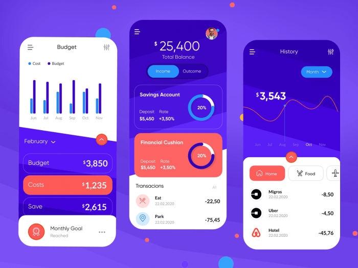
Visual Hierarchy in Stock Market Dashboards
Visual hierarchy is the arrangement of elements on a screen to guide the user’s eye and establish a clear order of importance. In a stock market dashboard, this is crucial for quickly conveying key information and allowing users to make informed decisions. For instance, the most important data points, such as current stock prices and percentage changes, should be prominently displayed using larger font sizes, bolder weights, and strategic placement (typically at the top or center). Secondary information, like trading volume or historical data, can be presented in smaller fonts or within easily collapsible sections. Color coding can also reinforce hierarchy, using vibrant colors for critical data and muted tones for less significant details. A well-designed dashboard leverages visual cues to create a clear visual path, enabling users to effortlessly navigate the information and understand the overall market trends at a glance. For example, a red color might indicate a significant drop in stock price, while green might signal a rise, immediately grabbing the user’s attention.
Affordance and Feedback in a News Website Navigation Menu
Affordance refers to how well an object or interface element communicates its purpose. Feedback is the confirmation given to a user after an action is performed. A news website navigation menu should clearly communicate the available sections and provide instant feedback upon selection.
- Home: This option should be clearly visible and possibly larger than other options, indicating its primary importance.
- World News: Presented as a clear button or link, allowing users to easily understand its function.
- Business: Similar to World News, this option uses clear visual cues to indicate its function.
- Technology: Consistent design language with other sections ensures a unified and intuitive experience.
- Politics: Clear visual separation from other options helps avoid confusion.
- Sports: Similar design to other sections ensures consistency and ease of use.
- Entertainment: Clear visual cues indicating this section’s function.
Upon clicking any of these menu items, the website should provide immediate feedback, such as a change in the menu item’s appearance (e.g., highlighting the selected item) or a smooth transition to the relevant news section. This feedback loop reassures the user that their action has been registered and guides them through the site. Lack of clear affordances and immediate feedback can lead to user confusion and frustration.
Color Palette Comparison for a Medical Application
Two distinct color palettes are considered for a medical application:
Palette A: Uses a predominantly cool color scheme with blues and greens, accented with a muted gray. This palette aims to evoke feelings of calmness, trust, and cleanliness. It is also highly accessible, offering sufficient contrast for users with visual impairments.
Palette B: Employs a warmer palette incorporating muted oranges and browns, with accents of a light teal. While potentially more visually appealing to some, this palette could present accessibility challenges if not carefully implemented, particularly in terms of sufficient contrast between text and background elements.
The choice between these palettes depends heavily on accessibility guidelines (WCAG) and usability testing. Palette A is generally preferred for its higher accessibility and its ability to project the sense of professionalism and reliability crucial in a medical context. While Palette B might be considered more visually engaging, the risk of insufficient contrast and potential negative impact on usability for a significant portion of users makes Palette A the more suitable choice. Careful selection of color combinations, ensuring sufficient contrast ratios, is paramount in ensuring usability for all users, regardless of visual abilities.
Practical Application & Testing
Effective UI design isn’t just about theoretical principles; it requires practical application and rigorous testing to ensure intuitive and user-friendly interfaces. This section will explore practical applications of UI design best practices, demonstrate the creation of interactive prototypes, and illustrate the use of A/B testing to optimize design elements.
UI Design Best Practices
Understanding and implementing UI best practices is crucial for creating effective interfaces. The following table showcases five examples, illustrating how these practices are implemented in popular apps and websites.
| Best Practice | Example | App/Website | Description |
|---|---|---|---|
| Clear Visual Hierarchy | Use of size, color, and contrast to guide the user’s eye to important information first. | Gmail | Gmail uses larger font sizes for subject lines and sender information, making them stand out from the rest of the email list. Important actions, like replying or archiving, are prominently displayed with clear visual cues. |
| Consistent Design Language | Maintaining a uniform style across all elements, including buttons, typography, and spacing. | Spotify | Spotify maintains a consistent color palette, font style, and button design throughout its app. This consistency creates a cohesive and recognizable user experience. |
| Intuitive Navigation | Easy-to-understand menus and clear pathways to desired information. | Amazon | Amazon’s navigation is straightforward, with clear categories and search functionality prominently displayed. Users can easily find what they are looking for without difficulty. |
| Effective Feedback Mechanisms | Providing clear visual and textual feedback to user actions. | Twitter provides immediate feedback when a tweet is sent or a like is given, often through subtle animations and confirmations. This lets users know their actions have been registered. | |
| Accessibility Considerations | Designing interfaces that are usable by people with disabilities. | Netflix | Netflix offers features like subtitles, audio descriptions, and keyboard navigation, ensuring accessibility for users with visual or auditory impairments. |
Interactive Prototype Design: Mobile App Calendar Feature
To illustrate the process of designing interactive prototypes, let’s consider a mobile app calendar feature. We will design two prototypes: one focusing on event creation and the other on event viewing.
Prototype 1: Event Creation
User Flow: The user taps the “Add Event” button. A form appears prompting for event title, date, time, and location. The user fills in the information and taps “Save.” A confirmation message appears, and the event is added to the calendar.
Prototype 2: Event Viewing
User Flow: The user navigates to a specific date. The events for that day are displayed. The user taps on an event to view details (time, location, description). The user can then choose to edit or delete the event.
A/B Testing: Website Checkout Process Optimization
A/B testing can significantly improve the checkout process of a website. Let’s consider a hypothetical e-commerce website. We will test two versions of the checkout page: Version A (the current design) and Version B (a modified design).
Version A: The current checkout page has a multi-step process with separate pages for shipping information, payment details, and order review.
Version B: The modified checkout page uses a single-page design, displaying all relevant information at once. It also incorporates progress indicators and clear calls to action.
Metrics Tracked: Conversion rate (percentage of visitors completing the purchase), cart abandonment rate, average order value, and time spent on the checkout page.
Potential Modifications Based on Results: If Version B shows a significantly higher conversion rate and lower cart abandonment rate, we would implement Version B as the new standard. If Version A performs better, we may need to further analyze the data to identify specific areas for improvement within Version A. If neither version shows a clear advantage, we might conduct further testing with additional modifications.
Ultimate Conclusion
Designing intuitive user interfaces is an iterative process that requires a deep understanding of user needs and a commitment to continuous improvement. By applying the principles and techniques Artikeld in this guide, you can create interfaces that are not only functional and efficient but also delightful to use. Remember that user feedback is invaluable; continuously test and refine your designs to ensure they meet and exceed user expectations, leading to higher user satisfaction and engagement.