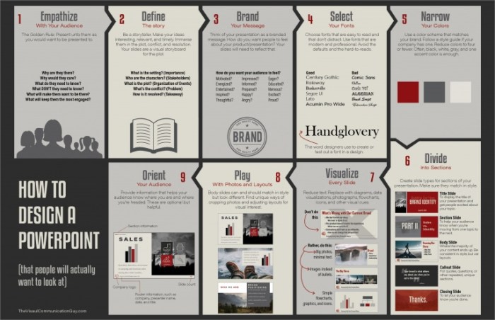
In today’s visually-driven world, effective visuals are paramount. Whether you’re crafting a marketing campaign, presenting data, or simply aiming to communicate an idea clearly, understanding the principles of visual design is crucial. This guide provides seven key tips to help you create impactful visuals that resonate with your audience and achieve your communication goals. We’ll explore how to tailor your designs to specific demographics, leverage color theory and typography, and utilize whitespace to enhance clarity and impact.
From understanding your target audience and their needs to mastering the principles of color, typography, and whitespace, we’ll delve into practical strategies for creating visuals that are not only aesthetically pleasing but also highly effective in conveying your message. We will cover the creation of infographics, the use of storytelling techniques in visual design, and the importance of simplifying complex concepts for better understanding.
Understanding Your Audience and Purpose

Effective visual communication hinges on a deep understanding of your target audience and the message you aim to convey. Ignoring this crucial step often leads to visuals that fail to resonate, resulting in missed opportunities for engagement and understanding. Tailoring your design choices to your audience’s age, background, and level of knowledge is paramount to achieving your communication goals.
Visuals Targeting Different Age Demographics
Designing visuals for diverse age groups requires careful consideration of their cognitive abilities, visual preferences, and cultural context. The following examples illustrate how different design elements can be used to effectively communicate the same information to children, young adults, and seniors.
| Demographic | Visual Style | Color Palette | Typography | Imagery | Design Rationale |
|---|---|---|---|---|---|
| Children (Ages 5-10) | Bright, playful, cartoonish | Vibrant primary colors (red, yellow, blue) | Large, friendly fonts (e.g., Comic Sans) | Simple, engaging illustrations of characters or objects | Children respond well to bold colors and simple imagery. Large fonts ensure readability. |
| Young Adults (Ages 18-35) | Modern, clean, minimalist | Muted colors with accent colors | Clean sans-serif fonts (e.g., Helvetica, Arial) | High-quality photography or stylized illustrations | Young adults appreciate contemporary aesthetics and visually uncluttered designs. |
| Seniors (Ages 65+) | Simple, clear, high contrast | High contrast colors (e.g., dark text on light background) | Large, easily readable serif fonts (e.g., Times New Roman) | Simple, easily identifiable imagery | Seniors may have impaired vision, so high contrast and large fonts are crucial for readability. Simple imagery reduces cognitive load. |
Representing Abstract and Concrete Data
The approach to visualizing data varies significantly depending on whether the data is abstract or concrete. Abstract data, such as concepts or ideas, requires a more symbolic or metaphorical representation, while concrete data, like numerical figures or statistics, benefits from a direct and literal visualization.
Consider a visual representing the concept of “global interconnectedness.” This abstract concept might be effectively represented by a network graph showing interconnected nodes, symbolizing countries or individuals. In contrast, visualizing concrete data, such as sales figures over time, would benefit from a simple line graph clearly showing the numerical trend.
- Abstract Data Visualization: Uses metaphors, symbols, and artistic license to represent intangible concepts.
- Concrete Data Visualization: Uses charts, graphs, and tables to directly represent numerical data.
- Audience Understanding: Concrete data visualizations are generally easier to understand for a broader audience, while abstract visualizations require more interpretation and may be more effective for specific audiences or concepts.
Communicating a Complex Concept
Consider explaining the concept of “climate change” which is inherently complex and involves multiple interconnected factors.
A complex visual might use a combination of maps, charts, and graphs to show temperature changes, sea-level rise, and greenhouse gas emissions. However, this can be overwhelming for a less knowledgeable audience. A simplified visual could focus on a single, easily understood aspect, such as rising global temperatures illustrated by a simple line graph showing temperature increase over time. This approach makes the information more accessible and digestible.
Changes made for simplification include reducing the number of data points and focusing on a single key indicator. The justification is to reduce cognitive load and improve comprehension for a less knowledgeable audience. Prioritizing clarity and simplicity over comprehensive detail is crucial when communicating complex information to a wider audience.
Principles of Visual Design

Effective visual communication relies heavily on understanding and applying fundamental design principles. These principles guide the arrangement of elements to create visually appealing and easily understandable visuals. Ignoring these principles can lead to cluttered, confusing, and ultimately ineffective designs. This section will explore key aspects of visual design, focusing on color theory, typography, and the strategic use of whitespace.
Color Theory and Emotional Response
Color significantly impacts the emotional response to a visual. Different colors evoke different feelings and associations. For example, a vibrant, sunny yellow might suggest happiness and optimism, while a deep, calming blue can convey tranquility and trust. Consider a website promoting a luxury spa: images featuring predominantly calming blues and greens, possibly accented with subtle golds, would effectively communicate relaxation and sophistication. In contrast, a children’s toy advertisement might utilize bright reds, oranges, and yellows to create a sense of excitement and playfulness. A marketing campaign for a serious financial institution might employ dark blues and grays to project stability and trustworthiness. The strategic use of color palettes is crucial for aligning visuals with the intended brand message and emotional impact.
Typography and Readability
Font selection is crucial for readability and visual appeal. Different fonts convey different moods and levels of formality. Serif fonts (like Times New Roman or Garamond), with their small decorative flourishes, often project a sense of tradition and sophistication. Sans-serif fonts (like Arial or Helvetica), clean and minimalist, are generally considered more modern and easily readable on screens. Script fonts (like Edwardian Script ITC or Lucida Calligraphy), with their cursive style, add a touch of elegance or informality depending on their specific design.
Let’s illustrate this with three variations of the same text, “Discover the Beauty of Nature”:
Variation 1: Discover the Beauty of Nature (using Times New Roman, a serif font). This evokes a classic and sophisticated feel, suitable for a nature documentary or high-end travel brochure.
Variation 2: Discover the Beauty of Nature (using Arial, a sans-serif font). This is clean, modern, and easily readable, appropriate for a website or infographic.
Variation 3: Discover the Beauty of Nature (using a stylized script font, mimicking a handwritten look). This creates a more whimsical and personal feel, potentially suitable for a nature-themed greeting card or artisan product label. The choice depends entirely on the context and desired aesthetic.
Whitespace and Negative Space
Whitespace (or negative space) refers to the empty areas surrounding design elements. It’s not simply empty space; it plays a vital role in visual organization and clarity. Effective use of whitespace creates visual breathing room, preventing clutter and improving readability.
Let’s compare two visuals:
| Visual with Ample Whitespace | Visual without Ample Whitespace |
|---|---|
| Imagine a minimalist poster advertising a photography exhibition. The poster features a single, high-quality photograph of a landscape, with generous margins around the image and minimal text. The clean layout emphasizes the photograph’s beauty and the exhibition’s sophisticated nature. | Imagine the same photography exhibition advertised on a poster crammed with multiple images, small text blocks, sponsors’ logos, and decorative elements. The cluttered layout is visually overwhelming, making it difficult to focus on the exhibition itself. |
| The impact is a feeling of calm and focus, drawing the viewer’s attention to the main image and message. | The impact is a sense of visual chaos and confusion, making it difficult for the viewer to process the information effectively. |
The effective use of whitespace significantly improves the visual appeal and message clarity of a design. By strategically placing elements within a well-defined space, designers can guide the viewer’s eye and create a more impactful and memorable experience.
Creating Engaging and Effective Visuals

Effective visuals are crucial for conveying information clearly and memorably. They should not only present data but also engage the viewer, leaving a lasting impression. This section explores techniques for crafting compelling visuals that achieve both clarity and impact.
Storytelling Through Visuals
A powerful way to engage viewers is to weave a narrative into your visual. Consider a visual depicting a young woman, meticulously tending a small sapling in a barren landscape. The sapling is depicted as vibrant and healthy, contrasting with the dry, cracked earth around it. The woman’s expression is one of determination and hope. The narrative here is one of perseverance and environmental stewardship. The visual elements—the vibrant sapling against the barren landscape, the woman’s hopeful expression—all contribute to the story, symbolizing the potential for growth and renewal even in challenging circumstances. The color palette could emphasize the contrast between the life-giving green of the sapling and the muted browns and yellows of the dry earth, further reinforcing the message.
Powerful Imagery with Minimal Text
A single, striking image can often convey a message more effectively than a lengthy explanation. Imagine a photograph of a lone figure standing on a mountaintop, silhouetted against a breathtaking sunrise. The vastness of the landscape emphasizes the individual’s smallness, but also their resilience and determination. The absence of text allows the viewer to interpret the image personally, connecting with its inherent symbolism of achievement, perseverance, or perhaps even solitude. The choice to use minimal text allows the impact of the image itself to resonate more powerfully, avoiding distraction and allowing for a deeper emotional connection. The photographer’s choice of lighting and composition would be key in creating this emotional impact.
Infographic Design with Data Visualization
Infographics are exceptionally useful for presenting complex data in an easily digestible format. Let’s say we want to illustrate the growth of renewable energy sources over the last decade. The following table shows hypothetical data:
| Year | Solar (MW) | Wind (MW) | Hydro (MW) |
|---|---|---|---|
| 2014 | 500 | 800 | 1200 |
| 2015 | 600 | 950 | 1300 |
| 2016 | 750 | 1100 | 1400 |
| 2017 | 900 | 1300 | 1500 |
| 2018 | 1100 | 1500 | 1600 |
| 2019 | 1300 | 1700 | 1700 |
| 2020 | 1500 | 1900 | 1800 |
| 2021 | 1700 | 2100 | 1900 |
| 2022 | 1900 | 2300 | 2000 |
| 2023 | 2100 | 2500 | 2100 |
This data could be effectively visualized using a combined bar and line chart. The bar chart would represent the individual contributions of solar, wind, and hydro power each year, while a line chart could show the overall growth of renewable energy over time. A clear, concise title and labeled axes would ensure easy understanding. The use of color-coding for different energy sources would further enhance readability. The infographic could also incorporate small icons representing each energy source for added visual appeal.
Outcome Summary

Mastering the art of visual communication is a journey, not a destination. By consistently applying these seven tips – understanding your audience, mastering design principles, and prioritizing engagement – you can elevate your visual creations and significantly improve how effectively your message is received. Remember that continuous learning and experimentation are key to honing your skills and staying ahead in the ever-evolving world of visual design. The impact of well-crafted visuals is undeniable; use this knowledge to create compelling and memorable experiences for your audience.