Symmetry, a fundamental principle in design, offers a powerful tool for creating visually appealing and balanced compositions. From the majestic symmetry of ancient architecture to the subtle balance in modern logos, understanding and applying symmetry can elevate any design project. This exploration delves into seven key ideas, revealing how to harness the power of symmetry to achieve a formal and sophisticated aesthetic.
We will examine different types of symmetry – bilateral, radial, and more – exploring their unique visual impact and psychological effects on the viewer. Practical applications across various design disciplines, including logo creation, typography, web design, and architecture, will be showcased. Furthermore, we will investigate the strategic use of asymmetry to add dynamism and avoid monotony, demonstrating how a careful interplay between symmetry and asymmetry can yield truly compelling results.
Understanding Symmetry in Design

Symmetry, the harmonious and visually pleasing arrangement of elements, plays a crucial role in design. It creates a sense of balance and order, impacting how viewers perceive and interact with a design. Understanding the different types of symmetry and their effects is essential for creating impactful and aesthetically pleasing work.
Symmetry in design is fundamentally about balance. It refers to the arrangement of elements around a central axis or point, resulting in a visually harmonious composition. The human eye naturally seeks patterns and order, and symmetry provides a satisfying sense of visual equilibrium. This inherent appeal translates into a more impactful and memorable design.
Types of Symmetry and Their Visual Impact
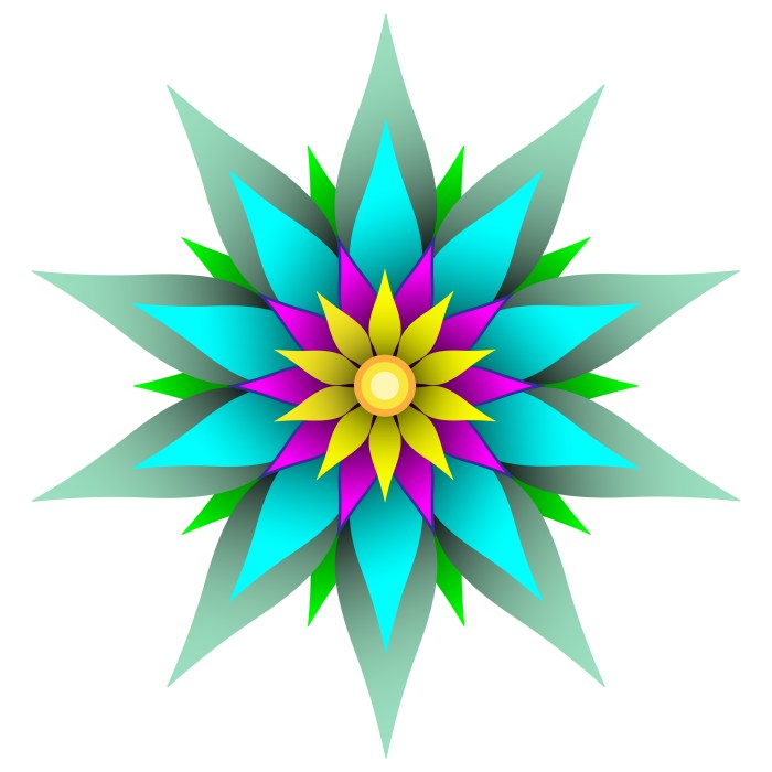
Several types of symmetry exist, each contributing unique visual characteristics. Bilateral symmetry, radial symmetry, and rotational symmetry are common types, each creating a distinct visual experience. Understanding these differences allows designers to select the most appropriate type for their specific project and intended effect.
| Symmetry Type | Description | Visual Example |
|---|---|---|
| Bilateral Symmetry | A mirrored arrangement of elements around a central axis. Imagine folding a design in half; both sides are identical reflections of each other. | A human face, a butterfly, a classic building facade with a central doorway and symmetrical wings. The visual impact is one of balance, stability, and often, formality. |
| Radial Symmetry | Elements are arranged around a central point, radiating outwards like spokes on a wheel. | A sunflower, a starfish, a mandala design. The visual effect is often one of dynamism and growth, emanating from the central point. |
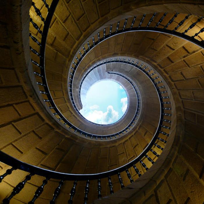
| Rotational Symmetry | A design that remains unchanged after rotation by a specific angle. | A square rotated by 90 degrees, a snowflake, a certain type of geometric pattern. This creates a sense of repetition and rhythm, with a feeling of movement and fluidity. |
Symmetry and Balance in Design
Symmetry is a powerful tool for creating visual balance in design. Bilateral symmetry, for example, often creates a feeling of stability and formality, as seen in classical architecture or logo designs. Radial symmetry, on the other hand, can convey a sense of movement and energy, making it suitable for designs that want to project dynamism. The careful selection and application of symmetry directly impacts the overall mood and message of the design.
Psychological Effects of Symmetry
Symmetry has a profound psychological impact on viewers. Studies have shown that symmetrical designs are often perceived as more aesthetically pleasing, beautiful, and even trustworthy. This is likely due to our innate preference for order and predictability. The stability and harmony associated with symmetry can evoke feelings of calm, security, and trust, making it a valuable tool in branding and marketing. For instance, logos that utilize bilateral symmetry often project an image of reliability and professionalism. Conversely, asymmetrical designs can create a sense of energy and excitement, though they might lack the same immediate appeal of symmetrical designs.
Applying Symmetry to Different Design Elements
Symmetry, the harmonious and balanced arrangement of elements, is a powerful tool in design, capable of creating visually appealing and memorable results across various applications. Its effective use can significantly enhance the impact and effectiveness of a design, whether it’s a logo, a website layout, or an architectural masterpiece. This section explores the practical applications of symmetry in different design elements.
Symmetry in Logo Design
Symmetrical logos often prove more memorable and easily recognizable due to their inherent balance and visual clarity. The human brain readily processes symmetrical forms, leading to quicker recognition and stronger brand recall. A well-executed symmetrical logo can convey stability, trust, and sophistication, depending on the specific design choices. For instance, the Adidas logo, with its three stripes radiating from a central point, utilizes rotational symmetry to create a dynamic yet balanced image. The simple yet powerful design is instantly recognizable globally. Conversely, the Pepsi logo, while not perfectly symmetrical, uses a near-symmetrical approach with subtle variations to achieve visual appeal and brand identity. The use of negative space and carefully placed elements within a symmetrical framework can greatly enhance the overall impact and memorability of a logo.
Symmetry in Typography
Symmetry plays a crucial role in typography, affecting both readability and visual appeal. Careful consideration of letter spacing, line height, and overall page layout can significantly enhance the visual harmony and effectiveness of text.
- Centered Alignment: Symmetrical alignment of text around a central point, such as in a title or heading, creates a sense of balance and order.
- Mirror Symmetry in Lettering: Some logos and designs utilize mirrored lettering for visual effect, often used in monogram designs to create a balanced and aesthetically pleasing visual.
- Balanced Column Arrangements: In multi-column layouts, symmetrical arrangements of text columns can improve readability and create a more visually pleasing page.
Symmetrical typographic arrangements guide the reader’s eye smoothly across the page, improving comprehension and reducing eye strain. The strategic use of white space and carefully selected fonts further enhances the visual impact of symmetrically arranged text.
Symmetry in Web Design
Symmetrical website layouts often contribute to improved user experience and navigation. A well-balanced design can guide the user’s eye naturally through the content, making it easier to find information and interact with the website.
Consider this example of a symmetrical website layout:
Imagine a website homepage with a central header image spanning the full width. Below this, two columns of equal width flank a central, smaller column. The left column features recent blog posts with thumbnails, while the right column displays featured products or services. The central column contains a concise call-to-action. This layout offers a clear visual hierarchy, guiding users towards important content. The symmetrical structure provides a sense of order and ease of navigation, making the user experience more intuitive and pleasant. The use of consistent spacing and alignment further reinforces the overall symmetry and visual appeal.
Symmetry in Architectural Design
Many famous structures throughout history showcase the effective use of symmetry in architectural design. Symmetry creates a sense of harmony, grandeur, and stability in buildings.
The Taj Mahal, for example, is a prime illustration of symmetrical design in architecture. Its near-perfect reflection across a central axis creates a breathtaking visual impact. The careful placement of gardens, pools, and other elements further enhances the symmetrical balance. Similarly, the Parthenon in Athens, though showing some minor deviations from perfect symmetry, is predominantly symmetrical in its design, reflecting the classical ideals of balance and harmony. The symmetrical facade with its columns and pediment contributes to its enduring aesthetic appeal. These structures demonstrate how symmetry can be used to create not only visually stunning but also structurally sound and enduring designs.
Exploring Creative Variations and Breaks in Symmetry
Symmetry, while providing a sense of order and balance, can sometimes feel static or predictable. Intentionally breaking symmetry introduces dynamism and visual interest, preventing the design from becoming monotonous. This technique allows designers to create more engaging and memorable compositions by strategically disrupting the expected equilibrium. The key is to maintain a sense of overall balance, even amidst the asymmetry.
Instances Where Breaking Symmetry Adds Visual Interest
Breaking symmetry can inject energy and personality into a design. Consider a perfectly symmetrical website layout: it might feel sterile. However, introducing a slightly off-center image, an asymmetrical arrangement of text blocks, or a contrasting color palette on one side can significantly enhance visual appeal. In photography, a perfectly centered subject can be less engaging than a subject positioned slightly off-center, using the rule of thirds. Similarly, in architecture, a slightly asymmetrical facade can be more visually captivating than a perfectly symmetrical one. The strategic use of asymmetry allows for emphasis on specific elements and guides the viewer’s eye through the composition.
Examples of Asymmetrical Design Elements
The following table showcases examples of how symmetry can be broken to create a more dynamic design:
| Design Element | Symmetrical Example | Asymmetrical Example | Impact |
|---|---|---|---|
| Website Layout | Two identical columns of text and images mirrored on either side of a central axis. | A wider column on the left with more prominent imagery, balanced by a narrower column of text on the right. | The asymmetrical layout creates a focal point and guides the reader’s eye more naturally. |
| Typography | Identical font sizes and styles used consistently across the page. | Varying font sizes and weights, using a larger headline on one side and smaller text on the other, balanced by visual weight of images or whitespace. | This adds visual hierarchy and emphasis to specific sections of text. |
| Photography | A perfectly centered subject within the frame. | A subject positioned according to the rule of thirds, creating a more dynamic and engaging composition. | The off-center placement creates more visual tension and interest. |
| Graphic Design | A perfectly balanced logo with mirrored elements. | A logo with asymmetrical elements, perhaps a curved line balancing a straight one, still maintaining visual balance. | This can make the logo more memorable and unique. |
A Design Concept Using Both Symmetrical and Asymmetrical Elements
Imagine a website landing page promoting a new sustainable clothing line. The top half of the page could feature a perfectly symmetrical arrangement: a central, high-quality image of a model wearing the clothing, flanked by identical blocks of text highlighting key product features (e.g., eco-friendly materials, ethical production). This creates an immediate sense of order and professionalism. However, the bottom half could incorporate asymmetry. A slightly larger image showcasing the manufacturing process could be placed on one side, while a smaller section with customer testimonials is on the other. This asymmetry adds a human touch and provides a counterpoint to the formality of the top half, maintaining a balanced and engaging composition. The color palette could remain consistent, using earth tones to reinforce the sustainability message, further unifying the symmetrical and asymmetrical elements.
Visual Impact of Perfectly Symmetrical vs. Subtly Asymmetrical Designs
Perfectly symmetrical designs convey a sense of stability, formality, and often, elegance. Think of the Parthenon or the facade of many classical buildings. However, this perfection can sometimes feel static and predictable. Subtly asymmetrical designs, on the other hand, often feel more dynamic, engaging, and less predictable. They can guide the viewer’s eye more effectively and create a more memorable visual experience. The difference lies in the subtle disruption of the perfect balance, adding a sense of movement and visual intrigue.
Incorporating Subtle Asymmetrical Elements into Symmetrical Designs
1. Identify a Focal Point: Determine the primary element you want to emphasize. This could be an image, a headline, or a specific piece of text.
2. Create a Symmetrical Base: Establish a foundation with symmetrical elements. This provides a sense of order and stability.
3. Introduce Subtle Asymmetry: Introduce a small asymmetrical element near your focal point. This could be a slightly off-center image, a different font size or weight for a headline, or a contrasting color block.
4. Balance Visual Weight: Ensure the asymmetrical element doesn’t overpower the symmetrical base. Consider the size, color, and overall visual weight of the elements. A small, but visually strong element can balance a larger, less prominent one.
5. Refine and Iterate: Step back and evaluate the overall composition. Adjust the asymmetrical element until you achieve a balanced and engaging result. This is an iterative process; refine until you’re satisfied with the visual harmony.
Wrap-Up

Mastering the art of symmetrical design involves understanding its underlying principles and applying them creatively. By skillfully incorporating various types of symmetry and strategically introducing asymmetry, designers can achieve a harmonious balance between order and visual interest. This approach not only enhances aesthetic appeal but also profoundly impacts the viewer’s experience, fostering feelings of stability, harmony, and engagement. The exploration of these seven ideas provides a solid foundation for creating sophisticated and memorable designs that leave a lasting impression.