Unlocking the power of Adobe InDesign to create stunning professional layouts is easier than you might think. This guide breaks down the process into three manageable steps, guiding you from mastering InDesign’s interface to exporting publication-ready files. We’ll explore essential tools, design principles, and best practices to elevate your design skills and create visually compelling documents, whether for print or digital distribution.
From understanding InDesign’s robust features like master pages and layers to applying fundamental design principles such as typography, whitespace, and visual hierarchy, this guide provides a practical, step-by-step approach. Learn to leverage InDesign’s capabilities to efficiently design newsletters, brochures, posters, and more, ensuring consistent branding and professional results.
Mastering InDesign’s Interface and Tools

InDesign’s power lies in its intuitive interface and robust toolset. Understanding these fundamentals is crucial for creating professional-looking layouts efficiently. This section will guide you through key aspects of InDesign, focusing on practical application and effective workflow strategies. We’ll cover essential tools, the use of master pages and layers, and techniques for maintaining consistency and efficiency in your design process.
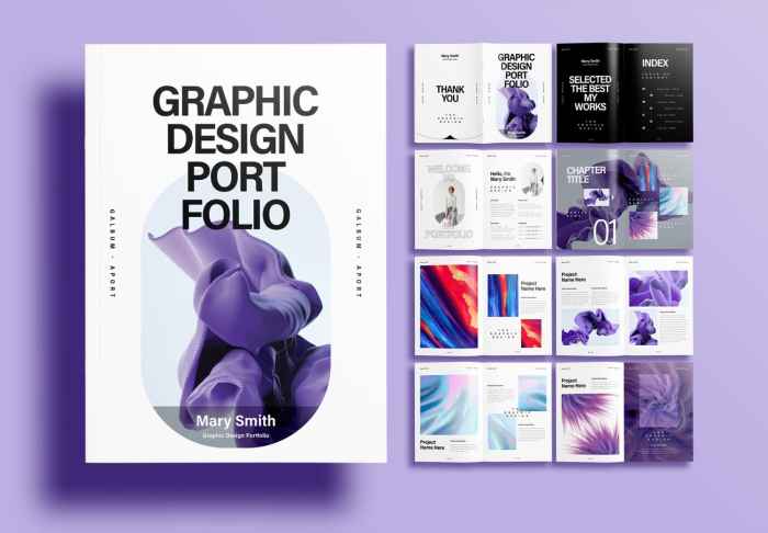
Designing a Sample Newsletter Layout
Let’s create a simple newsletter layout to illustrate the use of master pages and layers. First, we’ll set up a master page to contain consistent elements like headers, footers, and page numbers. This ensures uniformity across all pages. We’ll then create layers to organize content—one for the header, one for the body text, and another for images. This layered approach allows for easy editing and modification without affecting other elements. For example, imagine a two-column newsletter with a header containing the publication name and date. The master page would contain these elements. Subsequently, individual articles would be placed on separate layers within each page, making it easy to rearrange or edit individual sections.
Using Text Boxes, Image Frames, and Object Styles
Efficient layout design relies heavily on the effective use of text boxes, image frames, and object styles. Creating text boxes allows for precise control over text placement and formatting. Similarly, image frames enable accurate image positioning and scaling. Object styles, on the other hand, are a powerful tool for maintaining consistency in the appearance of elements throughout the document. For instance, all headings could use a specific object style, ensuring uniform font, size, and color. This significantly speeds up the design process and maintains a consistent brand identity. Consider a scenario where you need to change the font of all headings; with object styles, you simply modify the style itself, and all instances are automatically updated.
Utilizing InDesign’s Grid System and Guides
InDesign’s grid system and guides are invaluable for achieving professional alignment and consistency. The grid provides a structured framework for arranging elements, ensuring visual harmony and readability. Guides act as visual aids, helping to precisely align elements within the grid. Different grid configurations can significantly impact the layout’s feel and functionality.
| Grid Configuration | Impact on Layout |
|---|---|
| Column Grid (2 columns) | Creates a balanced layout suitable for text-heavy content, like articles or newsletters. |
| Row Grid (with margins) | Provides a framework for consistent spacing between rows of content, enhancing readability. |
| Combined Column and Row Grid | Offers a comprehensive structure for complex layouts, combining the benefits of both column and row grids. |
Applying Paragraph and Character Styles for Brand Consistency
Paragraph and character styles are fundamental to maintaining brand consistency and streamlining the editing process. Paragraph styles control the overall formatting of paragraphs (indentation, spacing, etc.), while character styles govern the formatting of individual characters (font, size, color, etc.). By creating and applying these styles consistently, you ensure that your document maintains a unified and professional appearance. For example, a specific paragraph style might be created for body text, specifying font, size, leading, and paragraph spacing. Similarly, a character style might be used for emphasis, applying bold or italic formatting. This ensures consistent application of styling across the entire document, minimizing manual adjustments and maintaining a consistent brand identity.
Designing Effective Layouts
Effective layout design is crucial for creating professional and engaging publications. A well-designed layout guides the reader’s eye, enhances readability, and ultimately strengthens your message. This section explores key principles and techniques for achieving visually appealing and impactful layouts in InDesign.
Typography’s Role in Layout Design
Typography is more than just choosing a font; it’s about establishing a visual rhythm and hierarchy that enhances readability and reflects the publication’s tone. Careful consideration of font selection, size, weight, and spacing contributes significantly to the overall aesthetic and effectiveness of the layout.
- Font Selection: Choose fonts that are legible and appropriate for your target audience and publication type. Serif fonts are often preferred for body text, while sans-serif fonts are commonly used for headings and titles.
- Font Size and Weight: Varying font sizes and weights creates visual hierarchy, guiding the reader’s eye to important information. Larger, bolder fonts are used for headings, while smaller, lighter fonts are used for body text.
- Leading and Kerning: Adjusting leading (line spacing) and kerning (space between individual letters) improves readability and visual appeal. Proper spacing prevents text from appearing cramped or overly spaced.
- Tracking: Adjusting the overall spacing between characters within a word or line can enhance the visual balance and readability of text blocks.
Whitespace and Visual Hierarchy
Whitespace, often overlooked, is a powerful design element. It provides visual breathing room, preventing the layout from feeling cluttered and improving readability. Visual hierarchy guides the reader’s eye through the content, emphasizing key information.
- Whitespace: Strategically placed whitespace separates elements, creating visual breathing room and improving readability. It also helps to establish a sense of order and balance.
- Visual Hierarchy: Use size, weight, color, and placement to create a clear visual hierarchy. Important elements should be prominently displayed, while less important elements should be less prominent.
- Margins and Gutters: Consistent margins and gutters create a sense of order and professionalism. They also provide visual separation between different sections of the layout.
Layout Styles: Grid-Based vs. Asymmetrical
Different layout styles suit different purposes. Grid-based layouts offer structure and consistency, while asymmetrical layouts provide more flexibility and visual interest.
| Layout Style | Advantages | Disadvantages |
|---|---|---|
| Grid-Based | Provides structure, consistency, and readability; easy to maintain visual balance. | Can feel rigid or restrictive; may require more planning and effort. |
| Asymmetrical | Offers flexibility and visual interest; allows for more creative freedom. | Requires careful planning to maintain visual balance; can be more challenging to design. |
Creating Visually Appealing and Balanced Layouts
Achieving a balanced and visually appealing layout involves integrating color theory, imagery, and thoughtful placement.
- Color Theory: Understanding color theory helps create harmonious and impactful color palettes. Consider using complementary, analogous, or triadic color schemes to create visually appealing combinations.
- Imagery: High-quality images enhance visual appeal and engage the reader. Choose images that are relevant to your content and that complement the overall design.
- Image Placement: Strategically place images to create visual interest and guide the reader’s eye. Consider using images as focal points or to break up large blocks of text.
- Rule of Thirds: Applying the rule of thirds, a principle of photography, can help create visually balanced and engaging compositions within your layout.
Design Mockups: Applying Principles to Different Publications
The following are descriptions of design mockups illustrating the application of design principles.
- Brochure Mockup: A tri-fold brochure showcasing a new product line uses a grid-based layout for consistency. High-quality product images are placed strategically using the rule of thirds, and a clear visual hierarchy is established through font sizes and weights. A harmonious color palette, based on the brand’s colors, enhances the overall aesthetic appeal.
- Poster Mockup: A poster advertising a music festival employs an asymmetrical layout to create a dynamic and eye-catching design. Bold typography and vibrant colors draw attention to key information, while strategically placed imagery enhances the overall visual impact. Whitespace is used effectively to prevent the design from feeling cluttered.
- Book Mockup: A book cover design utilizes a clean and simple layout with a strong visual hierarchy. The title is prominently displayed in a large, bold font, while the author’s name and a captivating image are placed strategically to create visual balance. A subtle color palette ensures that the design is both elegant and professional.
Exporting and Preparing Files for Print or Digital Distribution

Successfully designing a layout in InDesign is only half the battle. The final step, and a crucial one, involves exporting your work for its intended purpose – whether that’s high-quality print or seamless online distribution. This process requires careful attention to detail to ensure your design’s integrity and visual appeal are maintained across different platforms. Proper export settings are key to achieving professional results.
Exporting your InDesign file involves choosing the correct file format and settings depending on the final output. For print, this means selecting a high-resolution format and appropriate color profile; for web, the focus shifts to optimized file sizes and potentially interactive elements. This section will guide you through the essential steps and considerations for each scenario.
Exporting for Print
Exporting for print necessitates prioritizing high resolution and color accuracy. InDesign allows exporting to various formats, but PDF/X-1a is generally preferred for professional printing. This format ensures color consistency and compatibility across different printing presses. The resolution should be at least 300 DPI (dots per inch) for optimal print quality. Selecting the correct color profile (e.g., CMYK) is also vital for accurate color reproduction, avoiding unexpected shifts from your screen display to the printed page. Failure to select the correct color profile can result in significant color discrepancies. For example, a design that looks vibrant on your monitor might appear dull or washed out in print if the wrong color space is used.
Preflighting InDesign Documents
A preflight checklist is an essential step before sending your InDesign file to print. This process involves a thorough review of your document to identify and correct potential problems that could cause delays or errors during printing. A preflight check helps to catch issues like missing fonts, low-resolution images, or color profile inconsistencies before they impact the final product. This can save you time, money, and potential frustration.
Here’s a sample preflight checklist:
- Verify all fonts are embedded or Artikeld.
- Check image resolutions (minimum 300 DPI for print).
- Confirm correct color profile (e.g., CMYK) is used.
- Inspect for any overset text or missing links.
- Review bleed settings to ensure proper margins.
- Examine the document for any unexpected color shifts or artifacts.
- Check for any potential trapping issues (overlapping colors).
Exporting for Web and Digital Platforms
Exporting for digital platforms offers more flexibility in file formats. Common choices include JPEGs for images, PNGs for images with transparency, and interactive PDFs for documents requiring clickable links or animations. For web use, optimizing file sizes is critical to ensure fast loading times. This involves using appropriate compression settings for images and minimizing the file size of the exported document. For interactive PDFs, InDesign allows the inclusion of hyperlinks, buttons, animations, and even videos, making them ideal for engaging digital content. A well-designed interactive PDF can enhance user engagement and improve information accessibility.
File Format Comparison
The optimal file format depends heavily on the intended output. The table below summarizes the best choices for various applications:
| Output Method | Optimal File Format | Rationale |
|---|---|---|
| PDF/X-1a | Industry standard for print, ensuring color consistency and compatibility. | |
| Web (Images) | JPEG (for photographs), PNG (for graphics with transparency) | JPEG offers good compression for photographs; PNG preserves transparency for logos and illustrations. |
| Web (Documents) | Preserves formatting and ensures consistent display across different browsers and devices. | |
| Digital Distribution (Interactive) | Interactive PDF | Allows for inclusion of hyperlinks, buttons, animations, and other interactive elements. |
Ultimate Conclusion
By mastering InDesign’s interface, applying effective layout principles, and understanding the export process, you’ll be well-equipped to create professional-quality designs for a variety of applications. This guide has provided a solid foundation; continued practice and exploration of InDesign’s advanced features will further refine your skills and allow you to confidently tackle increasingly complex design projects. Remember, consistent application of these principles will lead to polished and impactful results.