Mastering web design hinges on understanding grid systems. This guide unveils five key secrets to achieving structural harmony in your layouts. We’ll explore fundamental principles, delve into practical application across various content types, and uncover advanced techniques to create visually appealing and responsive websites that seamlessly adapt to any screen size.
From basic column-based structures to the power of flexible grid systems and CSS frameworks like Flexbox and Grid, we’ll cover it all. Learn how to leverage gutters and margins effectively, navigate common challenges, and even build a responsive image gallery. This guide provides a comprehensive approach, equipping you with the skills to design elegant and functional websites.
Understanding Grid Systems Fundamentals
Grid systems are the backbone of effective web design, providing a structured and organized approach to arranging content. They ensure consistency, readability, and responsiveness across various screen sizes, ultimately enhancing the user experience. A well-implemented grid system allows for efficient content placement and a visually appealing layout, even with complex designs.
Grid systems provide a framework for aligning and spacing elements on a webpage, preventing a haphazard and cluttered appearance. They help designers create a visual hierarchy, guiding the user’s eye to important information first. This structured approach not only improves aesthetics but also contributes to better website usability and accessibility.
Types of Grid Systems
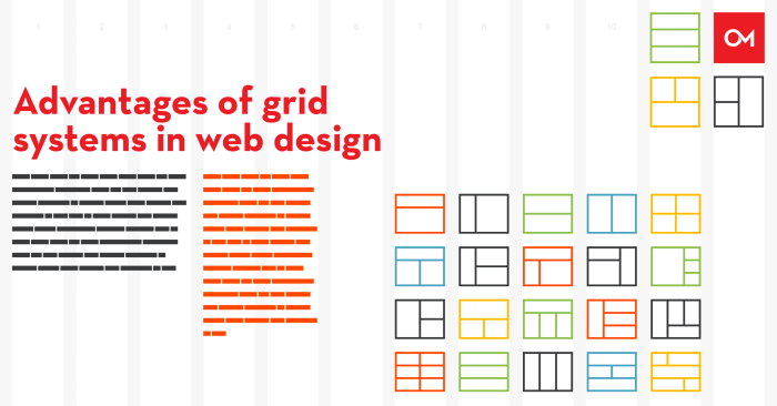
Several grid system types cater to different design needs. Column-based grids, the most common type, divide the page into vertical columns, providing a straightforward way to arrange content. Modular grids extend this concept by incorporating rows, creating a matrix for precise content placement. Fluid grids, designed for responsiveness, adjust their column widths based on the screen size, ensuring optimal viewing on various devices. Finally, hybrid grids combine elements from different grid types to offer a flexible and adaptable layout solution.
Examples of Grid System Implementation
Many successful websites leverage grid systems to achieve their visual appeal and functionality. For instance, consider the layout of a news website. A column-based grid typically features a main content column alongside smaller columns for sidebars, advertisements, and navigation. This clear separation improves readability and allows users to easily scan the page. E-commerce websites often utilize modular grids to create a visually appealing product catalog, arranging items neatly within rows and columns. A responsive design, employing a fluid grid, ensures that the catalog remains user-friendly on both desktop and mobile devices.
Designing a Webpage Layout with a 12-Column Grid
Let’s design a simple webpage using a 12-column grid. Imagine a website showcasing product categories. We’ll use a responsive 4-column table to display these categories.
| Category | Description | Image | Link |
|---|---|---|---|
| Electronics | Smartphones, Laptops, TVs | [Imagine an image of various electronics here] | Shop Now |
| Clothing | Shirts, Pants, Dresses | [Imagine an image of clothing items here] | Shop Now |
| Books | Fiction, Non-fiction, Textbooks | [Imagine an image of various books here] | Shop Now |
| Home Goods | Furniture, Decor, Kitchenware | [Imagine an image of home goods here] | Shop Now |
This simple table, within a 12-column grid, could occupy 12 columns on larger screens. On smaller screens, it would responsively adapt, perhaps stacking the columns vertically for better mobile viewing. The table’s responsive behavior is crucial for ensuring optimal user experience across devices. Each column in the table could be assigned a specific number of grid columns depending on the desired layout and screen size. For example, on larger screens, the “Image” column might take up 4 columns, while the “Description” column might occupy 6. On smaller screens, these would stack vertically. This illustrates the adaptability and effectiveness of a 12-column grid system in creating a responsive layout.
Mastering Grid System Application

Applying grid systems effectively is crucial for creating visually appealing and user-friendly websites and applications. Understanding how to adapt grid structures to various content types and screen sizes is key to achieving structural harmony and a consistent user experience. This section delves into best practices for implementing grid systems, emphasizing responsive design and the role of spacing elements.
Grid systems provide a robust framework for organizing diverse content types. Their inherent structure simplifies the process of arranging elements, ensuring consistency and visual balance across different platforms.
Applying Grid Systems to Different Content Types
Effective grid application depends on understanding the unique characteristics of each content type. Text, images, and videos each require specific considerations to ensure optimal presentation within the grid structure. For example, text blocks often benefit from consistent line heights and margins, while images may need to be resized or cropped to fit the grid’s proportions. Videos usually require dedicated containers to maintain aspect ratios and avoid distortion. Careful consideration of these nuances leads to a cohesive and visually pleasing layout.
Responsive Design and Grid System Adaptability
Responsive design ensures a website adapts seamlessly to various screen sizes and devices. Grid systems are fundamental to achieving this adaptability. Flexible grid systems, which use percentages or viewport units instead of fixed pixel values, allow the layout to reflow dynamically as the screen size changes. This ensures content remains legible and accessible across desktops, tablets, and smartphones. For instance, a twelve-column grid on a large desktop screen might collapse into a single-column layout on a small mobile phone, prioritizing content readability.
The Role of Gutters and Margins in Visual Harmony
Gutters (the space between columns) and margins (the space around elements) are crucial for establishing visual hierarchy and breathing room within a grid layout. Appropriate spacing prevents elements from feeling cramped and improves readability. Consistent use of gutters and margins creates visual rhythm and harmony, enhancing the overall aesthetic appeal. Experimenting with different gutter and margin sizes can significantly impact the perceived balance and flow of the design. A larger gutter might emphasize individual elements, while smaller gutters promote a more unified look.
Example of a Responsive Website Layout
Imagine a website featuring a three-column layout on a large desktop screen. Each column occupies four units of a twelve-unit grid (12-unit grid system). As the screen size shrinks, the layout might adapt as follows:
* Desktop (large screen): Three columns of equal width (4 units each), separated by gutters.
* Tablet (medium screen): Two columns, each occupying 6 units of the grid. The third column stacks beneath the other two.
* Mobile (small screen): One column, using the full width of the screen. All content stacks vertically.
The flexible grid system allows the columns to resize proportionally to the available screen space, ensuring the layout remains organized and visually appealing regardless of device. The grid units adjust to maintain consistent proportions and relationships between elements. The gutters might also adjust dynamically to maintain visual balance; they could become smaller on smaller screens to prevent excessive whitespace.
Advanced Grid System Techniques

Mastering basic grid systems is only the first step. To create truly sophisticated and adaptable layouts, we need to explore more advanced techniques and address the challenges that arise when complexity increases. This section delves into these advanced techniques, focusing on combining different approaches, troubleshooting common issues, and leveraging CSS features like Flexbox and Grid for enhanced functionality.
Complex layouts often require combining different grid approaches to achieve the desired visual hierarchy and responsiveness. For example, a site might use a 12-column grid for the main content area, but then employ a different, perhaps simpler, grid system within specific sections, like a sidebar or a featured image area. This allows for flexibility and prevents a rigid, overly structured design from hindering creative freedom. Understanding when to switch between different grid systems, or even to abandon a grid system altogether for specific elements, is a key skill for advanced grid design.
Comparing Different Approaches to Complex Layouts
Several strategies exist for managing complex layouts within a grid system. One common approach involves nesting grids: placing a smaller grid system within a cell of a larger grid. This is useful for creating intricate layouts within specific sections of a page. Another method is to combine grid systems with Flexbox, leveraging Flexbox’s flexibility for alignment and distribution within individual grid cells. This hybrid approach combines the strengths of both systems, offering powerful control over layout. Finally, a purely CSS Grid approach can be used for complex layouts, particularly when dealing with intricate arrangements that require precise control over row and column sizing and placement.
Addressing Challenges in Grid System Implementation
While grid systems offer significant advantages, they present challenges. One common issue is managing responsive design. A grid that works perfectly on a desktop might collapse or look awkward on a smaller screen. Solutions include using media queries to adjust the grid’s structure at different breakpoints, utilizing flexible units like percentages or viewport units (vw, vh), and employing responsive grid frameworks that handle responsiveness automatically. Another challenge is maintaining consistency across different sections and pages. Careful planning and the use of CSS variables (or preprocessors like Sass or Less) can help enforce consistent styles and spacing throughout the website.
Enhancing Grid System Functionality with Advanced CSS Techniques
Flexbox and CSS Grid are powerful tools that can significantly enhance a grid system’s capabilities. Flexbox excels at aligning and distributing items within a container, making it ideal for handling items within individual grid cells or for creating responsive headers and footers. CSS Grid, on the other hand, is better suited for defining the overall page layout and managing the relationships between major sections. Combining these two technologies allows for precise control over both the overall structure and the internal arrangement of elements within that structure. For example, a main content area could be defined with CSS Grid, while individual modules within that area could utilize Flexbox for internal arrangement.
Implementing a Responsive Image Gallery with a Grid System
Let’s build a responsive image gallery. We’ll use a simple 3-column grid for larger screens, collapsing to a single column on smaller screens. This example utilizes CSS Grid for its responsiveness and simplicity.
First, the HTML structure:
<div class="gallery">

  <img src="image1.jpg" alt="Image 1">

  <img src="image2.jpg" alt="Image 2">

  <img src="image3.jpg" alt="Image 3">

  <img src="image4.jpg" alt="Image 4">

  <img src="image5.jpg" alt="Image 5">

  <img src="image6.jpg" alt="Image 6">

</div>
Then, the CSS:
.gallery

  display: grid;

  grid-template-columns: repeat(auto-fit, minmax(250px, 1fr));

  grid-gap: 10px;
@media (max-width: 600px)
.gallery
grid-template-columns: 1fr;
This code creates a responsive gallery. `grid-template-columns: repeat(auto-fit, minmax(250px, 1fr));` ensures that the images are distributed across as many columns as fit within the available width, with a minimum width of 250px. The media query adjusts the layout to a single column on smaller screens.
Final Summary

By understanding and implementing the principles of grid systems, you’ll elevate your web design capabilities significantly. This guide has equipped you with the foundational knowledge and advanced techniques necessary to create responsive, visually appealing, and structurally sound websites. Remember, mastering grid systems isn’t just about technical proficiency; it’s about creating a harmonious user experience. Practice these techniques, experiment with different approaches, and watch your designs flourish.