In today’s mobile-centric world, designing for mobile first is no longer a best practice; it’s a necessity. This approach prioritizes the mobile user experience, ensuring a seamless and intuitive interaction across all devices. By focusing on the core elements and functionality on smaller screens, developers can then scale up to larger displays, creating a responsive design that adapts beautifully to any screen size. This approach offers significant advantages, including improved performance, enhanced user experience, and easier maintenance.
This guide delves into five key principles that will empower you to create truly responsive websites, optimized for mobile devices. We’ll explore the core tenets of mobile-first design, comparing and contrasting it with desktop-first methodologies. We’ll cover practical techniques like implementing fluid layouts using CSS media queries and optimizing images for faster loading times. Crucially, we will also discuss user experience considerations specific to mobile, ensuring your designs are not only visually appealing but also intuitive and user-friendly.
Understanding Mobile-First Design Principles

Mobile-first design prioritizes the creation of a website or application experience specifically for mobile devices first, then scaling up to larger screens. This contrasts sharply with the traditional desktop-first approach, which often leads to cumbersome and less user-friendly mobile experiences. The core tenet lies in optimizing for the smallest screen size initially, ensuring a core, functional experience before adding complexity for larger screens. This approach leads to several advantages, including improved user experience on mobile devices, faster loading times, and easier maintenance.
Mobile-first design ensures a streamlined and efficient user journey on mobile devices, which are increasingly the primary access point for the internet. By starting with the most constrained environment, developers are forced to focus on essential content and functionality, leading to a cleaner and more intuitive interface for all users. This approach often results in faster loading times, a critical factor for user engagement and search engine optimization (). Furthermore, a well-structured mobile-first design is inherently more maintainable, as the core codebase remains concise and easier to update.
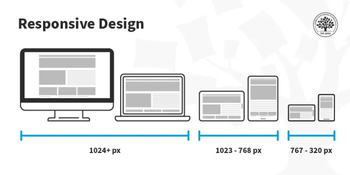
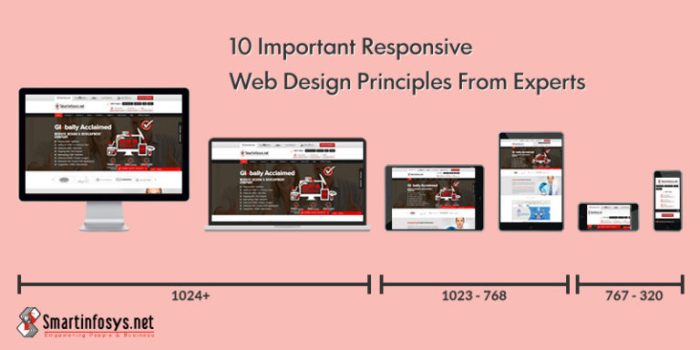
Mobile-First versus Responsive Design
Mobile-first and responsive design are closely related but distinct methodologies. Responsive design adapts the layout to different screen sizes using techniques like flexible grids and media queries. Mobile-first design is a *subset* of responsive design, emphasizing the prioritization of mobile as the primary design focus. Consider the example of a news website. A purely responsive design might start with a desktop layout and then adjust for smaller screens. A mobile-first approach would prioritize a clean, easily navigable mobile experience and then add features for larger screens. Conversely, a website like Medium uses a responsive design, adjusting content flow to accommodate various devices, whereas a simple, mobile-optimized blog could be considered a more pure example of a mobile-first approach.
Challenges of Mobile-First Design and Their Solutions
Adopting a mobile-first workflow presents some challenges. One common hurdle is the potential for reduced initial visual appeal on larger screens. The design, initially optimized for small screens, might seem simplistic or lacking detail when viewed on a desktop. However, this can be mitigated by carefully planning the progressive enhancement of content for larger screens. Another challenge lies in the potential for developers accustomed to desktop-first approaches to need time to adjust their thinking. This can be addressed through training and the adoption of design tools specifically tailored to mobile-first workflows. Finally, the need for thorough testing across a wide range of devices and screen sizes is crucial. This requires access to various devices or emulators and robust testing procedures.
Hypothetical E-commerce Mobile-First Website Layout
The following table illustrates a hypothetical mobile-first layout for an e-commerce platform, focusing on clear product presentation and ease of navigation. The design prioritizes a single column layout on mobile, expanding to two columns on larger screens.
| Product Image | Product Description |
|---|---|
 |
Product NameShort, compelling product description. Highlight key features and benefits. Price: $XX.XX
|
|
Product NameShort, compelling product description. Highlight key features and benefits. Price: $XX.XX
|
Implementing Responsive Design Techniques

Creating websites that seamlessly adapt to various screen sizes is crucial for a positive user experience. Responsive design ensures your website looks and functions optimally, whether viewed on a desktop monitor, tablet, or smartphone. This involves employing several key techniques to create fluid layouts and optimize performance across devices.
Responsive design is not simply about shrinking content; it’s about strategically adapting the layout and content delivery to best suit the device’s capabilities and the user’s context. This requires a deep understanding of CSS, HTML, and the principles of responsive design itself. We’ll explore techniques that empower you to build websites that are not only visually appealing but also performant and user-friendly across all platforms.
Fluid Layouts and Percentage-Based Units
The foundation of responsive design lies in utilizing relative units instead of fixed pixel values. By using percentage-based widths and heights for elements, the layout automatically adjusts to the available screen size. For instance, instead of setting a div’s width to `width: 800px;`, use `width: 80%;`. This ensures the div occupies 80% of its container’s width, regardless of the container’s size. This flexibility allows elements to scale proportionally, maintaining a consistent visual balance across different screen sizes. Combining this with flexible box model (flexbox) and grid layout techniques provides unparalleled control over layout responsiveness.
CSS Media Queries
CSS media queries are the heart of responsive design. They allow you to apply different styles based on specific characteristics of the device, such as screen width, screen height, orientation, and even device type. This enables you to create tailored layouts for different screen sizes and user experiences. For example, you can hide certain elements on smaller screens to improve readability or rearrange elements for better mobile usability.
Here are a few examples of media query implementations:
/* Styles for screens wider than 768px */
@media (min-width: 768px)
  .container
    width: 960px;
    margin: 0 auto;


/* Styles for screens narrower than 768px */
@media (max-width: 767px)
  .container
    width: 90%;
    margin: 0;

  .sidebar
    display: none; /* Hide the sidebar on smaller screens */


/* Styles for portrait orientation */
@media (orientation: portrait)
  body
    font-size: 14px;
Responsive Images
Images are often the largest contributors to a website’s load time. Using responsive image techniques is critical for optimizing performance on mobile devices. This involves using the `` tag to provide different image sizes for different screen resolutions. The browser then selects the most appropriate image based on the device’s capabilities, resulting in faster loading times and reduced data usage. For example:
<picture>
  <source media="(min-width: 768px)" srcset="large.jpg">
  <source media="(min-width: 480px)" srcset="medium.jpg">
  <img src="small.jpg" alt="Responsive Image">
</picture>
Comparison of CSS Frameworks
Several CSS frameworks simplify the process of building responsive websites. Each framework offers different advantages and disadvantages depending on project needs and developer preferences. The following table compares three popular frameworks:
| Framework Name | Pros | Cons | Example Use Case |
|---|---|---|---|
| Bootstrap | Large community, extensive documentation, pre-built components | Can be bulky, learning curve for customization | Large-scale enterprise applications, projects requiring rapid prototyping |
| Tailwind CSS | Highly customizable, utility-first approach, excellent performance | Steeper learning curve, requires more manual CSS writing | Projects requiring highly specific design, performance-critical applications |
| Foundation | Robust grid system, comprehensive component library, accessible design features | Can be less flexible than Tailwind CSS, larger file size than some alternatives | Projects needing a strong grid system and accessibility features |
Optimizing for Mobile User Experience
Creating a positive mobile user experience is paramount for the success of any mobile-first website. It requires careful consideration of how users interact with smaller screens, limited processing power, and varying network conditions. Optimizing for mobile goes beyond simply making a website responsive; it involves a deep understanding of mobile user behavior and preferences.
Mobile users interact differently than desktop users. They are often on the go, multitasking, and have shorter attention spans. Therefore, designing for mobile necessitates a focus on intuitive navigation, quick loading times, and easily digestible content. Failure to prioritize these aspects can lead to high bounce rates and a negative user experience.
Touch Interactions and Navigation
Effective mobile navigation hinges on intuitive touch interactions. Buttons should be large enough to easily tap with a finger, and menus should be logically organized and easily accessible. Common mobile navigation patterns include hamburger menus (three horizontal lines indicating a hidden menu), tab bars (located at the bottom of the screen), and side drawers (menus that slide in from the side). The choice of navigation pattern depends on the website’s complexity and content structure. A simple website might only need a tab bar, while a more complex website might benefit from a combination of a hamburger menu and a search bar. Avoid overly complex nested menus that require multiple taps to access information. Instead, prioritize clear visual hierarchy and intuitive information architecture.
Mobile Website Loading Speed and Performance
Slow loading speeds are a significant barrier to user engagement on mobile devices. Users expect immediate results, and slow-loading websites lead to frustration and abandonment. Optimizing for speed involves several strategies. Image optimization is crucial; images should be compressed without sacrificing quality. This can be achieved through tools that reduce file size while maintaining visual fidelity. Code minification reduces the size of CSS and JavaScript files, improving load times. Caching mechanisms store frequently accessed resources locally, reducing server requests and improving responsiveness. Leveraging Content Delivery Networks (CDNs) distributes website content across multiple servers, ensuring faster delivery to users regardless of their geographical location. For example, a large e-commerce website using a CDN will experience significantly faster load times for users globally compared to a website relying solely on a single server.
Effective Mobile Navigation Patterns
Several effective mobile navigation patterns exist, each with its strengths and weaknesses. Hamburger menus are compact but can hide important content. Tab bars provide quick access to key sections but are limited in the number of items they can display effectively. Side drawers offer a comprehensive menu but can obscure content. The best choice depends on the specific website and its content. For a blog, a simple tab bar with categories might suffice. For an e-commerce site, a combination of a search bar, a hamburger menu, and a tab bar for key sections (e.g., home, cart, account) would likely be more appropriate. The key is to ensure that navigation is intuitive, easily accessible, and consistent throughout the user experience.
Mobile-First Landing Page Design
A mobile-first landing page prioritizes a clear call to action (CTA). Consider a landing page for a mobile app promoting productivity.
* Headline: A concise and compelling headline highlighting the app’s core benefit (“Boost Your Productivity with [App Name]”). Purpose: Immediately grabs attention and communicates value.
* Subheadline: Expands on the headline, providing more detail about the app’s functionality (“Organize your tasks, manage your time, and achieve your goals effortlessly”). Purpose: Provides context and elaborates on the headline’s promise.
* Hero Image/Video: A high-quality, visually appealing image or short video demonstrating the app in action. Purpose: Visually reinforces the headline and subheadline, showcasing the app’s benefits.
* Call to Action Button: A prominent, clearly labeled button encouraging users to download the app (“Download Now”). Purpose: Guides users towards the desired action.
* Short, Concise Text: Bullet points outlining key features and benefits. Purpose: Quickly communicates the app’s value proposition without overwhelming the user.
* Social Proof (Optional): Testimonials or ratings to build trust and credibility. Purpose: Encourages users to take action by showing the app is well-regarded.
The visual hierarchy is designed to guide the user’s eye towards the CTA button. Information architecture prioritizes clarity and conciseness, ensuring that the key message is easily understood and acted upon. The design utilizes ample white space to avoid visual clutter and enhance readability.
Conclusive Thoughts
Mastering mobile-first design is about more than just resizing elements; it’s about understanding user behavior on smaller screens and prioritizing a streamlined, efficient experience. By adopting the five principles Artikeld in this guide – from understanding core tenets to optimizing for speed and user experience – you can create websites that are not only responsive but also engaging and effective across all platforms. Remember, a mobile-first approach isn’t just about adapting to smaller screens; it’s about building a better user experience from the ground up.