Asymmetry, often overlooked in design, offers a powerful tool for creating visually captivating and dynamic compositions. Breaking free from the symmetry’s predictable balance allows for a sense of movement, energy, and unexpected visual interest. This guide explores ten key tips to master asymmetrical design, transforming static layouts into engaging visual experiences.
We will delve into the fundamental principles of asymmetrical balance, examining how contrasting shapes, sizes, colors, and visual weight contribute to a successful composition. Through practical examples and clear explanations, you’ll learn how to guide the viewer’s eye, create visual tension, and evoke specific moods using this versatile technique. Whether you’re a seasoned designer or just starting out, understanding asymmetry unlocks a new level of creative potential.
Understanding Asymmetrical Balance
Asymmetrical balance, in contrast to its symmetrical counterpart, achieves visual equilibrium not through mirroring but through the careful arrangement of elements with differing visual weights. It’s a dynamic and often more engaging approach to composition, creating a sense of movement and visual interest. This principle relies on the interplay of various design elements to create a feeling of balance, even when the elements aren’t identical or mirrored.
Asymmetrical balance is achieved by counterbalancing elements of different sizes, shapes, colors, and textures. A large, dark element, for example, might be balanced by several smaller, lighter elements strategically placed. The key is to understand visual weight and how different elements contribute to the overall feeling of balance in a composition.
Examples of Asymmetrical Balance in Nature and Art
Asymmetrical balance is prevalent throughout nature. Consider the branches of a tree; they rarely mirror each other perfectly, yet the overall form feels balanced. Similarly, the human face, while possessing some symmetrical features, ultimately achieves its unique beauty through asymmetrical elements like the subtle differences between the two eyes or the slight curve of the mouth. In art, many famous paintings utilize asymmetrical balance to great effect. For example, the composition of many works by Vincent van Gogh, with their bold brushstrokes and off-center subjects, showcase the dynamic energy of asymmetrical arrangements. Think of the swirling movement in “Starry Night” – the visual weight is distributed across the canvas in a non-mirrored yet balanced way.
Visual Representation of Symmetrical and Asymmetrical Compositions
Imagine a simple composition: a square. A symmetrical design would feature an identical square placed directly opposite, creating a mirrored image. The visual weight is evenly distributed, creating a sense of stability and formality. Now, consider an asymmetrical composition. Replace one of the squares with a group of three smaller, differently colored circles arranged in a triangular formation. While not mirroring the original square, the visual weight of the three circles, taken together, could potentially balance the single square, creating a sense of dynamic equilibrium. The symmetrical composition is static, predictable; the asymmetrical is active, intriguing.
Visual Weight in Symmetrical vs. Asymmetrical Designs
In symmetrical designs, visual weight is evenly distributed. Elements are balanced by their mirrored counterparts, resulting in a stable, often formal composition. This balance is easily perceived and understood. In asymmetrical designs, visual weight is distributed unevenly. Balance is achieved by counterbalancing elements of different visual weights – a large, dark element might be balanced by several smaller, lighter elements, or a centrally positioned element could be balanced by several smaller elements placed strategically around it. This creates a more dynamic and engaging composition, but requires a more careful consideration of the visual weight of each element.
Techniques for Achieving Asymmetrical Balance
| Technique | Description | Example | Visual Impact |
|---|---|---|---|
| Visual Weight | Balancing elements of varying size, color, and texture. Larger, darker, or more complex elements carry more weight. | A large dark shape balanced by several smaller, lighter shapes. | Dynamic and engaging; creates visual interest. |
| Placement | Strategic positioning of elements to counterbalance each other. Off-center placement can create a sense of movement and energy. | A single large object positioned off-center, balanced by smaller elements clustered on the opposite side. | Creates a sense of visual flow and movement. |
| Color and Value | Using contrasting colors or values to create visual interest and balance. Darker colors generally carry more weight than lighter colors. | A bright, small shape balanced by a dark, larger shape. | Creates visual harmony through contrast. |
| Texture and Pattern | Employing contrasting textures or patterns to add visual interest and balance. A busy pattern might balance a simple, smooth texture. | A textured element balanced by a smooth element. | Adds depth and complexity to the composition. |
Creating Visual Interest with Asymmetry
Asymmetry, unlike its symmetrical counterpart, introduces a dynamic tension and visual intrigue to a composition. By deliberately avoiding perfect balance, we create designs that are more engaging, unexpected, and ultimately, more memorable. This inherent unpredictability keeps the viewer’s eye moving, exploring the interplay of elements and discovering the subtle nuances of the design.
Asymmetry achieves visual balance not through mirroring, but through a careful orchestration of contrasting elements. This allows for a greater sense of freedom and creativity, resulting in designs that are both visually stimulating and aesthetically pleasing.
Contrasting Elements in Asymmetrical Balance
The key to successful asymmetrical compositions lies in the skillful use of contrast in shape, size, and color. Contrasting shapes, such as sharp geometric forms juxtaposed with organic curves, create visual interest and prevent monotony. Similarly, varying the size of elements – placing a small element next to a large one – introduces a sense of scale and dynamism. Color contrast, whether through complementary hues or high-contrast pairings, further enhances the visual impact and guides the viewer’s gaze. Consider a design featuring a bold red circle dominating one side of the composition, balanced by a cluster of smaller, cool-toned shapes on the other. The red circle immediately draws the eye, but the cool tones prevent the composition from feeling unbalanced. The eye is then guided to explore the other elements, creating a visual journey.
Guiding the Viewer’s Eye
Asymmetrical compositions naturally lead the viewer’s eye on a path through the design. The placement of elements, their size, and their color all contribute to this visual narrative. For instance, a series of increasingly larger shapes could lead the eye towards a focal point. Alternatively, a line, whether straight or curved, can act as a visual guide, directing attention to specific areas within the composition. A strong diagonal line, for example, can instantly create a sense of movement and direct the viewer’s gaze across the design.
Asymmetrical Compositions: Mood and Style
Below are descriptions of three distinct asymmetrical compositions, each conveying a different mood:
Calm Composition: Imagine a soft, muted palette of blues and greens. A large, oval-shaped element dominates the left side, suggesting a calm body of water. On the right, smaller, irregular shapes representing islands are scattered sparsely, creating a feeling of tranquility and spaciousness. The absence of sharp lines and the gentle curves of the shapes contribute to the overall sense of peace.
Energetic Composition: This composition uses vibrant, contrasting colors such as bright yellow, orange, and purple. Sharp geometric shapes, such as triangles and squares, are dynamically arranged, overlapping and creating a sense of movement. A strong diagonal line further emphasizes the energy and dynamism of the composition. The variety of shapes and their energetic arrangement convey a feeling of excitement and activity.
Mysterious Composition: A dark, shadowy palette dominates this composition. A large, irregular black shape occupies the center, suggesting an unknown form. Smaller, lighter shapes are subtly placed around it, hinting at details without fully revealing them. The limited color palette and the enigmatic shapes contribute to a sense of mystery and intrigue. The overall darkness and the suggestion of hidden elements create a captivating sense of the unknown.
Arranging Asymmetrical Elements
Let’s consider arranging a large circle, a small square, a tall thin rectangle, and a curved line asymmetrically.
One possible arrangement would place the large circle centrally but slightly off-center, creating a visual anchor. The tall thin rectangle could be positioned vertically near the left edge, acting as a counterweight to the circle’s visual weight. The small square could be nestled within the curve of the line, placed near the bottom right, providing a small but noticeable contrasting shape. The curved line itself could arc gracefully from the top left corner, flowing past the rectangle and connecting visually to the circle, unifying the elements. This placement utilizes both size contrast and strategic positioning to achieve asymmetrical balance. The large circle is visually dominant, but the other elements contribute enough weight to prevent imbalance and guide the eye through a pleasing path.
Applying Asymmetry in Different Design Contexts

Asymmetry, far from being chaotic, offers a powerful tool for creating dynamic and engaging designs across various disciplines. Its successful application hinges on understanding visual weight and balance, allowing designers to guide the viewer’s eye intentionally and create a sense of movement and energy. This section explores how asymmetry manifests in different design fields and highlights key considerations for its effective use.
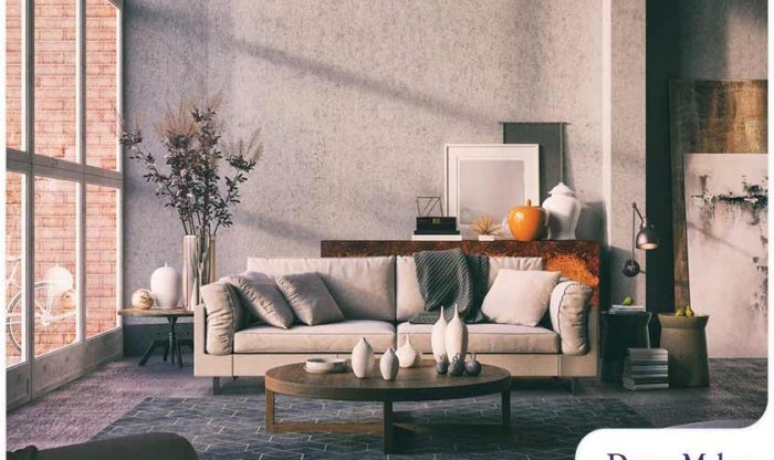
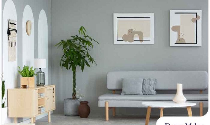
The principles of asymmetrical balance translate seamlessly across diverse design contexts. In graphic design, asymmetrical layouts can be used to create striking posters, brochures, and logos. Web design benefits from asymmetry to break the monotony of symmetrical grids, leading to more engaging and user-friendly interfaces. Interior design utilizes asymmetrical arrangements of furniture and decor to generate visual interest and a sense of dynamism within a space. Even in photography, the skillful use of asymmetry can lead to captivating compositions that draw the viewer into the scene.
The Rule of Thirds in Asymmetrical Compositions
The rule of thirds, a fundamental principle in photography and composition, provides a practical framework for creating asymmetrical balance. By dividing the design space into nine equal parts using two equally-spaced horizontal and two equally-spaced vertical lines, key elements are strategically placed at the intersections of these lines or along the lines themselves, rather than centrally. This creates a more natural and visually appealing composition than a perfectly symmetrical one. For example, in a landscape photograph, the horizon might be placed along the upper horizontal line, while the main subject, such as a tree or building, is positioned at one of the lower intersection points. This offsetting creates a more dynamic and engaging image than simply centering the horizon.
Common Pitfalls to Avoid When Using Asymmetry
While asymmetry offers great creative potential, it’s crucial to avoid certain pitfalls. Overusing asymmetry can lead to a chaotic and unbalanced design. Failing to consider visual weight – the perceived heaviness or lightness of design elements based on factors like size, color, and shape – can result in a composition that feels unstable or unsettling. Ignoring the interplay of positive and negative space can also create an unbalanced or cluttered look. Careful planning and iterative refinement are essential to avoid these common mistakes.
Examples of Asymmetrical Compositions in Different Design Styles
Asymmetry is not limited to a specific design style; it can enhance minimalist, modern, and traditional aesthetics. A minimalist design might feature a single, large, off-center image against a vast expanse of white space. A modern design might employ bold, contrasting colors and shapes arranged asymmetrically to create a vibrant and energetic feel. A traditional design might use asymmetry subtly, perhaps by placing a focal point slightly off-center within a classically structured layout. The key is to maintain visual balance despite the asymmetrical arrangement.
Visual Representation of an Asymmetrical Web Page Layout
Imagine a web page with a large, high-quality image spanning the entire width near the top, but positioned slightly off-center to the left. Below this, a column of text sits on the left, taking up roughly one-third of the page width. To the right, a smaller column contains related images arranged in a staggered, asymmetrical grid. A call-to-action button is placed prominently in the lower right-hand corner, creating a visual pathway from the top image down through the text and image columns to the button. This arrangement uses visual weight effectively: the large image draws the eye first, then the text, then the smaller images, finally leading to the button. The asymmetrical placement of elements creates a dynamic and engaging visual flow, guiding the user through the page’s content.
Conclusive Thoughts

Mastering asymmetrical design is about more than just avoiding symmetry; it’s about harnessing the power of visual imbalance to create compelling and memorable designs. By understanding the principles of visual weight, utilizing contrasting elements effectively, and consciously guiding the viewer’s eye, you can elevate your work from the ordinary to the extraordinary. Experiment with different techniques, embrace the unexpected, and discover the dynamic possibilities of asymmetrical compositions.