Creating truly inclusive websites benefits everyone. This guide explores ten key guidelines for designing web experiences accessible to all users, regardless of ability. We’ll delve into the principles of WCAG, practical techniques for implementation, and crucial testing methods, ensuring your website welcomes a diverse audience.
From understanding the POUR principles (Perceivable, Operable, Understandable, Robust) to mastering semantic HTML and implementing robust accessibility testing, this guide provides a comprehensive roadmap. We’ll explore the use of assistive technologies and demonstrate how to create websites that are fully navigable with a keyboard, ensuring inclusivity for users with diverse needs.
Understanding Web Accessibility Principles

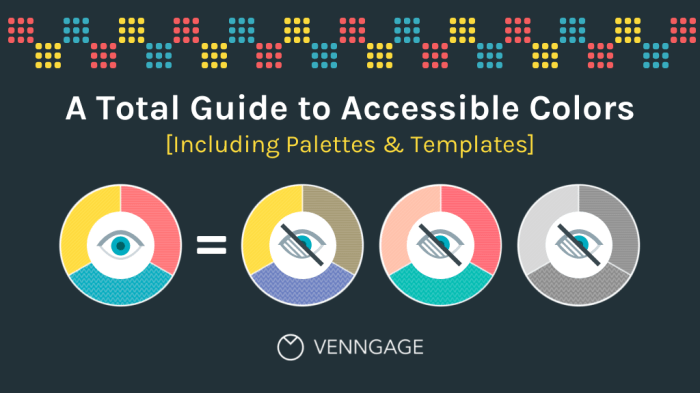
Web accessibility ensures that people with disabilities can perceive, operate, understand, and robustly interact with websites. Designing for accessibility isn’t just about compliance; it’s about creating a more inclusive and user-friendly experience for everyone. This section explores the core principles guiding accessible web design.
The Web Content Accessibility Guidelines (WCAG) are internationally recognized standards for web accessibility. Developed by the World Wide Web Consortium (W3C), WCAG provides a comprehensive set of guidelines and success criteria to ensure websites are usable by people with a wide range of disabilities. Adherence to WCAG demonstrates a commitment to inclusive design and helps organizations avoid legal issues and expand their audience reach.
The POUR Principles
The four principles of POUR (Perceivable, Operable, Understandable, Robust) provide a framework for understanding web accessibility. Each principle addresses a crucial aspect of the user experience, ensuring that content is usable by individuals with various disabilities.
Perceivable: Information and user interface components must be presentable to users in ways they can perceive. This includes providing text alternatives for non-text content (like images and videos with alt text), using sufficient color contrast between text and background, and ensuring that content can be resized without losing functionality. For example, an image of a graph should have alt text describing the data presented, while text should have sufficient contrast to avoid readability issues for users with low vision.
Operable: User interface components and navigation must be operable. This means that all functionality can be accessed through a keyboard, that there are sufficient time limits for users to complete tasks, and that content doesn’t have features that cause seizures. For example, a website should be fully navigable using only a keyboard, eliminating the need for a mouse for all users, including those with motor impairments. Avoid using auto-playing videos with sound, which can be disruptive and disorienting.
Understandable: Information and the operation of the user interface must be understandable. This involves using clear and concise language, providing help and documentation, and ensuring that content is consistent and predictable. For example, avoid using jargon or overly complex sentence structures. Make sure instructions are clear and easy to follow, and that navigation is intuitive and predictable.
Robust: Content must be robust enough that it can be interpreted reliably by a wide variety of user agents, including assistive technologies. This means using valid HTML and CSS, ensuring compatibility across different browsers and devices, and avoiding the use of deprecated technologies. For example, using semantic HTML5 elements (like <article>, <nav>, <aside>) improves the overall accessibility of the website for assistive technologies.
Assistive Technology Comparison
The following table compares different assistive technologies and their functionalities:
| Assistive Technology | Primary Function | User Needs Addressed | Example Implementations |
|---|---|---|---|
| Screen Readers (e.g., JAWS, NVDA) | Convert on-screen text and other information into audio or Braille. | Blindness, low vision | JAWS for Windows, NVDA for Windows and Linux |
| Screen Magnifiers (e.g., ZoomText, MAGic) | Enlarge portions of the screen to improve visibility. | Low vision, macular degeneration | ZoomText, MAGic |
| Alternative Input Devices (e.g., switch devices, eye-tracking software) | Allow users to interact with the computer using alternative methods. | Motor impairments, paralysis | Various switch devices, Tobii eye-tracking systems |
| Speech Recognition Software (e.g., Dragon NaturallySpeaking) | Convert spoken words into text. | Motor impairments, dyslexia | Dragon NaturallySpeaking, Windows Speech Recognition |
Practical Techniques for Accessible Web Design
Creating truly inclusive websites requires moving beyond theoretical understanding and implementing practical techniques. This section details essential methods for ensuring your web designs are accessible to everyone, regardless of ability. We’ll cover image descriptions, color contrast, semantic HTML, accessible forms, and keyboard navigation. These are not merely best practices; they are fundamental requirements for building a truly inclusive online experience.
Alt Text for Images
Providing alternative text (alt text) for images is crucial for users who cannot see them, such as those using screen readers. Effective alt text concisely describes the image’s content and purpose within the context of the page. Avoid generic descriptions like “image” or “picture.” Instead, focus on conveying the information the image provides.
- Identify the image’s purpose: What information does the image communicate? Is it decorative, informative, or navigational?
- Write concise and descriptive text: If the image is decorative and adds no meaningful information, use an empty alt attribute:
<img src="image.jpg" alt="">. If informative, describe the image accurately and briefly. For example, an image of a graph showing website traffic could have alt text like:<img src="traffic-graph.png" alt="Line graph showing website traffic increase of 20% over the past quarter."> - Context is key: The alt text should make sense within the surrounding text. It should add to the user’s understanding, not replace it.
Color Contrast
Sufficient color contrast between text and its background is essential for readability, especially for users with low vision. Tools like WebAIM’s contrast checker can help ensure your color combinations meet WCAG (Web Content Accessibility Guidelines) standards. A minimum contrast ratio of 4.5:1 is generally recommended for normal text.
For example, using dark text on a light background (like black text on white) provides excellent contrast. Conversely, light text on a dark background (like white text on a dark blue) also works well, provided the contrast ratio is met. Avoid using color alone to convey information; always provide alternative cues, such as text labels or icons.
Semantic HTML5
Using semantic HTML5 elements improves accessibility by providing structure and meaning to your content. Screen readers and other assistive technologies rely on this structure to understand and convey information to users.
Instead of relying solely on <div> elements, use appropriate semantic tags like <header>, <nav>, <main>, <article>, <aside>, and <footer> to clearly define the different sections of your webpage. This helps assistive technologies understand the page’s structure and navigate it more effectively.
Accessible Forms
Forms should be designed with accessibility in mind to ensure all users can easily complete them.
- Clear and concise labels: Each form field should have a clear and associated label. Use the
<label>element and theforattribute to link labels to their corresponding input fields:<label for="email">Email Address:</label><input type="email" id="email"> - Input validation: Provide real-time feedback to users as they fill out the form, indicating errors or missing information. This helps prevent frustration and ensures data accuracy.
- Accessible input types: Use appropriate input types (e.g.,
<input type="email">,<input type="date">) to provide semantic meaning and improve user experience.
Keyboard Navigation
Websites must be fully usable with a keyboard alone. This is crucial for users who cannot use a mouse or other pointing devices.
All interactive elements (buttons, links, form fields) should be reachable and focusable using the Tab key. Logical tab order is also essential. Users should be able to navigate through the elements in a predictable and intuitive way. Proper use of ARIA attributes (Accessible Rich Internet Applications) can further enhance keyboard navigation for complex widgets or custom controls. For instance, ensuring that focus styles are clear and distinct is vital for keyboard users to understand where they are on the page.
Consider the following example of a button with proper keyboard focus styling:
<button style="background-color: #4CAF50; /* Green */

border: none;

color: white;

padding: 15px 32px;

text-align: center;

text-decoration: none;

display: inline-block;

font-size: 16px;

&:focus

  Artikel: 3px solid #FFD700; /* Yellow Artikel on focus */
">Submit</button>
Testing and Evaluating Accessibility

Ensuring web accessibility isn’t a one-time task; it’s an ongoing process of testing and refinement. Effective evaluation combines automated tools with manual checks and, crucially, user feedback from individuals with diverse disabilities. This multifaceted approach ensures your website truly meets the needs of all users.
Accessibility Testing Methods
A robust accessibility testing strategy utilizes both automated and manual techniques. Automated tools provide a quick initial scan, identifying potential issues, while manual testing delves deeper, evaluating nuanced aspects of usability and experience. Combining these approaches offers a comprehensive assessment.
- Automated Tools: These tools scan your website’s code for common accessibility violations. Examples include WAVE, aXe, and Lighthouse. These tools flag issues such as missing alt text for images, incorrect heading structure, and insufficient color contrast. While helpful, automated tools cannot identify all accessibility problems; they should be considered a first step, not the final word.
- Manual Testing: This involves directly interacting with your website using assistive technologies like screen readers (JAWS, NVDA), screen magnifiers, and keyboard navigation. This allows for a more in-depth assessment of how users with disabilities experience your website. Manual testing should focus on elements automated tools may miss, such as keyboard navigation flow, proper labeling of interactive elements, and overall usability.
- Cognitive Testing: This involves testing the site’s usability for users with cognitive disabilities. This may involve tasks like navigating to specific sections, completing forms, or finding information. Observation and feedback are key to identifying areas for improvement.
User Testing with People with Disabilities
Incorporating user feedback from people with disabilities is paramount. Their direct experience provides invaluable insights that automated and manual testing alone cannot offer. These sessions should be conducted in a respectful and collaborative manner, focusing on understanding user needs and challenges.
- Recruitment: Partner with disability organizations or user panels specializing in accessibility testing to recruit participants with a range of disabilities.
- Session Design: Clearly define the goals of the testing session. Provide participants with tasks that reflect real-world scenarios. Allow ample time for questions and feedback. Ensure the testing environment is comfortable and accessible.
- Data Collection: Document user interactions, challenges encountered, and feedback provided. Use screen recordings and notes to capture detailed information.
- Analysis and Iteration: Analyze the collected data to identify areas for improvement. Use this feedback to iterate on your website’s design and functionality.
Common Accessibility Errors and Solutions
Many common accessibility errors can be easily addressed with careful planning and attention to detail. Addressing these issues ensures a more inclusive and user-friendly experience.
- Missing Alt Text for Images: Provide descriptive alt text for all images. This allows screen readers to convey the image’s content to visually impaired users. Solution: Write concise and informative alt text that accurately describes the image and its purpose.
- Insufficient Color Contrast: Ensure sufficient color contrast between text and background. Tools like WebAIM’s Color Contrast Checker can help. Solution: Use a color contrast checker to verify sufficient contrast ratios, and adjust colors accordingly.
- Poor Keyboard Navigation: All website functionality should be accessible via keyboard. Solution: Test the site using only a keyboard, ensuring all interactive elements can be focused and activated.
- Lack of Semantic HTML: Use appropriate HTML elements (headings, lists, etc.) to structure content logically. Solution: Utilize proper semantic HTML to ensure content is properly structured and interpreted by assistive technologies.
- Missing or Inconsistent Labels: Clearly label all form fields and interactive elements. Solution: Use descriptive labels that clearly explain the purpose of each field.
Closing Summary
By embracing web accessibility, you not only comply with legal standards but also unlock the potential to reach a far broader audience. Implementing the guidelines Artikeld here – from ensuring sufficient color contrast to conducting thorough user testing – will create a more welcoming and user-friendly online experience for everyone. Remember, accessibility is not just a matter of compliance; it’s a commitment to inclusivity and a key element of exceptional web design.