Designing for inclusivity isn’t just a matter of ticking boxes; it’s about crafting digital experiences that genuinely resonate with everyone. This means considering the diverse needs of users with varying abilities, from visual and motor impairments to cognitive differences. By understanding these needs and implementing accessible design principles, we can create products and services that are not only usable but also enjoyable for a far wider audience.
This exploration delves into five key strategies for achieving inclusive design. We’ll examine how to understand diverse user needs, implement accessible design elements, and rigorously test and iterate on designs to ensure they meet the needs of all users. The goal is to move beyond compliance and towards creating truly equitable digital experiences.
Understanding Diverse User Needs

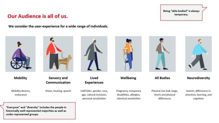
Designing for inclusivity necessitates a deep understanding of the diverse needs and capabilities of all potential users. This involves moving beyond assumptions and actively seeking to understand the challenges faced by individuals with various disabilities, ensuring that digital products and services are usable and accessible to everyone.
A Hypothetical Scenario: Visually Impaired User and Website Interaction
Imagine Sarah, a visually impaired user, attempting to navigate an online bookstore. She relies on a screen reader to access the website’s content. If the website lacks proper semantic HTML (meaningful tags that describe the content), the screen reader may struggle to interpret the information accurately, presenting a jumbled or incomplete experience. For instance, an image of a book cover without alternative text (alt text) would be rendered as “image” by the screen reader, providing no information about the book’s title or author. Similarly, if the website uses color alone to convey information (e.g., red text for sale items), Sarah would miss this crucial information. A well-designed website, however, would provide detailed alt text for images, clear headings and labels, sufficient color contrast, and keyboard navigation, enabling Sarah to easily browse the catalog, find the book she needs, and complete her purchase.
Accessibility Features Comparison Across Websites
The following table compares the accessibility features of three popular websites:
| Website Name | Screen Reader Compatibility | Keyboard Navigation | Color Contrast Ratio |
|---|---|---|---|
| Website A (Example: Amazon) | Generally good, but some inconsistencies may exist depending on the specific page and content. | Fully functional; all interactive elements are accessible via keyboard. | Mostly meets WCAG standards, though some areas might require improvement. |
| Website B (Example: A smaller online store) | May have limitations depending on the implementation of accessibility features. | Partially functional; some elements may be inaccessible. | Potentially low in some areas, requiring significant improvement for full accessibility. |
| Website C (Example: A Government Website) | Generally good, often adhering to strict accessibility guidelines. | Fully functional, prioritized for ease of navigation for all users. | Usually high, meeting or exceeding WCAG standards. |
Note: This is a simplified comparison, and individual experiences may vary. A thorough accessibility audit would be required for a definitive assessment.
Challenges Faced by Users with Motor Impairments Using Touchscreens
Users with motor impairments, such as tremors, limited dexterity, or paralysis, often face significant challenges when interacting with touchscreens. Precise targeting of small on-screen elements can be difficult, leading to frustration and inaccurate selections. The lack of tactile feedback further complicates navigation, as users cannot physically feel the boundaries of buttons or other interactive elements. This can result in accidental selections, missed actions, and an overall less efficient and satisfying user experience.
Inclusive Design Principles in Mobile App Development for Users with Cognitive Disabilities
Inclusive design for users with cognitive disabilities focuses on simplifying the user interface and providing clear, concise information. Examples include:
– Clear and simple language: Avoiding jargon, complex sentence structures, and ambiguous wording.
– Chunking information: Breaking down large blocks of text into smaller, manageable sections.
– Visual hierarchy: Using clear visual cues, such as headings, subheadings, and bullet points, to organize information.
– Consistent navigation: Maintaining a consistent layout and navigation structure throughout the app.
– Progress indicators: Providing clear visual feedback to users about the progress of tasks.
– Error prevention: Designing the app to minimize the possibility of errors and providing clear, helpful error messages when they do occur. For example, using input validation to prevent users from entering incorrect information.
Accessible Design Elements & Implementation
Creating inclusive designs requires careful consideration of accessibility. This involves implementing design elements and features that ensure usability for individuals with diverse needs and abilities, particularly those with disabilities. This section will detail best practices for achieving this.
Clear and Concise Text for Low Literacy Users
Designing for users with low literacy levels demands a commitment to simplicity and clarity. Avoid jargon, complex sentence structures, and overly technical language. Use short sentences and paragraphs, focusing on conveying information efficiently. Employ active voice and strong verbs, making the meaning readily apparent. Consider using visual aids, such as icons and illustrations, to supplement text and reinforce understanding. For example, instead of writing “The aforementioned document requires immediate attention to rectify the identified discrepancies,” try “Please read this document and fix the problems.” The use of bullet points and numbered lists can further improve readability and comprehension.
Effective Use of Alt Text for Images
Alt text (alternative text) provides textual descriptions of images for users who cannot see them, such as those using screen readers. Effective alt text is concise yet comprehensive, conveying the image’s essential information and context. Avoid redundant descriptions like “Image of a cat.” Instead, provide meaningful details: “A fluffy grey tabby cat sitting on a windowsill, looking out at a garden.” For decorative images that don’t convey information, use an empty alt attribute (alt=””). The goal is to ensure that the image’s meaning is accessible to everyone, regardless of their visual abilities.
Implementing ARIA Attributes for Interactive Elements
Accessible Rich Internet Applications (ARIA) attributes provide additional semantic information to interactive elements, making them more understandable to assistive technologies. For instance, using ARIA roles can clarify the purpose of elements. A button might have the role=”button” attribute, while a menu might have role=”menu”. ARIA states and properties can describe the current state of an element; for example, `aria-expanded=”true”` indicates that a menu is currently open. Properly implemented ARIA attributes enhance the accessibility of complex interactive components, making them usable for individuals who rely on screen readers or other assistive technologies. For example, a dynamically updating list might use `aria-live=”polite”` to notify screen reader users of changes without interrupting their current task.
Tools and Resources for Accessibility Testing
Several tools and resources are available to assist designers in evaluating the accessibility of their work. These include automated testing tools like WAVE (Web Accessibility Evaluation Tool), which analyzes web pages for accessibility issues and provides suggestions for improvement. Manual testing, involving users with disabilities, is crucial for identifying issues that automated tools might miss. Browser developer tools also offer accessibility features, allowing designers to inspect the accessibility tree and identify potential problems. Additionally, guidelines such as the Web Content Accessibility Guidelines (WCAG) provide a comprehensive framework for building accessible websites and applications. These resources empower designers to create truly inclusive experiences for all users.
Testing and Iteration for Inclusivity
Ensuring digital products are truly inclusive requires rigorous testing and iterative refinement. Feedback from diverse users is crucial to identify and address accessibility barriers that might otherwise be overlooked. A well-structured testing plan, coupled with a commitment to iterative design, is essential for creating products usable by everyone.
Designing a User Testing Plan for Diverse Participants
A comprehensive user testing plan should prioritize the inclusion of participants representing a wide range of abilities and backgrounds. This includes individuals with visual, auditory, motor, cognitive, and neurological disabilities, as well as those from diverse age groups, cultural backgrounds, and technological proficiency levels. Recruiting participants through established accessibility organizations and user groups is a valuable strategy. The plan should clearly define testing goals, tasks for participants, and methods for collecting feedback (e.g., think-aloud protocols, questionnaires, usability testing sessions). Consider offering incentives to encourage participation and ensure diverse representation.
Comparing Methods for Evaluating Website Usability for Users with Disabilities
Several methods can be employed to evaluate website usability for users with disabilities. Heuristic evaluations, where experts assess a website’s adherence to accessibility guidelines (like WCAG), offer a quick and cost-effective initial assessment. However, they lack the real-world perspective of actual users. Usability testing with assistive technologies, such as screen readers or switch controls, provides direct insights into how users with disabilities interact with the website. Automated accessibility testing tools can identify potential issues quickly, but they should not be solely relied upon as they often miss context-dependent problems. Combining these methods provides a more comprehensive evaluation. For instance, an automated scan can highlight missing alt text, while usability testing with a screen reader user can reveal issues with navigation and content structure.
Checklist for Evaluating Website Accessibility According to WCAG Guidelines
A checklist based on WCAG (Web Content Accessibility Guidelines) is vital for systematic accessibility evaluation. The checklist should cover key WCAG success criteria, such as: providing alternative text for images, ensuring sufficient color contrast, using appropriate heading structures, offering keyboard navigation, and making content compatible with assistive technologies. For each criterion, the checklist should include specific questions to guide the evaluation, such as: “Are all images accompanied by descriptive alt text?” or “Does the website pass a color contrast checker?”. Regularly reviewing and updating this checklist to align with the latest WCAG standards is essential.
Iterative Design for Improving Inclusivity
Iterative design is crucial for improving the inclusivity of digital products. It’s a cyclical process of design, testing, and refinement. This approach allows for continuous improvement based on user feedback, ensuring the product evolves to meet the needs of a diverse user base. A suggested three-step iterative process includes:
- Design and Prototyping: Create initial designs incorporating accessibility features based on WCAG guidelines and best practices.
- User Testing: Conduct usability testing with diverse participants to identify accessibility issues and gather feedback.
- Refinement and Redesign: Based on user feedback, revise designs to address identified accessibility issues and improve inclusivity. Repeat this cycle until a satisfactory level of accessibility is achieved.
For example, a company might initially design a website with limited alt text. After user testing with visually impaired users, they find navigation is difficult. The redesign then focuses on improving the site’s structure and adding comprehensive alt text. This iterative approach ensures that the final product is significantly more accessible and inclusive.
Closing Notes
Ultimately, designing for inclusivity is an ongoing process of learning, adapting, and striving for greater equity. By embracing the principles Artikeld here—understanding diverse needs, implementing accessible elements, and rigorously testing—designers can create digital products that are not only usable but also empowering for everyone. The reward is a richer, more inclusive digital world where everyone can participate fully.