Creating eye-catching brochures that effectively communicate your message requires a blend of design principles, compelling content, and meticulous preparation for print. This guide provides seven essential tips to elevate your brochure design from ordinary to outstanding, ensuring your message resonates with your target audience and leaves a lasting impression.
We’ll explore fundamental design principles like the rule of thirds and whitespace utilization, demonstrating how these elements contribute to visual appeal and readability. We’ll also delve into crafting compelling content, including headline creation, call-to-action design, and the strategic use of visuals. Finally, we’ll cover the crucial steps in preparing your files for professional printing, ensuring a high-quality final product.
Understanding Print Design Principles

Effective print design hinges on a solid understanding of fundamental design principles. Ignoring these can lead to brochures that are visually unappealing and fail to communicate their message effectively. Mastering these principles allows you to create brochures that are not only aesthetically pleasing but also highly functional in conveying your intended information.
Rule of Thirds in Brochure Layout
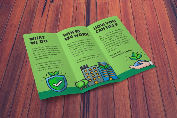
The rule of thirds is a fundamental compositional guideline suggesting that an image should be imagined as divided into nine equal parts by two equally-spaced horizontal lines and two equally-spaced vertical lines, and that important compositional elements should be placed along these lines or their intersections. Applying this to a tri-fold brochure, for instance, you could place a compelling image or headline at one of these intersections on the front panel, drawing the viewer’s eye immediately. The second panel could then elaborate on the initial visual cue, and the third panel might contain a call to action or contact information. This creates a visually balanced and engaging flow through the brochure. Imagine a brochure advertising a new luxury car. The front panel could feature a striking image of the car positioned at the intersection of two rule-of-thirds lines, immediately grabbing the reader’s attention.
Whitespace in Print Design
Whitespace, or negative space, is the area around and between elements in a design. It’s not simply empty space; it’s a crucial element that significantly impacts readability and visual appeal. Adequate whitespace prevents a cluttered look, allowing the eye to rest and focus on individual elements. It creates visual hierarchy, guiding the reader’s eye through the information in a logical sequence. Consider a brochure with tightly packed text and images – it’s overwhelming and difficult to navigate. Conversely, a brochure with ample whitespace feels clean, professional, and easy to read. Effective use of whitespace enhances the overall aesthetic and improves the effectiveness of the message.
Typography Choices for Brochures
Choosing the right typography is critical for readability and establishing the desired tone. Serif fonts (like Times New Roman or Garamond), with their small decorative flourishes at the ends of strokes, are often associated with tradition, elegance, and sophistication. They are generally considered more readable in large blocks of text. Sans-serif fonts (like Arial or Helvetica), lacking these flourishes, are often seen as modern, clean, and minimalist. They work well for headlines and shorter text blocks where clarity is paramount. A brochure might use a sophisticated serif font for body text and a clean sans-serif font for headings to create a balance of readability and visual impact. For example, a brochure for a law firm might use a classic serif font for body text to project authority and trustworthiness, while using a modern sans-serif font for headings to create a sense of contemporary professionalism.
Color Palettes for Professional Brochures
Color significantly impacts the emotional response of the viewer. Choosing the right palette is crucial for aligning the brochure’s aesthetic with the brand and message.
- Blue and Green Palette: Evokes feelings of trust, stability, and serenity. Suitable for businesses in finance, healthcare, or environmental sectors. Think of a brochure for a sustainable energy company using shades of teal and forest green, creating a sense of calm and responsibility.
- Gray and Gold Palette: Projects sophistication, luxury, and elegance. Ideal for businesses in high-end fashion, jewelry, or luxury goods. Imagine a brochure for a luxury watchmaker using deep gray as a background and accents of gold to highlight key features, conveying exclusivity and high quality.
- Orange and Teal Palette: Creates a vibrant, energetic, and creative feel. Suitable for businesses in technology, creative industries, or entertainment. A brochure for a tech startup might use bright orange for headlines and teal for background elements, creating a sense of innovation and dynamism.
Crafting Compelling Brochure Content

Effective brochure design hinges not only on visual appeal but also on the power of its content. A well-written brochure can transform a casual glance into genuine interest, driving conversions and solidifying brand identity. The words you choose, how you structure your information, and the visual elements you pair with them all contribute to a compelling narrative that resonates with your target audience. This section explores key strategies for crafting content that captivates and converts.
Headline and Subheadline Examples
A strong headline immediately grabs attention, while a subheadline provides context and further entices the reader. Consider these examples for a fictional product brochure showcasing a new line of ergonomic office chairs:
Headline: Unleash Your Productivity: Experience the Comfort Revolution.
Subheadline: Introducing the “Zenith” chair – ergonomic design meets unparalleled comfort for peak performance.
This headline uses strong action words and promises a benefit (increased productivity), while the subheadline clarifies what’s being offered and highlights key features. A similar approach can be applied to any product or service, focusing on the key benefit and clearly identifying the offering.
Call to Action Examples
The call to action (CTA) is crucial; it guides the reader towards the desired next step. For a brochure promoting a new service, such as “Express Document Review,” a compelling CTA could be:
Get Your Free Quote Today! Visit our website at [website address] or call us at [phone number].
This CTA is direct, actionable, and provides multiple avenues for engagement. Other effective CTAs could include “Schedule a Consultation,” “Download Your Free Guide,” or “Learn More.” The best CTA will always depend on the specific service or product and the desired outcome.
Benefits of Strong Visuals
Strong visuals are not merely decorative; they significantly enhance the impact of brochure text. High-quality photography or illustrations can:
* Improve comprehension: A well-chosen image can convey complex information quickly and memorably, supporting and enhancing the written text. For example, an image showcasing a happy customer using your product adds credibility and emotional connection.
* Increase engagement: Visually appealing brochures are more likely to be read and retained. Strategic use of color, typography, and imagery creates a visually engaging experience that keeps the reader invested.
* Strengthen brand identity: Consistent visual branding throughout the brochure reinforces your brand’s message and personality, creating a cohesive and memorable impression.
* Break up large blocks of text: Images help to avoid overwhelming the reader with lengthy paragraphs, making the brochure more digestible and user-friendly. For instance, using infographics to display statistics is much more engaging than simply listing numbers.
Organizing Information Hierarchically
A clear hierarchical structure is essential for effective communication. This means organizing information in a logical sequence, using headings, subheadings, bullet points, and white space to guide the reader’s eye and improve readability. For example, a brochure might follow this structure:
1. Headline & Subheadline: Grab attention and introduce the topic.
2. Problem/Need: Briefly address the reader’s pain points.
3. Solution: Introduce your product or service as the solution.
4. Key Features & Benefits: Highlight the most compelling aspects.
5. Case Studies/Testimonials: Provide social proof.
6. Call to Action: Guide the reader to the next step.
This structured approach ensures that information is presented clearly and concisely, making it easy for the reader to understand and engage with your message.
Preparing Files for Print

Preparing your files correctly is crucial for achieving the desired results in your printed brochures. Overlooking this step can lead to disappointing color discrepancies, blurry images, and misaligned elements, ultimately undermining the effectiveness of your design. This section details the essential steps to ensure your files are print-ready.
High-Resolution Images for Print
High-resolution images are paramount for achieving sharp, clear visuals in your printed brochure. Low-resolution images will appear pixelated and blurry when printed, significantly impacting the overall quality. For optimal results, aim for a resolution of at least 300 DPI (dots per inch). This ensures that the image details are rendered accurately and smoothly during the printing process. Consider the final size of your image within the brochure layout; a small image may not require as high a resolution as a large, prominent image. Using images at 72 DPI, typical for web use, will result in unsatisfactory print quality.
CMYK Color Mode for Print
Digital screens use RGB (Red, Green, Blue) color mode, while most printing processes use CMYK (Cyan, Magenta, Yellow, Key/Black). Directly using an RGB file for printing will lead to inaccurate color reproduction. The colors will appear duller, washed out, or significantly different from what you see on screen. Always convert your design to CMYK color mode before sending your files to the printer. This ensures that the colors you intend are accurately represented in the final printed product. Some color shifts are unavoidable during this conversion, so it’s crucial to review and adjust your CMYK design to ensure color accuracy.
Creating Bleed and Trim Marks
Bleed refers to extending your design beyond the final trim size of your brochure. This prevents white edges from appearing after the printer cuts the paper to the final dimensions. Generally, a 0.125-inch (3mm) bleed is recommended on all sides. Trim marks indicate where the printer should cut the paper. Most design software allows you to easily add bleed and trim marks to your document. In Adobe InDesign, for instance, you define the bleed area in the document setup, and the program automatically creates the bleed. The trim marks are then added to the document, clearly showing the cutting lines. Failing to include bleed will result in unsightly white borders around your design after printing.
Print-Ready File Checklist
Before sending your files to the printer, review this checklist to ensure everything is in order:
- All images are at least 300 DPI.
- The color mode is CMYK.
- Bleed and trim marks are included (typically 0.125 inches).
- Fonts are Artikeld or embedded.
- All linked files are included and correctly linked.
- The document is saved in a compatible format (e.g., PDF/X-1a).
- The file size is appropriate for the printer’s specifications.
Following these steps will significantly increase the likelihood of a successful print job and a stunning final product. Careful attention to these details will save time and avoid costly reprints.
Final Wrap-Up
Mastering brochure design is a journey that blends art and science. By understanding fundamental design principles, crafting compelling content, and meticulously preparing your files for print, you can create brochures that not only look stunning but also effectively communicate your message. Remember, a well-designed brochure is a powerful tool—invest the time and effort to make it count. The results will speak for themselves.