Transforming a concept into a visually captivating magazine requires careful planning and execution. This guide provides a structured approach, leading you through the essential steps from initial conceptualization to final print-ready output. We’ll explore various layout styles, image selection techniques, and the crucial role of whitespace in creating a professional and engaging reading experience. Learn how to leverage visual elements like pull quotes and infographics to enhance readability and overall aesthetic appeal.
From crafting a compelling cover design to mastering the art of exporting a print-ready file, we’ll equip you with the knowledge and practical skills to design a magazine that stands out. This step-by-step process demystifies the design process, making it accessible even to those with limited experience in graphic design or layout software.
Planning and Conceptualization
Designing a stunning magazine layout begins long before the first image is placed. Thorough planning and conceptualization are crucial for a cohesive and visually appealing final product. This involves defining the magazine’s overall aesthetic, content strategy, and the intended reader experience.
Magazine Cover Design
The magazine cover serves as the first impression, instantly communicating the magazine’s tone and content. For a vibrant, modern aesthetic, consider a color palette built around a deep teal (#008080) as the base, accented with a bright coral (#FF7F50) for pops of energy and a warm, neutral beige (#F5F5DC) for balance. The typography should be bold and contemporary. A sans-serif font like Montserrat for headlines and a clean serif font like Playfair Display for body text would create a sophisticated contrast. Imagery should be high-quality, sharp, and evocative. A close-up photograph of a person with a dynamic expression, possibly a successful entrepreneur or artist, would align well with the modern theme. The coral accent could be used in a geometric design element behind the title, creating a modern and eye-catching frame.
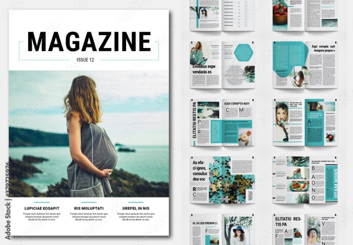
Comparison of Magazine Layout Styles
Understanding the strengths and weaknesses of different layout styles is essential for choosing the most suitable approach for your magazine. The following table compares three common styles:
| Layout Style | Readability | Visual Appeal | Suitability for Content Types |
|---|---|---|---|
| Grid | High; consistent structure provides easy navigation. | Can be clean and organized, but may appear monotonous if not executed creatively. | Suitable for informational magazines, news publications, or those with a lot of text. |
| Asymmetrical | Moderate; requires careful consideration of visual hierarchy to maintain readability. | High; dynamic and visually interesting, creating a sense of movement and energy. | Suitable for fashion magazines, lifestyle publications, or those with a strong visual focus. |
| Modular | High; uses repeating modules for consistency and visual rhythm, making navigation intuitive. | High; offers a balance between structure and visual interest. | Versatile; suitable for a wide range of content types, allowing for flexibility in design. |
Content Plan
A detailed content plan is crucial for ensuring a logical flow and visual hierarchy throughout the magazine. This plan should specify the placement of articles, photographs, and advertisements across each page, considering the reader’s natural eye movement (typically from top-left to bottom-right). For example, a two-page spread might feature a large, impactful image spanning both pages, with a related article broken into sections across the spread. Advertisements could be strategically placed to maximize visibility without disrupting the reader’s flow. The use of white space is crucial for visual breathing room, preventing the pages from feeling cluttered. High-impact articles, such as feature stories, should be prominently placed, perhaps opening a section or even a whole issue. Less critical content, such as shorter news pieces, can be grouped together. The placement of advertisements should be balanced to avoid overwhelming the reader but also ensure they are noticed. A strong visual hierarchy, achieved through variations in font size, weight, and color, as well as image placement, guides the reader’s eye smoothly through the content.
Layout Design and Implementation
Creating a visually appealing and effective magazine layout involves careful consideration of several key elements. The successful integration of text, images, and other visual elements is crucial for engaging the reader and conveying information clearly. This section details the practical steps in designing and implementing a stunning magazine layout, focusing on the use of HTML tables for structure and the incorporation of various visual enhancements.
Double-Page Spread Design Using HTML Tables
A double-page spread provides ample space to create a visually impactful design. We can structure this using HTML tables. Imagine a double-page spread featuring an article on sustainable living. The headline, “Embrace a Greener Tomorrow,” could be placed across the top of both pages, using a large, bold sans-serif font like Montserrat, size 48px, with ample spacing (20px) above and below. The table would then be structured to divide the space. One column could contain a large, high-resolution image (at least 300 DPI) of a lush, green landscape, spanning the full height of the page. The other column would contain the body text, using a serif font like Garamond, size 12px, with 1.5 line spacing and appropriate paragraph indents. This clear separation ensures readability and visual balance. The table structure allows for precise control over the positioning of elements, ensuring a clean and professional look. The image would be carefully chosen to reflect the article’s theme and would be strategically placed to complement the text, rather than competing with it.
Utilizing Visual Elements for Enhanced Readability
Several visual elements can significantly enhance the reader’s experience.
- Pull Quotes: A striking pull quote, such as “Small changes, big impact,” taken from the article’s body text, could be highlighted using a larger, bolder font (24px) and a contrasting color, placed strategically within the text column to draw the eye and emphasize key points. This breaks up large blocks of text and adds visual interest.
- Sidebars: A sidebar, positioned next to the main text column, could contain supplementary information, such as a list of eco-friendly products or tips for reducing your carbon footprint. This provides additional context without disrupting the flow of the main article. The sidebar could use a different background color to visually distinguish it from the main content.
- Infographics: A simple infographic illustrating the environmental benefits of sustainable practices could be incorporated. This visually summarizes complex data, making it easier for the reader to understand and retain. Infographics should be clean, well-labeled, and use a consistent color scheme to maintain visual harmony.
Image Selection and Optimization
High-quality images are essential for a professional magazine layout. Selecting images with a resolution of at least 300 DPI (dots per inch) for print and a high resolution for digital publications is crucial for sharp, clear visuals. The images should be relevant to the article’s content and visually appealing. Proper attribution is vital, always citing the source and obtaining necessary permissions. Image editing techniques such as color correction, sharpening, and cropping can optimize images for the chosen medium. For example, reducing the file size without compromising quality is essential for digital publications to ensure fast loading times. For print, color profiles must be managed to ensure accurate color reproduction. We would carefully adjust contrast and brightness to ensure the image complements the overall design and doesn’t clash with the color scheme.
Refinement and Final Touches
Polishing your magazine layout involves refining the visual hierarchy, ensuring readability, and preparing it for professional printing. This stage is crucial for creating a visually appealing and professional publication. Careful attention to detail will significantly impact the final product’s quality and impact.
Whitespace Management for Readability
Effective use of whitespace—the empty space around text and images—is essential for improving readability and creating a clean aesthetic. Too much clutter makes the magazine look cramped and difficult to navigate; too little makes it feel overwhelming. Strategic whitespace creates visual breathing room, guiding the reader’s eye and improving comprehension.
For instance, consider using generous margins around the page edges. This provides a clean border and prevents text from feeling cramped. Between columns, sufficient gutter space prevents text from merging visually, enhancing readability. Furthermore, ample space around images allows them to breathe and prevents them from feeling overwhelmed by surrounding text. In a two-column layout, a wider gutter between columns might be employed to emphasize the separation of different sections or articles. In contrast, a tighter gutter might be used in a three-column layout to create a more compact and densely packed feel, especially if the columns contain shorter pieces of text.
Visual Style Guide
A consistent visual style guide ensures uniformity and professionalism throughout the magazine. This document should clearly define the magazine’s visual identity.
| Element | Specification | Example |
|---|---|---|
| Font Choices | Heading: Montserrat, Body: Lato | Montserrat is a geometric sans-serif font suitable for headings, while Lato, a humanist sans-serif font, provides excellent readability for body text. |
| Color Palette | Primary: #228B22 (Forest Green), Secondary: #F0E68C (Khaki), Accent: #FFD700 (Gold) | This palette evokes a natural and sophisticated feel, with the forest green providing stability, khaki offering warmth, and gold adding a touch of luxury. |
| Image Styles | High-resolution images, consistent brightness and contrast, natural color grading | Images should be sharp and clear, with a consistent style to maintain a unified look. Avoid over-saturated or overly processed images. |
| Overall Aesthetic | Modern, clean, and sophisticated, with a touch of elegance. | The overall design should reflect a professional and refined aesthetic, appealing to the target audience. |
Exporting for Print
Exporting your magazine layout in a print-ready format requires attention to detail to ensure high-quality results. Incorrect settings can lead to color mismatches, blurry images, and other printing issues.
- Resolution: Use a high resolution (at least 300 DPI) for crisp, sharp images and text. Lower resolutions will result in blurry output.
- Color Profile: Convert your document to CMYK (Cyan, Magenta, Yellow, Key/Black) color mode. This is the standard color profile for print. RGB (Red, Green, Blue) is for screens and will not print accurately.
- File Format: Export your layout as a PDF/X-1a or PDF/X-4. These formats are industry standards for print-ready files and preserve embedded fonts and colors.
- Bleed: Add bleed (typically 0.125 inches or 3mm) around the edges of your pages. This ensures that colors and images extend beyond the trim line, preventing white borders after trimming.
- Fonts: Embed all fonts used in your layout to prevent font substitution issues during printing.
- Color Management: Ensure your color management settings are properly configured to prevent color shifts between your screen and the final printed output. This might involve using a professional color management system.
- Proofing: Always create a proof copy before sending your file to the printer. This allows you to review the final output and catch any potential errors.
Closure
Designing a stunning magazine layout is a rewarding process that blends creativity with technical skill. By following these ten steps, you can confidently navigate the design journey, from initial concept to final product. Remember that attention to detail, consistency in visual style, and a keen understanding of your target audience are crucial for creating a magazine that is not only beautiful but also highly effective in communicating its message. Embrace the iterative nature of design, refine your work, and enjoy the process of bringing your vision to life.