Unlock the secrets of visually stunning design with the Golden Ratio. This principle, found throughout nature and art history, offers a powerful framework for creating balanced and aesthetically pleasing compositions. We’ll explore its mathematical basis, practical applications in various design elements (logos, websites, typography), and advanced techniques to elevate your design skills. Discover how to harness this natural proportion to achieve harmonious and captivating results.
From understanding the ratio’s mathematical foundation to mastering its application in diverse design contexts, this guide provides a comprehensive journey into the world of aesthetically pleasing design. We’ll delve into practical examples, address common pitfalls, and compare the Golden Ratio to other design principles, equipping you with the knowledge to create truly exceptional work.
Understanding the Golden Ratio in Design
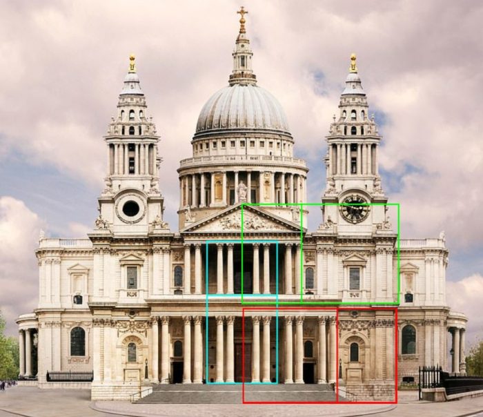
The Golden Ratio, approximately 1.618, is a mathematical concept with profound implications for aesthetics and design. Its influence spans millennia, appearing in ancient Greek architecture and continuing to inspire artists and designers today. Understanding its basis and applications can significantly enhance the visual appeal and impact of your work.
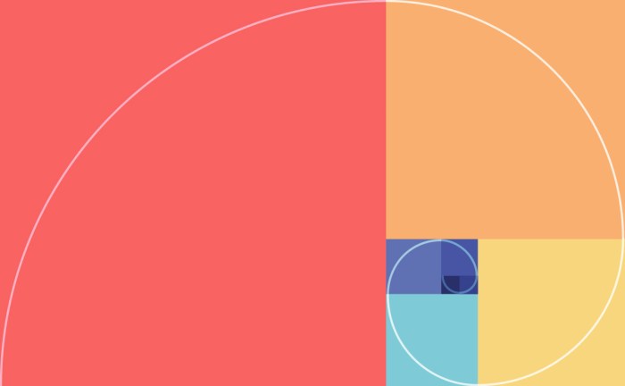
The Golden Ratio, often represented by the Greek letter phi (Φ), is derived from the Fibonacci sequence (0, 1, 1, 2, 3, 5, 8, 13, and so on), where each number is the sum of the two preceding ones. As the sequence progresses, the ratio between consecutive numbers approaches the Golden Ratio. This ratio creates a visually pleasing proportion, often described as naturally harmonious and balanced. Its presence in various aspects of art and architecture throughout history speaks to its inherent appeal. The Parthenon in Athens, for instance, demonstrates the application of the Golden Ratio in its dimensions and proportions.
The Golden Ratio in Nature
The Golden Ratio’s appearance extends beyond human creations; it’s prevalent in the natural world, suggesting an underlying principle of aesthetic harmony. This reinforces its usefulness as a design tool, as it reflects patterns found in nature itself. Observing these natural occurrences helps us appreciate its application in design contexts.
| Example | Description | Golden Ratio Application | Visual Description |
|---|---|---|---|
| Nautilus Shell | A spiral-shaped mollusk shell. | The spiral’s growth follows the Fibonacci sequence, resulting in a shape that adheres closely to the Golden Ratio. | Imagine a tightly wound spiral, starting small and gradually expanding outwards. Each turn of the spiral increases in size proportionally, maintaining the Golden Ratio relationship between successive turns. The overall shape is elegant and organically pleasing. |
| Sunflower Seed Arrangement | The arrangement of seeds in a sunflower head. | The seeds are arranged in spirals, with the number of spirals in each direction often being Fibonacci numbers. The ratio between these numbers approximates the Golden Ratio. | Picture a dense array of seeds filling a circular head. Observe closely, and you’ll notice two sets of spirals, one clockwise and one counterclockwise. The number of spirals in each direction are usually consecutive Fibonacci numbers (e.g., 34 and 55). This creates a pattern of remarkable efficiency and visual balance. |
| Flower Petals | The number of petals in many flowers. | Many flowers have a number of petals that corresponds to a Fibonacci number (e.g., lilies have 3 petals, buttercups 5, daisies often 34 or 55). | Consider a simple flower like a lily with its three delicate petals, or a more complex daisy with numerous petals arranged in a radial pattern. The petal count frequently reflects Fibonacci numbers, hinting at the underlying mathematical harmony. |
| Branching Patterns in Trees | The way branches grow from a tree trunk. | The branching patterns often exhibit a Fibonacci-like sequence, with larger branches splitting into smaller ones in a proportional manner that reflects the Golden Ratio. | Visualize the trunk of a tree dividing into major branches, which further subdivide into smaller branches and twigs. The angles and lengths of these branches often follow a pattern related to the Fibonacci sequence, resulting in a naturally balanced and aesthetically pleasing structure. |
Practical Applications in Design
Applying the Golden Ratio in design involves using its proportions to create visually harmonious compositions. This can be achieved through various techniques, impacting layout, typography, and image placement. The resulting designs often feel more balanced and naturally appealing.
The Golden Ratio offers a framework, not a rigid rule. Its effective use relies on intuitive application and consideration of the overall design context.
By incorporating the Golden Ratio’s proportions into your design, you can create layouts that are visually appealing and balanced. For example, you can use the Golden Ratio to determine the ideal placement of elements on a webpage, ensuring that the most important information is given prominence. Similarly, the Golden Ratio can be used to create harmonious proportions in typography, leading to a more readable and aesthetically pleasing text. The application is versatile and adaptable across numerous design fields.
Applying the Golden Ratio to Different Design Elements
The Golden Ratio, approximately 1.618, offers a naturally pleasing proportion that can elevate design across various mediums. Its application isn’t about rigidly adhering to the ratio in every aspect, but rather using it as a guideline to create visual harmony and balance. By strategically incorporating the Golden Ratio, designers can achieve layouts that feel intuitively comfortable and aesthetically appealing to the viewer.
Logo Design Using the Golden Ratio
Designing a logo using the Golden Ratio involves constructing a framework based on its proportions before adding visual elements. Let’s create a simple, abstract logo as an example. We’ll start with a square.
1. Creating the Base: Begin with a square. This square forms the initial building block of our logo.
2. Extending the Square: Extend one side of the square to create a rectangle whose length is 1.618 times its width (the Golden Ratio). This creates a Golden Rectangle.
3. Adding the Spiral (Optional): A Golden Spiral can be drawn within the Golden Rectangle. This spiral, based on the Fibonacci sequence (a series of numbers where each number is the sum of the two preceding ones, e.g., 1, 1, 2, 3, 5, 8…), visually represents the proportions. This step is optional, but it can help guide the placement of design elements.
4. Incorporating Design Elements: Now, using the Golden Rectangle and spiral as a guide, strategically place your logo’s core elements. For example, you might place the main text within the larger area of the rectangle, and a smaller graphic element within a smaller, proportionally related area. The goal is to use the proportions to create visual balance.
5. Refinement: The Golden Ratio acts as a starting point; refine the logo through iteration, ensuring the proportions remain harmonious while incorporating other design considerations such as color and typography. This ensures the final logo is both aesthetically pleasing and effective. The rationale behind each design choice is to create a visually balanced and appealing logo, guided by the inherent harmony of the Golden Ratio’s proportions.
Website Layout and User Experience
The Golden Ratio can significantly enhance website usability and visual appeal. By incorporating its proportions into the layout, designers can create a more intuitive and engaging experience for users.
The impact on user experience stems from the inherent visual harmony the ratio provides. Users subconsciously respond to this balance, leading to a more positive and less jarring experience.
- Main Content Area: Position the main content area within a Golden Rectangle, creating a focal point that naturally draws the user’s attention.
- Sidebar Placement: Use the Golden Ratio to determine the optimal width of sidebars in relation to the main content area. This prevents the sidebar from overwhelming the main content.
- Image Placement and Sizing: When using images, ensure their dimensions relate to the Golden Ratio, or that their placement within the layout adheres to it. This creates visual harmony and prevents images from looking out of place.
- Button Placement and Sizing: The size and placement of call-to-action buttons can benefit from the Golden Ratio. This improves visual hierarchy and encourages engagement.
Typography and Balanced Text Layouts
Applying the Golden Ratio to typography creates harmonious and balanced text layouts. This involves using the ratio to determine relationships between font sizes, line heights, and margins.
| Typography Element | Application of Golden Ratio |
|---|---|
| Heading Size | Use the Golden Ratio to determine the relationship between heading and body text sizes. For example, if the body text is 16px, the heading could be approximately 26px (16 * 1.618 ≈ 26). |
| Line Height | The line height (leading) can be related to the font size using the Golden Ratio for improved readability and visual balance. |
| Margin and Padding | Use the Golden Ratio to determine the proportions of margins and padding around text blocks, creating visual breathing room and hierarchy. |
| Column Widths | In multi-column layouts, the widths of columns can be based on the Golden Ratio for a balanced and visually appealing arrangement. |
Advanced Techniques and Considerations

Mastering the Golden Ratio involves more than just applying the formula; it requires understanding its nuances and integrating it effectively within broader design principles. This section delves into advanced techniques, comparing it to other design methodologies, exploring its application across diverse design styles, and addressing potential pitfalls to avoid.
Comparison of the Golden Ratio and the Rule of Thirds
The Golden Ratio and the Rule of Thirds are both powerful compositional tools, but they achieve visual harmony through different means. The Golden Ratio utilizes the mathematical constant φ (approximately 1.618) to create proportions perceived as naturally pleasing, while the Rule of Thirds divides the image into nine equal parts using two equally-spaced horizontal and two equally-spaced vertical lines, suggesting key placement points for the subject.
| Principle | Strengths | Weaknesses | Design Contexts |
|---|---|---|---|
| Golden Ratio | Creates a subtle, harmonious balance; applicable across various scales; provides a more precise and mathematically defined structure. | Can be more challenging to apply intuitively; may feel overly structured in some contexts; less versatile for quick compositions. | Logos, typography, architecture, product design, web layouts. |
| Rule of Thirds | Simple and easy to apply; visually intuitive; works well for quick compositions and capturing attention. | Less precise than the Golden Ratio; may not always produce the most harmonious results; limited application in certain design aspects. | Photography, painting, graphic design, video composition. |
Incorporating the Golden Ratio into Different Design Styles
The Golden Ratio’s adaptability makes it suitable for various design aesthetics. Its application, however, varies depending on the style’s inherent characteristics.
Minimalist Design: Minimalist design emphasizes simplicity and clean lines. The Golden Ratio can be subtly incorporated by using it to determine the proportions of key elements, such as the spacing between text blocks or the size ratios of graphical elements. Imagine a minimalist website layout where the main content area’s width is related to the overall page width according to the Golden Ratio. This subtle proportion creates a sense of visual harmony without overwhelming the minimalist aesthetic.
Modern Design: Modern design often embraces geometric shapes and clean lines. The Golden Ratio can be used to create pleasing proportions within these shapes, for instance, in the dimensions of a building facade or the layout of a modern furniture piece. A modern poster might use the Golden Ratio to determine the placement of text and images, ensuring visual balance and a sense of sophistication. The precise proportions contribute to a sense of order and sophistication.
Traditional Design: Traditional design often involves ornate details and complex compositions. The Golden Ratio can be applied to create a sense of balance and harmony within the complexity. For example, the dimensions of architectural features like windows or doors in a traditional building might follow the Golden Ratio, creating a subtle underlying order that enhances the overall aesthetic appeal. The use of the ratio helps maintain balance despite the elaborate details.
Common Pitfalls and Solutions When Applying the Golden Ratio
While the Golden Ratio is a powerful tool, improper application can lead to less-than-desirable results.
It is crucial to avoid blindly applying the Golden Ratio without considering the overall design context. Over-reliance on the ratio can lead to designs that feel rigid and unnatural. The key is to use it as a guide, not a rigid rule.
- Mistake: Forcing the Golden Ratio into designs where it doesn’t naturally fit. Solution: Use the Golden Ratio as a suggestion, not a strict rule. Consider other design principles in conjunction with it.
- Mistake: Ignoring other design principles and relying solely on the Golden Ratio. Solution: Balance the Golden Ratio with other elements like visual hierarchy, color theory, and typography.
- Mistake: Using the Golden Ratio without understanding its underlying principles. Solution: Thoroughly understand the mathematical basis of the ratio and its visual impact before applying it.
- Mistake: Overusing the Golden Ratio, making the design feel artificial and contrived. Solution: Use it subtly and sparingly, focusing on key elements rather than every aspect of the design.
Last Recap
Mastering the Golden Ratio is not just about adhering to a mathematical formula; it’s about understanding its underlying principles of balance and harmony. By thoughtfully integrating this powerful tool into your design process, you can create visually compelling and engaging work that resonates with audiences on a deeper level. Remember to experiment, iterate, and let the natural beauty of the Golden Ratio guide your creative vision. The result will be designs that are not only aesthetically pleasing but also inherently satisfying and effective.