Effective font pairing is crucial for visually appealing and readable design. This guide delves into the art of combining typefaces, exploring font classifications, principles of harmonious pairings, and practical applications across various design projects. We’ll uncover five key secrets to create designs that are not only aesthetically pleasing but also communicate effectively.
From understanding the nuances of serif and sans-serif fonts to mastering the art of visual weight and contrast, we’ll equip you with the knowledge and techniques to confidently select and combine fonts. We’ll also address common pitfalls and provide practical examples to illustrate successful font pairings in websites, posters, and books.
Understanding Font Families and Classifications
Choosing the right font is crucial for effective design. A strong understanding of font families and their classifications allows designers to create visually appealing and harmonious combinations that effectively communicate the intended message. This section will explore the different font classifications and their visual characteristics, providing examples of popular fonts and their typical uses.
Font families are broadly categorized based on their visual characteristics, influencing their readability and suitability for various design contexts. These classifications help designers quickly identify fonts that align with their design goals, ensuring a cohesive and professional aesthetic.
Serif Fonts
Serif fonts are characterized by small decorative strokes, or “serifs,” at the ends of their letterforms. These serifs add a sense of tradition and sophistication. They are generally considered highly legible, especially in larger sizes and for body text. Popular examples include Times New Roman, Garamond, and Georgia. Times New Roman is often used in newspapers and books for its readability, while Garamond’s elegant appearance makes it suitable for formal invitations or high-end branding. Georgia, with its slightly more modern feel, is often preferred for online reading due to its improved screen readability.
Sans-Serif Fonts
Sans-serif fonts lack the decorative serifs found in serif fonts. Their clean and modern appearance makes them versatile choices for a wide range of applications. They are often preferred for headlines, website text, and contemporary designs. Popular examples include Arial, Helvetica, and Open Sans. Arial is a ubiquitous choice for its neutrality and broad compatibility, while Helvetica is known for its geometric precision and often used in corporate branding. Open Sans, with its slightly more rounded forms, offers better readability on screens and is popular for website design.
Script Fonts
Script fonts mimic handwritten lettering, often featuring flowing, connected strokes. They are typically used for decorative purposes, such as logos, invitations, or headings, rather than large blocks of body text, due to their lower readability in longer passages. Examples include Edwardian Script ITC and Pacifico. Edwardian Script ITC offers a more formal and elegant feel, while Pacifico has a more casual and playful appearance.
Display Fonts
Display fonts are highly stylized and decorative fonts, often used for headlines, titles, or short text segments to make a strong visual statement. Their unique characteristics make them unsuitable for large blocks of text due to their lower readability. Examples include Impact, Bebas Neue, and Lobster. Impact is known for its bold and aggressive style, often used to draw attention. Bebas Neue offers a more modern and minimalist take on a display font, while Lobster’s playful handwritten style makes it suitable for branding related to food or children’s products.
Monospace Fonts
Monospace fonts, also known as fixed-width fonts, allocate the same amount of horizontal space to each character. This makes them ideal for programming code, tables, and other contexts where consistent character spacing is crucial. Courier New is a widely used example.
Font Family Comparison
| Font Family | Classification | Key Features | Suitable for |
|---|---|---|---|
| Times New Roman | Serif | Traditional, highly legible | Body text, books, newspapers |
| Arial | Sans-serif | Clean, versatile, neutral | Headlines, website text, general use |
| Edwardian Script ITC | Script | Elegant, formal, handwritten style | Logos, invitations, short text segments |
| Impact | Display | Bold, aggressive, attention-grabbing | Headlines, short text segments |
| Courier New | Monospace | Fixed-width, consistent spacing | Programming code, tables |
Principles of Harmonious Font Pairing
Effective font pairing is crucial for creating visually appealing and readable designs. It’s about more than just picking two fonts you like; it involves understanding fundamental typographic principles to achieve harmony and enhance the overall message. This section will explore the key principles that guide successful font pairings.
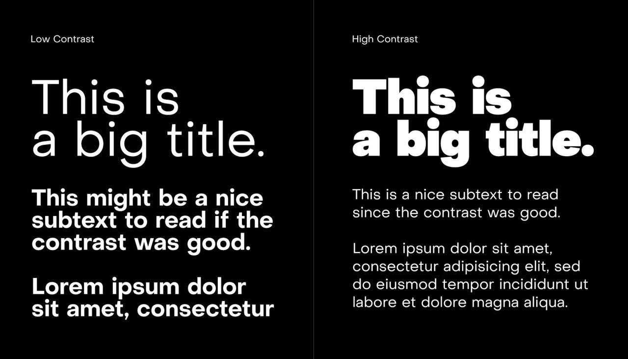
Understanding visual weight and contrast is paramount when selecting fonts. Visual weight refers to how heavy or light a typeface appears, influenced by factors like stroke thickness, x-height (the height of lowercase letters), and overall design. Contrast, on the other hand, involves the difference between elements—in this case, fonts—creating visual interest and hierarchy.
Visual Weight and Its Impact on Font Pairing
Visual weight plays a significant role in determining the balance and hierarchy within a design. Pairing fonts with drastically different weights can create a strong contrast, ideal for headings and body text. For example, a bold, heavy serif font used for headings can contrast beautifully with a light, sans-serif font for body text, creating a clear visual distinction between the two. Conversely, using fonts with similar weights can create a more unified and subtle look, suitable for designs requiring a harmonious and consistent feel. Imbalance in visual weight can lead to a jarring or unbalanced design.
Contrast in Font Pairing
Contrast is essential for readability and visual appeal. It’s not just about contrasting weights; it can also involve contrasting styles, such as pairing a serif font with a sans-serif font. This creates visual distinction and helps guide the reader’s eye through the content. Too much contrast, however, can be overwhelming, while too little can make the design monotonous. Finding the right balance is key.
Approaches to Font Pairing: Contrasting Weights vs. Similar Styles
There are several approaches to font pairing, each offering unique visual effects. The choice depends on the desired aesthetic and the overall design goals.
- Contrasting Weights: This approach uses fonts with significantly different weights, such as a bold display font paired with a light body font. This creates a clear hierarchy and visual interest. For example, pairing Montserrat Bold with Montserrat Light creates a strong contrast while maintaining consistency through the use of the same font family. The bold heading stands out prominently, guiding the reader’s attention, while the lighter body text remains easily readable.
- Similar Styles: This method employs fonts with similar styles but different weights or slightly different characteristics. This approach creates a more cohesive and unified feel. For instance, pairing Playfair Display with Lora creates a harmonious look; both are serif fonts, but their distinct characteristics prevent monotony. Playfair Display’s more decorative nature works well for headings, while Lora’s readability is perfect for body text.
- Contrasting Styles: This involves pairing fonts with entirely different styles, such as a serif and a sans-serif font. This creates a strong visual contrast, often used to differentiate headings from body text. For example, pairing a classic serif like Garamond with a modern sans-serif like Helvetica creates a sophisticated yet contemporary look. The serif font adds a touch of elegance to the headings, while the sans-serif font provides clean readability for the body text.
Examples of Successful Font Pairings
Here are some examples of successful font pairings and the rationale behind their selection:
- Lora and Playfair Display: Lora, a transitional serif font, provides excellent readability for body text. Playfair Display, with its elegant and slightly more decorative serif style, is a perfect choice for headings. The combination offers a sophisticated yet balanced look, suitable for publications or websites requiring a touch of elegance.
- Montserrat and Open Sans: Montserrat, a geometric sans-serif font, is highly versatile and legible. Open Sans, another geometric sans-serif, complements it well, offering a slightly softer feel. This pairing works well for modern and clean designs, particularly websites and applications where readability is paramount. The consistency in style creates a unified feel, while subtle differences in weight and character provide enough contrast to maintain visual interest.
- Roboto and Merriweather: Roboto, a clean and geometric sans-serif, is excellent for body text and UI elements. Merriweather, a transitional serif with high readability, adds a touch of sophistication to headings. This pairing is a good example of contrasting styles while maintaining a sense of balance. The modern feel of Roboto is complemented by the classic elegance of Merriweather, making it suitable for a variety of applications.
Practical Applications and Advanced Techniques
Successfully pairing fonts involves more than just understanding theory; it requires practical application across diverse design projects. The principles of harmony, contrast, and readability must be tailored to the specific medium and intended audience. Mastering these techniques elevates your designs from merely functional to visually compelling and effective.
Font Pairing for Different Design Projects
Choosing font pairings depends heavily on the project’s context. A website demands different considerations than a poster or a book. For websites, readability and user experience are paramount. A common approach is to use a clean, legible sans-serif font like Open Sans for body text, paired with a more distinctive serif font like Merriweather for headings. This provides contrast while maintaining readability across various screen sizes. Conversely, a poster might benefit from a bolder, more impactful pairing, perhaps using a geometric sans-serif like Montserrat for the main title and a contrasting script font like Pacifico for a secondary element, prioritizing visual appeal and memorability over extensive text blocks. Book design often prioritizes legibility over stylistic boldness, frequently employing a classic serif like Garamond for the body and a slightly more modern serif or a sans-serif for chapter headings and titles to create a sense of hierarchy without jarring the reader.
Best Practices for Using Multiple Fonts Effectively
Effective use of multiple fonts hinges on restraint and intentionality. Overusing fonts leads to visual chaos and distracts from the message. A general rule of thumb is to limit yourself to two or three fonts at most. Prioritize clear distinctions in weight, style, and size to differentiate their roles. For instance, a bold sans-serif for headlines, a lighter sans-serif for subheadings, and a serif for body text creates a clear visual hierarchy. Maintaining consistency in font characteristics like x-height (the height of lowercase letters) across different fonts can also enhance visual harmony.
Enhancing Readability and Hierarchy with Font Pairings
Font pairing is crucial for establishing visual hierarchy and improving readability. Consider a mock-up of a website landing page. The main headline might use a large, bold sans-serif font (e.g., Bebas Neue) for immediate impact. Subheadings could employ a slightly smaller, lighter sans-serif (e.g., Open Sans Bold), creating a clear distinction. The body text would utilize a legible serif font (e.g., Lora) for comfortable reading. This layering, achieved through font choice and size, guides the reader’s eye effortlessly through the information, emphasizing key points while maintaining readability. The contrast between the fonts ensures each section is easily distinguishable, preventing visual fatigue.
Potential Pitfalls in Font Pairing
Several pitfalls can undermine a well-intentioned font pairing. Clashing styles are a common issue. Pairing a highly decorative script font with a geometric sans-serif can create visual dissonance. Poor readability results when fonts are too similar in weight or style, making it difficult to distinguish between headings and body text. Furthermore, using fonts with inconsistent x-heights can lead to an uneven and unprofessional appearance. Finally, ignoring the context of the design – using a playful font for a serious project, for example – can undermine the overall message and credibility.
Final Review
By understanding font classifications, visual weight, contrast, and applying the principles Artikeld, you can elevate your designs. Mastering font pairing isn’t just about aesthetics; it’s about enhancing readability, establishing visual hierarchy, and creating a cohesive and impactful design. Experiment, iterate, and discover the endless possibilities of harmonious type combinations to transform your projects.