Unlocking the timeless appeal of vintage design is easier than you think. This guide delves into three key techniques to infuse your projects with retro charm, transforming ordinary designs into captivating nods to the past. We’ll explore the art of crafting evocative color palettes, selecting period-appropriate typography, and incorporating authentic textures and patterns to achieve a truly vintage aesthetic.
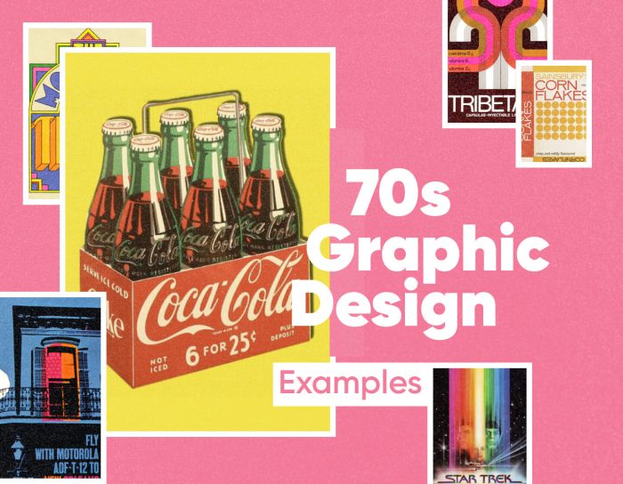
From the muted tones of the 1920s to the bold hues of the 1950s and the groovy patterns of the 1970s, we’ll journey through different eras, uncovering the unique design elements that defined each decade. Learn how to leverage these elements in your own work, whether you’re designing a website, a poster, or any other creative project. This guide provides practical advice and visual examples to help you master the art of vintage design.
Mastering Color Palettes for a Vintage Aesthetic

Color palettes are fundamental to achieving a convincing vintage aesthetic. The right color combinations can instantly transport your designs to a specific era, evoking the mood and style of the past. Understanding the dominant hues and their subtle variations across different decades is key to mastering this aspect of vintage design.
1950s Diner Color Palette
A 1950s diner aesthetic often evokes feelings of cheerful optimism and mid-century modern design. This is reflected in its characteristic color palette, typically featuring bold, yet somewhat saturated, hues. The palette below exemplifies this:
| Color Name | Hex Code | Color Swatch |
|---|---|---|
| Jubilee Red | #C23B22 | |
| Mint Cream | #D0F0C0 | |
| Butter Yellow | #FFF2CC | |
| Chocolate Brown | #4B291E | |
| Seafoam Green | #98FB98 |
Comparative Analysis of Vintage Era Color Palettes
The dominant hues and their cultural significance varied considerably across different vintage eras. Understanding these differences allows for a more nuanced and accurate representation of the specific period you’re aiming to emulate.
Here’s a comparison of three distinct vintage eras:
1920s Color Palette
- Dominant Hues: Deep reds, emerald greens, golds, and blacks. These rich, saturated colors reflected the Art Deco movement’s opulence and glamour.
- Cultural Significance: The post-war prosperity and the burgeoning flapper culture influenced the use of luxurious and vibrant colors.
- Examples: Think of the rich jewel tones in Art Deco posters and the elegant color schemes of speakeasies.
1950s Color Palette
- Dominant Hues: Bright pastels, cheerful yellows, and bold reds. These colors reflected the optimism and consumerism of the post-war boom.
- Cultural Significance: The rise of suburban living and the emphasis on family life contributed to the use of softer, more approachable colors.
- Examples: Classic diner interiors, advertising campaigns featuring bright and happy imagery.
1970s Color Palette
- Dominant Hues: Earthy browns, mustard yellows, burnt oranges, and avocado greens. These colors reflected the back-to-nature movement and a more relaxed aesthetic.
- Cultural Significance: The counter-culture movement and a shift away from the bright colors of previous decades contributed to the adoption of earth tones.
- Examples: Retro-style kitchens, groovy album covers featuring muted tones and earthy hues.
Muted Tones and Pastel Shades in Vintage Design
Muted tones and pastel shades play a crucial role in creating a vintage aesthetic, adding a sense of softness and nostalgia. They often act as a beautiful counterpoint to bolder hues, providing balance and visual interest.
Their application is versatile:
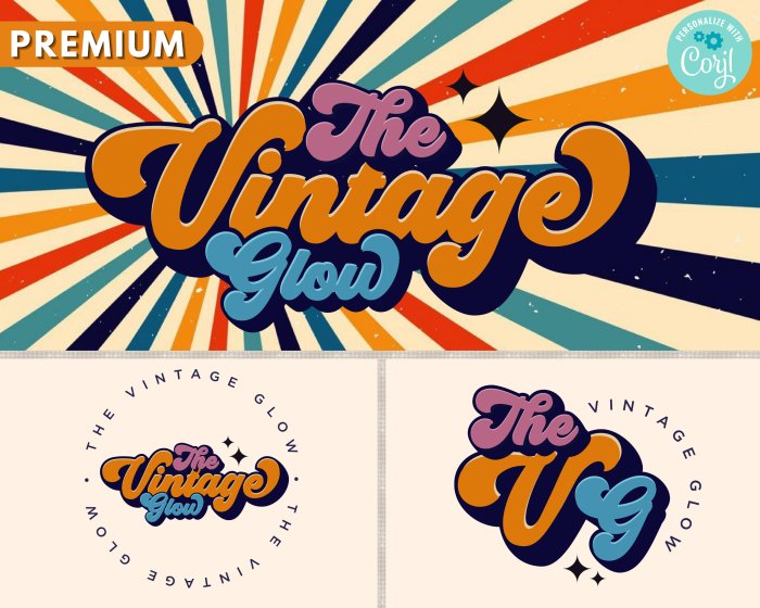
In fashion design, pastel shades are often used to create delicate and romantic looks reminiscent of the 1950s. Muted tones, on the other hand, can add a touch of sophistication to modern clothing, evoking a vintage feel without being overly literal. In interior design, muted tones create a calm and inviting atmosphere, often used in combination with bolder accent colors. Pastel shades can be used to create a sense of light and airiness, particularly in small spaces. In graphic design, muted tones are often used to create a vintage feel for logos and branding, while pastels can add a touch of whimsy and playfulness to illustrations and packaging. For instance, a muted teal background with a pastel pink logo could create a sophisticated yet approachable brand identity reminiscent of the 1960s.
Utilizing Vintage Typography and Font Choices

Typography plays a crucial role in achieving a genuine vintage aesthetic. The right font can instantly transport your design back in time, evoking a specific era and contributing significantly to the overall mood and feel. Careful consideration of font choice, historical context, and the interplay between serif and sans-serif styles is key to successfully implementing vintage typography.
The impact of font selection on the overall vintage aesthetic is significant. Choosing the wrong font can easily derail the intended retro feel, while the right one can elevate the design to a new level of authenticity. Understanding the historical context of different typefaces allows designers to make informed choices that resonate with the desired era.
Vintage Poster Mock-up
Imagine a poster advertising a 1950s sock hop. The layout is vertically oriented, with a vibrant color palette featuring deep teal, coral, and cream. At the top, in a bold, Art Deco-inspired typeface like “Broadway”, we see the title: “SOCK HOP EXTRAVAGANZA!”. Broadway’s geometric forms and strong vertical emphasis are characteristic of the Art Deco movement prevalent in the 1920s and 30s, but its bold, playful nature fits the energetic spirit of the 1950s as well. Below the title, in a more playful, rounded script font reminiscent of “Edwardian Script ITC”, the tagline reads: “Get Ready to Jitterbug!”. This script font adds a touch of elegance and fluidity, contrasting nicely with the geometric title. Finally, at the bottom, in a clean, sans-serif typeface like “Bebas Neue,” we find the event details: “Saturday, October 26th, 8 PM, The Town Hall”. Bebas Neue’s simplicity provides a modern counterpoint, helping to ground the design and make the information easily readable. The overall effect is a dynamic, visually engaging poster that successfully blends elements from different vintage styles.
Serif and Sans-Serif Fonts in Vintage Design
Serif fonts, characterized by small decorative strokes at the ends of their letterforms, often evoke a sense of tradition and sophistication. Fonts like Garamond or Baskerville, with their classic elegance, are frequently associated with vintage designs, particularly those from the early to mid-20th century. They are well-suited for body text or elements requiring readability and a touch of formality. In contrast, sans-serif fonts, lacking these decorative strokes, often project a more modern, clean aesthetic. However, certain sans-serif fonts, like Futura or Gill Sans, developed in the early 20th century, possess a vintage appeal of their own, particularly when used in conjunction with other vintage design elements. They are often a good choice for headlines or elements where a bolder, more contemporary feel is desired while still maintaining a connection to the past. The careful balance between serif and sans-serif fonts can greatly enhance the overall vintage effect.
Vintage Font Selection Process and its Contribution to Retro Aesthetic
Choosing the right font is paramount in achieving a convincing vintage aesthetic. For this paragraph, I selected “Playfair Display,” a serif typeface inspired by transitional serif styles of the late 18th and early 19th centuries. Its elegant, slightly ornate letterforms, with their high contrast and subtle detailing, immediately evoke a sense of classic sophistication. The font’s high x-height ensures good readability, preventing the text from appearing overly fussy. The Playfair Display’s subtle curves and refined proportions contribute significantly to the retro feel, while its versatility allows it to be used in various contexts, from headings to body text. Its historical context and visual characteristics perfectly align with the overall goal of creating a design with authentic vintage charm.
Incorporating Vintage Textures and Patterns

Adding authentic vintage textures and patterns is crucial for achieving a truly retro aesthetic. These elements go beyond mere color palettes and typography; they provide the tactile and visual depth that truly transports the viewer back in time. By skillfully incorporating these elements, designers can imbue their work with a sense of history and craftsmanship, enhancing the overall impact and authenticity of the vintage style.
Recreating Vintage Textures Digitally
To achieve the look of aged materials, several techniques can be employed in digital design software. Let’s examine three distinct textures and their digital recreation.
- Distressed Wood: The look of worn, aged wood is characterized by visible grain, cracks, and variations in color. Digitally, this can be achieved by using a high-resolution scan of actual distressed wood, adjusting its color balance to create a more muted or faded effect, and adding subtle noise or texture overlays to enhance the impression of age and wear. Alternatively, many design software packages offer built-in texture generators or filter effects that allow for the creation of similar textures from scratch. The key is to avoid overly sharp or uniform patterns, aiming instead for organic variation in color and texture.
- Faded Fabric: Faded fabrics often display subtle variations in color and texture, with areas showing more wear than others. This can be recreated digitally by starting with a high-resolution image of a fabric texture (or a solid color), then applying various filters such as gaussian blur, noise, and color adjustments to create a sense of fading and wear. Experiment with different blending modes to layer textures and achieve a more nuanced look. The goal is to simulate the effects of sunlight, washing, and general wear and tear on the fabric.
- Aged Paper: The characteristics of aged paper include discoloration, wrinkles, and possibly even small tears or stains. Digitally, this can be achieved by starting with a plain paper texture, then applying a subtle yellow or sepia tone. To simulate wrinkles, you could use a filter to add subtle distortions or warping effects. For stains or tears, you could add high-contrast noise or use a masking technique to create the illusion of damage. The overall effect should be subtle, creating the impression of age without overwhelming the design.
Designing a Repeating Art Deco Pattern
Art Deco, with its geometric precision and luxurious feel, provides a rich source of inspiration for repeating patterns. This example focuses on a pattern inspired by the sunburst motif, a common element in Art Deco design.
The design process begins with sketching several sunburst variations, experimenting with different angles, thicknesses, and levels of detail. Once a preferred sunburst is chosen, it is digitally recreated using vector graphics software. This allows for easy scaling and modification without loss of quality. The chosen sunburst is then duplicated and arranged in a grid-like formation, creating a repeating pattern. To add visual interest, negative space is strategically incorporated between the sunbursts, creating a sense of balance and sophistication. The final pattern incorporates a subtle color gradient, shifting from a deep gold to a lighter champagne hue, to mimic the shimmering effect of metallic materials often found in Art Deco designs. The pattern components (sunbursts and negative space) are arranged in a symmetrical, almost hypnotic formation, emphasizing the style’s characteristic elegance and order.
Comparative Analysis of Textures and Patterns in Vintage Design Movements
The use of textures and patterns varies significantly across different vintage design movements. The following table illustrates this variation:
| Design Movement | Dominant Textures | Dominant Patterns | Overall Aesthetic |
|---|---|---|---|
| Art Deco | Smooth, polished surfaces; metallic textures; lacquered finishes | Geometric shapes; sunbursts; stylized floral motifs; repeating lines and curves | Elegant, sophisticated, luxurious, geometric precision |
| 1950s Mid-Century Modern | Wood grain; textured fabrics (e.g., bouclé); molded plastics | Abstract shapes; organic forms; bold graphic prints; floral patterns | Optimistic, playful, functional, clean lines |
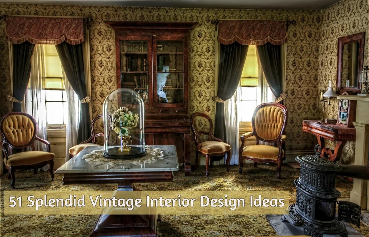
| Victorian Era | Embossed fabrics; heavily textured wallpapers; ornate wood carvings | Intricate floral patterns; damask; paisley; highly detailed scenes | Ornate, opulent, detailed, romantic |
Summary

By mastering the art of color palettes, typography, and texture, you can successfully create designs that resonate with the nostalgic charm of vintage aesthetics. Remember, the key lies in thoughtful selection and a keen eye for detail. Whether you’re aiming for the elegance of Art Deco or the playful exuberance of mid-century modern, these techniques will empower you to craft unique and captivating pieces that stand the test of time. Embrace the past to inspire your future designs.