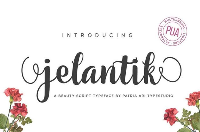
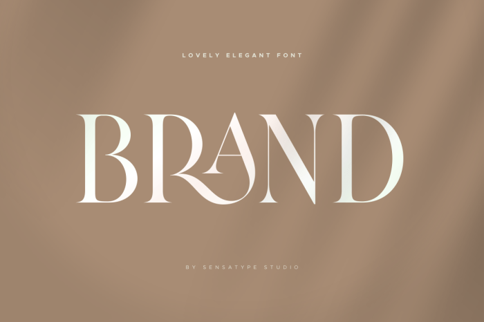
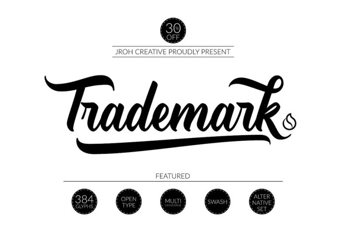
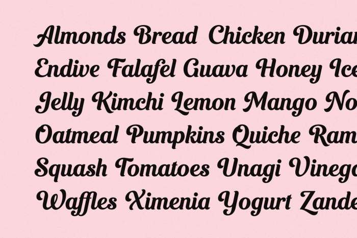
Script fonts, with their elegant flourishes and expressive characters, offer a unique design opportunity. However, their successful application requires careful consideration of font selection, application techniques, and stylistic enhancements. This guide provides a structured approach to mastering script fonts, transforming your designs with sophisticated and visually appealing results.
We’ll explore the nuances of choosing the right script font for your project, considering factors such as readability, formality, and brand personality. We’ll then delve into practical techniques for proper spacing and kerning, ensuring your designs are both beautiful and easy to read. Finally, we’ll explore ways to add those extra elegant touches—from decorative elements to strategic color and texture choices—to elevate your designs to the next level.
Selecting the Right Script Font

Choosing the perfect script font is crucial for achieving an elegant and impactful design. The right font can elevate your project, while the wrong one can detract from its overall aesthetic and message. This section will guide you through the process of selecting a script font that aligns with your design goals.
Script Font Comparison
The characteristics of a script font significantly impact its suitability for different projects. Consider factors like formality, readability, and stroke weight when making your selection. The following table compares four distinct script fonts:
| Font Name | Formality | Readability | Stroke Weight |
|---|---|---|---|
| Pacifico | Informal | High | Medium |
| Great Vibes | Informal | Medium | Medium |
| Playfair Display | Formal | High | Medium to Bold |
| Dancing Script | Informal | Medium | Variable |
Script Fonts and Brand Personality
Different script fonts evoke distinct moods and brand personalities. For instance, a playful, rounded script like Pacifico might suit a children’s brand or a bakery, conveying a sense of fun and approachability. Imagine a logo for a bakery using Pacifico; the soft curves and relaxed style instantly communicate warmth and deliciousness. Conversely, a more elegant and refined script like Playfair Display might be ideal for a luxury brand or a high-end boutique, projecting sophistication and exclusivity. Visualize a wedding invitation featuring Playfair Display; the font’s refined strokes and classic feel instantly enhance the occasion’s formality. A script font with a more whimsical style like Great Vibes could be used for a craft shop or a coffee brand to convey creativity and a unique identity. Finally, a font like Dancing Script, with its variable stroke weight and flowing style, could be used for a brand associated with movement, dance, or artistic expression.
Script Font Selection Based on Intended Use
The context in which a script font will be used significantly influences the choice. For a wedding invitation, a formal and highly legible script like Playfair Display or a more classic font with subtle flourishes is appropriate. The emphasis should be on readability and creating an elegant atmosphere. However, for a website header, a simpler script with high readability, like Pacifico, might be preferable. Excessive ornamentation could hinder readability on a screen, so a more streamlined design is usually preferred. For body text, script fonts are generally avoided due to their lower readability compared to serif or sans-serif fonts. Their primary application is typically for headlines, logos, or short, impactful text elements where aesthetics take precedence over extensive readability.
Mastering Script Font Application

Script fonts, with their elegant flourishes and flowing characters, add a unique touch to any design. However, their very nature—the interconnected letters and varying stroke weights—requires a nuanced approach to ensure readability and visual appeal. Mastering their application involves careful consideration of spacing, kerning, and harmonious pairings with other font types. This section will guide you through these essential techniques.
Proper spacing and kerning are crucial for ensuring your script font remains legible and aesthetically pleasing. Poor spacing can lead to a cluttered, illegible mess, while overly spaced letters can look awkward and unprofessional. Careful consideration of these aspects transforms a potentially chaotic element into a refined design feature.
Script Font Spacing and Kerning
Achieving optimal readability with script fonts relies heavily on precise spacing and kerning adjustments. These adjustments go beyond simply adjusting the space between words; it involves fine-tuning the space between individual letters (kerning) to create a balanced and harmonious appearance. Here’s a step-by-step guide:
- Assess the baseline: Ensure consistent baseline alignment across all letters to avoid a visually uneven appearance. Script fonts often have varying ascenders and descenders, making this crucial.
- Adjust word spacing: While generally tighter than with sans-serif fonts, avoid overly compact spacing that creates crowding. Experiment to find the sweet spot between legibility and visual density.
- Kern carefully: Pay close attention to letter pairings that might clash visually. For example, the combination of “AV” or “To” in many script fonts might require manual kerning adjustments to prevent the letters from overlapping or appearing too far apart. Use your design software’s kerning tools to fine-tune these pairings.
- Test readability: Always test your design at various sizes and resolutions. What looks good on screen might not be legible in print, and vice versa.
Script Font Application in Different Design Contexts
Let’s examine how script fonts can effectively enhance different design projects. The following mock-ups illustrate successful applications, highlighting the importance of context and careful font selection.
Mock-up 1: Logo Design
Imagine a logo for a boutique bakery named “Flourish.” The logo features the name “Flourish” in a delicate, slightly italicized script font with a subtle flourish at the end of the “h.” The font color is a deep brown, reminiscent of rich chocolate. A simple, understated sans-serif font (“Open Sans” for example) is used for the tagline, “Baked with Love,” placed subtly below the main name. The combination creates a sophisticated yet approachable brand identity, blending elegance with warmth. The script font’s elegance reflects the quality of the bakery’s products, while the sans-serif font ensures readability of supporting text.
Mock-up 2: Packaging Design
Consider the packaging for a premium line of teas. The packaging uses a more ornate script font for the brand name, “Serene Sip,” printed in a muted gold foil on a deep green background. The font’s elegant curves evoke a sense of luxury and tranquility. The tea flavors are listed in a clear, easy-to-read sans-serif font, ensuring the information is easily accessible to the consumer. The contrast between the ornate script for the brand and the clear sans-serif for the details maintains visual balance and avoids overwhelming the design.
Mock-up 3: Body Text Application (limited use)
Using script fonts for large bodies of text is generally discouraged due to readability issues. However, a script font can be effectively used sparingly within a larger design, such as a wedding invitation. The main body text would use a highly legible serif or sans-serif font. A decorative script font could be used for headings, such as the couple’s names or a short, impactful phrase like “With Joyful Hearts.” This limited application maintains elegance without sacrificing readability.
Combining Script and Other Font Types
Successfully integrating script fonts often involves pairing them with other font families to create visual harmony. Careful selection of accompanying fonts is essential to prevent visual clashes and maintain a balanced design.
Effective pairings: Script fonts often pair well with clean, modern sans-serif fonts like Open Sans, Montserrat, or Lato. The simplicity of the sans-serif balances the script’s ornate nature, creating a visually appealing contrast. Similarly, classic serif fonts like Garamond or Times New Roman can complement script fonts, offering a more traditional and sophisticated feel. The key is to ensure a clear visual hierarchy, where the script font is used for emphasis and the supporting font ensures readability. Avoid pairing two overly ornate fonts together, as this can lead to visual chaos and reduce readability.
Adding Elegant Touches with Script Fonts

Script fonts, with their flowing lines and elegant characters, offer a unique opportunity to elevate design projects beyond the ordinary. Their inherent grace allows for the creation of visually striking elements that add personality and sophistication. By strategically incorporating script fonts, designers can achieve a level of visual refinement that significantly impacts the overall aesthetic appeal of their work.
Moving beyond simply using script fonts for body text, we can explore their potential for creating decorative elements and enhancing the visual hierarchy of a design. This involves understanding how to integrate them seamlessly into the broader composition, balancing their artistic flair with considerations of legibility and overall design harmony.
Script Font Flourishes and Drop Caps
Flourishes and drop caps, decorative initial letters, are classic typographic elements that can be significantly enhanced by the use of script fonts. Imagine a wedding invitation where the couple’s names are written in a delicate script, with a flowing flourish extending from the last letter, adding a touch of whimsy and romance. The flourish could be a simple, elegant curl, or a more complex design, mirroring the style of the main script. Similarly, a drop cap, a large initial letter at the beginning of a paragraph, rendered in a bold script font, can instantly draw the reader’s eye and create a sense of visual interest. The design could be further enhanced by subtly shading or texturizing the drop cap to make it stand out even more effectively. Consider the contrast between a classic serif font for the body text and a bold, slightly embellished script font for the drop cap – a beautiful juxtaposition.
Tips for Legibility and Design Harmony
The inherent beauty of script fonts should not come at the expense of readability. Using them effectively requires careful consideration.
Here are some key considerations to ensure your script fonts enhance, rather than detract from, your design:
- Choose appropriate font weights and sizes: Too thin a script can be difficult to read, while an overly bold one might overwhelm the design. Experiment with different weights and sizes to find the optimal balance.
- Maintain sufficient spacing: Ensure adequate spacing between letters (kerning) and lines (leading) to prevent crowding and improve legibility. Script fonts, with their connected letters, can easily appear cramped if not spaced correctly.
- Use sparingly: Script fonts are best used as accents, not for large blocks of text. Overusing them can make the design feel cluttered and difficult to read.
- Consider the context: The appropriateness of a script font depends heavily on the project. A playful script might be perfect for a children’s book, but inappropriate for a legal document.
- Contrast with other fonts: Pairing a script font with a simpler sans-serif or serif font can create a visually appealing and balanced design. The contrast in styles enhances the impact of both fonts.
Color and Texture Applications
Color and texture can dramatically enhance the visual impact of script fonts. Careful consideration of these elements can transform a simple script into a truly captivating design feature.
Here are some suggestions for effective color and texture combinations:
- Monochromatic palettes: Using variations of a single color, such as different shades of blue or green, can create a sophisticated and harmonious look. A slightly textured background in a lighter shade of the same color can subtly enhance the script font without distracting from it.
- Complementary colors: Pairing colors that are opposite each other on the color wheel, such as blue and orange or red and green, can create a vibrant and eye-catching effect. However, ensure that the color combination does not clash with the overall design aesthetic.
- Textured backgrounds: Subtle textures, such as a light watercolor wash or a subtle linen texture, can add depth and visual interest to the background, making the script font stand out even more effectively. Avoid overly busy textures that compete with the script.
- Metallic accents: Adding a subtle metallic sheen, such as gold or silver, to a script font can add a touch of luxury and sophistication. This is particularly effective for designs related to luxury goods or high-end brands.
Final Thoughts

Mastering script fonts isn’t about simply choosing a pretty typeface; it’s about understanding their unique characteristics and employing them strategically. By thoughtfully selecting fonts, mastering their application, and adding subtle yet impactful stylistic details, you can create designs that are both aesthetically pleasing and effectively communicate your message. This guide provides a solid foundation for confidently incorporating script fonts into your design projects, unlocking their potential to add a touch of refined elegance.