Unlock the secrets to crafting compelling pie charts! This guide delves into eight key strategies for creating visually engaging and easily interpretable pie charts. We’ll explore data selection, color palettes, labeling techniques, and more, transforming your data visualizations from mundane to memorable.
From understanding the limitations of pie charts and choosing the right data to mastering color theory and optimizing for accessibility, we’ll cover everything you need to create impactful visualizations that communicate your data effectively. We’ll also address common pitfalls and offer practical solutions to help you avoid them.
Choosing the Right Data & Structure for Impactful Pie Charts

Pie charts, while visually appealing, are best suited for specific types of data. Understanding these limitations and employing effective data structuring is crucial for creating impactful visualizations. Misusing pie charts can lead to unclear or misleading representations, undermining the effectiveness of your data presentation.
Effective pie charts showcase a simple, clear comparison of parts to a whole. They are ideal when you need to highlight the relative proportions of different categories within a single dataset. The key is to keep the number of categories manageable; too many slices make the chart difficult to interpret.
Suitable Datasets for Pie Charts
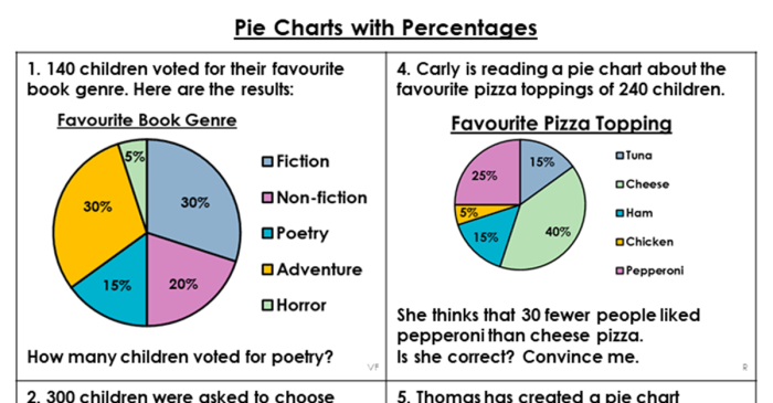
Datasets best suited for pie charts typically involve a single categorical variable representing the whole, divided into a small number of distinct categories. For instance, market share analysis, where different brands represent slices of the total market, is a perfect application. Similarly, a survey showing the distribution of responses across several options, like preferred colors or types of food, would be well-represented. Avoid using pie charts for datasets with numerous categories or where precise numerical comparisons are paramount.
Data Categorization Methods for Pie Charts
Organizing data effectively is key to a clear and understandable pie chart. Different methods of categorization lead to varying interpretations and insights. Choosing the right method depends on the specific questions you are trying to answer with your data.
| Categorization Method | Description | Example | Advantages |
|---|---|---|---|
| Simple Categorical Grouping | Directly assigning data points to pre-defined categories. | Survey responses categorized as “Agree,” “Disagree,” “Neutral.” | Easy to understand and implement. |
| Hierarchical Categorization | Grouping data into broader categories, then further subdividing them into sub-categories. | Sales data categorized by region (North, South, East, West), then further broken down by product type within each region. | Provides a more granular view of data, allowing for a multi-layered analysis. |
| Proportional Categorization | Categorizing data based on relative proportions or percentages within the whole dataset. | Market share analysis, where each slice represents the percentage of market held by a particular company. | Clearly highlights the relative contribution of each category to the whole. |
| Time-Based Categorization | Categorizing data based on time periods, such as months, quarters, or years. | Sales figures categorized by month, showing the sales trend over a year. | Useful for visualizing trends and changes over time, although this is better suited to other chart types. |
Limitations of Pie Charts and Alternative Visualizations
Pie charts are not always the optimal choice for data visualization. Their effectiveness diminishes with an increasing number of categories. When dealing with many categories or needing to show precise numerical comparisons, alternative visualization methods are often superior.
For instance, if you have more than 5-7 categories, a bar chart might be more effective in clearly representing the data. Bar charts allow for easier comparison of individual category values and are less susceptible to visual distortion caused by unequal slice sizes in pie charts. Similarly, for displaying trends over time, line charts are significantly more appropriate than pie charts. Treemaps or other hierarchical visualizations can be more useful when representing hierarchical data structures. Finally, for showing the relationships between parts of a whole and their contribution to a larger whole, a stacked bar chart might be a better choice than a pie chart.
Mastering Visual Elements

Effective pie chart design hinges not only on data accuracy but also on the skillful application of visual elements. Color palettes, labeling techniques, and legend styles significantly impact a viewer’s ability to quickly understand and interpret the data presented. A well-designed pie chart should be visually appealing and immediately convey the key insights.
Color Palette Selection for Enhanced Data Interpretation
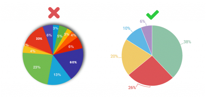
Choosing the right color palette is crucial for clear data communication. A well-selected palette enhances readability and avoids visual clutter, while a poorly chosen one can confuse and mislead the viewer. The goal is to create a visually pleasing chart that accurately reflects the data’s proportions. Consider using color palettes that are both aesthetically pleasing and accessible, such as those with sufficient color contrast for individuals with visual impairments. Avoid using too many colors, as this can make the chart difficult to interpret.
| Color Palette | Example | Impact |
|---|---|---|
| Good: Categorical Color Palette (e.g., using distinct hues from a color wheel) | Imagine a pie chart showing market share of different brands. Each brand is represented by a distinct color, like a vibrant blue for Brand A, a sunny yellow for Brand B, and a deep green for Brand C. | Clear distinction between categories, easy comparison of proportions. |
| Good: Sequential Color Palette (e.g., shades of a single color) for ordered data | Visualizing survey responses ranked from strongly agree to strongly disagree. Shades of blue, ranging from a light blue for strongly agree to a dark blue for strongly disagree, are used. | Effective visualization of gradual change or ranking. |
| Bad: Too many colors or similar shades | A pie chart with eight categories, each represented by a slightly different shade of blue. | Difficult to distinguish categories; leads to visual confusion. |
| Bad: Using colors with poor contrast | A pie chart using light pastel colors against a white background. | Difficult to read, especially for people with visual impairments. |
Effective Pie Chart Labeling
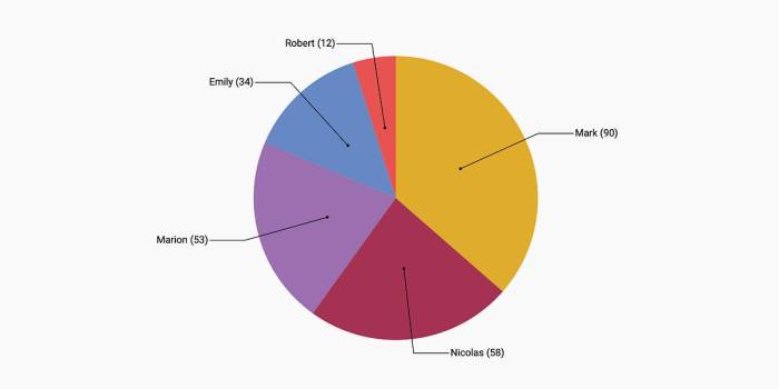
Clear and concise labels are essential for a pie chart’s readability. Labels should accurately represent the data categories and their corresponding values. Avoid overcrowding the chart with excessively long or complex labels. Optimal label placement is crucial; consider placing labels directly on the slices or using a separate legend if space is limited. The font size should be legible without overwhelming the chart’s visual appeal. For example, a well-labeled pie chart might show each slice with its category name directly written within the slice, with the percentage value displayed slightly smaller, neatly positioned to avoid overlapping.
Legend Styles and Their Applications
Pie charts often utilize legends to provide further context to the data visualization. Several legend styles exist, each suited to different situations. A simple legend, listing categories and corresponding colors, is suitable for most charts. However, for charts with many categories or limited space, a compact legend or a key integrated directly into the chart might be preferable. An interactive legend, where clicking on a legend entry highlights the corresponding slice, can be particularly useful for complex datasets. Consider the complexity of your data and the available space when choosing a legend style.
Closing Notes

By following these eight secrets, you can transform your data into visually appealing and easily understood pie charts. Remember that clear communication is key, and thoughtful design choices will ensure your audience grasps the information quickly and efficiently. Mastering these techniques will elevate your data visualization skills and allow you to create charts that are both informative and aesthetically pleasing.