Unlocking the power of data visualization requires more than just charts and graphs. Effective data visualization hinges on understanding your audience, selecting appropriate chart types, and employing compelling visual elements. This guide delves into eight key secrets, transforming raw data into insightful and engaging narratives that resonate with your intended audience, regardless of their technical expertise. We’ll explore techniques for choosing the right visualization, crafting clear titles and labels, and utilizing color palettes and annotations to maximize impact and understanding.
From mastering the art of choosing between bar charts, line graphs, and heatmaps to leveraging the power of annotations and visual cues, this guide equips you with practical strategies to design data visualizations that not only present information but also tell a compelling story. Learn how to tailor your visualizations to different audiences, avoiding common pitfalls and ensuring your data is communicated clearly and effectively.
Understanding Your Audience and Data

Effective data visualization hinges on a deep understanding of both your audience and the data itself. A visualization that is clear and insightful for a data scientist might be completely incomprehensible to a non-technical stakeholder. Similarly, choosing the wrong chart type for your data can lead to misleading or inaccurate interpretations. This section will explore these crucial considerations.
Understanding your audience’s level of technical expertise is paramount. For instance, presenting complex financial data to a board of directors requires a different approach than explaining the same data to a team of analysts. Simplicity and clarity are key for non-technical audiences, while technical audiences might appreciate more granular detail and sophisticated visualizations.
Designing for Non-Technical Audiences: An Example
Consider explaining complex financial data, such as quarterly performance across different business units, to a non-technical audience. A well-structured table can be highly effective.
| Quarter | Unit A (Revenue) | Unit B (Profit Margin) | Overall Growth |
|---|---|---|---|
| Q1 2024 | $10 million | 15% | 5% |
| Q2 2024 | $12 million | 18% | 10% |
| Q3 2024 | $15 million | 20% | 15% |
| Q4 2024 | $18 million | 22% | 20% |
This table uses clear labels and concise numerical data, making it easily digestible for a non-technical audience. The responsive design ensures readability across different devices.
Understanding Data Distributions
Before selecting a visualization type, analyzing the data’s distribution is critical. The distribution reveals the shape and spread of your data, influencing the choice of chart that best represents it. Choosing an inappropriate chart can misrepresent the data and lead to flawed conclusions.
Here are some examples illustrating the importance of understanding data distributions:
- Normally Distributed Data: If your data follows a normal (bell-curve) distribution, a histogram or box plot effectively displays the central tendency and spread. A pie chart would be inappropriate as it emphasizes proportions, not the distribution itself.
- Skewed Data: For skewed data (data concentrated at one end of the range), a box plot or a violin plot better illustrates the median, quartiles, and overall asymmetry than a bar chart, which could be misleading.
- Categorical Data: Bar charts are ideal for comparing categorical data, while a line chart would be inappropriate as it implies a continuous relationship that doesn’t exist.
Chart Type Comparison
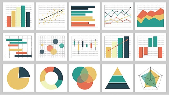
The following table compares the strengths and weaknesses of common chart types for different data sets.
| Chart Type | Strengths | Weaknesses | Suitable Data Types |
|---|---|---|---|
| Bar Chart | Easy to understand, good for comparisons across categories. | Can become cluttered with many categories, not suitable for showing trends over time. | Categorical data, comparisons of discrete values. |
| Line Chart | Excellent for showing trends over time, highlighting changes and patterns. | Can be difficult to interpret with many lines or overlapping data points. | Time-series data, continuous data showing trends. |
| Pie Chart | Good for showing proportions of a whole, simple and visually appealing. | Difficult to compare small proportions accurately, not suitable for many categories. | Proportional data, parts of a whole. |
| Scatter Plot | Reveals correlations and relationships between two variables. | Can be difficult to interpret with many data points, doesn’t show causal relationships. | Two continuous variables, identifying correlations. |
Choosing the Right Visualization Type

Selecting the appropriate visualization is crucial for effectively communicating insights from data. The wrong chart can obscure patterns, mislead the audience, and ultimately render your data analysis useless. The key lies in understanding the type of data you have and the message you want to convey. Different visualization types are suited to different tasks, and choosing wisely will significantly impact the clarity and impact of your work.
A well-chosen visualization type can transform complex data into easily digestible information, revealing trends and relationships that might otherwise remain hidden. Conversely, a poorly chosen visualization can lead to misinterpretations and a failure to communicate effectively.
Scatter Plots for Correlation
Scatter plots are ideal for illustrating the correlation between two continuous variables. Each point on the plot represents a single data point, with its horizontal and vertical position determined by the values of the two variables. The overall pattern of the points reveals the correlation: a positive correlation shows points clustered along a line sloping upwards, a negative correlation shows points clustered along a line sloping downwards, and no correlation shows points scattered randomly. For example, a scatter plot could effectively show the relationship between ice cream sales and temperature. Higher temperatures would likely correlate with higher ice cream sales, indicated by a positive upward trend in the data points. The strength of the correlation is reflected in how tightly clustered the points are around the trend line. A tightly clustered pattern suggests a strong correlation, while a loosely scattered pattern indicates a weaker correlation.
Heatmaps versus Clustered Bar Charts for Multi-Dimensional Data
Heatmaps and clustered bar charts are both useful for displaying multi-dimensional data, but they serve different purposes and highlight different aspects of the data.
The choice between these two visualization types depends on the specific goals of your analysis and the nature of your data. Consider the size of your dataset and the level of detail you need to present.
- Heatmaps are excellent for visualizing the magnitude of a variable across two other variables. For example, a heatmap could show sales figures for different products across various regions, with color intensity representing sales volume. The advantage of heatmaps is their ability to quickly reveal patterns and trends across large datasets, making it easy to identify high-performing regions or products. However, heatmaps can become difficult to interpret if there are too many categories or if the color scale is not well-chosen.
- Clustered bar charts, on the other hand, are better suited for comparing the values of a single variable across multiple categories, broken down by another variable. For example, a clustered bar chart could show the average customer satisfaction scores for different products, broken down by customer segment (e.g., age group). Clustered bar charts are easier to read than heatmaps for smaller datasets, allowing for precise comparisons between specific categories. However, they can become cluttered and difficult to interpret when dealing with many categories.
Visualizing Hierarchical Data with Nested Charts or Treemaps
Hierarchical data, which represents data organized in a tree-like structure, can be effectively visualized using nested charts or treemaps.
The design process for visualizing hierarchical data involves several key steps: first, understanding the structure of the hierarchy; second, selecting the appropriate visualization type; and third, carefully designing the visual elements to ensure clarity and readability.
Nested charts, such as nested bar charts or pie charts, represent hierarchical levels as nested layers within the chart. For instance, a nested bar chart could display sales figures for different regions, with each region further broken down by product category. This allows for a clear visual representation of the hierarchical structure and the contribution of each sub-category to the higher-level category. The design process involves determining the order of nesting, selecting appropriate colors or patterns to differentiate the levels, and ensuring sufficient space for labels and values.
Treemaps, on the other hand, represent hierarchical data using nested rectangles. The size of each rectangle is proportional to the value it represents, and the rectangles are nested to reflect the hierarchical structure. For example, a treemap could show market share for different companies, with each company further broken down by product line. The design process involves carefully arranging the rectangles to maximize the use of space and ensure that the sizes are easily comparable. Color coding can be used to further differentiate the categories. A well-designed treemap allows for quick identification of the largest and smallest contributors at each level of the hierarchy.
Closure

Mastering the art of data visualization is a journey of understanding both your data and your audience. By applying these eight secrets – from understanding data distributions to crafting effective visual elements – you can transform complex information into clear, compelling narratives. Remember, the goal is not just to display data, but to illuminate insights and drive understanding. Through thoughtful design and a focus on clarity, your data visualizations will become powerful tools for communication and decision-making.