Data visualization is evolving, moving beyond static charts and graphs. Animated data visualizations offer a dynamic and engaging way to present information, making complex datasets more accessible and memorable. This exploration delves into five creative approaches, transforming data into compelling narratives through interactive storytelling, kinetic typography, and abstract artistic representations.
From illustrating company growth with interactive bar charts to using abstract particle systems to represent stock market fluctuations, these methods enhance understanding and create a lasting impact. We’ll examine practical examples, technical considerations, and the advantages each approach offers for effectively communicating data-driven insights.
Interactive Storytelling with Animated Charts

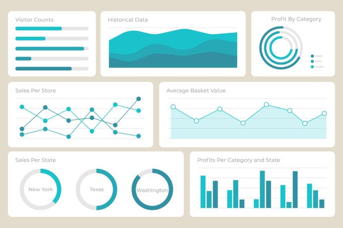
Animated charts offer a powerful way to engage audiences and communicate complex data effectively. By incorporating interactivity, we can transform static visualizations into dynamic narratives, allowing viewers to explore data at their own pace and gain a deeper understanding. This approach enhances data accessibility and fosters greater engagement compared to traditional static charts.
This section will explore the creation of interactive animated charts, illustrating their application in various scenarios. We’ll delve into specific examples, detailing design choices and technical approaches.
Animated Bar Chart Illustrating Company Growth
This example showcases the growth of a fictional company, “InnovateTech,” over five years (2018-2022). The animated bar chart uses vibrant colors – blues for revenue and oranges for profit – to represent the data. Each bar grows smoothly over time, revealing the year-over-year changes. Interactive elements allow users to hover over each bar to see precise numerical values for revenue and profit for that specific year. A subtle highlight effect accentuates the selected bar, making it stand out from the others. The transition between years is smooth and visually appealing, using a fade-in/fade-out effect for a seamless user experience. The overall aesthetic is clean and modern, ensuring readability and avoiding visual clutter.
Animated Sequence Showing Marketing Campaign Impact
This visualization uses a combination of line graphs and pie charts to illustrate the impact of a marketing campaign on sales figures. The line graph shows sales trends before, during, and after the campaign, with a clear visual marker indicating the campaign’s start and end dates. The pie charts, appearing alongside the line graph at regular intervals, show the breakdown of sales by product category. Miniature icons, representing individual customers or product types, are used to visually enhance the data representation. For example, a small shopping cart icon could represent each sale, increasing in number as the line graph ascends. The animation uses smooth transitions between data points and emphasizes the positive change in sales following the marketing campaign.
Animated Map Visualizing Population Density Changes
This visualization uses an animated map to show population density changes across a fictional country called “Atheria” over a decade (2013-2023). The map employs a color gradient, ranging from light green (low density) to dark red (high density), to represent population density. The animation shows a smooth transition between years, highlighting areas with significant population growth or decline. The legend clearly explains the color-coding, allowing viewers to easily interpret the map’s visual representation. Areas experiencing rapid population growth might exhibit a more pronounced animation effect, drawing attention to significant shifts in population distribution. The animation aims for clarity and avoids overly complex transitions, maintaining a user-friendly experience.
Table Summarizing Animated Chart Examples
| Visualization Type | Description | Key Features | Technical Approach |
|---|---|---|---|
| Animated Bar Chart | Illustrates InnovateTech’s revenue and profit growth over five years (2018-2022). | Interactive hover for data values, smooth bar growth animation, vibrant color scheme. | Likely implemented using JavaScript libraries like D3.js or Chart.js for animation and interactivity. |
| Combined Line and Pie Charts | Shows the impact of a marketing campaign on sales figures, broken down by product category. | Line graph illustrating sales trends, pie charts showing product breakdown, miniature icons for visual enhancement. | Likely uses JavaScript libraries like D3.js or similar animation and charting tools. |
| Animated Map | Visualizes population density changes in Atheria over a decade (2013-2023). | Color gradient representing population density, smooth transitions between years, clear legend. | Potentially utilizes a mapping library like Leaflet or Mapbox GL JS, combined with animation libraries. |
Abstract and Artistic Data Representations

Abstract and artistic data visualization offers a compelling alternative to traditional charts and graphs, enabling a more engaging and intuitive understanding of complex datasets. By moving beyond the constraints of conventional representations, we can unlock new avenues for visual storytelling, transforming data into captivating experiences. This approach prioritizes the emotional and aesthetic impact of the visualization, often prioritizing artistic expression over strict adherence to numerical precision.
Abstract Animated Visualization of a Stock Market Index
This visualization uses a particle system to represent the fluctuations of a stock market index. Imagine a field of particles, each representing a single data point. As the index rises, the particles coalesce and glow brighter, perhaps shifting to warmer colors like orange and yellow. Conversely, a market downturn would see the particles disperse and dim, their colors shifting to cooler tones like blue and purple. The density of the particles could also reflect trading volume, with denser clusters indicating higher activity. This approach avoids the rigid structure of a line graph, instead creating a dynamic and visually rich representation that emphasizes the overall trend and volatility of the market. The design choice to use particles allows for a more intuitive grasp of the market’s ebb and flow, focusing on the overall movement rather than precise numerical values.
Animated Visualization of Network Data
This visualization represents a network using nodes and connections, dynamically changing based on data input. Each node represents an entity within the network (e.g., a person, a website, a city), and the connections represent relationships between them. The size of a node could reflect its importance or influence within the network, while the thickness and color of the connections could represent the strength or type of relationship. For example, a strong positive relationship might be depicted with a thick, bright green line, while a weak negative relationship could be a thin, dark red line. The animation would show the network evolving over time, with connections forming, strengthening, weakening, or breaking based on the incoming data. This dynamic representation clarifies relationships by visually highlighting the key players and the strength of their interactions, allowing for a quick understanding of network dynamics.
Animated Visualization of Music Data
This visualization uses abstract shapes and colors to represent music data such as frequency and amplitude. Imagine a screen filled with pulsating shapes, their size and color changing in response to the music. Higher frequencies might be represented by smaller, faster-moving shapes with bright, sharp colors, while lower frequencies might be represented by larger, slower-moving shapes with softer, muted colors. The amplitude could be reflected in the intensity of the colors and the size of the shapes, with louder passages resulting in larger, brighter shapes. This approach translates the intangible aspects of music into a visual experience, creating a dynamic and engaging representation that captures the emotional essence of the audio. The visual elements directly correlate to the musical data, providing a concrete visual representation of an otherwise abstract phenomenon.
Comparison of Abstract and Traditional Data Visualization Approaches
The following table compares abstract and traditional data visualization approaches, highlighting their respective advantages and disadvantages.
| Abstract | Traditional |
|---|---|
| Advantages: More engaging and memorable; better suited for conveying overall trends and patterns; can be more aesthetically pleasing; can communicate complex data more intuitively. | Advantages: Precise and accurate; allows for detailed analysis; familiar and easily understood by a wide audience; easily incorporates numerical data. |
| Disadvantages: Can be less precise; may not be suitable for all types of data; requires more design expertise; interpretation can be subjective. | Disadvantages: Can be less engaging; can be difficult to understand for complex datasets; may not effectively convey overall trends; can be visually cluttered. |
Concluding Remarks

By leveraging the power of animation, data visualization transcends the limitations of static representations. The five creative approaches discussed—interactive storytelling, kinetic typography, abstract representations, and more—demonstrate the potential to transform complex information into captivating experiences. Through thoughtful design and innovative techniques, data can be presented in a way that is not only informative but also aesthetically pleasing and profoundly engaging, fostering deeper understanding and lasting impressions.