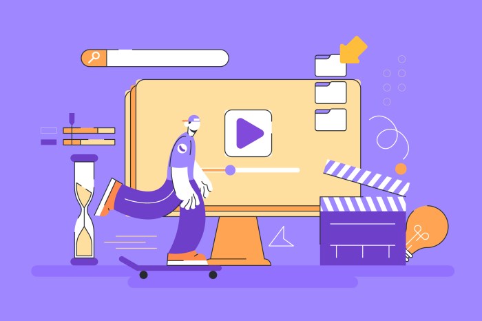
Web design is evolving beyond static visuals; motion is now a key element in creating engaging and user-friendly experiences. This guide explores seven innovative ways to incorporate motion into your web designs, transforming simple interactions into memorable moments. We’ll delve into micro-interactions, seamless page transitions, and advanced animation techniques, providing practical examples and best practices to elevate your web projects.
From subtle animations that provide feedback to users to more complex, visually stunning effects, we’ll cover a range of techniques using CSS, JavaScript, and SVG. We’ll also discuss performance optimization strategies to ensure your animations are smooth and efficient across all devices. By the end, you’ll possess a comprehensive toolkit for designing web experiences that are both beautiful and highly functional.
Micro-interactions

Micro-interactions are small, specific interactions within a user interface that provide immediate feedback and enhance the overall user experience. They are often subtle animations or visual cues that respond directly to user actions, making the interface feel more responsive and engaging. Well-designed micro-interactions contribute significantly to a product’s perceived quality and usability.
Button Click Animation Design
A well-designed button click animation provides instant visual feedback, confirming the user’s action and reinforcing the interaction. This can be achieved through a combination of scaling, color changes, and subtle shifts in position. The following table details the animation stages and easing functions for a simple button click:
| Stage | Duration (ms) | Easing Function | Description |
|---|---|---|---|
| Initial State | 0 | – | Button is in its resting state. |
| Press | 100 | easeInCubic | Button scales down slightly (e.g., 95% of its original size) and shifts slightly downwards. |
| Release | 100 | easeOutCubic | Button returns to its original size and position. A subtle color change (e.g., slightly lighter shade) can also be added during this stage. |
| Post-Click | 0 | – | Button returns to its resting state. |
Easing functions, like easeInCubic and easeOutCubic, control the speed and smoothness of the animation, making it feel more natural and less robotic. Experimentation is key to finding the right easing function for your specific design.
Subtle Animations for User Feedback
Subtle animations are crucial for providing immediate feedback on user actions. For instance, a loading indicator, such as a spinning icon or a progress bar, provides visual confirmation that the system is processing the user’s request. Similarly, a subtle animation after form submission (e.g., a brief checkmark icon) assures the user that their input has been received. These small visual cues prevent frustration and improve the overall user experience. They help manage user expectations by providing a clear indication of progress or completion.
Comparison of Animation Libraries
Several animation libraries are available for creating micro-interactions, each with its own strengths and weaknesses. GreenSock (GSAP) is a powerful and widely used library offering extensive control and performance optimization. However, it has a steeper learning curve compared to simpler libraries like Animate.css, which provides pre-built animations, making it easier to implement but less flexible. React Spring provides a declarative approach, integrating seamlessly with React applications, but requires familiarity with React concepts. The choice of library depends on project complexity, developer expertise, and performance requirements.
Loading Animation Description
A loading animation should be visually appealing and informative, conveying the idea of ongoing activity without being distracting. A good example would be a circular progress indicator with a dynamically updating percentage or a subtle pulsing animation within a small icon. The visual style should align with the overall design language of the application. Timing is crucial; the animation should be neither too fast (appearing jerky) nor too slow (feeling unresponsive). A duration of approximately 1-2 seconds for a complete cycle is generally considered a good balance, depending on the expected loading time. If loading takes longer, a more detailed progress bar would be preferable.
Page Transitions
Smooth and engaging page transitions are crucial for creating a positive user experience on a website. They enhance the overall flow and contribute significantly to the perceived quality of the design. Well-executed transitions can subtly guide users through the site, creating a sense of continuity and delight. Poorly implemented transitions, however, can disrupt the user experience and lead to frustration.
Page transitions, beyond simply moving from one page to another, offer a powerful opportunity to showcase creativity and enhance the user experience. By thoughtfully employing animation, we can transform mundane navigation into a visually engaging and memorable aspect of the website. This section explores different transition techniques, their user experience implications, and best practices for optimization.
CSS Page Transition Animations
Three common and effective page transition animations are fade, slide, and zoom. Each offers a distinct visual and user experience. We can implement these using CSS transitions and animations.
- Fade Transition: This involves gradually changing the opacity of the elements as the page transitions. A fade-in effect on the new page and a fade-out effect on the old page creates a smooth, unassuming change. The user experience is generally perceived as calm and unobtrusive, suitable for websites emphasizing content readability and minimal distractions. For example, imagine a news website where articles transition smoothly using a fade effect. The user’s focus remains on the content, with the transition acting as a gentle visual cue.
- Slide Transition: This transition involves moving elements horizontally or vertically across the screen. For example, the new page could slide in from the right while the old page slides out to the left. This effect creates a more dynamic and engaging feel compared to a fade, drawing more attention to the transition itself. This style is well-suited for websites aiming for a more modern and playful aesthetic. Think of an e-commerce site showcasing products; a slide transition could highlight the transition between product categories.
- Zoom Transition: This transition involves scaling the elements. The old page might zoom out, while the new page zooms in. This creates a sense of depth and can be particularly effective when transitioning between sections with distinct visual styles. This technique is more visually striking and could be suitable for websites that prioritize visual appeal, such as portfolios or artistic websites. A photographer’s website, for instance, could utilize zoom transitions to emphasize the transition between different photo galleries.
Creating Depth and Hierarchy with Animation
Animation can effectively create a sense of depth and hierarchy within a website’s navigation. By subtly animating elements, we can guide the user’s eye and highlight important interactions. For instance, a subtle drop shadow animation on hover can visually lift menu items, adding a sense of depth and making them stand out. Similarly, using a scale animation to enlarge an element on hover can draw attention and emphasize its importance. Using layered parallax scrolling (explained in the next section) is another powerful way to create depth and hierarchy.
Optimizing Page Transition Animations for Performance
Optimizing page transitions for performance, especially on mobile devices, is crucial for a smooth user experience. Poorly optimized animations can lead to janky transitions and negatively impact perceived performance.
- Minimize the number of elements animated: Animating only essential elements reduces the computational load. Avoid animating background images or non-essential UI elements unless it directly enhances the user experience.
- Use hardware acceleration: Employ CSS properties like `transform` and `opacity` to leverage the GPU for smoother animations. Avoid using properties like `top`, `left`, `width`, and `height` for animations, as these are often less efficiently handled by the GPU.
- Keep animations short and simple: Complex animations can be computationally expensive. Opt for shorter, simpler animations that are quick to render.
- Optimize images and videos: Large images and videos can significantly slow down page transitions. Compress images and use optimized video formats.
- Use efficient animation techniques: Techniques like CSS transitions and keyframes offer better performance than JavaScript-based animations in many cases.
Parallax Scrolling Effects
Parallax scrolling creates a sense of depth by moving background elements slower than foreground elements as the user scrolls. This technique is often used to create visually engaging and immersive experiences. It adds a three-dimensional feel, enhancing visual appeal and making the website more memorable. For example, imagine a website showcasing a mountain landscape; the mountains in the background would move slower than the trees in the foreground, creating a realistic sense of depth and perspective as the user scrolls. The impact on visual appeal is significant; it adds a dynamic and engaging element that elevates the user experience beyond static content. This is achieved by assigning different scroll speeds to different layers of the website using CSS transforms and JavaScript, if necessary, for more complex scenarios.
Advanced Animation Techniques
Elevating web design beyond simple transitions requires mastering advanced animation techniques. By skillfully employing these techniques, designers can create engaging and memorable user experiences that seamlessly blend aesthetics and functionality. This section delves into utilizing SVG animations, keyframe manipulation, and the strategic choice between CSS and JavaScript libraries for complex animations, ultimately demonstrating how to integrate motion graphics into a website’s hero section.
SVG Animation: An Interactive Element Example
Let’s create an interactive loading indicator using SVG. The visual design will be a circular progress bar that fills as the loading process completes. The circle will be a gradient, subtly changing color as it fills.
The process involves several steps: first, creating the SVG structure using a “ element; second, animating the `stroke-dasharray` and `stroke-dashoffset` attributes using CSS animations; and finally, triggering the animation on page load or an event.
Step 1: SVG Structure
We start with a basic SVG element containing a circle. The `stroke-dasharray` attribute controls the length of the dashes and gaps in the circle’s stroke, while `stroke-dashoffset` determines the starting position of the dashes. Initially, we set `stroke-dashoffset` to the circle’s circumference to hide the stroke completely.
<svg width="100" height="100">

  <circle cx="50" cy="50" r="40" stroke="linear-gradient(to right, #4CAF50, #8BC34A)" stroke-width="8" stroke-dasharray="251.33" stroke-dashoffset="251.33" fill="transparent"/>

</svg>
Step 2: CSS Animation
The CSS animation targets `stroke-dashoffset`, reducing it from the circumference to 0 over a specified duration. This reveals the circle’s stroke, creating the filling effect. We can use `animation-timing-function` to control the animation’s pacing, for example, using `ease-in-out` for a smoother transition.
.progress-circle

  animation: fill-circle 2s ease-in-out forwards;
@keyframes fill-circle
to stroke-dashoffset: 0;
Step 3: Triggering the Animation
We add the `progress-circle` class to the SVG element, triggering the animation. This can be done directly in the HTML or dynamically using JavaScript, depending on the loading process being visualized.
Keyframes and Timing Functions
Keyframes define specific points in an animation, specifying the properties’ values at each point. Timing functions control how the properties change between these keyframes, allowing for the creation of nuanced and complex animations. For example, `ease-in-out` provides a smooth acceleration and deceleration, while `steps()` creates a stepwise animation. By combining multiple keyframes and carefully selecting timing functions, designers can precisely control the animation’s flow and character. For instance, a bounce effect could be achieved using multiple keyframes with different timing functions to simulate the compression and expansion of a bouncing ball. A more complex animation, such as a character walking, might require dozens of keyframes to accurately depict each step and movement.
CSS Animations vs. JavaScript Libraries
CSS animations offer a lightweight and performant solution for simpler animations, directly integrated into the styling. However, for highly complex animations involving intricate calculations or interactions, JavaScript libraries like GreenSock (GSAP) provide greater flexibility and control. CSS animations excel in simplicity and browser optimization; JavaScript libraries offer unmatched power and fine-grained control over every aspect of the animation, but may impact performance if not optimized carefully. The choice depends on the animation’s complexity and performance requirements. Simple animations like loading indicators or subtle transitions are ideal for CSS; complex character animations or physics-based interactions often benefit from a JavaScript library’s capabilities.
Motion Graphics in a Hero Section Plan
The following table Artikels a plan for incorporating motion graphics into a website’s hero section to enhance user engagement. The plan focuses on subtle, elegant animations that complement the content rather than overwhelming it.
| Element | Animation | Duration | Effect |
|---|---|---|---|
| Headline Text | Fade-in with slight scale-up | 1.5s | Draws attention to the main message. |
| Subheadline Text | Fade-in with a slight delay after the headline | 1s | Provides context and builds on the headline’s impact. |
| Hero Image/Video | Parallax scrolling effect | Continuous | Creates depth and adds a subtle interactive element. |
| Call to Action Button | Slight hover animation (scale-up and color change) | 0.2s | Encourages user interaction. |
Ultimate Conclusion
Mastering motion design for the web is about more than just adding flashy animations; it’s about enhancing usability and creating a cohesive, engaging experience. By thoughtfully integrating micro-interactions, smooth transitions, and visually compelling animations, you can significantly improve user satisfaction and leave a lasting impression. This guide has provided a foundation; now, experiment, iterate, and discover the endless possibilities of motion in web design.