Motion design elevates user experiences, transforming static interfaces into dynamic and engaging narratives. Understanding fundamental principles, like anticipation and squash and stretch, is crucial for creating compelling animations. This guide delves into five best practices for seamlessly integrating motion into UI/UX design, focusing on impactful micro-interactions and intuitive transitions. We’ll explore how to avoid common pitfalls and harness the power of motion to enhance user engagement and satisfaction.
From creating effective motion graphics for visual communication to designing engaging loading animations, we will cover a range of techniques and considerations. The guide provides a practical framework for designers seeking to master the art of motion design and create visually stunning and user-friendly interfaces.
Understanding Fundamental Motion Design Principles

Effective motion design in UI/UX isn’t just about adding movement; it’s about using animation strategically to enhance user experience and guide the user seamlessly through the interface. Understanding the fundamental principles of animation is key to achieving this. These principles, originally developed for traditional animation, are equally applicable and crucial in the digital realm.
The twelve basic principles of animation, developed by Disney animators Ollie Johnston and Frank Thomas, provide a framework for creating believable and engaging motion. Applying these principles to UI/UX design results in more intuitive, enjoyable, and user-friendly interfaces. They guide the creation of animations that are not only visually appealing but also serve a clear purpose within the design.
The Twelve Principles of Animation Applied to UI/UX
Each of the twelve principles – squash and stretch, anticipation, staging, straight ahead action and pose to pose, follow through and overlapping action, slow in and slow out, arcs, secondary action, timing, exaggeration, solid drawing, and appeal – contributes to the overall effectiveness of an animation. Let’s explore how some of these principles translate into practical UI/UX design applications.
Anticipation, Staging, and Follow-Through in Website Design
These three principles work together to create a sense of realism and predictability in animation. Anticipation prepares the user for an upcoming action, staging focuses attention on the key element, and follow-through adds a sense of weight and realism to the movement.
For example, consider a button that expands to reveal more options. Anticipation might involve a subtle pre-expansion, a slight shift in color or a small shadow that subtly indicates the button’s imminent change. Staging would ensure the button is clearly highlighted, perhaps through a change in color or size before the expansion, drawing the user’s eye to it. Follow-through could be a slight lingering wobble or a subtle afterglow as the button fully expands, adding a sense of physicality to the digital action.
Squash and Stretch
Squash and stretch is a fundamental principle that gives objects a sense of weight, volume, and flexibility. It involves distorting an object’s shape while maintaining its volume. This creates a more lifelike and dynamic feel. In UI/UX, this could be used to give buttons a more playful and responsive feel, or to make loading indicators appear more engaging.
| Before Image | After Image | Description | Principle Applied |
|---|---|---|---|
| Imagine a simple red circle. | Imagine the same circle, but vertically elongated and horizontally compressed, maintaining the same overall area. | The circle is squashed vertically and stretched horizontally. | Squash and Stretch |
| Imagine a simple red circle. | Imagine the same circle, but horizontally elongated and vertically compressed, maintaining the same overall area. | The circle is squashed horizontally and stretched vertically. | Squash and Stretch |
Timing and Spacing in Engaging Motion
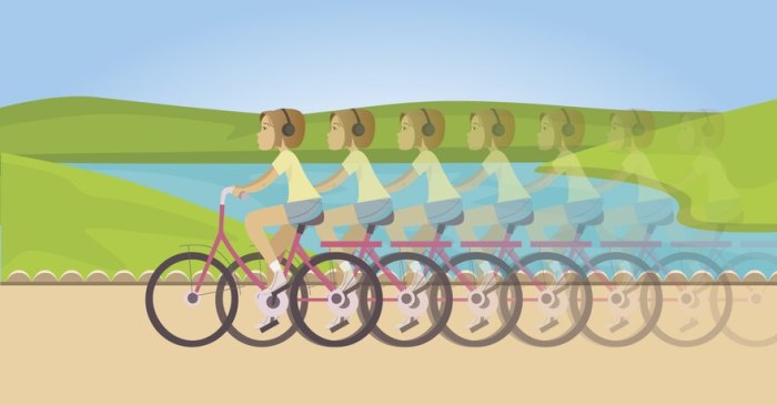
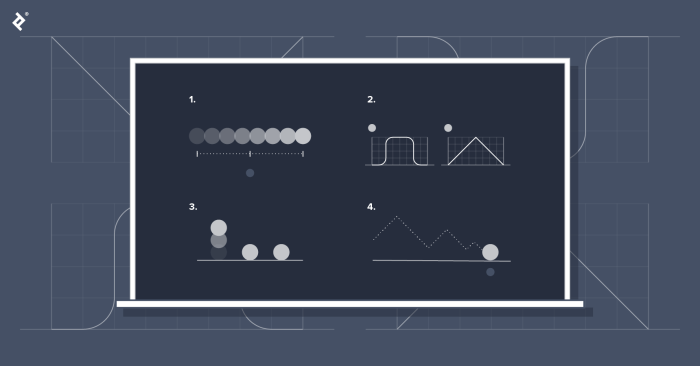
Timing and spacing are crucial for controlling the rhythm and feel of an animation. Precise timing determines the speed and duration of an action, while spacing controls the distance between keyframes, influencing the animation’s smoothness and overall pacing. Poor timing can make an animation feel jerky or unnatural, while poor spacing can make it feel rushed or slow.
For instance, a fast, snappy transition between screens might use short timing and evenly spaced keyframes to create a quick, efficient experience. Conversely, a more subtle, elegant transition might employ longer timing and varied spacing, creating a smoother, more deliberate feel. The key is to match the timing and spacing to the overall tone and purpose of the animation.
Best Practices for Implementing Motion Design in User Interfaces

Motion design, when thoughtfully implemented, can significantly enhance the user experience, making interactions more intuitive and enjoyable. However, poorly executed motion can be distracting and even frustrating. This section Artikels best practices to ensure your motion design contributes positively to your UI.
Effective motion design in user interfaces hinges on understanding its purpose and carefully considering its implementation. It’s not about adding flashy animations for the sake of it; it’s about subtly guiding users, providing feedback, and creating a more engaging and satisfying experience.
Micro-interactions and User Engagement
Micro-interactions, small animations triggered by user actions (like a button press or a page scroll), play a crucial role in user engagement and satisfaction. They provide immediate visual feedback, confirming that the user’s action has been registered. A well-designed micro-interaction, such as a subtle bounce animation on a button press, can significantly increase perceived responsiveness and delight. Conversely, a lack of feedback can leave users feeling uncertain about whether their action has been successful. Consider the difference between a simple button click with no visual response and one that subtly changes color or provides a short animation. The latter provides a much more satisfying user experience.
Motion Design in Different User Interfaces
The application of motion design varies across different UI types. Mobile apps, due to their smaller screen size and touch-based interaction, often benefit from more subtle and concise animations. Websites, with their larger canvases and diverse interaction methods, allow for a broader range of motion design techniques. However, the core principle remains consistent: motion should enhance usability and not detract from it. A mobile app might use subtle transitions between screens, while a website might employ more elaborate animations for interactive elements. The key is to maintain consistency and appropriateness for the platform.
Drawbacks of Overusing Motion Design
Overusing motion design can have several detrimental effects on the user experience:
- Increased loading times: Complex animations can significantly increase page load times, leading to frustration and potentially impacting .
- Distraction and cognitive overload: Excessive motion can distract users from the core content and tasks, leading to cognitive overload and decreased comprehension.
- Accessibility issues: Poorly implemented motion can be inaccessible to users with certain disabilities, such as motion sensitivity or visual impairments.
- Decreased credibility: Overly flashy or gimmicky animations can detract from the professionalism and credibility of a website or app.
- Battery drain on mobile devices: Resource-intensive animations can drain battery life on mobile devices, leading to user dissatisfaction.
Designing Intuitive and Visually Appealing Transitions
Effective transitions should be both visually appealing and intuitive, seamlessly guiding users between different states or screens. They should be consistent with the overall design language and should never disrupt the user’s workflow. For example, a simple fade-in/fade-out transition is often preferred for its simplicity and clarity, while more complex transitions might be appropriate for specific contexts. The key is to prioritize clarity and predictability. Transitions should always be smooth and natural, avoiding jerky or abrupt movements that can be jarring to the user. Consider using easing functions to create more natural-looking animations. For instance, an ease-out effect can create a more satisfying feeling of completion, while an ease-in effect can build anticipation.
Creating Effective Motion Graphics for Visual Communication

Motion graphics are a powerful tool for conveying information and engaging audiences. By skillfully combining animation, visuals, and sound, designers can create compelling narratives, explain complex concepts, and enhance brand identity. Effective motion graphics prioritize clarity, visual storytelling, and emotional resonance.
Different Styles of Motion Graphics
Choosing the right style is crucial for aligning your motion graphics with your overall message and target audience. The style significantly impacts the perceived tone and effectiveness of your communication. Here are three distinct styles:
- Kinetic Typography: This style uses animated text as the primary visual element. Think of text flowing, transforming, or appearing dynamically to emphasize key words or phrases. A classic example is the opening sequence of a movie trailer, where titles appear with stylized animations and transitions. The design choices here often involve bold fonts, creative text layouts, and well-timed animations.
- 2D Animation: This encompasses a broad range of styles, from simple, flat illustrations to more complex character animations. Consider the animated explainer videos often used for software tutorials or marketing campaigns. These videos usually employ clean lines, vibrant colors, and character animations to communicate information in an engaging way. The style can be cartoonish, realistic, or somewhere in between, depending on the desired tone and subject matter.
- 3D Animation: This style leverages three-dimensional modeling and animation to create highly realistic or stylized visuals. Think of product demonstrations, architectural visualizations, or animated logos. 3D animation often requires more technical expertise and resources but can deliver stunning results, particularly for showcasing complex objects or environments. The design choices frequently involve detailed modeling, realistic lighting and texturing, and smooth camera movements.
Creating a Simple Animated Explainer Video
Producing an effective explainer video involves a structured approach. Following these steps will ensure a cohesive and engaging final product.
- Storyboarding: Plan the video’s narrative visually, outlining key scenes and transitions. This stage ensures a clear structure and helps avoid costly revisions later.
- Asset Creation: Design and create the necessary visual elements, including characters, backgrounds, and text. Consider using vector graphics for scalability and flexibility.
- Animation: Animate the assets, paying close attention to timing, pacing, and easing. Smooth transitions and well-timed animations significantly improve viewer engagement.
- Sound Design: Add music, voiceover, and sound effects to enhance the narrative and emotional impact. Well-chosen sound can elevate the overall viewing experience.
- Rendering and Export: Render the final video at the appropriate resolution and format for your target platform.
Enhancing Motion Graphics with Color, Typography, and Sound
The careful selection of color palettes, typography, and sound significantly impacts the overall effectiveness of motion graphics.
Color: Color evokes emotions and establishes tone. A vibrant palette might be suitable for a playful brand, while a muted palette could be more appropriate for a sophisticated product. Consistent color schemes throughout the animation create visual harmony.
Typography: Font selection should align with the brand’s personality and the overall message. Legible fonts are crucial, especially in kinetic typography. Consider using different font weights and styles to create visual hierarchy and emphasize key information.
Sound: Music, voiceover, and sound effects should complement the visuals, reinforcing the narrative and creating an immersive experience. Music sets the mood, voiceover provides clarity, and sound effects add realism and impact.
Designing Motion Graphics for Brand Communication
A series of motion graphics can effectively communicate a brand story or highlight product features. Consider the following example:
Brand Story: A series of three short animations could showcase the company’s history, mission, and values. The first animation might depict the company’s founding, using nostalgic imagery and a warm color palette. The second animation could highlight the company’s commitment to sustainability, featuring nature-inspired visuals and calming music. The final animation might showcase the company’s future vision, using futuristic imagery and upbeat music.
Product Feature: A set of short animated clips could demonstrate a new product feature. Each clip could focus on a specific aspect of the feature, using clear visuals and concise animations. For instance, one clip might show how the feature works, another could highlight its benefits, and a third might showcase user testimonials.
Creating an Engaging Loading Animation
A well-designed loading animation can significantly improve user experience.
Visuals: A simple, yet visually appealing animation, such as a rotating logo or a progress bar with subtle animation, can keep users engaged. Avoid overly complex or distracting animations.
Color Palette: Use a color palette that aligns with the brand’s identity. A calming color palette might be preferred to reduce user frustration during loading times.
Animation Techniques: Simple, smooth animations are more effective than jarring or erratic movements. Consider using easing functions to create a more natural flow.
Example: A loading animation could feature a circular progress bar that fills gradually with a gradient of blues and greens, accompanied by a subtle, calming sound. The company logo could rotate slowly in the center of the circle.
Conclusion

By applying these five best practices and understanding the fundamental principles of motion design, you can create interfaces that are not only visually appealing but also intuitive and engaging. Remember that effective motion design is about enhancing the user experience, not overwhelming it. Strive for subtlety and purpose in your animations, focusing on clarity and functionality. With careful planning and execution, motion design can transform your designs, leaving a lasting positive impression on your users.