Unlocking the power of illustration in design requires more than just selecting pretty pictures. This guide delves into the art of seamlessly integrating illustrations to enhance user experience and achieve a truly unique brand aesthetic. We’ll explore various illustration styles, optimization techniques, and crucial considerations for harmonizing visuals with overall design elements, ultimately empowering you to create designs that captivate and resonate.
From understanding the nuances of different illustration types and their application to mastering the art of color palette selection and negative space utilization, we’ll equip you with practical strategies for maximizing the impact of your illustrations. Learn how to guide the viewer’s eye, evoke specific emotions, and ultimately, elevate your designs to the next level of custom appeal.
Selecting and Integrating Illustrations
Choosing the right illustrations and seamlessly integrating them into your design is crucial for achieving a cohesive and impactful visual narrative. The style, size, and resolution of your illustrations will significantly influence the overall aesthetic and effectiveness of your project. Careful consideration of these factors is essential for creating custom appeal.
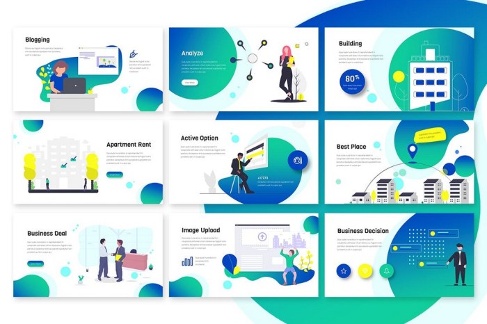
Illustration Styles and Project Suitability
The selection of an illustration style should be carefully considered based on the project’s goals and target audience. Different styles evoke different emotions and suit different design contexts. The table below compares several popular illustration styles and their applications.
| Illustration Style | Description | Suitable Projects | Unsuitable Projects |
|---|---|---|---|
| Vector | Created using mathematical equations, scalable without loss of quality. | Logos, icons, website graphics, animations, scalable print materials | Projects requiring a highly realistic or textured look. |
| Watercolor | Painterly style, characterized by soft edges and blended colors. | Branding materials for businesses emphasizing creativity and artistry, wedding invitations, children’s books | Technical manuals, minimalist designs, projects requiring sharp lines and precision. |
| Line Art | Simple, clean illustrations using only lines and minimal shading. | Infographics, website illustrations, children’s books, minimalist branding | Projects requiring photorealism or intricate detail. |
| Isometric | Three-dimensional illustrations viewed from an oblique angle. | Technical illustrations, diagrams, game assets, infographics | Projects requiring a realistic perspective. |
Finding Royalty-Free Illustrations
Locating royalty-free illustrations that perfectly match your brand aesthetic requires a strategic approach. This ensures you avoid copyright infringement and maintain design consistency.
- Define your brand aesthetic: Clearly articulate your brand’s personality, values, and visual style (e.g., minimalist, modern, rustic, playful). This will guide your search.
- Identify relevant s: Develop a comprehensive list of s that accurately reflect your brand’s visual style and the subject matter of your illustrations (e.g., “minimalist line art coffee,” “watercolor floral wedding,” “modern vector technology”).
- Utilize reputable stock illustration websites: Explore platforms like Shutterstock, iStock, Adobe Stock, and Creative Market, filtering your search using your s and brand aesthetic guidelines.
- Review licenses carefully: Ensure that the selected illustrations have a license that permits commercial use and aligns with your project’s requirements.
- Assess the quality and consistency: Check the resolution and style of the illustrations, making sure they maintain consistency with your brand’s overall visual identity.
Illustration Size and Resolution for Different Applications
The appropriate size and resolution of illustrations vary significantly depending on their intended use. Using the wrong dimensions can lead to blurry images or unnecessarily large file sizes.
- Web: Generally requires smaller file sizes for faster loading times. Optimizing for web requires using compressed file formats like JPEG or WebP, with resolutions ranging from 72 to 150 DPI. For example, a website banner might use a JPEG at 1200 x 600 pixels at 72 DPI.
- Print: Requires higher resolutions for sharp, crisp output. Common print resolutions range from 300 to 600 DPI. A printed brochure might need a 300 DPI image at 3000 x 2000 pixels.
- Social Media: Platform-specific dimensions are crucial. For instance, Instagram posts often require images sized for a square or vertical aspect ratio, with resolution adjusted to platform recommendations. A square Instagram post might be 1080 x 1080 pixels.
Harmonizing Illustrations with Design Elements

Successful illustration integration hinges on a harmonious relationship with the overall design. The style of illustration chosen should complement, not clash with, the existing aesthetic, enhancing the user experience and conveying the intended message effectively. This involves careful consideration of design style, color palette, and strategic placement.
Illustrations play a vital role in shaping the overall feel and impact of a design. Their style and integration significantly influence the user’s perception and interaction with the content. Understanding the interplay between illustration style and design principles is crucial for achieving a cohesive and visually appealing outcome.
Illustration Styles in Minimalist and Maximalist Design
The choice of illustration style directly impacts the overall design aesthetic. Minimalist and maximalist designs offer contrasting approaches to illustration usage.
- Minimalist Design: Minimalist designs prioritize simplicity and clean lines. Illustrations in this style are typically simple, often line drawings or flat vector graphics, with limited color palettes. They serve as subtle accents, enhancing the overall clean aesthetic without overwhelming the design. Think of a website for a Scandinavian furniture company – clean lines, muted colors, and a single, elegantly simple illustration of a chair.
- Maximalist Design: Maximalist designs embrace vibrancy and detail. Illustrations in this style can be complex, richly detailed, and use a wide range of colors and textures. They often play a central role in the design, contributing significantly to the overall visual impact. Imagine a website for a vibrant, eclectic clothing brand featuring bold, colorful illustrations of clothing items and models that are almost overflowing with detail and energy.
Landing Page Illustration Enhancement
Consider a website landing page for a new productivity app. The background features a subtle gradient of blues and greens, evoking a sense of calm and focus. Centrally placed is a large, hand-drawn illustration depicting a person smiling and working efficiently on a laptop, surrounded by simplified icons representing key app features (calendar, checklist, etc.). The illustration style is friendly and approachable, mirroring the app’s intended user experience. Smaller, more detailed illustrations of individual app features are subtly integrated within the text blocks, visually breaking up large chunks of information and enhancing readability. The overall color palette remains consistent with the background, using shades of blue and green to maintain visual harmony.
Color Palette Selection for Illustration Enhancement
Choosing a color palette that complements the illustrations is crucial for visual harmony. The process often involves:
- Analyzing Illustration Colors: Identify the dominant and secondary colors within the illustrations. Note the color temperature (warm or cool) and saturation levels.
- Choosing a Base Palette: Select a base palette that either harmonizes with or contrasts with the illustration’s colors. Harmonious palettes use similar colors, creating a cohesive feel. Contrasting palettes use complementary colors, creating a more dynamic effect. For example, if the illustrations use warm earthy tones, a cool blue or green might serve as an effective contrasting base.
- Accent Colors: Introduce accent colors strategically to highlight specific elements within the design. These should complement both the base palette and the illustration colors.
- Testing and Iteration: Test different color combinations alongside the illustrations to ensure visual appeal and effective communication. Iterate on the palette until a visually pleasing and effective result is achieved.
Optimizing Illustrations for Impact

Effective illustration use significantly enhances design appeal and user experience. Choosing the right illustration is only half the battle; strategically optimizing its placement and presentation is crucial for maximizing its impact. This section explores techniques to ensure your illustrations not only complement your design but actively guide the viewer and strengthen your message.
By understanding how to leverage visual hierarchy and negative space, you can transform illustrations from simple embellishments into powerful communication tools.
Guiding the User’s Eye
Strategic placement of illustrations can subtly direct the user’s gaze, leading them through your design in a logical and engaging manner. This improves navigation and comprehension, creating a more satisfying user experience.
- Use size and scale: Larger illustrations naturally draw more attention than smaller ones. Place key illustrations prominently to highlight important information.
- Employ directional cues: Illustrations featuring characters or objects pointing or looking in a specific direction can subtly guide the viewer’s eyes to other elements on the page.
- Create visual pathways: Arrange illustrations to form a natural flow, leading the user’s eye from one section of the design to the next. Think of it like creating a visual story.
- Use color contrast: A brightly colored illustration will stand out against a more muted background, drawing the eye immediately. Conversely, a muted illustration can provide a visual resting point.
- Integrate with typography: Position illustrations near relevant text to visually connect the two. The illustration can then reinforce the message of the text.
- Leverage whitespace: Strategic use of negative space can isolate and emphasize illustrations, making them more prominent and impactful.
- Utilize visual hierarchy: Place more important illustrations higher up on the page or in more central locations, following the established principles of visual hierarchy.
Conveying Emotions and Brand Messaging
Illustrations are remarkably effective tools for communicating emotions and reinforcing brand identity. A well-chosen illustration can instantly evoke a feeling or solidify a brand’s personality, making a lasting impression on the viewer.
- Illustrating Trust: A friendly, approachable character illustration with soft lines and warm colors can convey trustworthiness, particularly suitable for financial or healthcare brands. Imagine a smiling doctor gently holding a child’s hand.
- Illustrating Excitement: Dynamic illustrations with bold colors and energetic lines can generate excitement and enthusiasm. For example, a vibrant illustration of people celebrating a successful project would effectively convey this feeling.
- Illustrating Calmness: Illustrations featuring natural elements, such as flowing water or serene landscapes, in pastel tones can evoke a sense of peace and tranquility. Think of a minimalist illustration of a calm ocean scene at sunset.
- Illustrating Innovation: Abstract illustrations with geometric shapes and futuristic elements can project a sense of innovation and forward-thinking. Imagine a stylized illustration of interconnected circuits or futuristic technology.
Utilizing Negative Space
Negative space, or the area around an illustration, is just as important as the illustration itself. Effective use of negative space can significantly enhance the visual impact of an illustration by providing breathing room and allowing the illustration to stand out.
- Creating emphasis: Surrounding an illustration with ample white space isolates it, making it the clear focal point of the design.
- Improving readability: Sufficient negative space around an illustration prevents it from overwhelming surrounding text, improving overall readability.
- Adding visual balance: Careful consideration of negative space ensures a balanced composition, preventing the design from feeling cluttered or overwhelming.
- Highlighting detail: In illustrations with intricate details, negative space can draw attention to these specifics, preventing the viewer from feeling overwhelmed by the level of detail.
Ultimate Conclusion

Mastering the art of incorporating illustrations into your designs is a journey of understanding visual harmony and strategic placement. By thoughtfully selecting illustration styles, optimizing their size and resolution, and skillfully harmonizing them with your overall design aesthetic, you can create visually stunning and engaging experiences. Remember, the key lies in utilizing illustrations not just as decorative elements, but as powerful tools to communicate your message effectively and build a unique brand identity.