Designing exceptional user experiences is paramount in today’s digital landscape. This guide delves into seven best practices, transforming the often-abstract concept of UX design into a practical, actionable framework. We’ll explore user research methodologies, information architecture principles, and iterative design processes, equipping you with the knowledge to create intuitive and engaging digital products.
From understanding user needs through meticulous research to crafting effective information architectures and conducting rigorous usability testing, we’ll cover each stage of the design process. This comprehensive approach will empower you to build user-centered designs that not only meet but exceed user expectations, fostering positive user engagement and ultimately, driving success.
Understanding User Needs & Research Methods

Effective UX design begins with a deep understanding of the users it serves. Ignoring user needs leads to products and services that are difficult to use, fail to meet expectations, and ultimately, fail in the marketplace. This section explores crucial methods for uncovering and incorporating user needs into the design process.
User Persona: The Ideal Customer
A user persona is a fictional representation of your ideal customer. It’s a detailed profile that combines demographic information with behavioral patterns, goals, and frustrations. Creating a robust persona helps designers empathize with users and make informed design decisions. For example, consider a persona for a new mobile banking app. “Sarah,” a 32-year-old marketing professional, is busy, tech-savvy, and values security and convenience. Her goal is to manage her finances efficiently, and her frustrations include complicated interfaces and slow transaction times. This persona informs design choices, such as prioritizing intuitive navigation and fast loading speeds. Further detail might include her income level, family status, and preferred communication channels, allowing for more nuanced design choices.
User Interview Plan: Gathering Qualitative Data
Conducting user interviews is a powerful method for gathering qualitative data directly from your target audience. A well-structured interview plan is crucial for efficient and insightful data collection. The plan should begin with defining clear objectives, specifying what information needs to be gathered. Next, recruit participants who accurately represent the target user group, ensuring diversity in age, background, and experience. The interview itself should follow a structured format, with a mix of open-ended and specific questions to explore users’ needs, behaviors, and pain points. A pilot test of the interview script is highly recommended to identify any ambiguities or areas needing refinement before the main data collection begins. The interviews should be recorded (with participant consent) and transcribed for thorough analysis. Finally, the collected data should be analyzed to identify recurring themes and patterns, informing design improvements.
User Research Methods: Comparing Strengths and Weaknesses
Several research methods can be employed to understand user needs. Three common approaches are surveys, A/B testing, and card sorting.
- Surveys: Surveys are efficient for gathering quantitative data from a large number of users. Their strength lies in scalability and the ability to analyze responses statistically. However, they may lack the depth of qualitative data obtained through interviews and can be subject to response bias.
- A/B Testing: A/B testing compares two versions of a design element (e.g., button color, layout) to determine which performs better. Its strength is in providing measurable data on user preferences and behavior. However, it’s limited to testing specific design elements and may not reveal underlying user needs.
- Card Sorting: Card sorting is a useful method for understanding how users organize information. Participants group cards representing website content or features, revealing their mental models and information architecture preferences. Its strength is in uncovering intuitive information structures. However, it may be less effective for complex systems with numerous elements.
User Journey Map: Visualizing the User Experience
A user journey map visually represents a user’s interaction with a product or service from start to finish. It illustrates the user’s actions, emotions, and pain points at each stage. For example, a journey map for an online shopping experience might include stages such as browsing products, adding items to a cart, checking out, and receiving delivery. Each stage can be annotated with the user’s thoughts and feelings, highlighting pain points like a complicated checkout process or slow delivery times. Opportunities for improvement are identified by examining these pain points, such as simplifying the checkout process or offering faster shipping options. The map serves as a valuable tool for identifying areas needing design intervention and improving the overall user experience.
Information Architecture & Interaction Design

Effective information architecture (IA) and interaction design (IxD) are crucial for creating user-friendly and engaging digital experiences. A well-structured website or app allows users to easily find what they need, complete tasks efficiently, and enjoy a positive overall experience. This section will explore key aspects of IA and IxD, illustrating these concepts with practical examples.
E-commerce Website Sitemap and Navigation Structure
A clear and logical sitemap is the foundation of good IA. The following table Artikels a possible sitemap for a hypothetical e-commerce website selling clothing:
| Category | Subcategory | Page Type | Navigation Link |
|---|---|---|---|
| Women’s | Dresses | Product Listing | /women/dresses |
| Women’s | Tops | Product Listing | /women/tops |
| Women’s | Bottoms | Product Listing | /women/bottoms |
| Men’s | Shirts | Product Listing | /men/shirts |
| Men’s | Pants | Product Listing | /men/pants |
| Accessories | Jewelry | Product Listing | /accessories/jewelry |
| Accessories | Bags | Product Listing | /accessories/bags |
| About Us | Our Story | Static Page | /about |
| Contact Us | Contact Form | Contact Page | /contact |
| Shopping Cart | View Cart | Dynamic Page | /cart |
This structure uses a hierarchical approach, grouping related items together for easy browsing. Navigation links are concise and descriptive.
Examples of Effective and Ineffective Navigation Patterns
Effective navigation relies on clear visual cues, consistent placement, and intuitive labeling. A mega-menu, for example, allows users to quickly browse many categories simultaneously. This is effective because it presents a comprehensive overview of product options without requiring multiple clicks. Conversely, a poorly designed dropdown menu with unclear labels or nested submenus can be incredibly frustrating and confusing for users. This exemplifies ineffective navigation due to its lack of clarity and inefficient information retrieval. A breadcrumb trail, showing the user’s current location within the site, is another effective navigation element providing context and allowing users to easily backtrack.
Mobile App Login Screen Wireframe
The following describes a wireframe for a mobile app login screen: The screen is vertically oriented. At the top, a logo is prominently displayed. Below the logo, there are two input fields for “Email” and “Password,” each with clear labels and placeholder text. Below the input fields, a “Login” button is placed, styled to be visually distinct and easy to tap. Beneath the “Login” button, a smaller, less prominent “Forgot Password?” link is provided. At the very bottom, a “Create Account” link encourages new users to register. The entire screen uses sufficient padding to avoid a cramped feel. Design choices prioritize simplicity, clarity, and accessibility, ensuring ease of use for all users, including those with visual impairments. The font size is large enough for comfortable reading, and sufficient contrast is maintained between text and background.
Designing a User Interface (UI) Aligned with IA and IxD
Once the IA and IxD are established, the UI design should seamlessly integrate with them. The visual design elements—colors, typography, imagery—should reinforce the site’s structure and enhance the user experience. For instance, consistent use of visual cues, such as color-coding categories or using distinct icons for navigation elements, improves usability. This ensures a cohesive and intuitive experience that aligns perfectly with the underlying information architecture and interaction design. The overall aesthetic should also be consistent with the brand identity, creating a recognizable and memorable experience for the user.
Prototyping, Testing & Iteration

Effective UX design isn’t a linear process; it’s iterative. Prototyping, testing, and iterating on designs based on user feedback are crucial for creating truly user-centered products. This process allows designers to identify and address usability issues early, saving time and resources in the long run and resulting in a more satisfying user experience.
Prototyping allows designers to visualize and test their ideas before investing significant time and resources in development. Testing reveals real-world usability issues and informs design iterations, leading to a more refined and user-friendly final product. The iterative nature of this process ensures that the final design effectively meets user needs and expectations.
Low-Fidelity Prototype of a Mobile App Feature
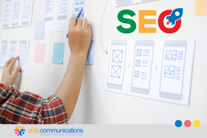
A low-fidelity prototype for a mobile app’s “Add to Cart” feature could be sketched on paper. The sketch would depict the product listing page with a prominent “Add to Cart” button. Arrows would indicate the user’s interaction flow, showing the transition to a cart summary page upon button press. The cart summary page would show the added item with a quantity and a total price. This simple representation allows for quick iteration and testing of the basic functionality and user flow. A digital tool such as Figma or Balsamiq could also be used to create a more refined, but still low-fidelity, digital prototype. The focus here is on functionality, not visual polish.
Usability Testing Plan
A usability test with five participants will evaluate the “Add to Cart” feature. Each participant will be given the task of adding two different items to their cart and then proceeding to checkout. Think-aloud protocols will be used, where participants verbalize their thoughts and actions as they interact with the prototype. Data will be collected through observation, screen recordings, and participant feedback. This data will be analyzed to identify usability issues, such as difficulty finding the “Add to Cart” button, confusion in the checkout process, or unexpected behavior. Specific metrics, such as task completion rate and time on task, will be measured. The goal is to identify pain points and areas for improvement.
Button Design Comparison
Three different button designs for a website will be compared:
| Button Design | Visual Description | Rationale | Expected User Response |
|---|---|---|---|
| Design A | A simple rectangular button with the text “Add to Cart” in white on a blue background. | Classic and easily recognizable; uses a clear call to action. | High click-through rate, clear understanding of function. |
| Design B | A rounded rectangular button with a subtle gradient background and the text “Add to Cart” in a slightly bolder font. | More modern and visually appealing; aims to attract attention. | Potentially higher click-through rate due to visual appeal. |
| Design C | A button with an icon (shopping cart) and the text “Add to Cart” in a smaller font. | Uses visual cues in addition to text; potentially better for users with visual impairments. | Potentially improved accessibility and understanding. |
Iterative Design Process
Feedback from usability testing informs design iterations. For example, if testing reveals that users struggle to find the “Add to Cart” button, its size, color, or placement could be adjusted in subsequent iterations. If the checkout process is confusing, the design could be simplified by reducing the number of steps or improving the clarity of instructions. This iterative process continues until the design meets predefined usability goals and user satisfaction levels. A/B testing could be employed to compare different design iterations and objectively measure their effectiveness. For instance, comparing click-through rates for different button designs provides quantitative data for decision-making.
Ultimate Conclusion

Mastering user experience design requires a blend of empathy, technical skill, and a commitment to iterative improvement. By implementing the seven best practices Artikeld in this guide—from thorough user research to continuous testing and refinement—you can create digital products that are not only functional and aesthetically pleasing but also genuinely delightful to use. Remember, user-centric design is an ongoing process of learning and adaptation, so embrace the iterative nature of UX design and continuously strive to enhance the user experience.