Effective visual communication transcends mere aesthetics; it’s about conveying information clearly, strategically, and inclusively. This exploration delves into three core principles – clarity and conciseness, strategic use of visual elements, and accessibility – crucial for creating impactful and universally understood visuals.
Mastering these principles allows designers and communicators to craft compelling visuals that resonate with their audiences, regardless of background or ability. From understanding color psychology to prioritizing accessibility, this guide offers practical insights and techniques for improving visual communication effectiveness across various platforms and contexts.
Clarity and Conciseness in Visual Communication

Effective visual communication hinges on clarity and conciseness. A well-designed visual should convey its message quickly and easily, leaving no room for misinterpretation. This requires careful consideration of the elements used and a commitment to eliminating unnecessary information. The goal is to create a visual that is both impactful and easily understood by the intended audience.
Designing a Visual Representation of a Complex Idea
To effectively communicate a complex idea using minimal elements, consider the principle of reduction. Start by identifying the core message you want to convey. Then, brainstorm the simplest visual elements – shapes, colors, lines, and text – that can represent that message accurately. For example, to illustrate the concept of global interconnectedness, one might use a network diagram with nodes representing countries and connecting lines representing trade or communication routes. The fewer nodes and lines used, the clearer the message will be. The use of a consistent color scheme and simple typography further enhances clarity.
Examples of Unclear Visuals
- Overly cluttered infographic: An infographic packed with too much text, data points, and images can overwhelm the viewer, making it difficult to identify the key message. The visual noise distracts from the central idea.
- Chart with unclear labels: A chart with poorly labeled axes or unclear legend entries makes it impossible for the viewer to interpret the data correctly. This lack of precision renders the visual ineffective.
- Image with poor contrast: An image with low contrast or blurry elements makes it hard to distinguish different components. Poor visual quality hinders comprehension and communication.
Techniques for Ensuring Concise Visual Communication
The following techniques help ensure your visual communication is concise and avoids unnecessary information:
- Prioritize key information: Focus on the most important data points and eliminate everything else. Less is often more.
- Use clear and concise labels: Avoid jargon or technical terms that your audience may not understand. Use simple and direct language.
- Choose appropriate visual format: Select the visual format (chart, graph, infographic, etc.) that best suits the type of data being presented.
- Employ a consistent visual style: Use a consistent color palette, font, and style throughout the visual to maintain visual harmony and enhance readability.
- Proofread carefully: Before sharing your visual, carefully check for any errors in spelling, grammar, or data.
The Role of Whitespace
Whitespace, or the empty space surrounding visual elements, is crucial for enhancing clarity and readability. It provides visual breathing room, preventing the visual from feeling cluttered or overwhelming. Whitespace guides the viewer’s eye, directing attention to key elements and improving the overall aesthetic appeal. Adequate use of whitespace significantly improves the comprehension and retention of information presented.
Effectiveness of Different Visual Formats
| Visual Format | Best for | Strengths | Weaknesses |
|---|---|---|---|
| Bar Chart | Comparing categories | Easy to understand, visually appealing | Not ideal for showing trends or proportions |
| Line Graph | Showing trends over time | Clearly displays changes over time | Can be difficult to read with many data points |
| Pie Chart | Showing proportions of a whole | Visually represents parts of a whole | Difficult to compare small segments accurately |
| Infographic | Communicating complex information concisely | Combines text, images, and data for clear communication | Can be time-consuming to create |
Strategic Use of Visual Elements

Effective visual communication relies heavily on the strategic deployment of visual elements. Understanding how color, style, and image choices impact audience perception is crucial for creating compelling and impactful designs. This section will explore key aspects of this strategy, offering practical guidance for maximizing the effectiveness of your visuals.
Color Psychology and Emotional Response
Color psychology significantly influences audience perception and emotional response. Different colors evoke distinct feelings and associations. For example, blue often conveys trust and calmness, while red can represent excitement or urgency. Warm colors like orange and yellow tend to be associated with energy and happiness, whereas cool colors like green and blue often evoke feelings of peace and serenity. Understanding these associations allows designers to carefully select colors that align with their message and desired emotional impact. For instance, a website promoting relaxation might use calming blues and greens, while a website advertising a sale might utilize vibrant reds and oranges to create a sense of urgency. Careful consideration of color palettes is therefore essential for effective visual communication.
Visual Styles and Their Applications
Three distinct visual styles—minimalist, maximalist, and illustrative—offer diverse approaches to visual communication, each with specific applications.
- Minimalist Style: Characterized by simplicity and clean lines, minimalism prioritizes essential elements. It’s ideal for conveying complex information clearly and concisely, often used in corporate branding or technology interfaces where clarity is paramount. A minimalist website design might feature a single, high-quality image with minimal text and a clean, uncluttered layout.
- Maximalist Style: In contrast, maximalism embraces abundance and visual richness. It’s effective for creating a bold and memorable impression, often used in fashion, art, or entertainment where creativity and expressiveness are key. A maximalist advertisement might feature a vibrant collage of images and textures, creating a visually stimulating and engaging experience.
- Illustrative Style: This style uses custom illustrations to convey information or create a specific mood. It is versatile and can be adapted to various styles, from playful and cartoonish to sophisticated and realistic. Illustrative styles are often used in children’s books, educational materials, and branding campaigns targeting younger audiences. An example could be a website using hand-drawn illustrations to explain a complex process in a more accessible and engaging manner.
Images versus Icons in Information Conveyance
Images and icons serve distinct purposes in conveying information. Images offer a richer, more detailed representation of a subject, suitable for conveying complex ideas or evoking emotions. Icons, on the other hand, are simplified visual representations, ideal for quick understanding and navigation. For example, a photograph of a smiling person conveys a more nuanced message than a simple smiley face icon, but the icon is quicker to understand and process. The choice between images and icons depends on the context and the level of detail required. A website promoting tourism might use high-quality images of landscapes, while a navigation menu might rely on universally understood icons.
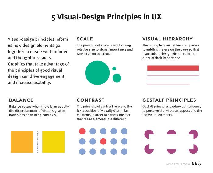
Visual Hierarchy for a Webpage
A well-designed visual hierarchy guides the user’s eye through a webpage, prioritizing important information. This is achieved through strategic use of size, color, contrast, and placement.
Consider a webpage for a fictional coffee shop:
The page’s title (“The Daily Grind”) would be the largest and most prominent element, perhaps in a bold, easily readable font. Below that, a high-quality hero image of the coffee shop’s interior would capture attention. Then, sections for “Our Menu,” “Location,” and “Contact Us” would be clearly labeled with distinct headings and colors, perhaps using a slightly smaller but still noticeable font size. Each section would then contain relevant information in a well-organized manner, ensuring readability and easy navigation. Call-to-action buttons (e.g., “Order Now,” “View Menu”) would be visually distinct, perhaps with contrasting colors and shapes, guiding users towards desired actions.
Typography and its Influence on Readability and Brand Identity
Typography plays a crucial role in readability and brand identity.
- Font Choice: Selecting appropriate fonts is crucial. Serif fonts (like Times New Roman) are often preferred for body text due to their readability, while sans-serif fonts (like Arial) are frequently used for headings and titles for their clean and modern appearance. The font choice should align with the brand’s personality and target audience.
- Font Size: Sufficiently large font sizes ensure readability, particularly for users with visual impairments. Headings should be larger than body text, creating a clear visual hierarchy.
- Font Weight: Bold or heavier weights can emphasize important information, while lighter weights can improve readability for large blocks of text. Consistent use of font weight enhances overall design coherence.
Accessibility and Inclusivity in Visual Design

Effective visual communication transcends visual acuity and cultural backgrounds. Creating accessible and inclusive designs ensures that everyone can understand and engage with the information presented, regardless of their abilities or cultural perspectives. This section will explore key strategies to achieve this goal, moving beyond simple aesthetics to encompass a broader understanding of user experience.
Accessible Visual Communication for People with Visual Impairments
Providing alternative text descriptions for images is paramount for users relying on screen readers. These assistive technologies convert visual information into audio, allowing visually impaired individuals to access the content. For example, instead of an image of a bustling city street, the alt text might read: “A vibrant city street scene, filled with pedestrians, cars, and tall buildings, conveying a sense of energy and urban life.” Another example could be a chart showing sales figures; the alt text should clearly state the key data points and trends, rather than simply describing the chart’s appearance. Detailed descriptions, focusing on the information conveyed rather than the image’s aesthetics, are crucial for effective communication. Similarly, providing sufficient color contrast between text and background ensures readability for individuals with low vision.
Effective Use of Alt Text for Screen Readers
Alt text should be concise yet informative, accurately reflecting the image’s content and context. Avoid generic descriptions like “image” or “picture.” Instead, focus on conveying the meaning and purpose of the image within the overall communication. For complex visuals, such as graphs or charts, alt text should summarize the key data and conclusions. For decorative images that don’t convey essential information, using an empty alt attribute (alt=””) is acceptable. The goal is to provide a clear and accurate textual representation of the visual information, enabling screen readers to convey the meaning effectively.
Culturally Sensitive Visual Design and Stereotype Avoidance
Visual communication should avoid perpetuating harmful stereotypes and cultural biases. Images and symbols should be carefully selected to represent diverse populations accurately and respectfully. For instance, instead of using stereotypical representations of different ethnic groups, it is crucial to portray individuals with authentic and nuanced characteristics. Using inclusive imagery that reflects the diversity of the intended audience fosters a sense of belonging and avoids alienating or misrepresenting any particular group. This includes careful consideration of body types, age ranges, and abilities. Similarly, language used in conjunction with visuals should be universally understandable and free from culturally specific jargon.
Color Palette Selection Considering Color Blindness
Approximately 8% of men and 0.5% of women experience some form of color blindness, primarily affecting the differentiation of red and green hues. Designers should utilize color palettes that ensure sufficient contrast even for individuals with color vision deficiencies. Tools and resources are readily available online to test color combinations for color blindness compatibility. For instance, the use of a color contrast checker can help designers ensure sufficient contrast between text and background. Furthermore, relying solely on color to convey information is risky; incorporating additional visual cues like patterns or shapes provides redundancy and ensures accessibility for everyone. Using a limited color palette with high contrast ensures readability and prevents confusion caused by color vision limitations.
Checklist for Universally Accessible Visual Communication
Before publishing any visual communication, it is vital to review it against a checklist of accessibility best practices.
- Alt text for all images: Ensure all images have descriptive and accurate alt text.
- Sufficient color contrast: Use a color contrast checker to verify readability for users with low vision.
- Avoid color-only coding: Do not rely solely on color to convey information; use additional visual cues.
- Culturally sensitive imagery: Use inclusive imagery that avoids stereotypes and represents diversity.
- Simple and clear design: Use a clean and uncluttered layout that is easy to navigate.
- Appropriate font sizes and styles: Choose fonts that are legible and easy to read, with sufficient sizing.
- Keyboard navigation: Ensure all interactive elements are accessible via keyboard navigation.
Final Thoughts
By focusing on clarity, strategic visual elements, and accessibility, we can create visual communication that is not only aesthetically pleasing but also effective and inclusive. Remember, the ultimate goal is clear, concise, and impactful communication that resonates with your intended audience, leaving a lasting impression and achieving your communication objectives. The thoughtful application of these three principles will significantly enhance the power and reach of your visual messages.