Serif fonts, with their elegant flourishes, have a rich history interwoven with design’s evolution. From classic book printing to modern branding, their timeless appeal endures. This exploration delves into the characteristics of serif fonts, offering practical guidance on their effective application in diverse design projects, highlighting seven key ideas to achieve a classic aesthetic. We’ll cover font pairings, explore creative applications, and address potential challenges in digital contexts.
Understanding the nuances of different serif classifications – Old Style, Transitional, Modern, and Slab Serif – is crucial for informed selection. This understanding allows designers to harness the unique visual impact each classification offers, shaping the mood and readability of their work. We’ll explore how the right serif font can elevate a logo, enhance a website, or transform a printed piece, all while maintaining visual harmony and balance.
Understanding Serif Font Characteristics
Serif fonts, with their distinctive small flourishes at the ends of strokes, have a long and rich history in typography. Their visual characteristics, historical evolution, and diverse classifications contribute significantly to their enduring appeal and versatility in design. Understanding these aspects is crucial for effectively utilizing serif fonts in various design projects.
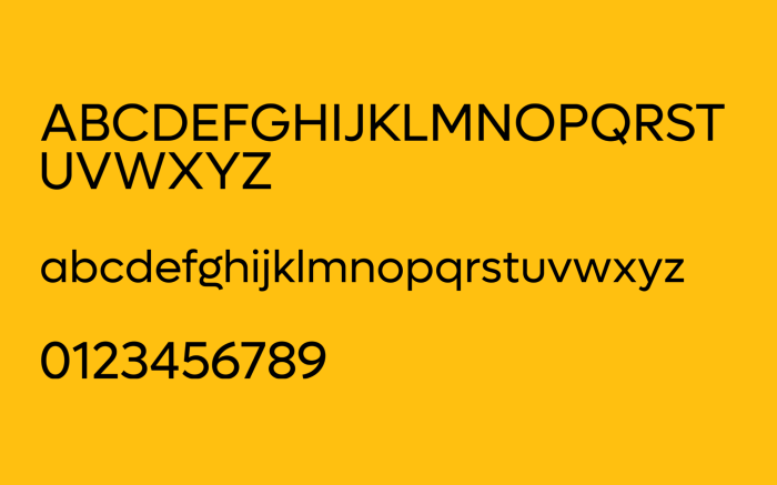
Serif fonts are easily distinguished from their sans-serif counterparts by the presence of serifs – those small, decorative strokes at the end of each letterform. Sans-serif fonts, conversely, lack these features, resulting in a cleaner, more modern aesthetic. This fundamental difference impacts readability and the overall feeling a typeface conveys. Serifs can subtly guide the eye along the lines of text, improving readability in larger blocks of text, while the clean lines of sans-serif fonts are often preferred for headlines and shorter text segments where impact is prioritized over extended readability.
Serif Font History and Evolution
Serif typefaces emerged from the Roman inscriptional capitals and evolved through centuries of hand-lettering and printing techniques. Early Roman inscriptions, often carved in stone, naturally exhibited serifs as a result of the chisel’s action. This characteristic carried over into the development of metal typefaces, initially using techniques that mimicked the look of handwritten script. The invention of movable type in the 15th century saw the standardization of serif typefaces, which became the dominant style for printed materials for centuries. The evolution continued with the development of different classifications, reflecting changing aesthetic preferences and technological advancements in printing.
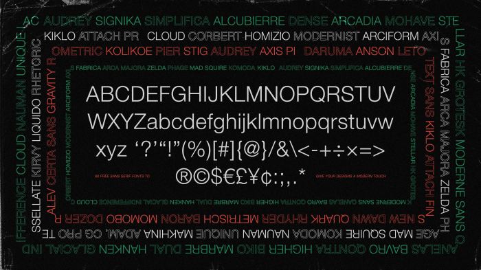
Serif Font Classifications
Serif fonts are categorized into various classifications based on their distinctive features, such as the contrast between thick and thin strokes, the shape of the serifs, and the overall feel. Four prominent classifications are: Old Style, Transitional, Modern, and Slab Serif.
| Classification | Characteristics | Examples | Visual Description |
|---|---|---|---|
| Old Style | Low contrast between thick and thin strokes, bracketed serifs (serifs that are connected to the main stroke), slightly diagonal stress (the thickest part of the stroke isn’t perfectly vertical) | Garamond, Caslon, Goudy Old Style | These fonts possess a gentle, timeless quality. The serifs are subtly integrated, creating a feeling of warmth and readability. The strokes exhibit a slight variation in thickness, but the difference is not drastic. |
| Transitional | Increased contrast between thick and thin strokes, more vertical stress, serifs that are slightly less bracketed | Baskerville, Times New Roman, Janson | Transitional serifs represent a bridge between Old Style and Modern styles. They offer a balance between readability and elegance, with a more pronounced contrast in stroke thickness than Old Style fonts. |
| Modern | High contrast between thick and thin strokes, very thin strokes, sharp, unbracketed serifs, extreme vertical stress | Didot, Bodoni | Modern serifs are characterized by their dramatic contrast and sharp, almost severe appearance. They often feel more formal and elegant, suitable for high-end applications. |
| Slab Serif | Thick, block-like serifs, little or no contrast between thick and thin strokes | Courier, Rockwell, Clarendon | Slab serifs are easily identifiable by their strong, heavy serifs. They convey a bold, often industrial or vintage aesthetic, and are frequently used for headlines or impactful statements. |
Applying Serif Fonts in Design Projects
Serif fonts, with their elegant flourishes and historical significance, offer a unique opportunity to imbue design projects with a sense of classic sophistication and enduring appeal. Their careful application can elevate a brand’s image, enhance readability, and create a memorable visual experience across various media. Understanding how to effectively utilize these versatile typefaces is key to unlocking their full potential.
Serif fonts’ inherent characteristics—the small strokes or “serifs”—impact readability and perceived mood. The subtle details of these serifs can guide the eye along the line of text, improving comprehension, especially in longer blocks of text like those found in books or lengthy articles. The overall visual weight and x-height (the height of lowercase letters) also play a role; heavier serifs and larger x-heights can project a sense of authority and stability, while lighter serifs and smaller x-heights can feel more delicate and refined. The choice of a serif font significantly influences the overall aesthetic, from conveying a sense of tradition and trustworthiness in a legal document to projecting a feeling of luxury and elegance in a high-end fashion campaign.
Serif Font Applications Across Design Contexts
The versatility of serif fonts extends across numerous design applications. In logo design, a well-chosen serif font can create a timeless and recognizable brand identity. Think of the iconic serif typeface used in the Coca-Cola logo—it’s instantly recognizable and communicates a sense of heritage and tradition. Similarly, in branding, serif fonts can lend an air of sophistication and authority to marketing materials, packaging, and website design. Print materials, such as brochures, books, and invitations, benefit greatly from the enhanced readability and classic aesthetic that serif fonts offer. Even in web design, carefully selected serif fonts can contribute to a sophisticated and refined user experience, particularly on websites focusing on content, such as blogs or news sites, where readability is paramount. However, careful consideration of screen size and resolution is crucial for optimal readability in digital applications.
Readability and Mood: The Influence of Serif Font Choices
The selection of a serif font directly impacts both readability and the overall mood of a design. Fonts with strong, clearly defined serifs generally offer superior readability in print, guiding the eye smoothly across lines of text. However, on screen, the intricate details of some serif fonts can appear less crisp at smaller sizes, potentially hindering readability. The weight of the serif and the overall typeface style contribute significantly to the mood. A bold, heavy serif font can evoke feelings of strength and stability, while a delicate, thin serif font can create a sense of elegance and refinement. A classic serif like Garamond might project sophistication and timelessness, while a more modern serif like Playfair Display could convey a feeling of luxury and opulence. Considering these factors allows designers to carefully curate the emotional response evoked by their design.
Pairing Serif Fonts with Other Typefaces
Effective font pairing is crucial for achieving visual harmony and balance in any design. Combining serif fonts with other typefaces, such as sans-serif or script fonts, requires a thoughtful approach to avoid visual clashes and ensure readability. Generally, pairing a serif with a sans-serif font creates a pleasing contrast, with the serif providing a sense of classic elegance and the sans-serif offering a modern, clean counterpoint. A script font, with its flowing, handwritten aesthetic, can add a touch of personality and informality when paired with a more formal serif.
Below are examples of effective serif/sans-serif pairings:
- Times New Roman (serif) + Arial (sans-serif): This classic combination offers excellent readability and a balanced aesthetic. Times New Roman provides a traditional, trustworthy feel, while Arial’s clean lines offer a modern contrast.
- Playfair Display (serif) + Open Sans (sans-serif): This pairing combines the elegant luxury of Playfair Display with the clean, contemporary feel of Open Sans, suitable for projects requiring a balance of sophistication and modernity.
- Garamond (serif) + Lato (sans-serif): Garamond’s timeless elegance pairs beautifully with Lato’s modern and versatile design, creating a harmonious and readable combination for various applications.
Creative Applications of Serif Fonts

Serif fonts, with their distinctive flourishes, offer a timeless elegance that transcends fleeting design trends. Their versatility allows them to enhance a wide array of design projects, from the classic to the contemporary, conveying sophistication and authority while maintaining readability. This section explores several creative applications of serif fonts, highlighting their impact on visual communication.
Serif Font Applications in Diverse Design Projects
The inherent characteristics of serif fonts—their readability and established visual weight—make them suitable for a range of applications. Their classic feel can be leveraged to create a sense of tradition, trustworthiness, and high quality. Conversely, carefully selected serif fonts can also lend a modern and minimalist aesthetic.
A poster advertising a classic literature festival could effectively utilize a traditional serif typeface like Garamond or Caslon. The elegant serifs would complement the sophisticated subject matter, while the font’s readability ensures the event details are easily accessible. The poster’s color palette could be muted and refined, further enhancing the classic feel established by the typeface.
Wedding invitations often benefit from the refined look of serif fonts. A font like Didot or Bodoni, with its high contrast and elegant serifs, would create a sense of formality and timeless beauty. The font choice would be paired with high-quality paper stock and potentially letterpress printing to further elevate the invitation’s aesthetic. The overall design would exude sophistication and celebrate the occasion’s significance.
Book covers, particularly those for literary fiction or historical novels, often feature serif fonts. A serif typeface like Goudy Old Style or Trajan Pro can evoke a sense of history and tradition, complementing the book’s content. The font’s weight and size would be chosen carefully to balance readability with visual impact, ensuring the title and author’s name are prominent yet not overwhelming. The cover design would aim for a clean and elegant look, letting the typeface take center stage.
Even product packaging can benefit from the use of serif fonts. A high-end cosmetic brand might utilize a refined serif like Playfair Display to convey luxury and sophistication. The font’s elegance would be complemented by a minimalist design and high-quality materials, creating a cohesive brand identity. The carefully chosen font would subtly communicate the brand’s values and target audience.
Hypothetical Design Project: A Museum Brochure
Imagine designing a brochure for a modern art museum showcasing a retrospective of a renowned sculptor. The primary typeface chosen would be a geometric serif like Rockwell, its clean lines and strong structure mirroring the sculptor’s minimalist aesthetic. The brochure’s layout would be clean and uncluttered, with ample white space. Rockwell would be used for the main headings, conveying authority and importance. A lighter-weight sans-serif font would accompany it for body text, ensuring readability. The visual hierarchy would be clearly established, with Rockwell guiding the viewer’s eye to key information, such as the exhibition title, dates, and artist’s biography. The color palette would consist of muted tones—greys, blacks, and a single accent color—to create a sophisticated and understated feel, enhancing the overall message of the exhibition. The brochure’s design aims to convey a sense of modern elegance and intellectual rigor, aligning perfectly with the museum’s image and the artist’s work.
Challenges and Strategies for Using Serif Fonts in Digital Design
Serif fonts, while aesthetically pleasing, can present certain challenges in digital contexts. Smaller screen sizes can sometimes reduce the legibility of fine serifs, leading to a cluttered or less-defined appearance. Additionally, certain serif fonts may not render well on all devices or browsers.
To overcome these challenges, designers should prioritize font selection, choosing serif fonts with bolder serifs or those specifically designed for digital applications. They should also test the chosen font across different devices and screen sizes to ensure optimal readability. Furthermore, using sufficient point size and sufficient spacing between lines (leading) can significantly improve legibility, ensuring the serif font’s elegance doesn’t compromise clarity. Careful consideration of color contrast between text and background is also crucial for optimal readability on screens.
Summary
Mastering the art of using serif fonts involves understanding their historical context, appreciating their visual characteristics, and strategically employing them within broader design principles. By thoughtfully selecting and pairing serif typefaces, designers can create visually stunning and timeless pieces that resonate with audiences. The versatility of serif fonts allows for creative exploration across numerous design mediums, offering a pathway to crafting both classic and contemporary designs.