Unlocking the vibrant potential of complementary colors in design is simpler than you might think. This guide provides a clear, three-step process to harness the power of contrasting hues, creating visually striking and engaging designs. We’ll explore the color wheel, delve into practical applications, and address potential pitfalls to ensure your designs are not only eye-catching but also harmonious and effective.
From understanding the fundamental principles of complementary color pairings to mastering techniques for achieving balance and avoiding harsh contrasts, we’ll cover everything you need to confidently incorporate this powerful design tool into your work. Learn how to select dominant and accent colors, refine your palettes, and ultimately create designs that truly pop.
Understanding Complementary Colors
Complementary colors are a fundamental concept in design, offering a powerful tool for creating visually striking and vibrant compositions. Understanding their relationship on the color wheel is key to effectively utilizing their contrasting nature.
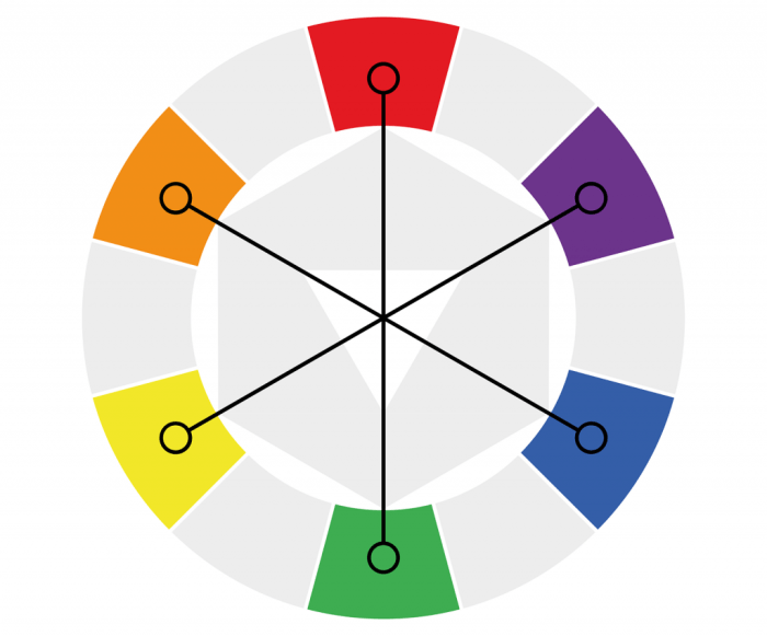
Complementary colors are positioned directly opposite each other on the color wheel. The color wheel itself is a visual representation of the relationships between colors, typically arranged in a circle. This arrangement demonstrates how colors blend and contrast, making it easy to identify complementary pairs.
Examples of Complementary Color Pairs
Several well-known complementary color pairs demonstrate the effectiveness of this color scheme. These pairings consistently create high visual impact due to their inherent contrast.
| Color Pair | Description | Example | Visual Impact |
|---|---|---|---|
| Red & Green | A classic and highly contrasting pair, often used in Christmas decorations and nature imagery. | Imagine a vibrant red poppy against a lush green field. | High contrast, creates a strong focal point. |
| Blue & Orange | This combination offers a cool and warm contrast, frequently seen in branding and advertising. | Think of a bright orange logo on a deep blue background. | Creates a balanced and energetic feel. |
| Yellow & Violet | A cheerful and sophisticated pairing, often used in art and fashion. | Picture a sunny yellow dress accented with a deep violet sash. | Visually appealing, creates a sense of elegance. |
| Purple & Yellow-Green | A less common but equally effective pair, offering a unique and less saturated contrast. | Envision a lavender field with patches of yellow-green foliage. | Subtle yet impactful, creates a calming yet interesting feel. |
How Complementary Colors Create Visual Contrast and Vibrancy
The vibrancy created by complementary colors stems from their inherent opposition on the color wheel. These colors possess opposing hues, meaning they sit on opposite sides of the spectrum of visible light. This opposition creates a visual “push and pull,” making each color appear more intense when placed next to its complement. For example, a red object will appear even redder when placed against a green background, and vice versa. This heightened contrast draws the viewer’s eye, creating a dynamic and engaging visual experience. The effect is particularly strong when using saturated, or highly pigmented, versions of the colors. A muted red and a pale green, for example, will produce a less dramatic contrast than their vibrant counterparts. The level of contrast can be carefully adjusted by altering the saturation and brightness of each color.
Applying Complementary Schemes in Design
Successfully integrating complementary colors requires understanding not just their theoretical relationship but also their practical application within design projects. This section explores effective strategies for using complementary color schemes, focusing on logo design and emphasizing the crucial role of color balance.
Complementary colors, by their very nature, offer high contrast. This inherent contrast can be incredibly powerful, creating visually striking designs. However, this vibrancy must be carefully managed to avoid overwhelming the viewer or creating a jarring effect. The key lies in understanding how to balance these opposing hues for optimal visual harmony.
Logo Design with Complementary Colors
A logo is often the first visual representation of a brand, so choosing the right colors is critical. Complementary colors can be exceptionally effective in logo design, providing a strong visual impact and memorability. Consider a logo for a technology company: a deep teal (blue-green) could represent stability and trust, while a vibrant coral (orange-red) could symbolize innovation and energy. The contrast between these two colors immediately draws the eye and communicates a sense of both reliability and forward-thinking.
Color Balance in Complementary Schemes
Maintaining color balance is paramount when working with complementary colors. Using one color overwhelmingly will create an unbalanced and potentially unpleasant visual experience. A successful design utilizes a dominant color, often the cooler or more subdued of the two, as the foundation, and then accents it strategically with its complementary counterpart. The dominant color usually takes up a larger visual area, while the accent color is used sparingly to highlight specific elements. Think of it as a supporting role; the accent color adds punch and visual interest without overpowering the dominant color.
Selecting Dominant and Accent Colors
Choosing the right dominant and accent colors within a complementary scheme requires a methodical approach. Following these steps will ensure a balanced and visually appealing outcome:
- Identify your brand personality and target audience: What feeling or message do you want to convey? A calm, sophisticated brand might benefit from muted blues and oranges, while a playful brand might use brighter, more saturated versions.
- Select your dominant color: This color should form the base of your design, typically occupying the largest visual area. Consider its emotional impact and how it relates to your brand. It’s often the less vibrant of the two complementary colors.
- Choose your accent color: This is the complementary color, used sparingly to add contrast and visual interest. Use it strategically to highlight key elements or call attention to specific areas.
- Test and refine: Create mock-ups and test your color combination in different contexts. Observe how the colors interact and adjust as needed to achieve the desired balance and visual effect.
Pure vs. Muted Complementary Colors
The intensity of your complementary colors significantly impacts the overall feel of your design. Pure, vibrant complementary colors create high contrast and a bold statement, ideal for brands aiming for a dynamic and energetic image. However, they can be overwhelming if not used carefully. Muted or desaturated versions offer a softer, more subtle contrast, suitable for brands seeking a sophisticated or calming aesthetic. For example, a logo using pure red and green might feel aggressive, while using muted burgundy and sage green would project a more refined image. The choice depends entirely on the brand’s desired personality and the overall design aesthetic.
Refining Complementary Color Designs

Successfully implementing complementary color schemes requires careful consideration beyond simply selecting opposing hues on the color wheel. While the vibrant contrast can be visually striking, unrefined use can lead to designs that are jarring or even fatiguing for the viewer. This section explores techniques for harmonizing complementary colors and achieving a balanced, aesthetically pleasing design.
The inherent high contrast of complementary colors presents several potential challenges. Directly juxtaposing pure, saturated complements can create a visually aggressive effect, making the design feel overwhelming or difficult to read. Furthermore, prolonged exposure to such high contrast can lead to eye strain and visual fatigue, diminishing the user experience. Therefore, skillful refinement is crucial for successful implementation.
Techniques for Softening High-Contrast Complementary Pairs
Softening the impact of high-contrast complementary pairs involves strategically manipulating the color values to reduce the intensity of the contrast while retaining the vibrancy of the scheme. This can be achieved through several methods. One effective approach is to desaturate one or both of the complementary colors. Reducing the saturation lowers the intensity, making the combination less harsh. Another technique is to adjust the brightness or lightness of the colors. For instance, choosing a darker shade of one color and a lighter shade of its complement can create a more subtle and harmonious effect. Finally, using one color as a dominant accent while the other provides a supporting role can also significantly reduce the intensity of the contrast.
Adjusting Saturation and Brightness for Harmony
The saturation and brightness of complementary colors directly influence the overall harmony of the design. High saturation in both colors creates a bold, energetic feel, but can be overwhelming if not balanced. Lowering the saturation of one or both colors can create a more subdued and sophisticated look. Similarly, adjusting the brightness can greatly impact the feel. For example, using a dark, desaturated blue paired with a light, slightly desaturated orange creates a more calming and elegant effect than using bright, fully saturated versions of the same colors. Experimentation is key to finding the optimal balance between vibrancy and harmony. Consider the context and intended mood of your design when making these adjustments. A website promoting a high-energy product might benefit from higher saturation, whereas a website for a spa might utilize lower saturation for a more relaxing atmosphere.
Example: Website Layout with Complementary Colors
Let’s imagine a website for a sustainable coffee company. We’ll use a complementary scheme of teal (#008080) and a muted coral (#F08080).
The teal serves as the primary color for the background and major structural elements, providing a sense of calm and naturalness, reflecting the brand’s commitment to sustainability.
The muted coral is used as an accent color for calls to action (buttons, highlighted text), creating a visually appealing contrast that draws the user’s attention without being overly jarring. The lower saturation prevents visual fatigue.
Typography is kept simple and legible, using a neutral gray (#808080) for body text and a slightly darker shade of teal for headings to maintain visual hierarchy and brand consistency. This ensures readability despite the color contrast.
Images of coffee beans and natural landscapes are incorporated, further enhancing the natural and sustainable theme, and complementing the color scheme.
The result is a website that is both visually appealing and easy on the eyes, effectively communicating the brand’s values and guiding the user experience. The muted coral subtly draws attention to key actions, while the teal background provides a calming and consistent backdrop. The combination showcases the potential of refined complementary color schemes to create sophisticated and effective designs.
Final Review

Mastering complementary color schemes opens a world of creative possibilities. By understanding the principles of color contrast, balance, and refinement, you can elevate your designs from ordinary to extraordinary. Remember to consider the overall impact of your color choices on visual hierarchy and user experience. With practice and attention to detail, you’ll confidently create vibrant and memorable designs that resonate with your audience.