Mastering collaborative design in Figma is key to efficient and effective teamwork. This guide provides a structured approach to leveraging Figma’s powerful features, from setting up projects for seamless collaboration to implementing robust version control. We’ll explore user interface design principles, best practices for component creation, and strategies for efficient feedback integration. Learn how to harness the full potential of Figma for streamlined team workflows and stunning design outcomes.
Through practical examples and clear explanations, you’ll discover how to optimize your Figma workflow for collaborative projects of any size. We’ll cover essential techniques for managing multiple versions, incorporating feedback, and maintaining design consistency across your team. This guide is designed to empower you with the knowledge and skills needed to excel in collaborative design using Figma.
Setting Up Your Figma Project for Collaboration

Effective collaboration is paramount in modern design. Setting up your Figma project correctly from the outset significantly impacts team efficiency and the overall quality of the final product. A well-structured project facilitates clear communication, streamlined workflows, and simplifies version control, ultimately leading to a smoother design process.
Successful collaborative design in Figma hinges on a robust project setup. This involves thoughtful file organization, leveraging Figma’s version control, and actively utilizing its communication features. Let’s delve into the specifics of creating a collaborative-ready Figma project.
Figma File Types and Their Use Cases
Understanding the different Figma file types is crucial for organizing a collaborative project. Choosing the right file type ensures efficient workflow and avoids confusion amongst team members.
Figma offers primarily two file types: Files and Pages. While seemingly simple, their effective utilization dramatically influences collaborative design.
| File Type | Description | Best Use Case | Collaboration Implications |
|---|---|---|---|
| File | The top-level container for all your design work. Think of it as the project’s central hub. | Housing all related design assets for a single project, like a website or mobile app. | Provides a single, easily accessible location for all team members to access and contribute to the project. |
| Page | A container within a file used to organize different screens or design components. | Organizing screens within a website, separating design iterations, or grouping related components (e.g., button styles). | Allows for parallel work on different aspects of a project without interfering with each other. Clear naming conventions are essential. |
Collaborative Figma Project Workflow
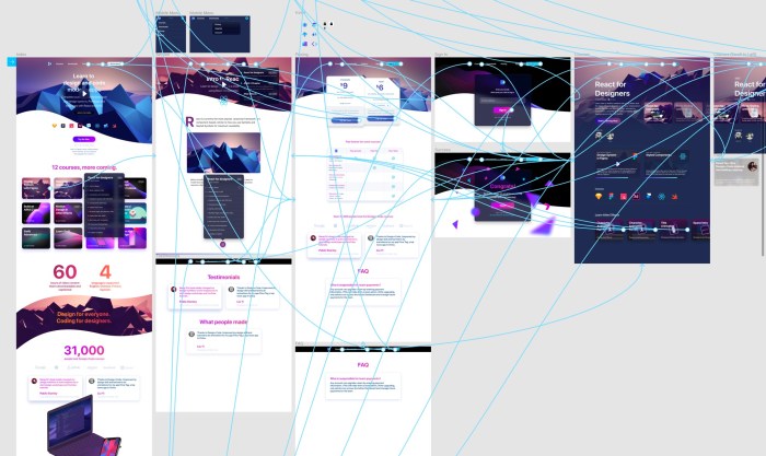
A well-defined workflow is essential for successful collaboration. The following diagram illustrates a sample workflow incorporating version control and clear file organization.
This example shows a simplified workflow, adaptable to various team sizes and project complexities. The key is establishing a consistent process and adhering to it.
| Step | Action | Responsibility | Outcome |
|---|---|---|---|
| 1 | Create a new Figma file and clearly name it. | Project Lead/Designer | Centralized project hub. |
| 2 | Organize pages within the file (e.g., Home, About, Contact). | Project Lead/Designer | Logical separation of design elements. |
| 3 | Share the file with collaborators, assigning appropriate permissions. | Project Lead/Designer | Controlled access for team members. |
| 4 | Collaborators work on assigned pages or components. | Individual team members | Parallel design progress. |
| 5 | Utilize Figma’s version history to track changes and revert if necessary. | All team members | Maintain design integrity and track progress. |
| 6 | Leave comments and feedback directly on designs. | All team members | Enhanced communication and iterative design refinement. |
Utilizing Figma’s Commenting and Feedback Features
Figma’s built-in commenting system significantly improves team communication and facilitates iterative design refinement. Directly leaving comments on specific design elements eliminates the need for lengthy email chains or separate meeting notes.
The commenting feature allows for targeted feedback, threaded conversations, and easy resolution tracking. This improves the clarity of feedback, reduces misunderstandings, and keeps the entire design process transparent.
For example, instead of sending an email stating “The button is too small,” a designer can directly comment on the button in Figma, highlighting the issue and suggesting a specific size adjustment. This targeted approach ensures that feedback is contextual and actionable.
Designing User Interfaces in Figma
Designing effective user interfaces (UIs) is crucial for creating successful digital products. A well-designed UI ensures users can easily interact with and understand your application. Figma, with its collaborative features and robust design tools, provides an excellent platform for this process. This section details a step-by-step approach to UI design in Figma, emphasizing user-centered design principles and best practices for efficiency.
Designing User Interfaces: A Step-by-Step Guide
Before diving into the design process, it’s important to establish a clear understanding of your target audience and their needs. Thorough user research, including competitor analysis and user surveys, informs design decisions, ensuring the final product meets user expectations and solves their problems effectively. The following steps Artikel a practical approach to UI design within Figma:
- Define the Purpose and Scope: Clearly articulate the goals of your application and the specific tasks users will perform. This forms the foundation for all subsequent design choices.
- Create User Flows and Wireframes: Map out the user journey through the application using wireframes. These low-fidelity mockups help visualize the structure and functionality before delving into visual design.
- Develop High-Fidelity Mockups: Refine the wireframes into visually appealing high-fidelity mockups, incorporating branding, typography, and imagery. Maintain consistency in design elements across all screens.
- Implement User Feedback: Conduct usability testing with target users to identify areas for improvement. Iterate on the design based on feedback to ensure user satisfaction.
- Prototype and Test Interactions: Create interactive prototypes in Figma to simulate the user experience. This allows for testing navigation and functionality before development.
- Establish Design System: Create a consistent design system encompassing reusable components, styles, and patterns to ensure design consistency and efficiency across the application.
- Collaborate and Iterate: Leverage Figma’s collaborative features to share designs with stakeholders and gather feedback throughout the process. Continuous iteration is key to refining the design.
- Handoff to Development: Export assets and specifications in a format easily accessible to developers, facilitating a smooth transition from design to development.
- Accessibility Considerations: Ensure the design adheres to accessibility guidelines, making the application usable by individuals with disabilities.
- Maintain Consistency: Regularly review and update the design system to maintain consistency and adapt to evolving user needs and design trends.
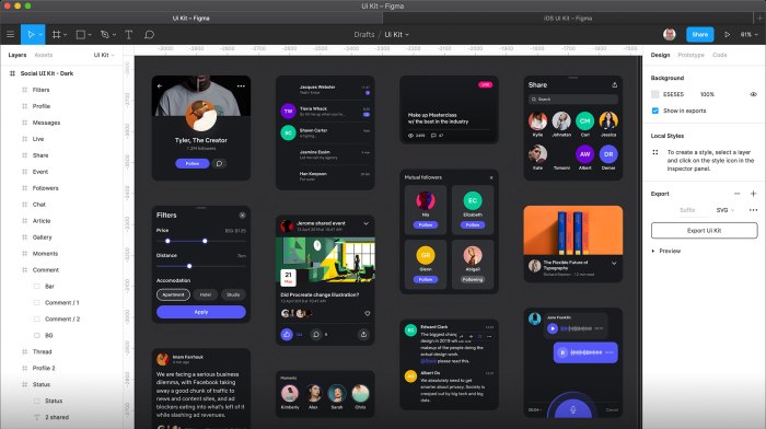
Best Practices for Reusable Components and Styles
Creating reusable components and styles is crucial for maintaining design consistency and improving efficiency. This approach ensures that updates are applied across the entire design system, reducing the risk of inconsistencies and saving significant time and effort.
- Component Libraries: Organize components into well-structured libraries for easy access and reuse. This allows designers to easily drag and drop pre-built components into their designs.
- Style Guides: Define consistent styles for typography, colors, and spacing. This ensures a cohesive visual language throughout the application.
- Version Control: Utilize Figma’s version history to track changes and revert to previous versions if needed. This allows for collaboration and easy management of design iterations.
- Naming Conventions: Implement a clear and consistent naming convention for components and styles to facilitate searchability and organization.
Mobile App Login Screen Mockups
Three different mockups for a simple mobile app login screen are presented below, each employing distinct design approaches.
- Mockup 1: Minimalist Approach: This design features a clean, uncluttered interface with a simple form containing only essential fields (email/username and password). A subtle background image adds a touch of visual interest without distracting from the core functionality. The color palette is muted and calming, promoting a sense of trust and security. This approach prioritizes ease of use and a streamlined user experience.
- Mockup 2: Modern and Bold: This mockup utilizes a more vibrant color scheme and bolder typography to create a visually striking design. The form is clearly structured, with clear labels and visual cues to guide the user. A progress indicator subtly suggests security and trust. This approach balances visual appeal with usability.
- Mockup 3: Illustrated Approach: This design incorporates illustrative elements to add personality and visual interest. The form remains functional and easy to use, but the illustrations enhance the overall aesthetic appeal. This approach prioritizes a friendly and engaging user experience, suitable for apps targeting a younger demographic.
Mastering Collaboration and Version Control in Figma
Effective collaboration is paramount in design, and Figma provides robust tools to manage this process seamlessly. This section will explore Figma’s features for version control and collaborative workflows, enabling teams to work efficiently and avoid conflicts. We’ll delve into branching and merging, compare different collaboration strategies, and examine the use of comments and prototyping for feedback.
Figma’s branching and merging capabilities mirror those found in sophisticated version control systems like Git. This allows designers to work on different features or iterations of a design simultaneously without overwriting each other’s work. Branches act as isolated copies of the main design file, enabling experimentation and parallel development. Once a branch is complete, its changes can be merged back into the main file, incorporating the updates without disrupting the overall project.
Branching and Merging in Figma
Creating a branch in Figma is straightforward. From the file menu, you select “Duplicate to branch.” This creates a new branch with a copy of your design file. You can then work independently on this branch, making changes and adding new features without impacting the main file. Once your changes are complete, you can merge the branch back into the main file using the “Merge branch” option. Figma intelligently compares the changes and attempts to automatically merge them. In cases of conflicting edits, Figma highlights these areas, allowing you to manually resolve the conflicts before completing the merge. This process maintains a clear history of changes, allowing you to revert to previous versions if necessary.
Comparison of Collaboration Strategies
Figma offers several approaches to collaborative design. Real-time co-editing allows multiple designers to work simultaneously on the same file, fostering immediate feedback and synchronicity. However, this approach may lead to conflicts if not managed carefully. Individual contributions, on the other hand, involve each designer working on their own copy before merging changes. This minimizes conflicts but may slow down the overall design process.
| Collaboration Strategy | Advantages | Disadvantages | Best Suited For |
|---|---|---|---|
| Real-time Co-editing | Faster iteration, immediate feedback, enhanced communication | Potential for conflicts, requires strong communication and coordination | Small teams working on smaller projects, rapid prototyping |
| Individual Contributions | Reduced risk of conflicts, allows for focused work | Slower iteration, requires more time for merging and review | Larger teams, complex projects, when precise control over changes is needed |
Providing and Receiving Design Feedback
Figma facilitates design feedback through its commenting and prototyping features. Designers can leave comments directly on specific elements within the design, providing targeted feedback and suggestions. Prototyping allows designers to create interactive mockups, simulating user interactions and gathering feedback on usability and functionality. These interactive prototypes can be shared with stakeholders for review and feedback, improving the overall design process. The comment thread associated with each design element provides a centralized location for discussions and revisions.
Outcome Summary

By following these ten steps, you’ll transform your Figma workflow into a collaborative powerhouse. From initial project setup to final feedback integration, you’ll be equipped to manage complex design projects with ease and efficiency. Remember that effective collaboration is an ongoing process, and consistent application of these techniques will significantly improve your team’s design process and produce superior results. Embrace the power of Figma and unlock the potential of collaborative design.