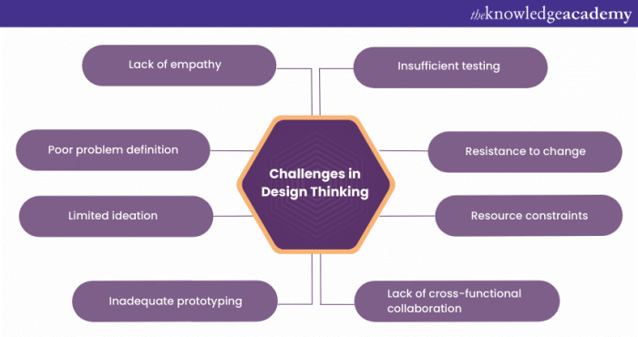
Design thinking, a powerful methodology for innovation, often stumbles upon common pitfalls that can derail even the most promising projects. Understanding these recurring mistakes is crucial for designers seeking to create truly user-centric and effective solutions. This exploration delves into nine prevalent errors, offering insights and strategies to avoid them, ultimately leading to more successful and impactful designs.
From neglecting user needs and falling in love with one’s own ideas to the critical oversight of iteration and testing, these pitfalls can significantly impact the final product. By recognizing these potential stumbling blocks and implementing proactive solutions, designers can significantly improve their design process and achieve better outcomes. This guide provides practical examples and actionable advice to navigate these challenges effectively.
Ignoring the User’s Needs

Neglecting user needs is a critical design flaw that can lead to products or services that are unusable, inefficient, and ultimately fail to meet their intended purpose. A user-centered approach, prioritizing the understanding and satisfaction of the end-user, is crucial for successful design. Failing to do so results in wasted resources and frustrated users.
Ignoring user needs often stems from a lack of proper research and a reliance on assumptions rather than data. This can manifest in various ways, ultimately leading to a disconnect between the designed solution and the actual needs of the target audience.
Scenarios Illustrating the Consequences of Neglecting User Research
The following table presents three scenarios where neglecting user research led to significant design flaws, impacting user experience and ultimately product success.
| Scenario | Problem | User Impact | Solution |
|---|---|---|---|
| A new mobile banking app with overly complex navigation. | Designers assumed users were tech-savvy and overlooked the needs of older users or those with limited digital literacy. The interface was cluttered and lacked intuitive pathways. | Frustration, confusion, and ultimately, low adoption rates among the target demographic. Users struggled to complete basic transactions. | Conduct thorough user research, including usability testing with diverse user groups. Simplify the navigation, using clear visual cues and intuitive icons. Consider offering alternative access methods, such as a simplified version for less tech-savvy users. |
| A website designed without considering accessibility needs. | The website lacked alt text for images, keyboard navigation, and sufficient color contrast, making it inaccessible to users with visual impairments or disabilities. | Exclusion of a significant portion of potential users. Violation of accessibility guidelines and legal requirements. | Implement accessibility best practices from the outset. Ensure compliance with WCAG guidelines. Conduct accessibility testing with users with disabilities. |
| A new e-commerce website with a cumbersome checkout process. | The designers prioritized aesthetics over functionality, creating a visually appealing but complicated checkout flow with numerous unnecessary steps. | High cart abandonment rates. Loss of potential sales due to frustrated users abandoning their purchases before completion. | Conduct A/B testing on different checkout flows to identify the most efficient and user-friendly option. Minimize the number of steps required to complete a purchase. Provide clear instructions and progress indicators. |
User-Centered Design Practices
Actively involving users throughout the design process is paramount to avoid neglecting their needs. The following practices ensure a user-centric approach:
Several key practices ensure a user-centric approach. By implementing these methods, designers can gather valuable insights and create products that truly resonate with their target audience.
- Usability testing: Observing users interacting with prototypes to identify pain points and areas for improvement.
- User interviews: Conducting in-depth conversations with users to understand their needs, motivations, and frustrations.
- Surveys and questionnaires: Gathering quantitative data on user preferences and opinions.
- A/B testing: Comparing different design options to determine which performs better in terms of user engagement and conversion rates.
- Focus groups: Facilitating discussions among a group of users to gather collective feedback and insights.
The Importance of User Personas and Journey Maps
User personas and journey maps are powerful tools for understanding users and their needs. Personas represent archetypal users, summarizing their demographics, goals, behaviors, and motivations. Journey maps visualize the user’s experience with a product or service, highlighting touchpoints and potential pain points. By creating these representations, designers can better empathize with their users and make informed design decisions.
A detailed example will illustrate the power of these tools. Consider a persona for an online grocery delivery service.
Example User Persona:
Name: Sarah Miller
Age: 35
Occupation: Marketing Manager
Goals: Conveniently order groceries without spending too much time shopping, receive fresh produce, save time for other activities.
Frustrations: Long checkout processes, limited delivery windows, lack of information about product freshness.
Technology Proficiency: High
This persona informs design decisions, for instance, prioritizing a streamlined checkout process, offering flexible delivery windows, and displaying clear information about product freshness. By understanding Sarah’s needs and frustrations, the design team can create a user-friendly and efficient grocery delivery experience.
Falling in Love with Your Own Ideas

Designers, by nature, are passionate and invested in their creations. This passion, however, can sometimes cloud objective judgment, leading to a dangerous bias: falling in love with your own ideas. Ignoring flaws and overlooking alternative solutions can severely impact the final product’s usability and success. Maintaining a critical distance from your work is crucial for delivering truly effective designs.
Objectively evaluating your own designs requires conscious effort and specific strategies. Without this critical distance, even the most talented designers risk producing subpar results. The following strategies can help mitigate the risk of becoming overly attached to your initial concepts.
Strategies for Objective Evaluation
It’s essential to employ several methods to counter inherent biases when reviewing your own work. A multi-faceted approach provides a more comprehensive and reliable assessment.
- Employ the “5 Whys” Technique: Repeatedly asking “why” about design choices forces you to delve deeper into your reasoning. This process can uncover underlying assumptions and potential weaknesses you might have initially overlooked. For example, if a design element is visually striking but functionally inefficient, repeated questioning might reveal that the focus was misplaced on aesthetics rather than user experience.
- Conduct a Peer Review with a Structured Checklist: Prepare a checklist of key design principles (usability, accessibility, aesthetics, etc.) and have a colleague review your work against it. This structured approach provides a consistent framework for feedback, preventing subjective opinions from dominating the evaluation.
- Use A/B Testing or Prototyping: Creating multiple design iterations and testing them with users allows for data-driven comparisons. User feedback, rather than personal preference, becomes the primary determinant of which design is superior. This data-driven approach helps to remove personal bias from the decision-making process.
Critique of a Fictional Product
Let’s consider a fictional product: “SmartSpoon,” a spoon embedded with sensors that measure food intake and provides nutritional information via a connected app.
My initial design featured a sleek, futuristic-looking spoon with a prominent display screen on the handle. However, through objective critique, I identified several flaws. The large screen added unnecessary bulk and weight, making it uncomfortable to use. The app interface, while visually appealing, was cluttered and difficult to navigate. Furthermore, the cost of the embedded technology would likely price the product out of reach for many consumers.
Through the “5 Whys” method, I realized my focus on aesthetics had overshadowed practicality. A peer review highlighted the usability issues. A simple prototype with a smaller, less obtrusive display and a streamlined app received significantly more positive feedback during user testing. The revised design prioritized functionality and affordability, addressing the initial shortcomings.
Comparing Approaches to Soliciting Constructive Criticism
Two distinct approaches to soliciting feedback are valuable, each offering unique benefits.
- Formal Peer Review: This involves a structured session with a designated group of peers, using a pre-determined checklist or rubric for evaluation. This method ensures a systematic and comprehensive review, minimizing the influence of individual biases. However, it can be more time-consuming to organize and might feel less informal and open.
- Informal Feedback Sessions: This approach involves casual discussions with colleagues, stakeholders, or potential users in less structured settings. This fosters a more natural flow of conversation and can reveal insights that a formal review might miss. However, the feedback might be less structured and more susceptible to personal biases unless carefully guided.
Lack of Iteration and Testing

Ignoring the iterative design process is a significant pitfall in design thinking. A successful product isn’t built in a single, linear step; it evolves through continuous refinement based on user feedback and testing. Failing to incorporate iterative cycles leads to products that miss the mark, frustrating users and wasting resources. This section explores the importance of iteration and testing in the design process, highlighting various testing methodologies and illustrating the consequences of neglecting this crucial aspect.
The iterative design process is characterized by cyclical improvement, where each iteration builds upon the previous one, incorporating lessons learned and user feedback. This continuous feedback loop is essential for creating user-centered products that effectively meet their needs.
Iterative Design Process: A Mobile App Example
Let’s illustrate the iterative design process by outlining the steps involved in designing a simple mobile to-do list app. Each stage incorporates testing and feedback integration to refine the design and ensure a user-friendly experience.
- Stage 1: Ideation and Research: Initial brainstorming and user research to define the app’s core functionality and target audience. Testing involves conducting initial user interviews to gather insights on existing to-do list management methods and pain points. This informs the initial design concepts.
- Stage 2: Prototyping (Low-Fidelity): Creation of a basic prototype using paper sketches or simple digital tools. Usability testing is conducted with a small group of users to assess the basic flow and identify major usability issues. Feedback is incorporated to refine the prototype’s navigation and functionality.
- Stage 3: Prototyping (High-Fidelity): Development of a more polished prototype that closely resembles the final app. This stage includes more detailed testing, such as A/B testing different design elements (e.g., button placement, color schemes) to determine which versions perform better. Feedback from these tests is integrated into the design.
- Stage 4: Development and Testing: The app is developed based on the refined prototype. Throughout development, rigorous testing is conducted, including unit testing, integration testing, and user acceptance testing (UAT) to ensure functionality and user satisfaction. Feedback from UAT informs any final adjustments before release.
- Stage 5: Post-Launch Monitoring and Iteration: After launch, the app is monitored for performance and user feedback. Data analytics and user reviews are analyzed to identify areas for improvement. Further iterations and updates are developed and released based on this post-launch feedback.
User Testing Methods
Various user testing methods exist, each serving a specific purpose. Selecting the appropriate method depends on the stage of the design process and the specific information sought.
| Testing Method | Description | Purpose | Example |
|---|---|---|---|
| A/B Testing | Comparing two versions of a design element (e.g., button color, layout) to see which performs better. | Determine which design element is more effective in achieving a specific goal (e.g., higher click-through rate). | Testing two different call-to-action button colors (blue vs. green) to see which leads to more conversions. |
| Usability Testing | Observing users interacting with a prototype or finished product to identify usability issues. | Identify areas where the design is confusing, difficult to use, or frustrating for users. | Observing users attempting to complete a task within a mobile banking app to identify navigation problems. |
| Beta Testing | Releasing a near-final version of the product to a select group of users for real-world testing. | Gather feedback on the overall user experience, identify bugs, and assess the product’s readiness for launch. | Releasing a pre-launch version of a mobile game to a group of gamers to identify bugs and gather feedback on gameplay. |
| User Interviews | Conducting one-on-one interviews with users to gather in-depth insights into their needs, preferences, and pain points. | Understand users’ motivations, attitudes, and perceptions related to the product. | Interviewing potential users of a new fitness app to understand their workout habits and preferences. |
Consequences of Lack of User Testing: A Hypothetical Scenario
Imagine a company launching a new social media app without conducting any user testing. They focused solely on their internal vision, resulting in a complex interface with confusing navigation and features that users didn’t find valuable. The app received overwhelmingly negative reviews, resulting in low adoption rates, poor user engagement, and ultimately, the app’s failure. The financial losses were significant, and the company’s reputation suffered. This failure could have been avoided by incorporating iterative testing throughout the design process, gathering user feedback at each stage, and adapting the design accordingly. Early and frequent testing would have revealed the usability issues and lack of user appeal before the significant investment in development and launch.
Last Word

Mastering design thinking requires not only creativity and technical skill but also a deep understanding of its potential pitfalls. By proactively addressing the nine common mistakes Artikeld here—from prioritizing user research to embracing iterative testing—designers can significantly enhance their process and create truly impactful solutions. Remember, the journey towards effective design is an iterative one, demanding continuous learning and adaptation to ensure user needs are always at the forefront.