Data visualization is key to effective communication, and line charts, when designed thoughtfully, can powerfully convey complex information. This guide provides seven essential tips for crafting line charts that not only present data but also narrate a compelling story, ensuring your insights resonate with your audience. We’ll explore techniques for selecting the right data, employing visual enhancements, and structuring your chart to guide the viewer’s understanding.
From choosing the appropriate chart type and ensuring data accuracy to leveraging visual cues and crafting a clear narrative, we will cover the crucial steps in transforming raw data into a visually engaging and insightful story. Understanding these principles will significantly improve the impact and clarity of your data presentations.
Choosing the Right Data and Chart Type for Storytelling

Selecting the appropriate data and chart type is crucial for effectively communicating insights through data visualization. The right combination ensures your story is clear, concise, and impactful, while the wrong choice can lead to confusion and misinterpretations. This section will explore how to make informed decisions about data selection and chart type to maximize the storytelling potential of your line charts.
Data Selection and Chart Type for Sales Growth
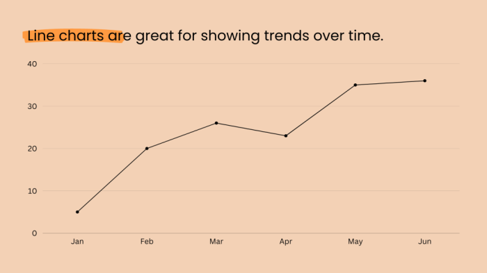
A line chart is ideal for visualizing trends over time, making it perfect for illustrating sales growth. Consider a scenario depicting sales figures for a hypothetical company, “Acme Corp,” over five years, with clear seasonal fluctuations. The data might look something like this (in thousands):
| Year | Q1 | Q2 | Q3 | Q4 |
|---|---|---|---|---|
| 2019 | 100 | 120 | 150 | 180 |
| 2020 | 110 | 130 | 160 | 200 |
| 2021 | 120 | 140 | 170 | 220 |
| 2022 | 130 | 150 | 180 | 240 |
| 2023 | 140 | 160 | 190 | 260 |
This data, when plotted on a line chart, would show a clear upward trend representing overall sales growth. The seasonal fluctuations (higher sales in Q4, lower in Q1) would be easily visible, adding another layer to the narrative. The chart would include a clear legend indicating “Acme Corp Sales” and appropriately labeled x-axis (Year/Quarter) and y-axis (Sales in Thousands). The visual representation would immediately communicate both the overall growth and the predictable seasonal pattern.
Line Charts versus Bar Charts for Website Traffic
The choice between a line chart and a bar chart for depicting monthly website traffic depends on the story you want to tell. A line chart emphasizes the trend over time, highlighting the continuous flow of traffic and any significant upward or downward shifts. This is advantageous for showcasing overall growth or decline and identifying patterns. However, a line chart may not be as effective in showing the precise value for each month, especially if the differences between months are small.
A bar chart, on the other hand, excels at displaying the exact value of website traffic for each month. This is beneficial when comparing specific months or highlighting particular peaks and valleys. However, a bar chart might obscure the overall trend, making it harder to discern the overall pattern of growth or decline. Therefore, for monthly website traffic, a line chart is generally preferable for illustrating the trend, but a bar chart might be better suited for detailed comparisons between specific months if that’s the primary focus.
The Importance of Data Accuracy in Line Chart Narratives
Data accuracy is paramount when creating line charts for storytelling. Inaccurate data fundamentally undermines the credibility of the narrative and can lead to entirely misleading conclusions. For example, if sales figures are incorrectly reported, a line chart might show a growth trend where none exists, or conversely, mask actual growth. Similarly, if website traffic data is flawed, the chart could inaccurately depict peak seasons or overall website performance. The consequences of inaccurate data visualization can range from minor misinterpretations to significant business decisions based on flawed information. Rigorous data validation and verification are crucial steps in ensuring the integrity of any line chart.
Visual Enhancements

Effective visual enhancements are crucial for transforming a simple line chart into a compelling narrative. By strategically employing color, annotation, and thoughtful design choices, we can guide the viewer’s eye and emphasize key trends or data points, making the information more accessible and memorable. This section will explore how to leverage these techniques to improve readability and maximize the impact of your line charts.
Color Gradients to Highlight Trends
A well-chosen color gradient can effectively highlight trends within your data. Consider a line chart illustrating the relationship between temperature and ice cream sales. Imagine a chart where the line representing ice cream sales is a gradient ranging from a light blue (representing low sales during colder months) to a vibrant, deep blue (representing high sales during warmer months). This visual cue immediately communicates the positive correlation between temperature and ice cream sales. Similarly, a negative correlation could be shown using a gradient shifting from a warm color to a cool color, providing a clear and intuitive understanding of the data. The use of a color scale, rather than simply a single color, significantly improves the chart’s ability to communicate the underlying trends.
Annotations to Emphasize Significant Events
Annotations are invaluable for adding context and highlighting specific events impacting your data. Let’s consider a line chart displaying stock prices over a year. Key events, such as product launches, market crashes, or significant news announcements, can be marked directly on the chart with small annotations. For instance, a downward spike in stock price might be annotated with “Negative Market Sentiment Following Q3 Earnings Report”. This contextual information allows the viewer to connect price fluctuations with external factors, creating a richer, more insightful narrative. The annotations act as guideposts, drawing attention to crucial moments and clarifying the story behind the data.
Comparative Line Chart of Product Performance
| Date | Product A | Product B | Product C |
|---|---|---|---|
| January | 100 | 120 | 80 |
| February | 110 | 130 | 90 |
| March | 120 | 140 | 100 |
| April | 130 | 150 | 110 |
| May | 140 | 160 | 120 |
| June | 150 | 170 | 130 |
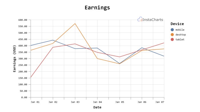
This table provides sales data for three products (A, B, and C) over six months. Visualizing this data in a line chart allows for a direct comparison of their performance. Using distinct colors for each product line, and potentially adding a legend, instantly clarifies the relative success of each product. The chart will clearly show which product experienced the greatest growth, which had consistent performance, and which lagged behind. This comparative visualization simplifies the interpretation of complex data, making key insights immediately apparent.
Crafting a Compelling Narrative Through Chart Design

A well-designed line chart can do more than simply display data; it can tell a story, revealing trends and insights that might otherwise remain hidden. By carefully considering design choices, we can guide the viewer’s eye and emphasize key findings, crafting a compelling narrative that resonates with the audience. This involves thoughtful selection of visual elements and a clear understanding of the message we aim to convey.
Different Narratives from the Same Dataset
Let’s consider a hypothetical dataset tracking website visits over a year. Three different line charts, each employing different design choices, can tell vastly different stories from this same data.
Chart 1: Focus on Overall Growth. This chart uses a single, bold line in a vibrant green, highlighting the overall upward trend of website visits. The x-axis (time) is clearly labeled, and the y-axis (visits) uses a scale that emphasizes the magnitude of the growth. Minimal annotations are used, allowing the growth trend to dominate the visual narrative. The story told is one of consistent and impressive success.
Chart 2: Highlighting Seasonal Fluctuations. This chart uses the same data but employs a thinner line and adds clear annotations highlighting peak and trough periods (e.g., holiday seasons, back-to-school periods). The color palette might be more subdued, and the y-axis scale might be adjusted to emphasize the relative size of the seasonal fluctuations. The narrative shifts to one of predictable seasonal patterns influencing website traffic, emphasizing the importance of seasonal marketing strategies.
Chart 3: Showcasing a Specific Event’s Impact. This chart might use a shaded region to highlight a specific marketing campaign period. The line itself could be broken down into pre-campaign and post-campaign segments with different line styles or colors. Annotations would specifically call out the campaign’s start and end dates, and perhaps even the increase in website traffic attributed to the campaign. The narrative here focuses on the effectiveness of a specific intervention, showcasing its direct impact on website visits.
Designing a Line Chart for Complex Trends
To effectively communicate the impact of social media marketing on brand awareness, a step-by-step approach is crucial.
- Define Key Metrics: Identify the relevant metrics, such as brand mentions, social media engagement, and website traffic. Ensure these are clearly defined and measurable.
- Data Collection and Cleaning: Gather data from various social media platforms and website analytics. Clean and organize the data to ensure accuracy and consistency.
- Chart Structure: Use multiple lines to represent different social media platforms or marketing campaigns. The x-axis should represent time (e.g., months or quarters), and the y-axis should represent the chosen metric (e.g., brand mentions).
- Visual Hierarchy: Use different line thicknesses, colors, and annotations to highlight key findings. For example, a thicker line could represent the overall brand awareness trend, while thinner lines represent individual social media platforms. Annotations could highlight significant events or milestones.
- Contextualization: Add a clear title and axis labels. Include a concise legend to explain the different lines. Consider adding a brief summary of the key findings within the chart itself.
- Iterative Refinement: Review the chart and make adjustments as needed to ensure clarity and effectiveness. Consider user feedback to improve the design.
- Accessibility: Ensure the chart is accessible to users with visual impairments by using appropriate color contrast and providing alternative text descriptions.
Using Visual Hierarchy to Emphasize Key Findings
Consider a line chart illustrating website traffic before, during, and after a major product launch. The line representing website traffic could be a thick, solid blue line. The period surrounding the product launch could be highlighted using a shaded area in a lighter shade of blue. A vertical annotation could point to the peak in website traffic on the launch day, with a text annotation clearly stating “Product Launch.” The visual hierarchy—the thick line, the shaded area, and the annotation—clearly guides the viewer’s eye to the key finding: the significant increase in website traffic directly attributable to the product launch. The contrast between the thick blue line and the lighter shaded area, along with the pointed annotation, ensures the viewer understands the importance of the launch day.
Final Thoughts

Mastering the art of designing effective line charts is a valuable skill for anyone working with data. By following these seven tips – selecting appropriate data, enhancing visual readability, and crafting a compelling narrative – you can transform complex datasets into easily understandable and engaging visual stories. Remember, a well-designed chart isn’t just about presenting data; it’s about communicating insights and driving understanding.