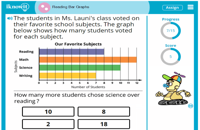
Data visualization is crucial for effective communication, and bar graphs are a fundamental tool. However, poorly designed bar graphs can lead to misinterpretations and hinder understanding. This guide explores five key strategies to create clear, concise, and easily understandable bar graphs, ensuring your data speaks volumes.
We’ll delve into selecting the appropriate chart type and data representation, optimizing visual elements for clarity, and addressing potential sources of misinterpretation. We will also cover best practices for accessibility, ensuring your visualizations are inclusive and understandable for everyone. By mastering these techniques, you can transform your data into compelling and insightful visuals.
Choosing the Right Chart Type and Data Representation
Selecting the appropriate chart type is crucial for effectively communicating data. The wrong choice can obscure insights and lead to misinterpretations. Understanding the strengths and weaknesses of different chart types, particularly bar graphs, is key to creating clear and compelling visualizations. This section will explore different bar graph applications and demonstrate how to optimize their design for maximum impact.
Clustered Bar Chart for Product Line Sales
A clustered bar chart is ideal for comparing multiple data series across different categories. Consider a scenario where we want to visualize the sales figures for three product lines (A, B, and C) over four quarters (Q1, Q2, Q3, Q4). Each product line would be represented by a different color, and the bars for each quarter would be clustered together.
Imagine a chart where the horizontal axis represents the four quarters (Q1, Q2, Q3, Q4), and the vertical axis represents sales figures (in thousands of dollars, for example). Three bars are clustered together for each quarter, one for each product line (A, B, C). Product line A might be represented by blue bars, product line B by orange bars, and product line C by green bars. A legend clearly indicates which color corresponds to which product line. For instance, Q1 might show Product A with sales of $100,000 (blue bar), Product B with sales of $75,000 (orange bar), and Product C with sales of $50,000 (green bar). This visual representation allows for a direct comparison of sales performance across product lines and over time.
Comparison of Horizontal and Vertical Bar Graphs for Average Temperatures
Horizontal and vertical bar graphs both serve the purpose of comparing categorical data, but their strengths differ. To illustrate, let’s compare average temperatures across several cities.
A *vertical* bar graph, with cities on the horizontal axis and temperature on the vertical axis, works well when you have many cities and want to easily compare their temperatures. The height of each bar directly represents the temperature, making comparisons straightforward. For example, a city with a higher bar would immediately be identified as having a higher average temperature.
A *horizontal* bar graph, with temperature on the vertical axis and cities on the horizontal axis, is more effective when the city names are long or complex, preventing overcrowding on the horizontal axis of a vertical bar graph. The length of the bar represents the temperature. In this case, longer bars indicate higher temperatures. This orientation is better for readability when dealing with numerous cities or lengthy city names.
Bar Graph for Market Share with Color Coding
Color coding significantly enhances the readability and memorability of bar graphs, especially when representing percentages. Let’s consider a market share visualization for five competing companies (A, B, C, D, and E).
A vertical bar graph with the company names on the horizontal axis and market share (in percentage) on the vertical axis is appropriate. We can use a color scheme that enhances visual distinction and potentially reflects brand colors if known. For example: Company A (market leader) could be represented by a deep blue (#003366) to convey stability and trust. Company B (second largest) could use a vibrant orange (#FF8C00) to symbolize energy and dynamism. Company C could be a lighter green (#90EE90) suggesting growth and freshness. Company D could be a muted purple (#800080) to suggest sophistication and Company E could be a grey (#808080) representing a neutral position in the market. The rationale behind these choices is to use colors that are visually distinct and convey subtle connotations related to each company’s potential brand image. This color coding makes it easy to identify and compare the market share of each company at a glance. The legend would clearly label each company and its corresponding color.
Addressing Potential Misinterpretations and Enhancing Accessibility
Creating clear and easily understandable bar graphs requires careful consideration of potential pitfalls that can lead to misinterpretations. Furthermore, accessibility for all users, including those with visual impairments, is crucial for effective data communication. This section will explore common sources of misinterpretation and provide strategies for designing accessible and accurate bar graphs.
Misleading Visual Representations in Bar Graphs
Improper scaling and formatting can significantly distort the message conveyed by a bar graph. One common issue is the truncated y-axis, where the vertical axis doesn’t start at zero. This technique can exaggerate differences between data points. For example, imagine a graph showing sales figures for two products. If the y-axis starts at $50,000 instead of zero, a small difference in sales might appear substantial. Always start the y-axis at zero to avoid this type of distortion. Another misleading practice is using a non-linear scale, making it difficult to accurately compare values. A consistent, linear scale is essential for clear interpretation. Finally, inconsistent bar widths can also confuse the viewer, leading to inaccurate comparisons. Ensure all bars are uniformly sized.
Accessible Bar Graph Design
Designing accessible bar graphs ensures inclusivity for everyone. For visually impaired users, alternative text descriptions are crucial. This text should concisely summarize the data presented, including the labels for each bar and the overall trend. For example, “Bar graph showing website traffic for the past three months. July had 10,000 visitors, August had 12,000, and September had 15,000.” Sufficient color contrast between bars and the background is equally important. Use a color palette that ensures readability for individuals with color blindness. Tools and resources are available online to check color contrast ratios and ensure they meet accessibility standards (e.g., WCAG guidelines).
Illustrative Example: Y-Axis Manipulation
Let’s consider two bar graphs displaying the same data: the number of books sold by two authors, Author A and Author B.
Graph 1: Accurate Representation
Imagine a bar graph where the y-axis ranges from 0 to 100,000 books sold. Author A’s bar reaches 10,000, and Author B’s bar reaches 90,000. The difference is clearly visible; Author B significantly outsells Author A. The bars are clearly distinct and the difference is immediately apparent due to the scale accurately reflecting the data.
Graph 2: Misleading Representation
Now, consider a second graph displaying the same data but with a y-axis ranging from 80,000 to 100,000. In this manipulated graph, Author A’s bar is short, near the bottom, and Author B’s bar is much longer, but the visual difference between the two bars appears much smaller than in Graph 1. This manipulation minimizes the apparent difference in sales, potentially leading the viewer to underestimate the success of Author B compared to Author A. The visual impact is drastically altered, even though the underlying data remains the same. The difference in sales appears far less significant due to the truncated and manipulated y-axis.
Last Point

Creating effective bar graphs isn’t merely about presenting data; it’s about fostering understanding. By carefully considering chart type, visual elements, potential misinterpretations, and accessibility, you can craft bar graphs that are not only visually appealing but also readily interpretable. This empowers your audience to grasp your data’s significance quickly and accurately, leading to more effective communication and informed decision-making.