Unlocking the power of data requires effective visualization. This exploration delves into four essential tools—Tableau, Power BI, Qlik Sense, and a fourth yet-to-be-revealed tool—comparing their strengths and weaknesses across various metrics. We’ll examine their ease of use, data connectivity options, visualization capabilities, and explore how they facilitate insightful data storytelling.
From basic chart types to advanced interactive dashboards and geographic maps, we’ll uncover the best applications for each tool, highlighting their unique features and capabilities. We’ll also discuss crucial pre-visualization steps like data cleaning and preparation, ensuring your visualizations are both accurate and impactful.
Top Data Visualization Tools

Choosing the right data visualization tool can significantly impact the effectiveness of your data analysis. This section provides a comparative overview of three leading tools: Tableau, Power BI, and Qlik Sense, focusing on their ease of use, data connectivity, and visualization capabilities. Understanding their strengths and weaknesses will help you select the best tool for your specific needs.
Comparative Overview of Tableau, Power BI, and Qlik Sense
The following table summarizes a comparison of Tableau, Power BI, and Qlik Sense across key features. Each tool offers unique advantages and disadvantages, making the optimal choice dependent on individual project requirements and user expertise.
| Tool | Ease of Use | Data Connectivity | Visualization Capabilities |
|---|---|---|---|
| Tableau | Generally considered user-friendly, with a drag-and-drop interface and intuitive design. However, mastering advanced features requires more effort. | Connects to a wide variety of data sources, including databases, spreadsheets, and cloud services. Its robust connector library facilitates seamless integration with diverse data environments. | Offers a comprehensive range of visualizations, including interactive dashboards, maps, and advanced charts. It excels in creating visually appealing and insightful representations of complex data. Examples include sophisticated geographic visualizations and interactive treemaps. |
| Power BI | Provides a relatively easy-to-learn interface, particularly for users familiar with the Microsoft ecosystem. Its integration with Excel and other Microsoft products simplifies data import and manipulation. | Strong connectivity to Microsoft products and services. Connects to various databases and cloud services, although its third-party connector library is less extensive than Tableau’s. | Offers a wide array of visualizations, including interactive dashboards and custom visuals. It is particularly strong in creating business-oriented reports and dashboards, featuring capabilities for KPI tracking and data storytelling. Examples include interactive charts showcasing sales trends and geographical heatmaps highlighting customer concentration. |
| Qlik Sense | While offering a powerful associative engine, the initial learning curve might be steeper than Tableau or Power BI for some users. However, its data exploration capabilities become increasingly intuitive with experience. | Connects to a broad range of data sources, similar to Tableau. Its strength lies in its ability to handle large and complex datasets, providing efficient data exploration and discovery. | Provides a strong selection of visualizations, including advanced analytics features. It excels in associative data exploration, allowing users to quickly uncover hidden relationships and patterns within data. Examples include network diagrams illustrating relationships between entities and dynamic visualizations responding to user selections. |
Strengths and Weaknesses of Each Tool
Each tool possesses unique strengths and weaknesses. Tableau excels in its ease of use for creating visually stunning and interactive dashboards, but its pricing can be prohibitive for some users. Power BI boasts seamless integration within the Microsoft ecosystem and a strong focus on business intelligence, but its advanced analytics capabilities might be less comprehensive than Tableau or Qlik Sense. Qlik Sense shines in its associative data exploration capabilities and handling of large datasets, but its initial learning curve might be steeper.
Hypothetical Data Analysis Scenario and Tool Selection
Let’s consider a scenario where a marketing team wants to analyze customer purchase data to identify key demographics and purchasing patterns. The data includes customer age, location, purchase history, and product categories. The desired outcome is an interactive dashboard showing sales trends by region, age group, and product category, allowing for drill-down analysis to understand specific customer segments.
In this scenario, Power BI would be the most suitable tool. Its strong business intelligence capabilities, combined with its user-friendly interface and seamless integration with Excel for data preparation, would facilitate the creation of an effective and easy-to-understand dashboard tailored to the marketing team’s needs. The ability to easily create interactive charts showing sales trends and geographical breakdowns would provide valuable insights.
Exploring Data Visualization Techniques with Popular Tools

Data visualization is crucial for extracting meaningful insights from raw data. Effective visualization transforms complex datasets into easily understandable and actionable information, enabling better decision-making. This section explores various data visualization techniques using popular tools like Tableau, Power BI, and Qlik Sense, demonstrating their capabilities and applications.
Tableau Chart Types and Applications
Different chart types serve distinct purposes in data visualization. Selecting the appropriate chart is key to effectively communicating insights. Tableau, with its user-friendly interface, provides a wide array of chart options, each best suited for specific data types and analytical goals.
- Bar Charts: Ideal for comparing categorical data. For instance, a bar chart in Tableau could compare sales figures across different product categories, visually highlighting the best-performing and underperforming areas. The height of each bar directly represents the value of the category, allowing for quick comparisons.
- Line Charts: Excellent for showing trends over time. A Tableau line chart could display website traffic over a year, revealing seasonal patterns or the impact of marketing campaigns. The continuous line clearly illustrates the progression of data points, highlighting upward or downward trends.
- Scatter Plots: Useful for identifying correlations between two numerical variables. A Tableau scatter plot could illustrate the relationship between advertising spend and sales revenue, revealing if increased spending correlates with higher sales. The position of each point on the plot represents the values of the two variables, enabling the identification of positive, negative, or no correlation.
- Pie Charts: Suitable for showing the proportion of different categories within a whole. A Tableau pie chart could represent the market share of different brands in an industry, clearly demonstrating the relative size of each segment. The size of each slice directly corresponds to its proportion of the total.
Power BI Dashboard Examples and Interactive Elements
Power BI excels at creating interactive dashboards that tell compelling data stories. Effective dashboards combine various visualizations to present a holistic view of the data, enabling users to explore different aspects and gain a deeper understanding.
Imagine a Power BI dashboard for a retail company tracking sales performance. The dashboard could include:
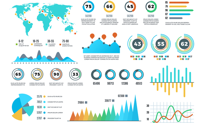
- A map visualization: Showing sales performance across different regions, allowing users to drill down into specific areas to analyze performance in detail. The map could be color-coded to represent sales volume, with darker shades indicating higher sales.
- A line chart: Displaying sales trends over time, enabling users to identify seasonal patterns or the impact of promotional campaigns. Interactive elements like date selectors could allow users to customize the time period displayed.
- Bar charts: Comparing sales performance across different product categories, allowing users to quickly identify top-selling and underperforming products. The charts could be interactive, allowing users to filter data based on specific categories or time periods.
This dashboard uses the data on sales figures, product categories, geographical location, and time. Insights gained include identifying top-performing regions, understanding seasonal sales patterns, and pinpointing best-selling product categories. The interactive elements allow for a more in-depth exploration of the data, uncovering more nuanced insights.
Qlik Sense Geographic Map Visualization
Creating a geographic map visualization in Qlik Sense involves several steps. First, you would import your data, ensuring it includes geographical coordinates (latitude and longitude) or postal codes. Then, you’d create a map layer, choosing a base map (e.g., street map, satellite imagery). Next, you would link your data to the map layer, assigning data points to specific geographical locations. This allows you to visualize data geographically, such as customer locations, sales figures by region, or the spread of a particular phenomenon. Finally, you could add interactive elements like tooltips, allowing users to hover over data points to see detailed information. Adding multiple data layers, for instance, overlaying population density onto sales data, can reveal deeper correlations. The ability to zoom and pan provides further interactive exploration of the data, leading to a more comprehensive understanding of spatial patterns.
Advanced Data Visualization Concepts and Applications

Effective data visualization hinges on more than just choosing the right tool; it requires a solid understanding of data preparation and advanced techniques to create truly insightful and impactful visuals. This section delves into crucial concepts and practical applications to elevate your data visualization skills.
Data Cleaning and Preparation for Visualization
Thorough data cleaning and preparation are paramount before visualization. Raw data often contains inconsistencies, errors, and missing values that can skew interpretations and render visualizations misleading. Addressing these issues is crucial for accurate and reliable insights.
Common Data Issues and Their Solutions
Data quality significantly impacts the effectiveness of any visualization. Common issues include missing values, outliers, inconsistent data formats, and inaccurate data entries. For example, missing values in a sales dataset could lead to an underestimation of total revenue if not properly handled through imputation techniques like mean/median substitution or more sophisticated methods like k-Nearest Neighbors. Outliers, unusually high or low values, can distort visualizations like scatter plots and histograms. Robust statistical methods, like using the median instead of the mean for central tendency calculations, can mitigate their influence. Inconsistent data formats, such as dates recorded in different styles, necessitate standardization for accurate analysis and visualization. Finally, inaccurate data entries, often due to human error, require careful review and correction. Data validation techniques and automated checks can help identify and flag these inconsistencies.
Creating an Interactive Infographic with Tableau
This step-by-step guide demonstrates building an interactive infographic using Tableau. We will assume a dataset containing sales figures across different regions and product categories.
- Data Connection: Connect Tableau to your data source (e.g., a CSV file or a database). Ensure the data is clean and properly formatted.
- Data Exploration: Explore the data using Tableau’s built-in features. Identify key relationships and patterns that you want to highlight in your infographic.
- Visualization Selection: Choose appropriate chart types to represent your data. For example, a map could show sales by region, while a bar chart could compare sales across product categories. Consider using interactive elements such as tooltips and filters to enhance user engagement.
- Dashboard Design: Arrange the visualizations on a dashboard, creating a visually appealing and coherent layout. Use Tableau’s design features to customize colors, fonts, and titles.
- Interactive Elements: Implement interactive elements such as filters, parameters, and actions to allow users to explore the data dynamically. For example, a filter could allow users to select a specific region or product category to view detailed sales data.
- Storytelling: Organize the visualizations in a logical sequence to tell a compelling story with your data. Use annotations and labels to provide context and highlight key findings.
- Publication: Publish the infographic to Tableau Server or Tableau Online to share it with others.
Comparison of Data Security and Collaboration Features
Choosing a data visualization tool often involves considering its security and collaboration features. Here’s a comparison of Tableau, Power BI, and Qlik Sense:
| Tool | Security Features | Collaboration Features | Cost |
|---|---|---|---|
| Tableau | Role-based access control, data encryption, audit trails | Real-time collaboration, version control, commenting features | Subscription-based, varying by features and users |
| Power BI | Row-level security, data encryption, data loss prevention | Shared workspaces, co-authoring, commenting | Free and paid options, depending on features and user needs |
| Qlik Sense | User authentication, data encryption, access control lists | Shared workspaces, version control, commenting features | Subscription-based, varying by features and users |
Concluding Remarks

Mastering data visualization is key to extracting meaningful insights from raw data. By understanding the nuances of each tool—Tableau, Power BI, Qlik Sense, and [fourth tool], as discussed—you can choose the best fit for your specific needs and create compelling visualizations that effectively communicate complex information. Remember, effective data storytelling relies not just on the tools, but on a clear understanding of your data and your intended audience.