Unlocking inclusive design requires understanding diverse user needs. This exploration delves into eight key strategies for creating products and experiences that resonate with a broad spectrum of users, irrespective of their abilities, backgrounds, or technological proficiency. We’ll examine practical techniques for user research, inclusive design principles, and iterative development processes to ensure accessibility and inclusivity are at the forefront of every design decision.
From crafting user personas representing individuals with disabilities to implementing culturally sensitive design elements, we will navigate the complexities of designing for a truly diverse user base. We’ll also discuss crucial aspects such as A/B testing for inclusive designs and mitigating biases in user research to ensure fairness and accuracy. This guide provides a roadmap for designers committed to creating equitable and universally accessible experiences.
Understanding Diverse User Needs

Designing for diversity necessitates a deep understanding of the varied needs and limitations of different user groups. Ignoring these differences leads to exclusion and limits the accessibility and usability of products and services for a significant portion of the population. This section will explore the challenges and solutions involved in designing for users with disabilities, varying digital literacy levels, and age-related considerations.
Designing a User Persona for a Person with a Disability
Consider Maria, a 35-year-old graphic designer with limited mobility due to cerebral palsy. She uses a wheelchair and relies on voice-activated software for many tasks. When interacting with a website, Maria faces several challenges. Navigation using a mouse can be difficult and time-consuming, requiring precise movements she may not be able to consistently execute. Complex layouts with small buttons and cluttered interfaces can be overwhelming and frustrating. She also relies heavily on screen readers, requiring websites to adhere to strict accessibility guidelines, including proper alt text for images and clear semantic HTML structure. Maria’s needs highlight the importance of keyboard navigation, sufficient color contrast, and clear, concise website content.
Inclusive Design Principles for Elderly Users in Mobile Applications
Designing for elderly users requires consideration of age-related changes in vision, hearing, and dexterity. A mobile banking application, for example, could incorporate several inclusive design principles. Larger, clearly labeled buttons and icons would improve usability for users with reduced dexterity or vision impairment. High contrast color schemes would enhance readability. Audio cues alongside visual notifications would aid users with impaired vision or those in noisy environments. Simplified navigation and clear, concise language would cater to users with cognitive decline or reduced processing speed. Furthermore, providing options for adjusting font sizes and using larger, bolder text would be essential. Regular feedback and clear progress indicators would also minimize user anxiety and frustration.
Challenges of Designing for Varying Digital Literacy Levels and Suggested Solutions
Designing for users with varying levels of digital literacy presents significant challenges. Some users may be highly proficient, while others may be complete novices. This disparity requires a flexible and adaptable approach. One challenge lies in balancing simplicity with functionality. Oversimplification can be frustrating for advanced users, while overly complex interfaces can overwhelm beginners. Solutions include providing multiple levels of interaction – a simplified mode for beginners and a more advanced mode for experienced users – or offering contextual help and tutorials. Clear, concise language, intuitive icons, and progressive disclosure of information are also crucial. Furthermore, offering multiple ways to access information, such as through both text and video tutorials, can improve accessibility for a wider range of users.
Accessibility Needs Comparison Across User Groups
| User Group | Primary Needs | Design Considerations | Example Implementations |
|---|---|---|---|
| Visually Impaired | Screen reader compatibility, sufficient color contrast, alternative text for images | Use semantic HTML, ensure sufficient color contrast ratio, provide detailed alt text for all images and interactive elements | Using ARIA attributes, adhering to WCAG guidelines, providing captions and transcripts for videos |
| Hearing Impaired | Captions and transcripts for audio and video content, visual alerts | Provide captions and transcripts for all audio and video content, use visual cues for notifications and alerts | Using closed captions, offering transcripts for podcasts, using visual indicators for incoming calls or messages |
| Motor-Impaired | Keyboard navigation, large touch targets, voice control | Ensure all functionality is accessible via keyboard, design large, easily selectable buttons, integrate voice control options | Implementing ARIA attributes for keyboard navigation, using large tap targets on mobile interfaces, providing voice command functionality |
Inclusive Design Strategies

Designing for diversity isn’t just about representation; it’s about creating products and services that are usable and valuable for everyone, regardless of their background, abilities, or circumstances. Inclusive design strategies move beyond simply adding features for specific groups; they involve a fundamental shift in the design process, prioritizing accessibility and user-centeredness from the outset. This section will explore several key methods and considerations for implementing truly inclusive design.
Methods for Conducting User Research with Diverse Participants
Effective user research is crucial for understanding diverse user needs. Employing a variety of research methods allows designers to gather rich, nuanced data and avoid relying on assumptions. Three effective approaches include ethnographic studies, participatory design, and remote user testing with diverse recruitment strategies.
Ethnographic studies involve observing users in their natural environments to understand their behaviors, needs, and contexts. This approach is particularly valuable for uncovering implicit biases and assumptions that might be missed through other methods. Data collection may involve participant observation, interviews, and artifact analysis. Analysis often involves identifying recurring patterns and themes in the data to understand user behaviors and needs. For example, observing how elderly users interact with a medication dispensing system in their homes could reveal usability issues not apparent in a lab setting.
Participatory design actively involves users in the design process. This collaborative approach ensures that diverse perspectives are integrated throughout the design lifecycle. Data is collected through workshops, co-creation sessions, and feedback rounds. Analysis focuses on synthesizing user feedback and incorporating it into design iterations. For instance, involving visually impaired users in the design of a mobile banking app ensures that accessibility features are integrated from the start, rather than being added as an afterthought.
Remote user testing allows for geographically diverse participation. Recruiting participants through diverse channels (e.g., online panels representing different demographics and abilities) ensures representation. Data collection involves recording user interactions and gathering feedback through questionnaires and interviews. Analysis may involve qualitative coding of user feedback and quantitative analysis of task completion rates and error rates. This method is particularly useful for testing global products with users in various locations and time zones.
Cultural Differences in Color Palettes and Imagery
Color and imagery hold significant cultural meaning and can evoke different emotions across cultures. Ignoring these differences can lead to misinterpretations or even offense. For example, the color white is associated with purity and mourning in different cultures, while certain imagery might be considered taboo or inappropriate in specific regions.
Careful research into cultural symbolism and color preferences is crucial. This involves reviewing existing research on cross-cultural color psychology and conducting user research with representatives from the target cultures. Designers should consult cultural experts and utilize culturally sensitive imagery that avoids stereotypes and promotes inclusivity. For instance, using images that represent a diverse range of ethnicities, genders, and abilities in marketing materials helps create a more inclusive and welcoming brand image. Using color palettes that are universally appealing and avoid culturally specific connotations ensures broader appeal and prevents misunderstandings.
Website Navigation System for Users with Cognitive Impairments
Designing a website that caters to users with cognitive impairments requires a simplified and predictable navigation system. This improves usability and comprehension for all users.
A clear and consistent information architecture is paramount. This involves organizing website content logically and using clear, concise labels. A hierarchical structure with clear pathways to key information minimizes cognitive load. For example, using descriptive and consistent page titles and headings helps users quickly understand the content of each page.
Simple and intuitive navigation elements are also crucial. Using large, easily identifiable buttons and icons minimizes the cognitive effort required to navigate the site. A visual hierarchy that guides users through the content is also essential. Avoid using cluttered layouts or excessive animations, which can overwhelm users. For example, using a breadcrumb trail to show the user’s location within the website helps with orientation.
Finally, providing alternative navigation options, such as keyboard navigation and screen readers, ensures accessibility for all users. These features are crucial for users who rely on assistive technologies. For example, ensuring that all interactive elements have appropriate keyboard shortcuts and ARIA attributes enhances the accessibility of the website.
Best Practices for Creating Accessible and Inclusive Forms
Forms are often a major point of friction for users, particularly those with disabilities. Careful design is crucial to ensure accessibility and inclusivity.
- Use clear and concise labels for all input fields. Avoid abbreviations or jargon.
- Provide sufficient space between input fields and labels to improve readability.
- Use appropriate input types (e.g., date pickers, number fields) to aid data entry.
- Provide real-time feedback to users as they complete the form (e.g., input validation).
- Use clear and informative error messages that guide users to correct errors.
- Ensure that forms are compatible with assistive technologies (e.g., screen readers).
- Provide alternative input methods (e.g., keyboard navigation).
- Offer clear instructions and guidance throughout the form completion process.
- Test forms with users with disabilities to identify and address accessibility issues.
Testing and Iteration for Inclusivity

Ensuring designs are truly inclusive requires rigorous testing and iterative refinement. This process involves evaluating design choices across diverse user groups, gathering feedback, and adapting the design accordingly to address identified shortcomings and biases. A systematic approach to testing and iteration is crucial for creating products and services that are usable and accessible to everyone.
A/B testing and usability testing are valuable tools in this process. A/B testing allows for a quantitative comparison of different design options, while usability testing provides qualitative insights into user experience. By combining both approaches, designers can gain a comprehensive understanding of how different user groups interact with their designs and identify areas for improvement.
A/B Testing for Inclusive Design Choices
A/B testing allows designers to compare two versions of a design element, such as a button’s color or the placement of a form field. By randomly assigning users to different versions, designers can collect data on which version performs better according to specific metrics, such as click-through rates or task completion times. For example, a designer might compare two versions of a website’s navigation menu: one with a traditional dropdown menu and another with a more visually intuitive icon-based navigation. By tracking user interactions with each version across different demographics, they can identify which version is more effective for different user groups, revealing potential accessibility issues or preferences. This data-driven approach allows for evidence-based decision-making in the pursuit of inclusivity.
Gathering Feedback from Diverse User Groups
Usability testing sessions involve observing users as they interact with a design. This allows researchers to identify pain points and areas of confusion. To ensure inclusivity, testing should involve participants from a wide range of backgrounds, abilities, and technological experiences. For example, a team designing a mobile banking app should test with users of varying ages, visual acuity, and digital literacy levels. Recruiting participants from diverse groups can be facilitated through partnerships with community organizations or by using specialized recruitment platforms that cater to diverse populations. Observation notes and user feedback gathered during these sessions are then analyzed to identify areas needing improvement.
Potential Biases in User Research and Mitigation Strategies
Several biases can hinder the creation of truly inclusive designs. Understanding and mitigating these biases is critical.
Firstly, confirmation bias occurs when researchers interpret data to confirm their pre-existing beliefs. To mitigate this, researchers should actively seek out data that contradicts their hypotheses and involve diverse team members in the interpretation process. Secondly, sampling bias can arise when the participant pool doesn’t accurately represent the target user population. This is addressed by employing robust participant recruitment strategies, ensuring diverse representation across age, ethnicity, ability, and other relevant demographics. Finally, experimenter bias, where the researcher’s expectations influence the results, can be reduced through double-blind testing, where neither the researcher nor the participant knows which version of the design is being tested.
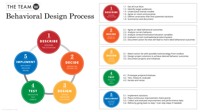
Iterative Design and Accessibility Testing
An iterative design process involves repeatedly testing, refining, and retesting designs based on user feedback. Accessibility testing, which evaluates how well a design meets accessibility standards, is an integral part of this process. After each round of testing, the design team should analyze the results, identify areas for improvement, and implement changes. This process is repeated until the design meets predefined accessibility standards and user satisfaction goals. For instance, if usability testing reveals that users with low vision struggle to navigate a website’s color scheme, the design team can adjust the contrast ratio to improve readability. This continuous cycle of testing, feedback incorporation, and refinement ensures the creation of truly inclusive designs.
Final Thoughts

By embracing these eight secrets, designers can move beyond superficial inclusivity and create truly transformative products and services. The journey toward universal design is iterative and requires ongoing learning and adaptation. However, the reward – a user experience that is both accessible and engaging for everyone – is well worth the effort. Remember that inclusivity isn’t just a checklist; it’s a fundamental principle that should guide every stage of the design process, leading to more innovative and impactful results.