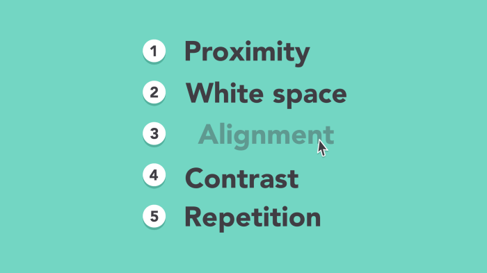
Effective font selection is paramount in design, impacting readability, aesthetics, and the overall message conveyed. This guide delves into five key principles for choosing and using fonts, transforming your designs from merely functional to truly impactful. We’ll explore the nuances of font families, the importance of typography for readability, and how to adapt font choices to various design contexts. Learn how to create visually appealing and effective designs through a thoughtful approach to typography.
From understanding the differences between serif, sans-serif, and script fonts to mastering techniques like leading and kerning, we’ll equip you with the knowledge to confidently select and implement fonts in any project. We will also explore how font weight, x-height, and color palettes contribute to a design’s overall success, helping you create designs that are not only beautiful but also easily digestible and engaging for your audience.
Understanding Font Families and Their Impact
Choosing the right font is crucial for effective design. Font selection significantly impacts readability, visual appeal, and the overall message conveyed. Understanding the different font families and their characteristics is the first step towards mastering this essential design skill. This section will explore serif, sans-serif, and script fonts, discuss the impact of font weight, and provide principles for selecting complementary font pairings.
Serif, Sans-Serif, and Script Fonts
Different font families possess distinct visual characteristics that influence their suitability for various applications. The three major categories—serif, sans-serif, and script—each offer unique qualities. The following table summarizes their key differences:
| Font Name | Category | Characteristics | Best Use Cases |
|---|---|---|---|
| Times New Roman | Serif | Traditional, elegant, with small decorative strokes (serifs) at the ends of letters; often considered more formal and readable for large blocks of text. | Body text in books, newspapers, formal documents. |
| Arial | Sans-serif | Clean, modern, without serifs; generally perceived as more contemporary and suitable for screen reading. | Headings, website text, signage, contemporary designs. |
| Edwardian Script ITC | Script | Cursive, flowing, mimicking handwriting; best used sparingly due to potential readability issues in large blocks of text. | Invitations, logos, short text elements where a personal touch is desired. |
| Garamond | Serif | Classic serif font, known for its readability and elegance; often used in high-end publications and branding. | Books, magazines, luxury branding. |
| Helvetica | Sans-serif | Highly versatile sans-serif font, known for its neutrality and clarity; widely used in corporate branding and signage. | Logos, corporate materials, signage, interfaces. |
| Brush Script MT | Script | Casual script font, often used for informal settings; less formal than Edwardian Script ITC. | Invitations, cards, informal marketing materials. |
Font Weight and Visual Hierarchy
Font weight, ranging from light to bold, significantly impacts readability and visual hierarchy. Using varying weights effectively guides the reader’s eye and emphasizes key information.
For example, consider a website header:
- Headline (Bold): Immediately draws attention, establishing the main topic.
- Subheading (Regular): Provides context and supporting information, less prominent than the headline.
- Body text (Light): Ensures comfortable reading, avoiding visual fatigue. The lighter weight contrasts with the bolder elements.
This contrast in font weight creates a clear visual hierarchy, making the information easily digestible and understandable. Overuse of bold fonts, however, can lead to a cluttered and overwhelming design.
Principles for Choosing Complementary Fonts
Selecting fonts that complement each other is essential for a cohesive and aesthetically pleasing design. Here are three guiding principles:
Principle 1: Contrast in Style: Pair a serif font with a sans-serif font to create visual interest and distinction. For example, using a classic serif font like Garamond for body text and a clean sans-serif like Helvetica for headings provides a balanced and sophisticated look.
Principle 2: Similar Weight and Style: For a more unified feel, choose fonts with similar weights and overall styles. Using different weights of the same font family, for example, a light weight for body text and a bold weight for headings, ensures consistency while maintaining visual hierarchy.
Principle 3: Limited Font Selection: Avoid using more than two or three fonts in a single design. Too many fonts can create visual chaos and make the design feel disorganized. Focus on selecting fonts that work harmoniously together to enhance the overall aesthetic.
Applying Principles of Typography for Readability and Aesthetics

Effective typography is crucial for creating visually appealing and easily digestible web designs. It’s about more than just choosing pretty fonts; it’s about understanding how typefaces interact, and how their characteristics influence the overall user experience. This section explores key typographic principles to enhance both readability and aesthetic appeal.
Website Header Designs: Font Pairings and Their Effectiveness
Let’s examine two contrasting website header designs to illustrate the impact of font pairing.
Design 1: The header uses “Playfair Display” (serif) for the main title and “Open Sans” (sans-serif) for the sub-heading. Playfair Display’s elegant serifs provide a sophisticated and authoritative feel for the main title, drawing the reader’s eye. Open Sans, with its clean and legible sans-serif design, complements the title, providing clear and easily readable sub-information. The contrast between the serif and sans-serif fonts creates visual interest without compromising readability. Imagine the main title “Welcome to Our Site” in a large, bold Playfair Display, followed by the sub-heading “Discover Our Services” in a smaller, but still clear, Open Sans.
Design 2: The header uses “Roboto” (sans-serif) for both the main title and sub-heading. While Roboto is a highly legible typeface, using it for both elements might result in a less visually stimulating header. The lack of contrast could lead to a less dynamic and engaging experience. In this case, “Welcome to Our Site” and “Discover Our Services” might appear somewhat monotonous, lacking the visual hierarchy provided by the different typefaces in Design 1. The overall effect, though readable, might feel less memorable and impactful.
X-Height and Its Impact on Readability
X-height refers to the height of the lowercase ‘x’ in a typeface. A larger x-height generally improves readability, particularly in body text, as it increases the perceived size and weight of the letters, making them easier to distinguish. Consider three text blocks, all using the same point size but with varying x-heights:
Block 1 (Low x-height): The text appears cramped and dense, potentially causing eye strain. The letters feel small and less distinct, hindering quick comprehension.
Block 2 (Medium x-height): The text is balanced and comfortable to read. The letters are clearly defined, and the overall appearance is pleasant and inviting.
Block 3 (High x-height): The text feels open and airy, but potentially less dense and less formal. While legible, it might appear less professional for certain applications.
Leading and Kerning for Readability and Visual Balance
Leading (line spacing) and kerning (letter spacing) are crucial for optimizing readability and visual balance. Insufficient leading can lead to cramped text, while excessive leading can create gaps that disrupt the flow. Poor kerning can result in uneven letter spacing, making the text appear awkward and unprofessional.
Let’s consider the following short paragraph:
“This paragraph demonstrates the impact of leading and kerning. Proper spacing ensures readability and visual appeal.”
With inadequate leading, the lines would appear crowded, making the text difficult to read. With excessive leading, the lines would be too far apart, hindering the natural flow. Similarly, improper kerning might create awkward gaps between certain letter combinations, such as “To” or “rn,” affecting the overall aesthetic. Careful adjustment of both leading and kerning is essential to create a visually pleasing and easily readable text block.
Font Selection for Different Design Contexts
Choosing the right font is crucial for effective design. The ideal font will depend heavily on the context, target audience, and the message being conveyed. Different design projects require different approaches to font selection to achieve optimal visual impact and readability.
Let’s explore how font choices vary across different design scenarios.
Font Selection for Websites, Posters, and Book Covers
The selection of fonts significantly impacts the overall aesthetic and effectiveness of a design. Consider the following scenarios:
Websites: Websites often require a balance between readability and visual appeal. For body text, a clean, legible sans-serif font like Open Sans or Lato works well. These fonts are highly readable on screens and maintain clarity at various sizes. Headlines, on the other hand, can benefit from a more stylized serif or sans-serif font to create visual hierarchy and brand identity. For example, a bold sans-serif like Montserrat for headings paired with a clean Open Sans for body text creates a modern and accessible look. The target audience for most websites is broad, so choosing fonts that are widely accessible and easy to read is paramount.
Posters: Posters demand fonts that are highly visible and impactful from a distance. Bold, condensed sans-serif fonts like Impact or Bebas Neue are often employed for headlines to grab attention. These fonts are designed for maximum readability at larger sizes. For supporting text, a simpler, easier-to-read sans-serif like Arial or Helvetica can be used, although the amount of body text should be minimized for maximum impact. The target audience is often a large, diverse group, so high visibility and immediate comprehension are key. The overall design aesthetic should be bold and memorable.
Book Covers: Book covers present a unique challenge, requiring fonts that reflect the genre and tone of the book while also being visually appealing. Serif fonts, like Garamond or Times New Roman, are frequently used for their classic and sophisticated feel, particularly for literary fiction or historical novels. For more contemporary or genre fiction, sans-serif fonts or even more stylized script fonts might be appropriate to convey the book’s mood and attract the intended readership. The target audience is specific to the genre and style of the book, so the font choice needs to reflect that target demographic’s expectations and preferences.
Body Text versus Headline Font Choices
The characteristics of fonts ideal for body text differ significantly from those suitable for headlines.
Choosing the right font for each is essential for optimal readability and visual hierarchy. Consider these properties:
Body Text Fonts:
- High readability: Fonts should be clear, legible, and easy on the eyes, even at smaller sizes. Examples include Open Sans, Lato, Georgia, and Times New Roman.
- Neutral style: Avoid overly stylized or decorative fonts that might distract from the content. A clean and simple design is key.
- Consistent x-height: A consistent x-height (the height of lowercase letters) ensures even spacing and improved readability.
- Appropriate kerning and tracking: Proper kerning (spacing between individual letters) and tracking (spacing between words) enhances legibility.
Headline Fonts:
- Strong visual impact: Headlines need to grab attention and convey the main message quickly. Bold weights, unusual styles, or large sizes are often used.
- Clear hierarchy: Headlines should stand out from the body text, creating a clear visual hierarchy.
- Versatility: The font should work well at larger sizes and maintain readability.
- Brand consistency: The font choice should reflect the brand identity and overall aesthetic.
Color and Font Selection for Readability and Visual Interest
Color plays a crucial role in enhancing readability and creating visual interest when paired with font selection.
Careful consideration of color palettes is essential for achieving a balanced and effective design. Here are some guidelines:
High Contrast: Using colors with sufficient contrast between the text and background is crucial for readability. For instance, dark text on a light background (black on white, dark gray on light gray) or light text on a dark background (white on black, light gray on dark gray) generally provides optimal contrast and minimizes eye strain. This is particularly important for body text.
Color Psychology: Different colors evoke different emotions and associations. For example, warm colors (reds, oranges, yellows) can convey energy and excitement, while cool colors (blues, greens, purples) can project calmness and serenity. The choice of color palette should align with the overall message and tone of the design. A vibrant color palette might be suitable for a poster advertising a music festival, while a more muted palette might be appropriate for a book cover promoting a serious novel.
Color Hierarchy: Similar to font hierarchy, color can be used to create visual hierarchy. Using a dominant color for headlines and a secondary color for body text can draw attention to key information and guide the reader’s eye through the design.
Final Thoughts
By understanding the fundamental principles of font selection and applying them strategically, you can elevate your designs significantly. Remember, the right font choice isn’t just about aesthetics; it’s about enhancing communication and creating a cohesive visual experience. Mastering these five principles will empower you to make informed decisions, resulting in designs that are both visually stunning and effectively communicate their intended message. Through careful consideration of font families, typography principles, and design context, you can unlock the full potential of typography in your work.