Mastering the art of typography goes beyond mere aesthetics; it’s about understanding the subtle yet powerful influence fonts exert on our emotions. This guide delves into the psychology behind font choices, offering a practical three-step approach to crafting designs that resonate deeply with your audience. We’ll explore how different font styles, weights, and sizes evoke specific feelings, impacting how viewers perceive your message. From understanding the basics of font psychology to refining your choices through testing, this guide empowers you to create designs that are not just visually appealing, but emotionally impactful.
We’ll examine practical strategies for selecting fonts that evoke specific emotions, such as trust, excitement, or sophistication. We’ll also discuss the importance of font pairing, kerning, tracking, and leading in creating a balanced and emotionally resonant design. The guide culminates in a discussion of A/B testing and identifying potential pitfalls in relying solely on personal preference when making font selections.
Understanding Font Psychology Basics
Choosing the right font is crucial for effective communication. Font psychology explores the subtle yet powerful influence typography exerts on a reader’s emotional response and comprehension. Understanding these psychological impacts allows designers to create visually appealing and emotionally resonant designs. This section will delve into the key aspects of font psychology, focusing on style, weight, and size.
The Psychological Impact of Different Font Styles
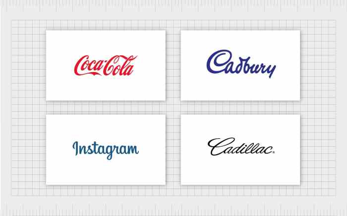
Different font styles evoke distinct emotional responses. Serifs, the small decorative flourishes at the ends of letter strokes (like Times New Roman), often project a sense of tradition, formality, and sophistication. They are frequently used in books, newspapers, and formal documents because they are considered highly readable for extended periods. Sans-serif fonts (like Arial or Helvetica), lacking these flourishes, appear cleaner, more modern, and sometimes bolder. They are commonly used in headlines, websites, and contemporary designs, often conveying a sense of efficiency and modernity. Script fonts (like Edwardian Script ITC), mimicking handwriting, evoke feelings of elegance, personality, and sometimes even nostalgia. However, overuse can lead to poor readability, so they are best used sparingly, often for logos, invitations, or short text elements.
The Influence of Font Weight on Perceived Message Importance
Font weight significantly impacts how a reader perceives the importance of the message. Bold fonts immediately draw the eye, emphasizing the text and conveying a sense of urgency, strength, or importance. Light fonts, on the other hand, create a softer, more delicate, and sometimes less assertive impression. Regular weight fonts provide a balance, often perceived as neutral and approachable. The weight chosen should align with the overall message and intended emotional impact. For instance, a bold headline on a website announcing a sale immediately grabs attention, while a light font might be more appropriate for a subtle, calming message.
The Effect of Font Size on Readability and Emotional Response
Font size directly affects readability and emotional perception. Larger font sizes improve readability, particularly for users with visual impairments, and often convey a sense of importance or prominence. Smaller font sizes, while useful for body text or fine details, can appear less significant or even overwhelming if not carefully managed. A large, bold headline in a contrasting color creates a strong emotional impact, instantly grabbing the reader’s attention. In contrast, smaller text sizes in the body of a webpage might suggest a more subtle or less crucial message. Extreme size differences should be avoided, unless a specific dramatic effect is intended.
Font Style, Weight, Size, and Perceived Mood
| Font Type | Weight | Size (px) | Perceived Mood |
|---|---|---|---|
| Times New Roman (Serif) | Regular | 12 | Formal, Traditional, Reliable |
| Arial (Sans-serif) | Bold | 16 | Modern, Strong, Urgent |
| Edwardian Script ITC (Script) | Light | 14 | Elegant, Delicate, Nostalgic |
| Times New Roman (Serif) | Bold | 24 | Authoritative, Important, Powerful |
| Arial (Sans-serif) | Light | 10 | Subtle, Delicate, Less Important |
| Edwardian Script ITC (Script) | Regular | 18 | Stylish, Personalized, Playful |
Applying Font Psychology in Design
Choosing the right font isn’t just about aesthetics; it’s about crafting an emotional connection with your audience. By understanding the psychological impact of different typefaces, designers can subtly influence how viewers perceive a brand, product, or message. This section will explore practical strategies for leveraging font psychology to achieve emotional resonance in your designs.
Effective font selection involves considering the message you want to convey and the emotions you want to evoke. Different typefaces possess inherent characteristics that subconsciously trigger specific feelings. For instance, a serif font like Times New Roman often projects an image of tradition and trustworthiness, while a sans-serif font like Helvetica can communicate modernity and efficiency. Bold, playful fonts can convey excitement and energy, while elegant script fonts can suggest sophistication and luxury. The key is to align the font’s inherent personality with the overall tone and purpose of your design.
Font Pairing and Visual Harmony
Successful design often relies on the strategic pairing of fonts. Combining different typefaces creates visual interest and hierarchy, but it’s crucial to ensure the chosen fonts complement each other rather than clash. A harmonious font pairing enhances readability and reinforces the emotional message. For example, pairing a classic serif font with a clean sans-serif font can create a balance between tradition and modernity, conveying a sense of sophistication and reliability. Conversely, pairing two highly contrasting fonts might create a jarring effect, detracting from the overall emotional impact. The goal is to select font pairings that work together to create a unified and emotionally resonant design. Consider the weight, style, and x-height of each font to ensure visual harmony.
The Role of Kerning, Tracking, and Leading in Emotional Impact
The subtle adjustments of kerning, tracking, and leading significantly impact the overall feel and readability of a text, thereby influencing its emotional impact. These typographic elements, while often overlooked, are powerful tools for creating a balanced and emotionally resonant design.
The following bullet points detail how each element contributes to the overall emotional impact:
- Kerning: Adjusting the space between individual letter pairs. Precise kerning can improve readability and create a sense of refinement and sophistication. Poor kerning, conversely, can make text appear cramped and unprofessional, potentially evoking feelings of frustration or distrust.
- Tracking: Adjusting the space between all letters in a word or block of text. Loose tracking can create an airy, spacious feel, suggesting openness and calmness. Tight tracking can convey a sense of density and intensity, potentially evoking feelings of urgency or excitement, but it can also hinder readability if overdone.
- Leading: Adjusting the space between lines of text. Generous leading improves readability and creates a clean, uncluttered look, fostering a sense of calm and professionalism. Tight leading can feel cramped and overwhelming, potentially creating a sense of anxiety or discomfort.
A Step-by-Step Guide to Font Selection for Different Projects
Choosing the right font for a specific project requires careful consideration of the target audience, the message, and the overall design aesthetic. A systematic approach can help ensure that the selected fonts effectively convey the intended emotional message.
- Define the project’s goals and target audience: What message are you trying to convey? Who is your intended audience? Understanding these factors will help you narrow down your font choices.
- Research and select potential fonts: Explore various font families, considering their inherent characteristics and emotional associations. Use online resources like Google Fonts or Adobe Fonts to browse a wide range of options.
- Test different font pairings: Experiment with different combinations of fonts to see how they work together. Consider the weight, style, and x-height of each font to ensure visual harmony.
- Refine kerning, tracking, and leading: Make subtle adjustments to these typographic elements to optimize readability and enhance the emotional impact of your text.
- Review and iterate: Get feedback from others and make necessary adjustments to ensure the fonts effectively convey your intended message.
Testing and Refining Font Choices

Selecting the right font is crucial for achieving emotional resonance in design. However, relying solely on intuition or personal preference can be misleading. A robust testing process is essential to ensure your font choices effectively communicate your intended message and resonate with your target audience. This involves systematically evaluating different options and refining your selections based on concrete data, not just gut feeling.
The effectiveness of font choices can be rigorously assessed through A/B testing, allowing for data-driven decisions instead of subjective opinions. This process allows designers to compare the performance of different font options within the same design context, measuring user engagement metrics to determine which font elicits a stronger response.
A/B Testing for Font Choice Evaluation
A/B testing involves presenting two versions of a design—each using a different font—to separate groups of users. Key metrics such as click-through rates, time spent on page, and bounce rates are then tracked and compared. For example, a website redesign might compare a headline using a bold, sans-serif font (like Montserrat) against a more elegant serif font (like Garamond). By analyzing user interaction with each version, designers can identify which font choice leads to better engagement. A higher click-through rate on a call-to-action button using Montserrat, for instance, suggests that this font is more effective in driving conversions. Similarly, a lower bounce rate with Garamond might indicate that users find the design more aesthetically pleasing and engaging, leading to longer session durations. The ultimate goal is to select the font that maximizes the desired user behavior.
Comparing Emotional Responses to Different Font Choices
Let’s consider a hypothetical example: a website for a luxury jewelry brand. One design version uses a classic serif font like Didot, known for its elegance and sophistication, while another employs a modern sans-serif font like Futura, conveying a sense of minimalism and modernity.
The Didot version aims to evoke feelings of luxury, tradition, and timeless elegance.
The emotional intention is to create a feeling of exclusivity and high-value.
The imagery used complements this with close-up shots of meticulously crafted jewelry pieces on a dark, rich background. User feedback might indicate that this design feels refined and trustworthy, appealing to a more established clientele.
The Futura version, conversely, aims for a modern and accessible feel.
The emotional intention is to project a sense of contemporary sophistication and accessibility.
The imagery is brighter, featuring lifestyle shots of people wearing the jewelry in everyday settings. User feedback might show that this design appeals to a younger, more fashion-conscious audience. It’s important to note that neither design is inherently “better”—the effectiveness depends entirely on the target audience and brand identity.
Pitfalls of Relying on Personal Preference
Relying solely on personal preference when selecting fonts is risky because individual tastes don’t necessarily reflect the preferences of the target audience. What one person finds elegant, another might find dated or difficult to read. This subjective approach can lead to designs that fail to resonate with the intended user base, impacting engagement and ultimately, business goals. A designer’s personal preference for a particular font style should be secondary to the font’s ability to effectively communicate the brand message and evoke the desired emotional response in the target audience.
Website Homepage Mock-ups
Imagine two homepage mock-ups for a hypothetical coffee shop:
Mock-up 1: Uses a warm, rounded sans-serif font like Playfair Display for headings and a clean, legible sans-serif like Lato for body text.
The emotional intention is to create a welcoming and friendly atmosphere, suggesting comfort and approachability.
The color palette is warm and inviting, featuring earthy tones and images of people enjoying coffee in a cozy setting.
Mock-up 2: Employs a bolder, more geometric sans-serif font like Montserrat for headings and a simpler sans-serif like Open Sans for body text.
The emotional intention is to convey a sense of modernity, efficiency, and energy.
The color palette is brighter and more contemporary, featuring clean lines and images of sleek coffee machines and expertly crafted beverages.
Both designs use different font combinations to achieve distinct emotional impacts, targeting different customer segments or brand messaging strategies. The choice between them would depend on the coffee shop’s overall branding and target market.
Final Wrap-Up
By understanding the psychological impact of fonts and employing a strategic approach to selection and refinement, you can elevate your designs beyond mere visual appeal. This guide has provided a framework for leveraging font psychology to create emotionally resonant designs that connect with your audience on a deeper level. Remember, the right font choice can significantly influence how your message is received, enhancing engagement and leaving a lasting impression. Through careful consideration and testing, you can harness the power of typography to achieve your design goals effectively.