Mastering typography is crucial for effective communication design. This guide delves into the art of choosing and using fonts to enhance legibility and readability, transforming text from mere words into a compelling visual experience. We’ll explore fundamental principles, advanced techniques, and practical applications, equipping you with the knowledge to create visually appealing and easily digestible content.
From understanding the nuances of serif and sans-serif fonts to mastering visual hierarchy and contrast, we’ll cover a range of essential topics. We’ll also address common mistakes and offer solutions, ensuring you can confidently create designs that are both aesthetically pleasing and highly accessible to your audience.
Understanding Basic Typography Principles for Legibility
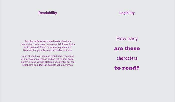
Effective typography is crucial for creating visually appealing and easily readable designs. Understanding fundamental principles allows designers to guide the reader’s eye effortlessly through text, ensuring the message is conveyed clearly and efficiently. This section will explore key aspects of typography that directly impact legibility.
Serif and Sans-Serif Fonts
Serif fonts, characterized by small decorative strokes (serifs) at the ends of letterforms, often evoke a sense of tradition and formality. They are generally considered more readable in large blocks of text, as the serifs can aid in guiding the eye along the lines. Examples include Times New Roman (often used in books and newspapers), Garamond (known for its elegance and readability), and Georgia (designed for on-screen readability). Sans-serif fonts, lacking these strokes, appear cleaner and more modern. They are frequently preferred for headlines, short text blocks, and digital interfaces where clarity and simplicity are paramount. Examples include Arial (a widely used, versatile font), Helvetica (known for its neutrality and geometric precision), and Open Sans (designed for on-screen readability and web use). The choice between serif and sans-serif depends heavily on the context and intended effect.
Font Family Comparison
The following table compares five font families, highlighting their x-height (the height of lowercase letters), weight (boldness), and overall readability assessment. These are subjective assessments based on general perception and common usage.
| Font Family | X-Height | Weight | Readability |
|---|---|---|---|
| Times New Roman | Medium | Medium | High (for print) |
| Arial | Medium | Medium | High (for screen and print) |
| Helvetica | Medium-Low | Medium | High (for screen and short text) |
| Garamond | Medium-High | Medium | High (for print) |
| Open Sans | Medium-High | Medium | High (for screen) |
Font Size, Leading, and Kerning
Optimal readability isn’t solely determined by font choice; font size, leading (line spacing), and kerning (spacing between individual letters) play equally vital roles. Imagine a paragraph of text set in a very small font size. It would be incredibly difficult to read, even with a perfect font. Conversely, an overly large font size, while legible, might look jarring and inefficient in terms of space. Leading, the vertical space between lines of text, directly impacts readability. Insufficient leading can lead to cramped lines, making it difficult to distinguish between lines, while excessive leading can make the text appear sparse and less cohesive. Imagine a line of text where the letters are too close together (“Hello”). This is an example of poor kerning, making it hard to distinguish individual letters. Conversely, if the letters are spaced too far apart (“H e l l o”), readability suffers again. The ideal values for font size, leading, and kerning will vary depending on the font, the context, and the medium (print vs. screen). A well-balanced combination of these elements ensures comfortable reading. For instance, a well-designed book will often use a specific font size, leading, and kerning combination, tested to optimize reading experience across different ages and reading levels.
Practical Applications and Best Practices
Choosing and using typography effectively is crucial for creating visually appealing and easily readable content. This section delves into practical applications and best practices to help you master the art of typography in your designs. We’ll explore how to select appropriate fonts for various content types, create effective font pairings, and avoid common typography mistakes.
Best Practices for Font Selection
Selecting the right font for your content is paramount for effective communication. The wrong font choice can hinder readability and detract from the overall design. Consider these best practices when choosing fonts:
- Website Copy (Body Text): Prioritize highly legible serif or sans-serif fonts like Georgia, Times New Roman (serif), or Open Sans, Lato (sans-serif). These fonts are designed for extended reading and offer excellent readability at various sizes. Avoid overly decorative or stylized fonts that can strain the eyes.
- Headlines: Use bolder, more impactful fonts to draw attention. Sans-serif fonts often work well for headlines, as they appear cleaner and more modern. Consider fonts like Montserrat, Roboto, or Playfair Display (for a more elegant feel). Ensure the headline font complements the body text font.
- Subheadings: Subheadings should be visually distinct from headlines and body text but maintain consistency with the overall design. You can use a slightly bolder weight or a different style of the same font family as the headline or body text for subheadings.
- Call to Action Buttons: For call-to-action buttons, choose a font that is easily readable, even at smaller sizes. A bold sans-serif font is often a good choice. The font should contrast well with the button’s background color to improve visibility.
- Infographics and Data Visualizations: Choose fonts that are clear and easy to read, even at smaller sizes. Sans-serif fonts are often preferred for their clean appearance. Consider using a consistent font throughout the infographic to maintain visual unity.
Step-by-Step Guide to Effective Font Pairing
Creating harmonious font pairings enhances the visual appeal and readability of your design. Follow these steps to achieve effective font combinations:
- Choose a Primary Font (Body Text): Select a highly legible font like Open Sans or Georgia as your base. This will form the foundation of your design.
- Select a Secondary Font (Headlines): Choose a font that complements your primary font but offers a distinct visual contrast. For example, if your primary font is Open Sans (sans-serif), you could pair it with Merriweather (serif) for headlines. The contrast in style creates visual interest.
- Consider Font Weight and Style: Vary the weight (boldness) and style (italic, regular) of your chosen fonts to create visual hierarchy and emphasis. Don’t overuse italics; they can reduce readability.
- Test Different Combinations: Experiment with different font pairings to find what works best for your specific design. Consider the overall tone and style of your content.
- Example Pairings: Open Sans (sans-serif) paired with Playfair Display (serif) creates an elegant and modern feel. Lato (sans-serif) with Lora (serif) offers a clean and classic combination. Roboto (sans-serif) with Montserrat (sans-serif) provides a modern and consistent look.
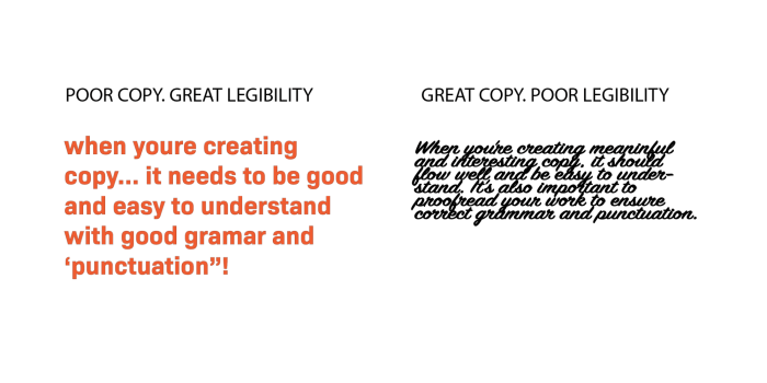
Common Typography Mistakes and Solutions
Several common mistakes can significantly impact the readability and visual appeal of your designs. Addressing these issues is crucial for creating effective typography.
- Using Too Many Fonts: Sticking to 2-3 fonts (maximum) keeps your design clean and avoids visual clutter. Solution: Choose a primary and secondary font, and use them consistently.
- Insufficient Font Size Contrast: Body text and headings must have sufficient size differences for clear visual hierarchy. Solution: Ensure adequate size differences between headlines, subheadings, and body text.
- Poor Line Spacing (Leading): Insufficient leading makes text appear cramped and difficult to read. Solution: Adjust leading to optimize spacing between lines.
- Ignoring Kerning and Tracking: Poor kerning (spacing between individual letters) and tracking (spacing between words) can create awkward gaps or crowded text. Solution: Use the kerning and tracking tools in your design software to fine-tune letter and word spacing.
- Inconsistent Font Weight and Style: Randomly changing font weight and style creates a disjointed and unprofessional look. Solution: Establish a consistent style guide for font usage and stick to it.
Final Conclusion
By understanding and applying the principles of typography, you can elevate your designs from functional to truly engaging. Remember, the right font choice, coupled with thoughtful consideration of size, spacing, and contrast, creates a harmonious reading experience that keeps your audience captivated. This guide provides a solid foundation; continue experimenting and refining your skills to master the art of typography.