Mastering tetradic color schemes unlocks a world of sophisticated design possibilities. This guide delves into the principles of this complex yet rewarding color harmony, offering practical techniques and inspiring examples to elevate your design projects. We’ll explore how to effectively manage dominant, recessive, and accent colors within a tetradic palette, navigating potential pitfalls such as muddiness and visual noise to create visually stunning and impactful results across various media.
From website design and logo creation to print media, we will examine successful applications of tetradic color schemes, analyzing how they contribute to user experience and brand messaging. Through hypothetical design briefs and detailed mood board examples, you’ll learn to confidently select and apply tetradic harmonies to achieve your desired aesthetic and emotional impact.
Understanding Tetradic Color Harmony

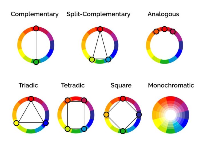
Tetradic color schemes, also known as double complementary schemes, offer a rich and complex approach to color design. They involve using four colors arranged in two complementary pairs, creating a vibrant and dynamic visual effect. Mastering this scheme unlocks a wider range of possibilities compared to simpler harmonies, allowing for sophisticated and visually engaging compositions. Understanding the relationships between these four colors and their effective application is key to successfully utilizing a tetradic palette.
Tetradic harmonies are built upon the principle of using two pairs of complementary colors. Complementary colors sit opposite each other on the color wheel, such as blue and orange, or red and green. A tetradic scheme takes this further by incorporating two such pairs, adding depth and complexity. This contrasts with triadic schemes, which use three colors evenly spaced on the color wheel, resulting in a more balanced, but potentially less dynamic, composition. Complementary schemes, while simpler, often lack the visual interest and range offered by a well-executed tetradic scheme. The careful selection and balance of these four colors is critical to avoiding visual chaos and achieving harmony.
Dominant, Recessive, and Accent Colors in Tetradic Schemes
In a tetradic color scheme, the role of each color is crucial to the overall effect. One color typically acts as the dominant color, setting the overall tone and mood of the design. This color is usually used in the largest areas and often represents the main subject or focus. A second color acts as a recessive color, providing a supporting role and creating balance. This color is often used in smaller areas or as a background element. The remaining two colors function as accent colors, adding pops of visual interest and contrast. These accent colors are used sparingly to highlight specific elements or draw attention to key areas of the design. The successful implementation of a tetradic scheme relies on the judicious use of these roles to create visual hierarchy and prevent visual overload. For example, in a website design, the dominant color might be used for the main navigation bar, the recessive color for the background, and the accent colors for call-to-action buttons and important text.
Visual Representation of a Tetradic Color Scheme
The following table visually represents a sample tetradic color scheme, illustrating the relationship between the four colors and their potential application. Each color has been chosen to demonstrate the potential for both harmony and contrast within a tetradic framework. The choice of colors can significantly influence the overall mood and feel of a design. Experimentation and careful consideration of the color’s psychological impact are essential for achieving the desired effect.
| Deep Cerulean (#007bff) | Tangerine (#ff9800) | Emerald (#00c851) | Crimson (#dc3545) |
Applying Tetradic Schemes in Different Design Contexts

Tetradic color schemes, with their inherent complexity and vibrancy, offer designers a powerful tool for creating visually engaging and memorable designs across various media. Their successful application, however, hinges on understanding the interplay of colors and their impact on the overall aesthetic and user experience. This section explores successful implementations of tetradic harmonies in different design contexts, providing practical examples and insights.
The strategic use of a tetradic scheme allows designers to achieve a balance between visual excitement and harmony. By carefully selecting the dominant, secondary, and accent colors, a designer can guide the viewer’s eye, create visual hierarchy, and ultimately enhance the overall message or experience.
Tetradic Color Schemes in Website Design
Effective website design relies heavily on user experience (UX). A well-chosen color palette can significantly improve UX by enhancing readability, guiding navigation, and creating a consistent brand identity. Consider a website for a sustainable fashion brand. They might use a tetradic scheme based on earthy greens (dominant), warm browns (secondary), a bright sunny yellow (accent), and a deep teal (accent). The greens represent nature and sustainability, the browns provide a grounding element, the yellow adds a cheerful pop, and the teal creates visual interest and contrast. This combination would be visually appealing and would align with the brand’s eco-conscious message, resulting in a positive user experience. Careful consideration of color contrast for readability is crucial; sufficient contrast between text and background colors must be maintained.
Tetradic Harmonies in Logo Design
Logos serve as the visual embodiment of a brand. A well-designed logo, using a tetradic color scheme, can effectively communicate the brand’s personality and values. Imagine a logo for a tech startup specializing in innovative AI solutions. A tetradic scheme might incorporate a deep blue (dominant, representing trust and stability), a vibrant orange (secondary, signifying innovation and energy), a muted grey (accent, providing balance and sophistication), and a bright lime green (accent, representing growth and technology). The resulting logo would be visually striking and communicate the brand’s core values: trustworthiness, innovation, and forward-thinking nature. The contrast between the colors would also make the logo memorable and easily recognizable.
Tetradic Color Schemes in Print Media
Print media, such as brochures and posters, offers a unique opportunity to leverage the visual impact of tetradic color schemes. The physical nature of print allows for a richer, more tactile experience. A brochure for a luxury travel agency, for example, could utilize a tetradic scheme incorporating a deep burgundy (dominant, conveying sophistication and luxury), a soft cream (secondary, providing elegance and warmth), a metallic gold (accent, adding a touch of opulence), and a deep teal (accent, representing the calming aspects of travel). The combination would create a visually stunning and luxurious feel, enticing the reader to learn more about the travel agency’s offerings. The strategic placement of colors would further enhance the visual hierarchy and guide the reader through the information.
Applying a Tetradic Scheme: A Hypothetical Design Brief
Let’s consider a design brief for a new line of organic skincare products. The client wants a brand identity that conveys naturalness, purity, and sophistication. The target audience is environmentally conscious consumers aged 25-45. A suitable tetradic scheme would be based on: a soft sage green (dominant, representing nature), a warm beige (secondary, conveying earthiness and purity), a deep terracotta (accent, adding a touch of sophistication), and a pale lavender (accent, signifying calmness and tranquility). This scheme would be used consistently across all branding materials, from packaging to website design, to create a cohesive and memorable brand identity that resonates with the target audience and effectively communicates the brand’s values. The color palette would be carefully tested for readability and visual appeal across different print and digital mediums to ensure optimal results.
Advanced Techniques and Considerations

Mastering tetradic color schemes requires understanding their inherent complexities. While offering vibrant and dynamic compositions, they present unique challenges that, if not addressed, can lead to visually jarring or muddled designs. This section explores advanced techniques and considerations for successfully implementing tetradic palettes, transforming potential pitfalls into opportunities for creative expression.
The primary hurdle with tetradic schemes lies in maintaining visual harmony amidst the richness of four colors. Improper balance can easily result in visual noise, a sense of overwhelming chaos, or a muddy, indistinct aesthetic. Furthermore, the selection of colors within the tetradic structure itself is crucial; poorly chosen analogous or complementary pairings within the scheme can negate the desired effect.
Challenges and Solutions in Tetradic Color Scheme Application
Several common issues arise when designers work with tetradic palettes. Understanding these problems and their solutions is crucial for achieving a successful design. The following points detail these common pitfalls and provide practical strategies for mitigation.
- Muddiness: Over-saturation or poorly balanced color ratios can lead to a muddy appearance. Solution: Reduce the saturation of one or more colors, particularly the two complementary pairs. Increase the contrast between the dominant color and its opposite. Consider using tints and shades of the colors to create depth and visual interest without sacrificing clarity.
- Visual Noise: Using four distinct colors without a clear hierarchy can create visual chaos. Solution: Establish a clear dominant color, use it more extensively than the others. Employ one or two colors as accents, using them sparingly to highlight key elements. Ensure that colors complement each other rather than clash.
- Lack of Cohesion: Poor color selection within the tetradic framework can result in a disjointed design. Solution: Choose colors that have a clear relationship, even within their complementary pairs. Consider using a color wheel to visualize relationships and ensure smooth transitions.
Step-by-Step Guide for Tetradic Color Scheme Selection
Choosing the right tetradic scheme requires careful consideration of the project’s goals and target audience. The following steps provide a structured approach to selecting a palette that effectively communicates your brand identity and resonates with your intended audience.
- Define Project Goals and Target Audience: Clearly articulate the project’s purpose and the desired emotional response. Identify the target audience’s demographics and preferences.
- Establish Brand Identity: Analyze existing brand guidelines or develop a clear brand identity if one doesn’t exist. Consider brand personality, values, and existing color palettes (if any).
- Select a Base Color: Choose a dominant color that aligns with your brand and project goals. This will be one of the four colors in your tetradic scheme.
- Identify Complementary Pairs: Using a color wheel, identify the complementary pairs to your base color. These will be the other two colors in your tetradic scheme.
- Select an Accent Color: Choose a fourth color that complements the other three, but adds a touch of contrast or uniqueness. This might be an analogous color to one of the other colors, or a color that provides a contrasting tone.
- Test and Refine: Create several variations of your chosen tetradic scheme. Test them in different contexts (mockups, prototypes) and gather feedback to refine your selection.
Tetradic Mood Board Examples
Three distinct mood boards illustrate the versatility of tetradic color schemes in evoking different moods and atmospheres. Each board demonstrates a unique application of a tetradic palette, highlighting its potential for diverse creative expression.
- Mood Board 1: Serene Tranquility
- Colors: A pale blue (dominant), a warm peach, a muted green, and a soft beige.
- Atmosphere: Evokes a sense of calm, peacefulness, and natural beauty. The muted tones create a relaxing and inviting feel. Imagine a spa, a tranquil garden, or a peaceful sunrise.
- Mood Board 2: Energetic Vibrancy
- Colors: A bright yellow-orange (dominant), a deep teal, a vibrant purple, and a sunny yellow.
- Atmosphere: Projects energy, excitement, and creativity. The bold, contrasting colors create a lively and dynamic feel. Think of a summer festival, a playful children’s room, or a bold piece of abstract art.
- Mood Board 3: Sophisticated Elegance
- Colors: A deep burgundy (dominant), a rich gold, a dark teal, and a muted grey.
- Atmosphere: Conveys luxury, sophistication, and timeless elegance. The rich, jewel-toned colors create a sense of opulence and refinement. Imagine a high-end boutique, a formal event, or a classic piece of furniture.
Last Word
By understanding the nuances of tetradic color schemes and applying the strategies Artikeld in this guide, designers can confidently create visually rich and emotionally resonant compositions. The ability to skillfully manage dominant, recessive, and accent colors within a tetradic palette is key to avoiding common pitfalls and achieving a polished, professional aesthetic. Remember, practice and experimentation are crucial in mastering this complex yet rewarding approach to color harmony, allowing you to unlock a new level of creativity in your design work.