Unlocking the power of color in design is key to creating visually compelling and effective work. Understanding color theory isn’t just about choosing pretty hues; it’s about strategically employing color to evoke emotion, guide the eye, and reinforce brand identity. This guide delves into five core principles, providing a practical framework for harnessing the expressive potential of color in your designs.
From mastering the color wheel and understanding color relationships to leveraging color psychology and applying these principles across various design contexts, this guide offers a comprehensive approach. We will explore how to manipulate hue, saturation, and value to create visual hierarchy and impactful designs, ultimately enabling you to confidently create palettes that resonate with your target audience and achieve your design goals.
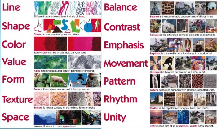
Understanding the Color Wheel and Basic Color Relationships

The color wheel is a fundamental tool for designers, providing a visual representation of how colors relate to each other. Understanding these relationships allows for the creation of harmonious and effective color palettes, crucial for conveying specific moods and messages in any design project. This section will explore the color wheel, focusing on key color relationships and their practical applications.
The Color Wheel’s Significance in Design
The color wheel, typically a circular arrangement of hues, is based on the additive primary colors (red, green, blue) or subtractive primary colors (cyan, magenta, yellow, black), depending on the context (light or pigment mixing). Its significance lies in its ability to visually demonstrate color harmonies and contrasts. By understanding the relationships between colors on the wheel, designers can create palettes that are visually appealing and effectively communicate their intended message. The wheel allows for a systematic approach to color selection, moving beyond arbitrary choices to informed decisions based on established color theory principles.
Complementary, Analogous, and Triadic Color Schemes
These are three common color schemes derived from the color wheel, each offering a unique aesthetic and emotional impact.
Complementary Colors: These are colors positioned directly opposite each other on the color wheel (e.g., red and green, blue and orange, yellow and purple). They create high contrast and visual excitement. In design, complementary schemes can be used to create bold statements, but careful balance is necessary to avoid jarring effects. For instance, a website might use a vibrant red button against a green background to draw attention. A logo might use complementary colors to create a memorable and striking visual identity.
Analogous Colors: These are colors located next to each other on the color wheel (e.g., blue, blue-green, and green). They create a harmonious and cohesive feel. Analogous schemes are often used to create a sense of calm and serenity. A travel brochure might use analogous shades of blues and greens to evoke a sense of tranquility associated with nature. A poster promoting a spa might use a palette of analogous calming colors like light greens and blues.
Triadic Colors: These are three colors evenly spaced around the color wheel (e.g., red, yellow, and blue; or orange, green, and violet). They offer a vibrant and balanced palette. Triadic color schemes are versatile and can be used to create both bold and sophisticated designs. A children’s book might use a bright triadic scheme of red, yellow, and blue. A corporate branding might use a more muted triadic palette to project a professional yet engaging image.
Visual Representation of a Color Wheel and Harmonious Combinations
Imagine a circle divided into twelve segments, each representing a different hue. Red, orange, yellow, green, blue, and violet are the primary and secondary colors, with intermediate hues filling the gaps. Complementary colors are found directly opposite each other. Analogous colors are found adjacent to each other, and triadic colors are found at equal intervals around the wheel. By connecting different points on the wheel, you can visualize the various color harmonies available. For example, connecting three equally spaced points forms a triadic scheme, while connecting two opposite points forms a complementary scheme.
Practical Applications of Color Schemes
The choice of color scheme significantly impacts the overall design’s effectiveness. A website using a complementary scheme might employ a bold primary color for call-to-action buttons against a contrasting background color. A logo design could utilize analogous colors to create a unified and professional look. A poster advertising a concert might leverage a triadic scheme to create a visually exciting and memorable design.
Emotional Impact of Warm and Cool Colors
| Color | Temperature | Emotional Impact | Example Use |
|---|---|---|---|
| Red | Warm | Energy, excitement, passion, urgency | Stop signs, sale banners |
| Orange | Warm | Enthusiasm, creativity, playfulness | Halloween decorations, fast food logos |
| Yellow | Warm | Happiness, optimism, cheerfulness | Children’s toys, school buses |
| Green | Cool | Nature, calmness, freshness, growth | Environmental organizations, health products |
| Blue | Cool | Trust, stability, calmness, serenity | Corporate websites, healthcare brands |
| Purple | Cool | Luxury, creativity, royalty, mystery | Cosmetics brands, high-end products |
Applying Color Principles
Understanding hue, saturation, and value—the three main components of color—is crucial for effective design. These elements work together to create visual hierarchy, establish mood, and enhance the overall impact of your designs. Mastering their manipulation allows for precise control over the visual communication of your work.
Hue, Saturation, and Value in Visual Hierarchy
Hue, saturation, and value directly influence how the eye perceives and prioritizes elements within a design. By strategically varying these attributes, you can guide the viewer’s attention. For example, a high-saturation, bright hue will naturally draw the eye more than a low-saturation, muted hue. Similarly, a light value against a dark background will stand out more prominently than a dark value against a light background. Consider a website design where the call-to-action button is a vibrant, high-saturation blue (high hue, high saturation, medium value) against a background of muted grey (low saturation, medium value). The blue button immediately becomes the focal point due to its contrasting hue, saturation, and value.
Using Saturation to Create Focal Points and Visual Interest
Saturation refers to the intensity or purity of a color. High saturation yields vibrant, bold colors, while low saturation results in muted, pastel-like tones. Employing a range of saturations is a powerful technique for creating visual interest and guiding the viewer’s gaze. High-saturation colors can be used strategically to highlight key elements, acting as focal points. Lower saturation colors can be used for background elements or less important information, ensuring that the design remains balanced and doesn’t feel visually overwhelming. Imagine a poster advertising a concert; the band’s logo might be rendered in high saturation, while the supporting text and background imagery are in lower saturation to prevent visual clutter and maintain the logo as the main focus.
Adjusting Value to Affect Mood and Readability
Value refers to the lightness or darkness of a color. Adjusting the value of colors significantly impacts the mood and readability of a design. Darker values often create a sense of seriousness, sophistication, or even mystery, while lighter values tend to evoke feelings of lightness, airiness, and optimism. In terms of readability, sufficient contrast between text and background value is crucial. For example, using dark text on a light background generally provides better readability than light text on a dark background. Consider a website for a luxury brand: using darker, richer values would reinforce the brand’s image of elegance and exclusivity. In contrast, a children’s website might benefit from a brighter, higher-value color palette to create a cheerful and playful atmosphere.
Examples of Hue, Saturation, and Value Manipulation
Let’s take the color red as an example. A pure, high-saturation red (#FF0000) is bold and energetic. Reducing the saturation results in a muted, less intense red (#CC0000), which feels more subdued. Lowering the value creates a darker, perhaps more mysterious red (#800000), while increasing the value yields a lighter, softer pink (#FFCCCC). Changing the hue entirely, while maintaining the same saturation and value, would transform the red into a completely different color, for example, orange or purple. These subtle shifts dramatically impact the overall feel and application of the color.
Using a Color Palette Generator to Modify a Base Color
Many online tools offer a simple, step-by-step process for color palette generation and manipulation. Most allow you to input a base color (e.g., hex code or color picker) and then adjust its hue, saturation, and value using sliders or numerical inputs. This allows for iterative experimentation and refinement of your color palette. Many also provide options to generate complementary, analogous, or triadic color schemes based on your chosen base color. The process typically involves: 1. Selecting a base color; 2. Adjusting the hue, saturation, and value sliders to modify the color; 3. Generating a palette based on the modified color; 4. Refining the palette until a desired aesthetic is achieved; 5. Exporting the palette in a usable format (e.g., hex codes, RGB values). This iterative approach ensures a well-coordinated and visually appealing color palette.
Mastering Color Psychology and Contextual Application
Color psychology is a powerful tool in design, influencing how viewers perceive and react to a product or brand. Understanding the cultural and emotional associations of different colors, and how these associations vary across different design styles, is crucial for creating effective and resonant designs. This section explores these concepts and demonstrates how to leverage color psychology to achieve specific design goals.
Cultural and Emotional Associations of Colors
Colors carry significant cultural and emotional weight. While some associations are relatively universal (e.g., white often represents purity or innocence), many are culturally specific. For instance, red symbolizes good fortune and celebration in some cultures, while in others it’s associated with danger or anger. Similarly, blue, often linked to peace and tranquility in Western cultures, can represent mourning in some parts of the world. Designers must be mindful of these nuances to avoid unintended misinterpretations. Consider the context of your target audience and research their cultural background to ensure your color choices are appropriate and effective. For example, a website targeting a predominantly Asian market might utilize red more prominently than one targeting a Western audience, leveraging its positive connotations in that context.
Color Use in Different Design Styles
Different design styles utilize color palettes in distinct ways. Minimalist design often employs a limited color palette, frequently focusing on neutrals like white, black, and gray, with one or two accent colors for emphasis. This approach creates a clean, uncluttered aesthetic. In contrast, vibrant design styles embrace bold, saturated colors to create energy and excitement. Vintage design often utilizes muted tones, pastels, and earthy colors to evoke a sense of nostalgia and timelessness. Understanding these stylistic conventions is key to choosing a palette that aligns with your design’s overall aesthetic. A vintage clothing brand, for instance, might utilize a palette of muted yellows, browns, and faded blues to create a sense of retro charm, whereas a children’s toy brand might employ bright, primary colors to evoke feelings of playfulness and joy.
Strategies for Creating Resonant Color Palettes
Creating a color palette that resonates with a specific target audience requires careful consideration. Market research, understanding demographics, and analyzing competitor strategies are all vital steps. For example, a luxury brand might utilize sophisticated jewel tones to convey exclusivity and high quality, while a youthful brand might opt for brighter, more playful hues. Tools like color psychology guides and online palette generators can assist in this process, but the final decision should always be informed by a deep understanding of the target audience and the brand’s identity. Analyzing competitor color palettes can provide valuable insights, but it’s essential to avoid direct imitation and strive for originality.
Color Palettes for a Fictional Product: “Zenith” Smartwatch
Let’s design three color palettes for a fictional smartwatch called “Zenith,” targeting different market segments:
- Palette 1: Professional Elegance – This palette uses deep navy blue (#002D62), charcoal gray (#36454F), and a subtle gold accent (#B8860B). This combination conveys sophistication, reliability, and premium quality, appealing to a professional demographic. The navy blue provides a sense of stability, the gray adds neutrality, and the gold subtly hints at luxury.
- Palette 2: Active Lifestyle – This palette incorporates bright teal (#008080), energetic orange (#FF8C00), and a neutral gray (#A9A9A9). This vibrant combination reflects energy and dynamism, targeting a younger, fitness-focused audience. The teal represents freshness and vitality, while the orange adds a pop of energy and excitement.
- Palette 3: Minimalist Chic – This palette features a soft white (#F8F8FF), a light gray (#D3D3D3), and a muted rose gold accent (#B76E79). This understated palette conveys a sense of modern simplicity and elegance, appealing to a more minimalist-minded consumer. The soft white provides a clean base, the light gray adds a touch of sophistication, and the rose gold offers a delicate, feminine touch.
Examples of Color’s Role in Evoking Emotion and Communicating Brand Identity
Consider the iconic Coca-Cola logo: its vibrant red immediately communicates energy, excitement, and happiness. Conversely, the calming blues often used by technology companies like IBM project feelings of trust, stability, and innovation. These are not accidental choices; they are carefully crafted to align with the brand’s personality and resonate with its target audience. The consistent use of these colors across all brand materials reinforces brand recognition and strengthens brand identity. The success of these brands is partly due to the strategic and consistent use of color to communicate their brand message effectively.
Conclusion

By mastering the fundamentals of color theory and applying these five key principles, designers can elevate their work from aesthetically pleasing to truly impactful. The ability to strategically utilize color isn’t merely a stylistic choice; it’s a powerful tool for communication and engagement. Remember, thoughtful color selection isn’t about random choices, but about deliberate decisions that enhance the overall message and resonate deeply with the viewer.