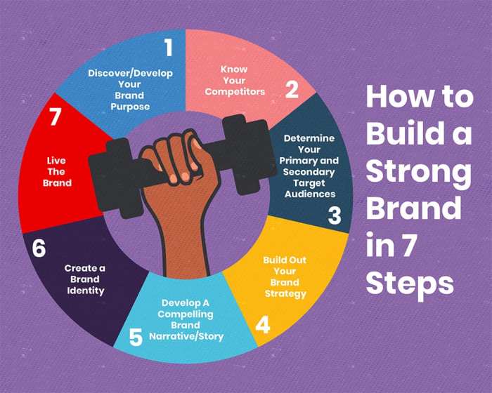
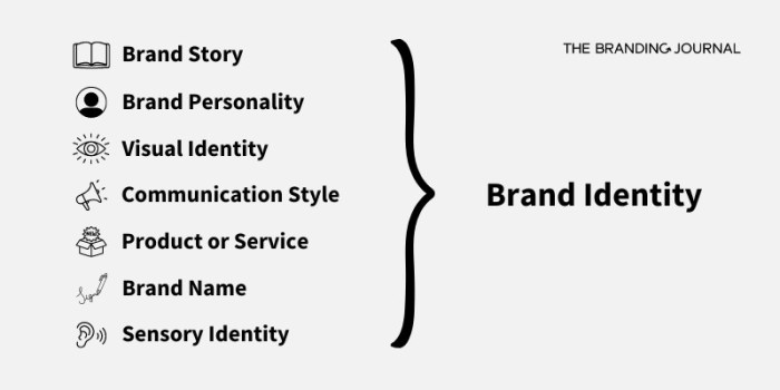
Crafting a compelling brand identity is crucial for success in today’s competitive market. This guide delves into the seven essential elements that form the bedrock of a strong brand, moving beyond mere aesthetics to encompass the core values, messaging, and visual consistency that resonate with target audiences. We’ll explore how to define your brand’s personality, create a visually appealing logo and color palette, and ensure consistent brand application across all platforms.
From defining your brand’s core values and mission statement to designing a logo and choosing a color palette, we’ll walk you through each step of the process. We will also discuss the importance of consistent messaging across various platforms and how to adapt your brand voice for different target audiences. By understanding and implementing these seven elements, you can build a brand that not only looks great but also effectively communicates your values and connects with your customers.
Defining Brand Identity

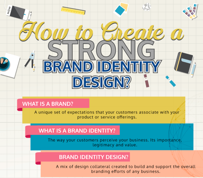
Establishing a strong brand identity is crucial for success in today’s competitive market. A well-defined brand identity acts as a compass, guiding all aspects of your business, from marketing and communications to product development and customer service. It’s more than just a logo; it’s the embodiment of your brand’s values, personality, and promise to your customers. This section will explore the core elements necessary to build a robust and memorable brand identity.
Visual Representation of Core Values
A mood board is a powerful tool for visualizing a brand’s core values. Let’s imagine a hypothetical brand, “Evergreen Wellness,” a company specializing in sustainable and ethically sourced skincare products. Their mood board might include the following:
| Visual Element | Description |
|---|---|
| Image: Lush green forest | Represents the natural, sustainable aspect of the brand, emphasizing the use of ethically sourced ingredients. The vibrant green evokes feelings of freshness and vitality. |
| Image: Close-up of hands gently applying cream | Highlights the personal care and attention to detail in their products. The gentle touch conveys a sense of calm and nurturing. |
| Color Palette: Earthy greens, soft browns, and creamy whites | Reflects the natural and organic nature of the products. The calming color scheme promotes feelings of serenity and well-being. |
| Font: A clean, sans-serif typeface with slight curves | Conveys a modern, approachable, and sophisticated feel, balancing professionalism with a friendly aesthetic. |
| Texture: Image of recycled paper or bamboo | Reinforces the commitment to sustainability and eco-friendly practices. The tactile element adds a sense of authenticity and naturalness. |
Brand Voice and Tone
Brand voice and tone are essential for creating a consistent and recognizable brand identity. Brand voice is the overall personality of your brand, while brand tone is the specific attitude or style used in individual communications. A consistent brand voice ensures that all communications, whether through social media, website copy, or advertising, feel unified and authentic.
For example, Nike’s brand voice is empowering and motivational, while Dove’s brand voice is inclusive and supportive. Conversely, a brand like Wendy’s uses a sassy and humorous tone on social media, creating a distinct and memorable brand personality. Maintaining a consistent brand voice and tone builds trust and strengthens customer relationships.
Brand Mission Statement and Value Proposition
For Evergreen Wellness, a concise mission statement could be: “To provide high-quality, sustainable skincare solutions that nurture both your skin and the planet.” Their value proposition would be: “Experience the difference of ethically sourced, naturally effective skincare that leaves you feeling refreshed, rejuvenated, and confident in your choice to support sustainability.”
| Visual Elements | Verbal Elements |
|---|---|
| Lush green forest, close-up of hands applying cream, earthy color palette, clean sans-serif font, recycled paper texture | Mission Statement: To provide high-quality, sustainable skincare solutions that nurture both your skin and the planet. Value Proposition: Experience the difference of ethically sourced, naturally effective skincare that leaves you feeling refreshed, rejuvenated, and confident in your choice to support sustainability. |
Visual Brand Identity

Visual brand identity is the cornerstone of a successful brand. It’s the visual language that communicates your brand’s personality, values, and message to your target audience. A strong visual identity is cohesive, memorable, and effectively conveys the essence of your brand across all platforms. This section will explore three key components: logo design, color palette selection, and typography choices. We’ll examine how these elements work together to create a compelling and consistent visual experience.
Logo Variations for a Tech Startup
Effective logo design is crucial for establishing immediate brand recognition. A good logo is simple, memorable, and relevant to the brand’s offerings. Below are three distinct logo variations for a hypothetical tech startup, “InnovateTech,” each with a different approach.
| Logo Variation | Description | Rationale |
|---|---|---|
| Abstract Geometric Shape | A stylized, abstract geometric shape, perhaps incorporating lines and angles that suggest innovation and technology. The shape could be incorporated with the company name in a clean, modern font. | This approach conveys a sense of modernity, sophistication, and forward-thinking, which aligns with the tech industry. The abstract nature allows for flexibility in application across various media. |
| Icon-Based Logo | A simple, easily recognizable icon representing a key aspect of InnovateTech’s technology or services, paired with the company name. For example, a stylized circuit board or data stream could be used. | An icon-based logo is easily memorable and visually impactful, quickly communicating the company’s core function. This option is particularly effective for digital platforms and mobile applications. |
| Wordmark Logo | A clean and modern wordmark, using a custom typeface that reflects InnovateTech’s brand personality. The focus is on the company name itself, making it the primary visual element. | This approach works well when the company name itself is strong and memorable. It provides a sense of elegance and professionalism, suitable for a more established or sophisticated tech company. |
Color Palette for a Sustainable Clothing Brand
Color psychology plays a vital role in branding. Careful selection of colors can evoke specific emotions and associations, aligning with a brand’s values and target audience. The following color palette is proposed for “Evergreen Threads,” a sustainable clothing brand.
| Color | Hex Code | Rationale |
|---|---|---|
| Deep Forest Green | #228B22 | Represents nature, growth, and sustainability, core values of the brand. |
| Soft Cream | #FAEBD7 | Adds a touch of warmth and natural elegance, conveying a sense of comfort and quality. |
| Light Grey | #D3D3D3 | Provides neutrality and balance, making the other colors pop while maintaining a sophisticated feel. |
| Earth Brown | #A0522D | Represents grounding, stability, and natural earth tones, reinforcing the sustainable message. |
Typography Options for a Luxury Skincare Brand
Typography is another crucial visual element that communicates brand personality. The font choice should reflect the brand’s desired image—luxury, sophistication, or approachability. For “SereneSkin,” a luxury skincare brand, the following typography options are considered.
| Font | Style | Rationale |
|---|---|---|
| Didot | Elegant serif typeface | Its classic and sophisticated design conveys a sense of luxury and timeless elegance, perfectly suited for a high-end skincare brand. |
| Garamond | Classic serif typeface | Similar to Didot but slightly more approachable, offering a balance between luxury and readability. |
| Playfair Display | Elegant serif typeface with a modern twist | Offers a modern interpretation of a classic serif, appealing to a contemporary audience while maintaining a luxurious feel. |
Brand Application Across Platforms

Maintaining a consistent brand identity across all platforms is crucial for building strong brand recognition and customer loyalty. Inconsistency can confuse customers and dilute the impact of your brand messaging. This section explores how to apply a consistent brand identity across various touchpoints, using real-world examples to illustrate best practices.
Coffee Shop Brand Application
Let’s imagine a fictional coffee shop called “The Daily Grind.” Their brand identity centers around a rustic, welcoming atmosphere with a focus on ethically sourced coffee beans. This identity is consistently applied across their website, social media, and print materials. Their website features warm, earthy tones, high-quality images of their coffee and baristas, and easy navigation. Their social media utilizes the same color palette and imagery, posting engaging content like behind-the-scenes glimpses of coffee preparation and customer testimonials. Print materials, such as menus and loyalty cards, mirror the website’s design, maintaining a cohesive brand experience. The messaging emphasizes the quality of their coffee, the welcoming atmosphere, and their commitment to ethical sourcing.
Eco-Tourism Company Social Media Posts
“Explore Earth,” a hypothetical eco-tourism company, aims to promote sustainable travel and responsible exploration. Their social media strategy focuses on visually stunning imagery and informative captions.
| Platform | Visual Elements | Messaging | Target Audience |
|---|---|---|---|
| High-resolution photos of breathtaking landscapes, showcasing local wildlife and sustainable tourism practices. Use of the company’s logo, which incorporates a stylized leaf. | Caption: “Discover the untouched beauty of Costa Rica’s rainforests. Support sustainable tourism and protect our planet. #ExploreEarth #SustainableTravel #CostaRica” | Millennials and Gen Z interested in sustainable and experiential travel. | |
| A video showcasing the local community’s involvement in eco-tourism initiatives, emphasizing cultural preservation. | Caption: “Meet the people who make our eco-tourism experiences unforgettable. Learn about their culture and how they’re working to protect their environment. #CommunityTourism #CulturalImmersion #ExploreEarth” | Older demographics interested in cultural experiences and supporting local communities. | |
| A series of shorter tweets with stunning landscape images, highlighting specific locations and their unique features. | Caption: “Did you know the Amazon rainforest is home to millions of species? Book your responsible travel experience with us today! #Amazon #Biodiversity #ExploreEarth” | Broad audience interested in nature and travel, utilizing relevant hashtags for increased visibility. |
Fitness Apparel Brand Messaging Adaptation
“ActiveLife,” a fictional fitness apparel brand, tailors its messaging to resonate with different target audiences. For millennials, the messaging emphasizes individuality, self-expression, and community engagement through social media campaigns and influencer collaborations. For Gen X, the focus shifts towards functionality, durability, and comfort, highlighting the brand’s commitment to quality and performance. Visuals also adapt, using brighter, trendier colors and designs for millennials, while maintaining a more classic and understated aesthetic for Gen X.
Conclusive Thoughts

Building a successful brand is a journey, not a destination. By mastering the seven key elements discussed – from defining your core values to ensuring consistent application across platforms – you’ll lay a solid foundation for a brand that is both visually appealing and strategically sound. Remember, consistent effort and a keen understanding of your target audience are paramount to long-term brand success. Continuously evaluating and refining your brand identity will ensure its relevance and resonance with your customers for years to come.