Crafting a professional logo in a mere three hours might seem daunting, but with a strategic approach and the right tools, it’s entirely achievable. This guide unravels the process, transforming the seemingly impossible task into a manageable and even enjoyable experience. We’ll explore key design principles, efficient workflows, and essential software, empowering you to create a compelling brand identity within your tight deadline.
From understanding fundamental design concepts like balance and visual hierarchy to mastering efficient brainstorming techniques and utilizing readily available software, we’ll equip you with the knowledge and practical steps necessary to design a logo that effectively communicates your brand’s message. We’ll also delve into refining your design based on feedback and preparing it for various applications.
Understanding Design Principles for a Professional Logo
Creating a professional logo within a three-hour timeframe requires a strategic approach that prioritizes core design principles. Effective logo design isn’t about random creativity; it’s about applying established principles to create a memorable and impactful visual representation of a brand. This section will explore key principles and their practical application in logo design.
A successful logo balances aesthetic appeal with functionality. It needs to be easily recognizable, versatile across different applications (website, business cards, social media), and reflective of the brand’s identity and values. Understanding and applying core design principles is crucial to achieving this within a limited timeframe.
Logo Design Incorporating Balance, Contrast, and Visual Hierarchy
Balance, contrast, and visual hierarchy are fundamental design principles that contribute significantly to a professional logo’s effectiveness. Balance refers to the visual weight distribution within the logo. Symmetrical balance creates a sense of stability and formality, while asymmetrical balance offers dynamism and a more modern feel. Contrast, achieved through color, shape, and texture, makes elements stand out and improves readability. Visual hierarchy guides the viewer’s eye, emphasizing key elements and creating a clear focal point.
For example, consider a logo for a tech startup. An asymmetrical balance might be used, with a bold, contrasting icon positioned prominently (visual hierarchy) against a simpler, lighter background. The contrast in color and shape between the icon and background creates visual interest and draws attention to the brand name.
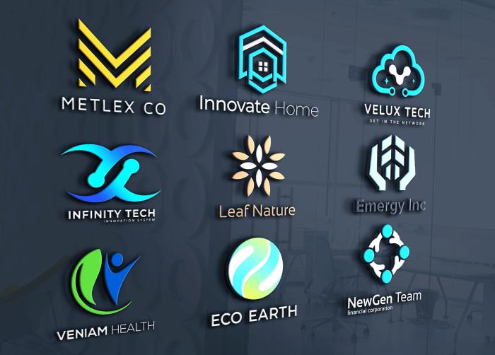
Examples of Successful Logo Designs and Their Design Principles
Many well-known logos effectively utilize these principles. The Nike swoosh, for instance, demonstrates asymmetrical balance and strong visual hierarchy, with the swoosh itself being the dominant and easily recognizable element. The simple, yet powerful, form contrasts sharply with the negative space, creating a memorable and iconic image. The Apple logo, with its clean, symmetrical design and bold contrast between the apple and the background, is another example of effective application of design principles. Its simplicity and memorability ensure high brand recognition.
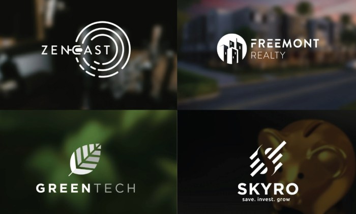
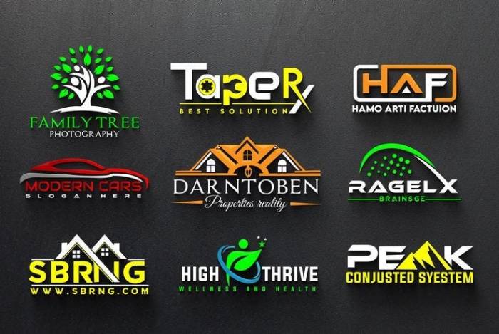
Minimalist Versus Detailed Logo Styles
Choosing between a minimalist or detailed logo style significantly impacts the design process within a three-hour timeframe. Minimalist logos, characterized by simplicity and clean lines, are faster to create and more versatile. However, they might lack detail and struggle to convey complex brand messages. Detailed logos, while more visually rich, require significantly more time and skill to design effectively and may be less adaptable across different sizes and applications.
For a three-hour timeframe, a minimalist approach is generally recommended. It allows for quicker execution while still achieving a professional look. However, if the brand identity requires a more complex visual representation, careful planning and prioritization of essential elements are crucial to manage the time constraint effectively. A detailed logo might require breaking the project into phases, sacrificing some elements for a quicker turnaround.
Comparison of Font Styles for Professional Logos
Choosing the right font is crucial for logo design. The font should be legible, reflect the brand’s personality, and work well at various sizes.
| Font Name | Style | Readability (1-5) | Suitability for Professional Use |
|---|---|---|---|
| Open Sans | Sans-serif | 5 | Excellent |
| Lato | Sans-serif | 4 | Good |
| Montserrat | Sans-serif | 5 | Excellent |
| Playfair Display | Serif | 3 | Good (for specific brands) |
| Merriweather | Serif | 4 | Good |
Efficient Logo Design Workflow in 3 Hours
Designing a professional logo in just three hours requires a focused and efficient workflow. This process prioritizes speed without sacrificing quality, leveraging effective brainstorming and design techniques to achieve a polished result within the allotted time. Success hinges on planning, utilizing the right tools, and a streamlined approach to concept development and refinement.
Essential Tools and Software
Selecting the right tools is crucial for a rapid design process. Using familiar software will significantly reduce the time spent learning new interfaces. A robust vector-based graphics editor is essential for creating scalable logos suitable for various applications.
- Vector Graphics Editor: Adobe Illustrator is the industry standard, offering extensive features and precision tools. Alternatively, Affinity Designer provides a powerful and more affordable option. Both allow for easy manipulation of shapes, text, and colors, crucial for logo creation.
- Font Management Software: A well-organized font library is vital. Software like FontExplorer X or similar programs help manage and easily access various fonts for testing and selection within your design.
- Color Palette Generator: Tools like Adobe Color or Coolors can quickly generate harmonious color palettes, saving time on color experimentation. These tools offer pre-set palettes and allow for customization based on your brand’s identity.
Effective Brainstorming Techniques
Generating multiple logo concepts swiftly demands structured brainstorming. Avoid aimless sketching; instead, focus on exploring key brand elements and translating them into visual representations.
Begin by thoroughly understanding the brand’s identity, target audience, and key message. Consider using mind mapping techniques to visually organize ideas, connecting s and concepts. Then, rapidly sketch thumbnail versions of multiple logo concepts. Focus on simple shapes and clear ideas; aim for quantity over detail at this stage. Aim for at least 5-10 diverse concepts in 30 minutes.
Rapid Logo Concept Development
Once you have several initial sketches, select 2-3 of the strongest concepts for further development. Refine these sketches in your vector graphics editor, focusing on precise shapes, typography, and color palettes. This stage should be highly iterative, experimenting with different variations to identify the most effective design.
Creating Logo Variations
From a single initial concept, several variations can be quickly created by experimenting with color palettes and typography. These variations offer different stylistic interpretations while maintaining a consistent core concept.
- Variation 1: Monochromatic Palette – Using shades of a single color provides a clean, sophisticated look. For example, if the initial concept uses a deep blue, variations could explore lighter blues and near-black shades for a refined, professional aesthetic.
- Variation 2: Complementary Colors – Using colors opposite each other on the color wheel creates high contrast and visual interest. If the base concept uses a warm orange, a cool blue could be used as an accent color.
- Variation 3: Different Typography – Experiment with different font styles and weights. A serif font might convey tradition, while a sans-serif font offers a modern feel. Consider pairing fonts for a more layered look, but avoid overcrowding the design.
- Variation 4: Simplified Iconography – If the logo incorporates an icon, explore simplified versions. Remove unnecessary detail to create a cleaner, more versatile design. For instance, a detailed illustration could be simplified to a symbolic representation.
Finalizing and Presenting the Logo Design
After the initial design phase, refining the logo based on feedback is crucial to achieving a final product that perfectly represents the brand. This involves iterative design adjustments, ensuring the logo’s effectiveness across various applications. The goal is to create a logo that is both visually appealing and functionally versatile.
Refining the logo through quick iteration cycles involves incorporating feedback, making adjustments, and presenting revised versions. This agile approach allows for rapid improvement and prevents lengthy design stagnation. It’s important to document all changes made, so the client can track the design’s evolution and understand the rationale behind each decision. This iterative process often involves multiple rounds of feedback and revision until the final design is approved.
Logo Suitability Across Applications
A checklist is essential to guarantee the logo’s functionality in various contexts. Thorough testing ensures the logo remains clear, legible, and impactful regardless of size or medium. This process involves assessing its performance on different backgrounds, resolutions, and color palettes.
The following checklist will help ensure the final logo’s suitability:
- Scalability: Does the logo maintain its clarity and visual appeal when scaled down to small sizes (e.g., favicon) or enlarged for large format printing (e.g., billboards)?
- Color Variations: Does the logo work effectively in both color and monochrome versions? Is there a suitable grayscale version that retains recognizability?
- Background Compatibility: Does the logo stand out against various background colors and textures? Is it easily readable on both light and dark backgrounds?
- File Formats: Is the logo available in all necessary formats (e.g., AI, EPS, PNG, JPG, SVG)? Are the files optimized for web and print use?
- Legibility: Is the logo easily readable and understandable at all sizes and in all contexts?
Logo Mock-up on Branding Materials
A compelling mock-up showcases the logo’s application on various branding materials, solidifying its visual impact and demonstrating its versatility. This visual representation helps the client understand how the logo will integrate into their overall brand identity.
Imagine a mock-up featuring a clean, modern website header. The logo, a stylized abstract leaf in shades of deep teal and emerald green, sits prominently in the top left corner, positioned above a concise navigation bar using a sans-serif font like Open Sans. The background is a subtle gradient of light grey and white. On a business card, the same logo is printed centrally in a slightly smaller size, with contact information using a matching, but slightly bolder, font weight of Open Sans. The background is a crisp, off-white. The social media profile picture is a square version of the logo, featuring a high-resolution rendering to maintain crispness even at smaller sizes. The background color remains consistent with the website header’s gradient, creating a unified brand presence across platforms.
Presentation Slide Summarizing the Design Process
A concise presentation slide effectively communicates the design rationale and creative journey behind the final logo. This visually engaging summary provides context for the client, demonstrating the thought process and decision-making behind the logo’s creation.
The slide features the final logo prominently centered. Below it, a brief timeline showcasing key milestones in the design process is presented, with images of the initial concepts and iterations leading up to the final design. A short, impactful caption such as “From Concept to Completion: A Journey of Brand Identity” is included. To the right, concise bullet points explain the logo’s key design elements, its intended symbolism, and its alignment with the brand’s values. The color palette used in the logo and the chosen typeface are also clearly displayed, reinforcing the cohesive visual identity.
Ultimate Conclusion
Designing a professional logo in three hours is a challenge, but a rewarding one. By following the steps Artikeld—from understanding core design principles and employing efficient workflows to iterating based on feedback and preparing for diverse applications—you can achieve impressive results. Remember, the key is strategic planning, efficient execution, and a focus on clear communication through your design. Your final logo should reflect your brand’s identity effectively and professionally.